Wedding website design example
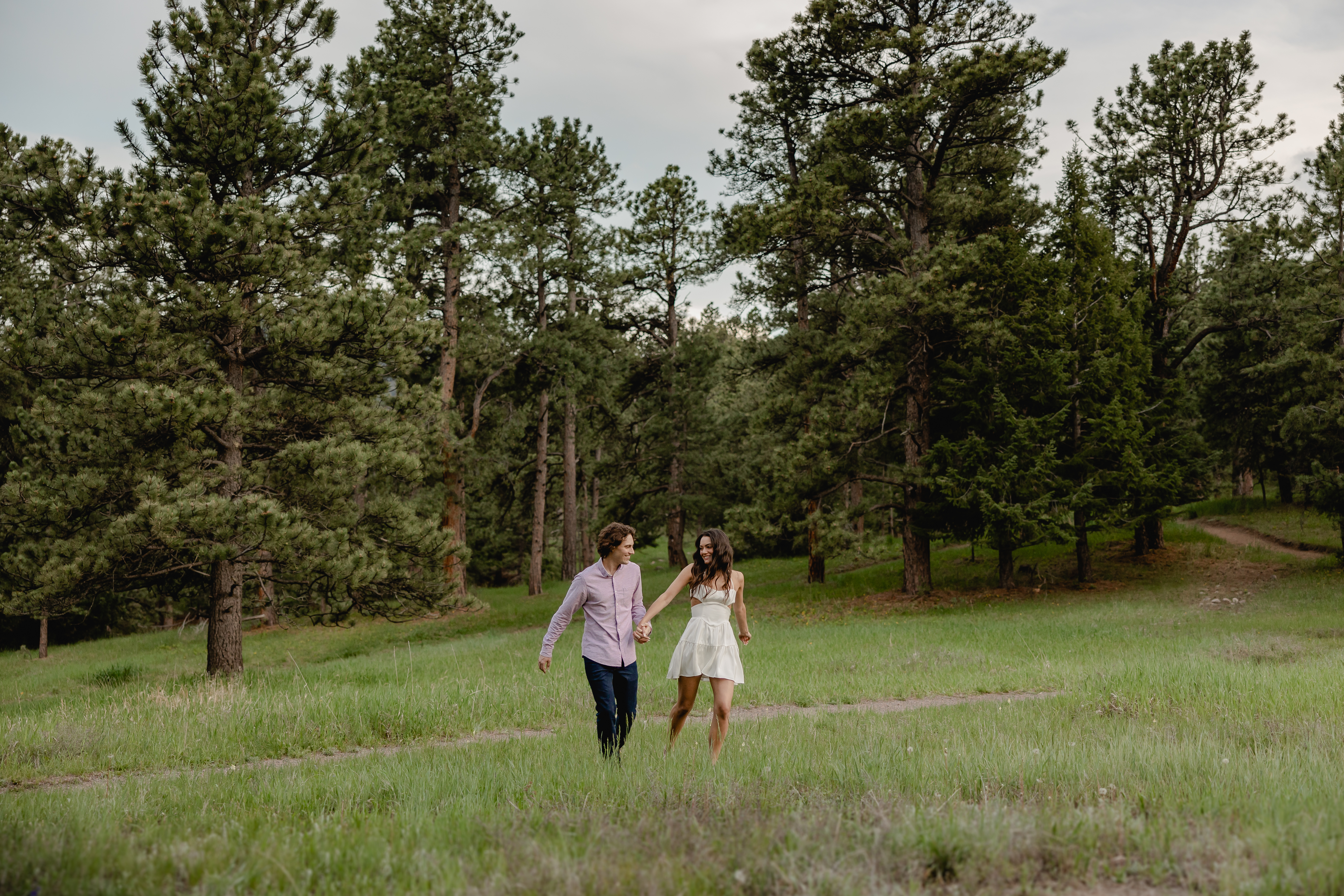
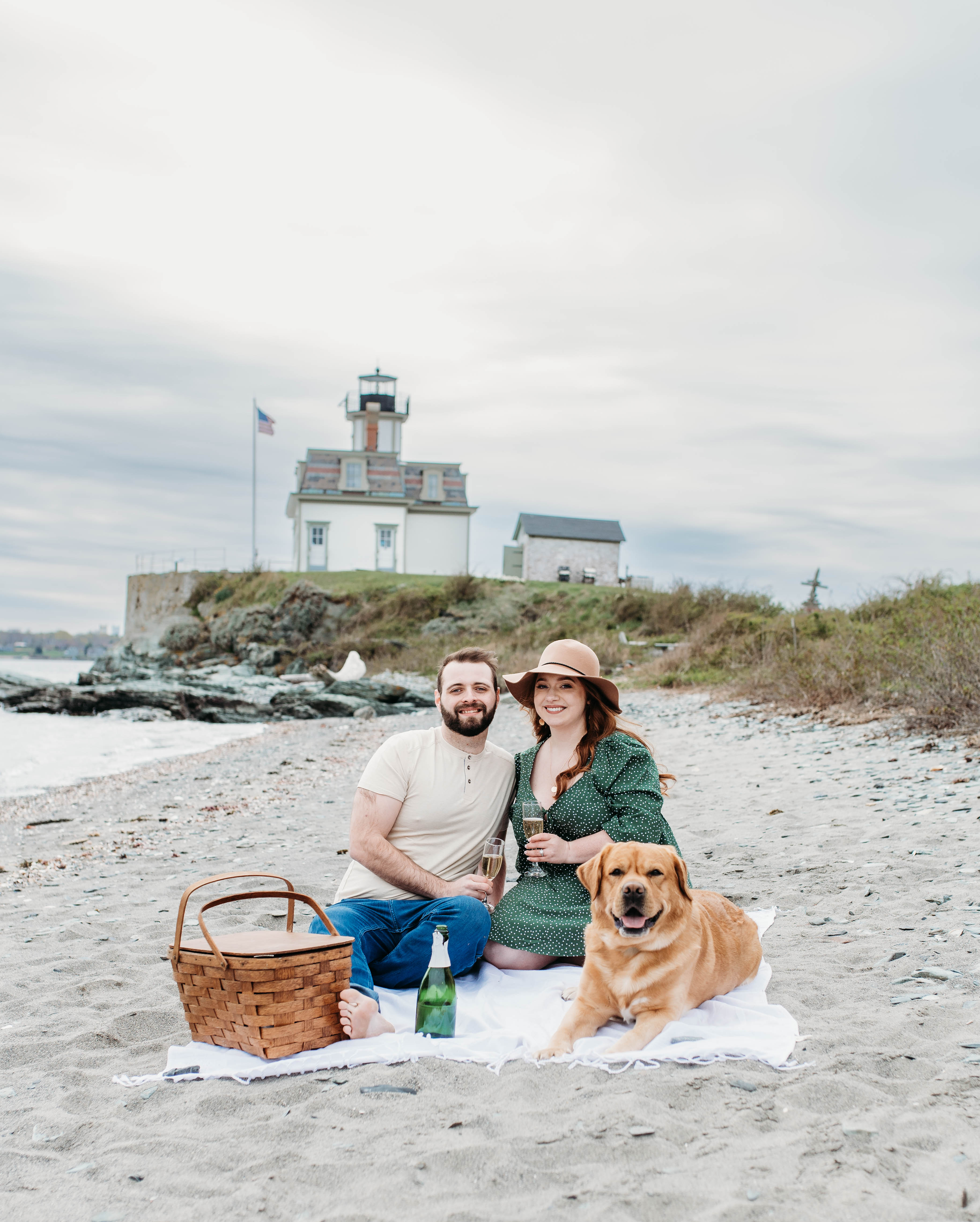
Johnny and Ran built this wedding website for their September 2026 celebration in Chicago, Illinois. The public homepage keeps things minimal: a soft cream background, two large rounded engagement photos and a quiet invitation to join them. It is one of those wedding website examples that hides all the logistics behind a private guest area.
Ready to build your own wedding website?
Wedding website design
The palette is barely-there cream and soft taupe, with the only real color coming from the green of the engagement photos. Type is light and delicate, a thin serif paired with a script that sits low-contrast against the background for a calm, airy feel. The understated wedding website design lets the photography carry the mood.
Large images with rounded corners are placed off-center, one to the right and one tucked into the lower left, which gives the page a relaxed editorial rhythm. A simple top-right menu holds just Home and Guest Area. An Add to Calendar button and a clear prompt to enter the guest area are the only actions on the page.
The couple behind the wedding website
Johnny and Ran are getting married in Chicago, and their site points guests toward a password-protected Guest Area for the full story and event details. The public page shares only the date, the city and a warm invitation to celebrate. Guests use a code from their invite card to unlock RSVP, travel tips and recommendations for the visit.
Who this website is a good example for
Couples who want a private, invite-only site. Gating the details behind a guest area keeps personal wedding websites secure while still giving guests a polished public landing page. Share a simple code on the invite and keep everything else locked.
Minimalists who want photos to lead. The cream background and light type let two engagement images do all the talking. If your photography is strong, a quiet layout makes it look even better.
Out-of-town hosts. A dedicated guest area for Chicago recommendations, RSVP and travel is a clean way to help visitors plan. Keep the public page short and put the heavy details where guests can find them.
Wedding website design tips
Lead with one clear action. The homepage points guests straight to the guest area and an Add to Calendar button, with nothing else competing. If you are short on wedding website ideas, start by deciding the single thing you want guests to do first.
Let cream and soft type set a calm mood. A near-white background with low-contrast lettering feels modern and unfussy. It also makes engagement photos pop without any bright accent color.
Place photos off-center for a modern look. Johnny and Ran stagger their images left and right instead of centering everything. Asymmetry with plenty of white space reads as designed rather than busy.
Gate the details, not the welcome. A short public page plus a private guest area protects logistics while still feeling warm. Spell out how to unlock it in one plain line, the kind of wedding website wording examples guests can follow instantly.
Tuck FAQs into the guest area. Putting answers behind the login keeps the public page clean while still covering the basics. A short FAQ section there gives guests ready wedding website faq examples for timing, dress code and travel.
Learn more: