Simple wedding website design
Metty and Josiah's site is one of the cleanest wedding website examples you'll find. A single couple photo, a date and a location, everything guests need is right there from the first scroll.
This wedding website design keeps the focus on what matters: the people and the day. It's a great model if you want a personal wedding website that feels warm without any visual noise.
Ready to build your own wedding website?
Wedding website design
The one-page layout is the star here. A hero photo anchors the top, and a simple navigation row covering About Us, Photos, Wedding Party, Q&A, Travel, Registry and RSVP handles every guest need without clutter. This kind of wedding website design proves less really is more.
There are no busy backgrounds or competing typefaces. The pared-back palette and generous white space let the couple's photo and the venue details breathe. It's a wedding website idea worth stealing if your goal is clarity over flash.
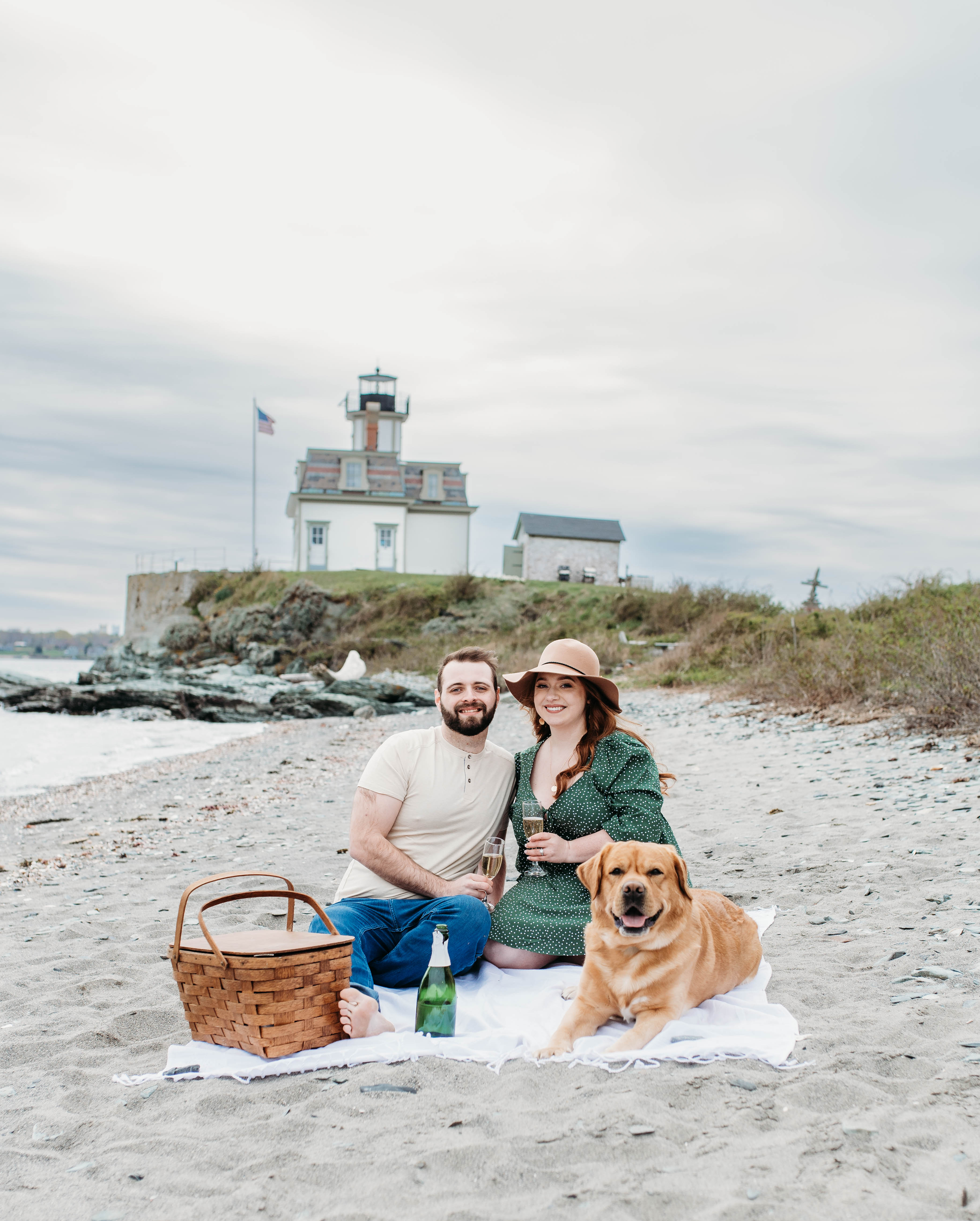
The couple behind the wedding website
Metty and Josiah chose Waldrop Freewill Baptist Church in Haleyville, Alabama, a venue with roots in their community. The site reflects that same sense of groundedness.
Their wedding website wording stays straightforward and personal, which makes it feel like a note from a friend rather than a formal announcement.
Who this website is a good example for
Couples who want simplicity. If you don't love spending hours on design, this is the wedding website idea for you. A clean template and a few good photos get you most of the way there.
Small or local ceremonies. When most guests already know the details, a minimal personal wedding website covers the essentials without over-explaining. The simple Q&A section handles the rest.
First-time site builders. This is a great wedding website example to reference if you're starting from scratch. The tab structure maps almost perfectly to a standard wedding template.
Wedding website design tips
Let one photo carry the page. Metty and Josiah's site works because a single strong couple photo does the heavy lifting at the top. Pick your best shot and resist the urge to add more.
Use tab labels guests already expect. Labels like RSVP, Registry and Travel are familiar for a reason. This site sticks to them, so guests find what they need without thinking about it.
Keep your wedding website wording short. Every section on this site uses brief, friendly copy. Short sentences reduce reading time and make the site feel less formal, which fits a dressy-casual vibe perfectly.
Add a details link early. This site places a direct registration and details link near the top of the page. Getting guests to the right info fast, before they scroll away, is smart wedding website design.
Learn more: