
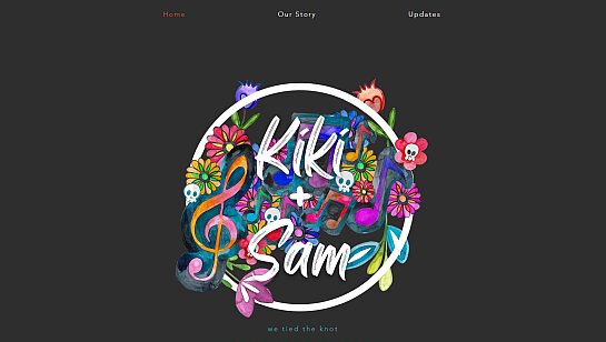
Website templates designed for you


Design your site your way on Wix
Drag and drop editor
With the Wix website maker you can freely arrange text, visuals, buttons and entire sections as you build.
Design features
Make your website stand out with scroll effects, animations and interactions, no code needed.
AI creation tools
Generate custom images, create content and add sections to your site with built-in AI features.
Business apps
Easily add features, like bookings or an online store, to meet your needs at every stage of your business journey.

What creators are saying about Wix
The Last Bookstore: experiential bookshop
“Wix had the tools that we needed to create that experience online. We could change and customize every single detail.”
The Last Bookstore: experiential bookshop
“Wix had the tools that we needed to create that experience online. We could change and customize every single detail.”

Forge to Table: kitchenware brand
“Having a great platform means that I can go to bed at night. It's the system that I've built and the website that's in place that we can serve a thousand customers.”

Fork N Film: a culinary cinema
“We literally built this business with our own two hands and it's really cool to say that we are the owners but also the website developers.”

Josh Harmon: musician and content creator
“I wanted the website to really represent me and my entire brand and it perfectly matched the tone that I was trying to get, which is playful yet professional.”

Keta Tov: dog dance training
“I was searching for a platform where I can really manage my business, a place that can help me share my knowledge and create a community. I found that in Wix.”

Trusted by over 290M users


Get content ideas for your website

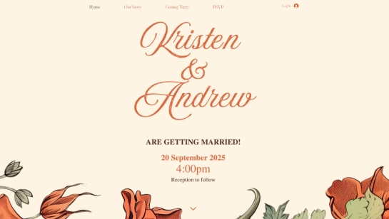
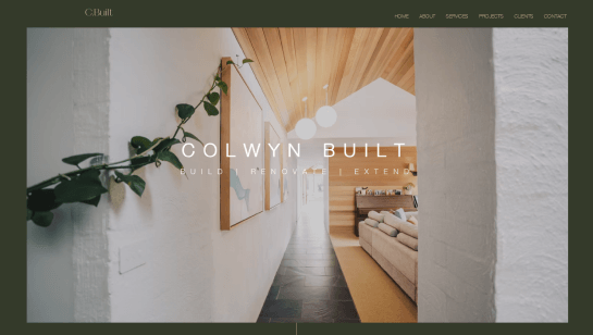
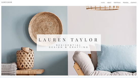
Homepage
Use a clear headline, bold welcome section and intentional website design to guide visitors to your most important content.

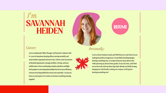
About us page
Share your story with organized sections, team photos and a clean layout that puts your mission and values center stage.

Contact us page
Keep it simple with a clean form, your contact info and a map so people can find you easily.

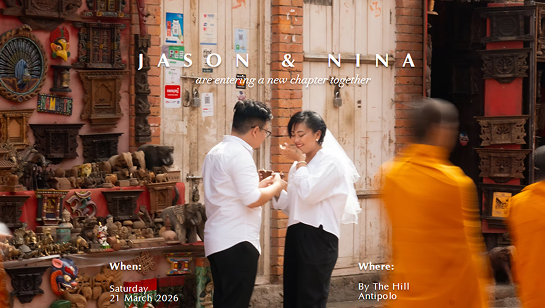
Testimonial page
Feature real quotes with readable formatting and images to build credibility and trust.
Website design ideas FAQ
Where to get inspiration for web design?
You can find website design inspiration by browsing sites in your industry to see what works and what you’re drawn to. Design galleries and online portfolio websites are great for exploring layouts, color combinations and typography ideas. Inspiration can also come from offline sources like magazines, art or nature. For an eCommerce site, focus on product page designs, navigation and checkout flow to make buying feel easy and intuitive.
What is the best way to design a website?
To learn how to design a website, start by planning: define your goals, understand your audience and organize your content. Once you have a clear plan, focus on visuals. Sketch layouts, choose a cohesive color palette and typography and experiment with templates to see what works best. Test your design with real users and refine it based on feedback to ensure your site is both visually appealing and easy to use. This approach helps you create a website that looks professional, engages visitors and meets your goals.
How to create a website design plan?
Start by mapping out your site. List your main pages, subpages and important sections. Then, decide what content goes on each page and how people will move between them. Choose your visual style including colors, fonts and images to keep your design consistent. Plan any special features you’ll need like forms or an online store.
How do I design a website with AI?
Using an AI website generator is a great way to speed up your design process. These tools can generate layouts, text and graphics that match your vibe in seconds. Simply tell the AI about your goals and style to get the ball rolling. Once it gives you a starting point, you can adjust the colors and fonts to make sure everything aligns with your vision. Let AI design tools handle the repetitive tasks and brainstorming so you can focus on the fun part—building a site that feels uniquely yours.
What is website branding?
Website branding is the consistent use of visual and messaging elements that reflect your business identity like colors, fonts, logos and tone of voice. It helps visitors recognize your brand and builds trust and credibility. A strong brand makes your site memorable and communicates your values clearly.
Can a beginner design a website?
Absolutely. With a drag-and-drop website builder you can learn how to create a website even if you’ve never written a line of code. Start with your most important pages and content, then use website templates, website design ideas and design inspiration to guide your layout colors and style. Play around with different elements, get feedback on how people use your site and make adjustments as you go.
How can I make my site look professional?
To give your site a professional feel, start with a clean layout and use a consistent palette of colors and fonts. High-quality images go a long way in making your pages look polished. You should also pick a custom domain name that’s easy to remember to help build trust with your visitors. A strong website idea also includes easy navigation, fast loading and a design that looks great on any device.
What makes an excellent website?
Excellent website examples are clean, easy to move through and look great. They share your brand story, load in a snap and work perfectly on desktop and mobile. Great sites also help visitors get where they want to go with simple layouts and clear buttons that point the way.
How to structure a website?
Structure your site with a clear plan that starts with your homepage and flows into main sections and subpages. Keep your navigation consistent so visitors can find what they need without a second thought. Group similar topics together and put your most important details right at the top where they can't be missed.
What makes a good homepage?
A good homepage grabs visitors' attention and quickly tells them what your site is about. Keep the design simple, your message short and use visuals that support your content to make the page engaging and easy to use. Check out homepage design examples for inspiration on featuring your most important information, guiding users to other pages and including clear calls to action.
What are common website mistakes?
Many websites miss the mark with cluttered layouts, confusing navigation, slow loading times or designs that don’t work well on mobile. Too much text or too many images can overwhelm visitors. Not thinking about the user's journey and missing clear calls to action often makes people leave before taking the next step.