As sleek and polished interfaces dominate the web, many designers want to figure out how to make a website that’s a refreshing departure from the norm. Web brutalism can help with that. The visual style is inspiring a new movement of distinctive and impactful website design that sparks interest in users and allows brands to stand out from the crowd.
In this article, we’ll discuss what brutalism is (web brutalism, in particular) and share examples of how websites have embraced this web design trend.
What does web brutalism refer to?
Brutalism in web design refers to a design approach that emphasizes raw, unpolished aesthetics. Brutalist websites incorporate visual features like bold typography, high-contrast color schemes and unrefined graphics. Such style conveys a sense of daring and boldness, and can be used to create a unique visual identity for a website.
History of brutalism and how it evolved to influence the design industry
The term "brutalism" originated in the field of architecture. "Brutalism" comes from the French word "béton brut," which means "raw concrete." This style emerged in the mid-20th century, primarily in Europe and North America. It was characterized by exposed geometric forms (using raw materials such as concrete, brick and steel to emphasize shapes) and a strong focus on functionality over ornamentation.
Brutalist architecture peaked in the 1950s and 1960s, but in the 1970s, it started to fade away because many people perceived it as cold and inhuman. Outside of architecture, brutalist aesthetics were adopted other design fields, such as art, graphic design and fashion.
What qualities are considered web brutalism when we create a website?
Brutalism faded away from contemporary architecture, but today it’s a style that’s being revived online as many designers and brands embed brutalism in web design.
Designers who use the brutalist style often aim to create non-confirmative works. They want to emphasize rawness and simplicity over refinement. While it’s still hard to pinpoint exactly how to define a brutalist website—since brutalism is not a single style but rather a collection of styles—it’s still possible to summarize a few qualities that brutalist websites have in common.
Bold typography
Content is the reason why people visit websites, and web creators naturally want to put their content front and center for users. Since brutalism emphasizes functionality over ornamentation, web designers rely on simple typography with large font sizes to put more visual weight on the text.
High-contrast color schemes
High contrast is used to communicate important information at a glance and convey a sense of raw energy. Interestingly, it's possible to achieve this goal using only one color, which is why many brutalist websites experiment with monochromatic color schemes.
Minimalist graphics
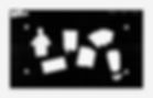
By nature of being rough and unrefined, graphics in brutalist web design are often minimalistic. Web designers intentionally use simple graphics (such as objects with elementary shapes like ovals and rectangles) to focus more attention on content.
Craigslist is an excellent example of a website created with a brutalist aesthetic. The website barely changed in the last 20 years because it doesn't require a massive redesign. Visitors can easily comprehend the information and navigate to a specific page.
Benefits of using brutalist aesthetics in web design
As with any visual style, web brutalism has its advantages and disadvantages. Here are a few benefits that brutalism can provide for web designers:
Memorable experience: Brutalist web design stands out from the crowd and can create a unique experience for users.
More focus on the website's core content: Well-designed brutalist websites strip away unnecessary visual distractions and focus visitors' attention on what's essential.
Fast loading time: Brutalist web design often features minimal graphics, resulting in faster load times and a better user experience for visitors, especially those with slow internet connection.
Better accessibility: Bold typography and high-contrast color schemes used in brutalist design can help to improve accessibility for users with visual impairments or color blindness.
Downsides of using brutalist aesthetics in web design
At the same time, the brutalist design also has a few significant downsides, such as:
This style is not for everyone: The raw, unpolished aesthetics of brutalist design can be a turnoff for some users who prefer more refined, polished designs.
Websites that embrace brutalism might be a challenge to navigate: Brutalist web design often uses unconventional navigation techniques, which can confuse the general audience.
11 excellent examples of brutalist websites
Let's take a closer look at some of the best websites that embrace brutalist aesthetics. All of these websites have one thing in common: those who created them didn't play by the rules, and their designs are anything but conventional. Thanks to this bold approach, these websites can easily steal the spotlight.
01. Studio Push
Studio Push is an international multidisciplinary studio specializing in graphic design and creative coding. The studio uses a brutalist style to convey a strong sense of personality. Visitors are invited to click on any part of the web page to see the featured artworks in their collection. Bold typography definitely benefits this design, and although the colors clash in certain areas, it's an effect that embodies the unique brutalist appeal.
02. Kurt Champion
Kurt Champion is a graphic designer and art director based in the U.K. He uses brutalist aesthetics for his personal portfolio website, where he displays all his work and contact information. Many brutalist websites risk having navigation problems, but Kurt's website is an exception. Kurt puts his website’s content into individual cards, and visitors can use toggles labeled "Work," "About me" and "Fun Stuff" located at the top of the page to quickly filter content on the page.
03. Jeremy Baxter
Jeremy Baxter is a visual artist, filmmaker, photographer and musician from Colorado. His portfolio website features a brutalist design with a black-and-white color scheme, bold typography and a focus on simplicity. Imagery plays a dominant role in this design, and the font style gracefully complements the punk rock atmosphere that Jeremy created.

04. Teacherie.how
Teacherie is Georgia Anne Muldrow's online institute. Muldrow offers an approach to music production via online study tools. Her site’s design uses solid color backgrounds—no decorations or fancy gradients, just plain color. This design decision helps improve the page's visual hierarchy. The brutalist-esque text blocks are nicely paired with relevant imagery, reinforcing the core message. Another notable quality about this design choice is how individual sections are visually separated from each other—the background color is used as a section divider.
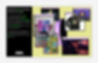
Derek McKechnie practices communication design, and his website showcases his experiments in printing. The website is full of geometric components with sharp edges, but once visitors start clicking around, they’ll notice that these objects are interactive. Silhouettes transition into images on mouse hover. This is an excellent website example of how you can use microinteractions to enhance the user experience of a brutalist design.
06. Kid Aroke
Kid_Aroke’s site works as a personal artist website and portfolio for the artist and designer. His website was created using the early 2000s aesthetics—slightly blurred text on the left panel nicely paired with images on the pale yellow background. This simple design decision helps to convey the innate brutalist mood of the early days of the web.
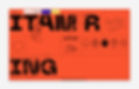
07. Mr. Itamar
Itamar is a graphic designer and photographer based in Tel Aviv. He pairs bright, saturated website background colors with bold typography and simple geometric shapes, creating a solid foundation for his design. The site uses open navigation. Navigation options are located at the top of the page so that users can quickly move to any desired page. This is a great way to touch on the web brutalist trend while ensuring that visitors don’t get lost on the page.
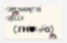
Kelly is a Vietnamese graphic designer currently residing in New York City. She believes that a balanced connection between concept and audience is what establishes a strong brand. Her graphic design website communicates the passion she has for her profession. Every element of the website, be it a text or imagery, expresses personality and immerses visitors in a visual raw, yet sophisticated journey.
09. Archerd Aparejo
Archerd Aparejo is a graphic designer working on design for magazines, posters, websites and exhibitions. It’s clear that he likes to bridge the physical with the digital world, and using a brutalist web style that highlights textures and material, Archerd finds a balance between the two in his personal website design. This approach led him to finding a unique navigation design—images of physical book covers serve as menu options, leading users to individual projects from his portfolio.
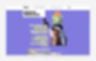
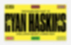
10. Ryan Haskins
Ryan Haskins is a branding designer located in Los Angeles, California. For his personal portfolio website, Ryan uses an extreme version of brutalism. Vibrant colors, large geometric objects and the overuse of flashy photos create a visually striking design. This Wix website example screams "look at me" and engages visitors into browsing.
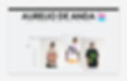
11. Aurelio De Anda
Aurelio De Anda is a graphic designer who works on merchandising, brand identity, print media and web design. Aurelio effectively incorporates elements of brutalism in his portfolio website. Brutalism is used to give more visual weight to individual elements or sections, which helps to attract visitors' attention to the right parts of the page as they’re scrolling through it.