Romantic wedding website design
Beatrice and Alex built a romantic wedding website that leans all the way into their love story. Soft serif headings, warm photo collages and a single scrolling page give this wedding website design a heartfelt, storybook feel.
It is a lovely example of how personal wedding websites can carry real emotion while still covering the details guests need.
Ready to build your own wedding website?
Wedding website design
The page opens with the couple's names in an elegant serif, set over a soft neutral palette that keeps the focus on their photos. A long-form love story section anchors the site, broken up with candid images and plenty of white space so the writing stays easy to read.
Warm tones, rounded photo crops and a simple top menu make this one of those wedding website examples that feels intimate rather than busy. The single-scroll layout means guests reach the story, date and RSVP without hunting through pages.
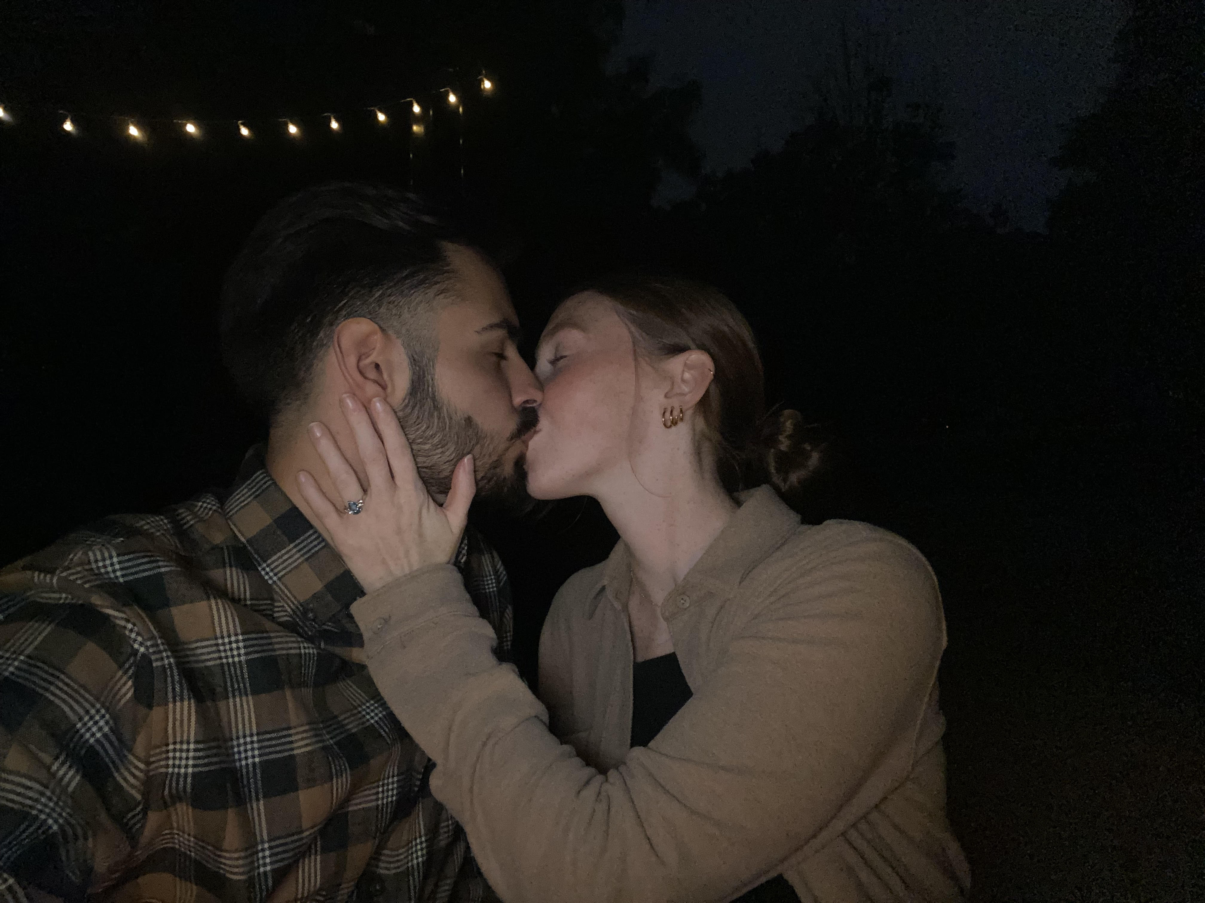
The couple behind the wedding website
Beatrice and Alex met on a dating app in early 2020 and bonded fast over a six-hour first date. Their site traces the years since, from raising their pup Boo to a Napa Valley proposal.
The writing is personal and unhurried, which is exactly what gives the site its charm.
Who this website is a good example for
Storytelling couples. If your relationship has a story worth telling, this site gives it room to breathe. It is a strong reference for anyone gathering wedding website our story examples.
Single-page fans. Everything lives on one scroll, so guests never feel lost. It is a clean model for simple wedding website ideas that still feel personal.
Lovers of soft palettes. The neutral tones prove you do not need bold color to make a site feel special. Borrow the approach for your own wedding website design.
Wedding website design tips
Lead with your story. Beatrice and Alex put their love story front and center, which warms up the whole page. Strong wedding website our story examples like this give guests a reason to keep scrolling.
Keep the palette soft. A warm, neutral scheme lets the photos do the talking. It is an easy way to make your wedding website design feel cohesive.
Use one clear call to action. A single RSVP button keeps guests focused on the thing you need from them. It keeps the page calm and simple.
Write the way you talk. The casual, honest tone makes the site feel genuine. Borrow it for your own wedding website wording examples.
Learn more: