- Oct 30, 2025
- 5 min read
Updated: Feb 22
Ready to create your own website? Get started with Wix's website builder.

When you're building a website for your business, it’s natural to want to pull out all the stops. After all, you’re aiming to impress.
But in the rush to create something unique, it's easy to fall into the common trap of trying too hard. I see it a lot, that desire to add just one more website feature or a fourth font to give a website more character. More often than not, though, this strategy has the opposite effect: instead of producing a website that wows visitors, you end up with one that overwhelms them and makes them click away.
The good news is that creating a striking and professional site is completely within your reach. It’s just that getting there is less about adding as many shiny new things as you can, and more about making thoughtful choices.
Here’s my take on what you should consider when thinking about how to make your own website that doesn’t underdeliver or overstretch.
Let’s start with the basics: Does your site actually work?
Before you even think about colors, fonts and effects, let’s talk about function.
It's surprisingly easy to overlook the simple mechanics of your site when you’re excited about the visual details. But if a visitor clicks a button and nothing happens, you might have already lost their trust in your business.
So get the basics right, first. Ask yourself, is the menu working properly? Are the CTAs doing what they’re supposed to? Do links to your social media or other external pages open correctly?
Fixing these functional issues is a simple, yet important, first step to making sure visitors have a positive user experience.

Content needs to breathe, too
Think about walking into a room packed wall-to-wall with furniture. It feels cramped and chaotic, and you don’t know where to look first. A website can feel the same way.
When text, images and buttons are crammed together without adequate spacing, the entire page feels overstimulating. This visual noise makes it hard for visitors to focus on your content and absorb your message.
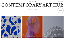
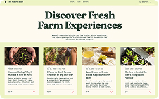
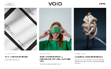
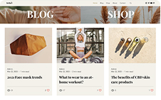
White space is the empty area around design elements, and it's one of the most powerful tools in your design kit. So, make use of it. Give your content room to breathe so your site feels open and organized. This also helps to guide the user’s eye from one section to the next and encourages them to explore your site at their own pace.
When reviewing your pages, ask yourself: Is there enough space between your paragraphs? Between images and text? Between different sections of your page? Increasing the padding and margins around your elements can instantly make your website feel more professional and inviting.

Tame your typography
Good typography can instantly make a website feel polished and professional, while messy typography can make it look amateurish.
I recommend having a strict typography system. Go for two fonts at most: one for your headings and one for your body text. This creates consistency and a clear visual hierarchy, helping visitors easily scan your content.
The classic pairing of a bold, expressive font for headings and a clean, simple font for paragraphs is a go-to for a reason—it works.
My hot take on fonts is that the serif and sans-serif font combination is overrated. I’ve used it as my go-to in the past, but it doesn’t always feel the most consistent or readable compared to other pairings. Sometimes, using two complementary sans-serif fonts (or two serif fonts) can create a more cohesive and readable experience. The key is consistency.
It’s okay to tone down the professionalism
A common misconception among SMBs is that their web content needs to be formal. While it's important to build credibility, a website that’s all business and no personality can feel cold and generic.
Remember, your business website is a chance for people to connect with your brand. Of course, it will depend on your audience, but weaving personality into your copy can make your brand more relatable and memorable. After all, people do business with people they like, and your website is the perfect place to make that connection.
Personally, I try to show a side of me you won’t find on my LinkedIn. I have a dry sense of humor, so I like to let that come through in my About section.
Keep background colors subtle
When it comes to color, your brand's personality should guide your choices. If a bold, bright color palette is true to your style, then go for it.
However, for many businesses, a simple background is the most effective choice. Your website often showcases your work—your products, your portfolio, your services. A neutral background, like black or white, paired with a strong accent color, allows your work to speak for itself. The focus remains on what you’re offering, not on a distracting background.
Think of your website's design as the frame for a painting. That frame should complement the art, not overpower it. By keeping the design clean and focused, you let the quality of your work take center stage.
For website design inspiration, take a look at the site for construction business In the Deets, which features a clean, professional layout that allows the company’s striking interior design work to take center stage.

Find the sweet spot between simple and over-stimulating
So, how do you create a business website that’s clean and simple without being boring?
For me, an overly simplified website is one without interactions or animations. Those small touches can take a site from flat to memorable. They instantly make your work stand out and the site more engaging.
You don't need wild, complex animations to make an impact. Simple effects can go far. Here are some to consider:
Hover effects: For example, an image that subtly zooms in or a button that changes color when you hover over it.
Parallax scrolling: An effect where the background moves at a different speed than the foreground, creating a sense of depth.
Fade-in animations: Elements that gracefully appear as the user scrolls down the page.
These small touches (which are easy to add in the Wix Editor, I might add) transform a site from a boring web page into a memorable experience.
Sure enough, you can go the other way too: animation overkill. To hit that sweet spot, use animations purposefully—to guide attention or enhance flow.
Get honest feedback
Creating a website isn’t a one-and-done task. It's okay to make mistakes and not have a perfect design right away.
Reaching a point where your site hits all the right notes without trying too hard comes not only from the tactics I’ve outlined, but also from being open to honest feedback. So, reach out to your family, friends and colleagues for their perspective. You might be surprised by the insights you get from a quick outsider’s view.
Finally, scope out the best tools like Wix’s drag-and-drop website builder or AI design tools to create a website that’s not only compelling but also works hard for your business.
Related reading:


