- May 25, 2025
- 17 min read
Updated: Dec 9, 2025
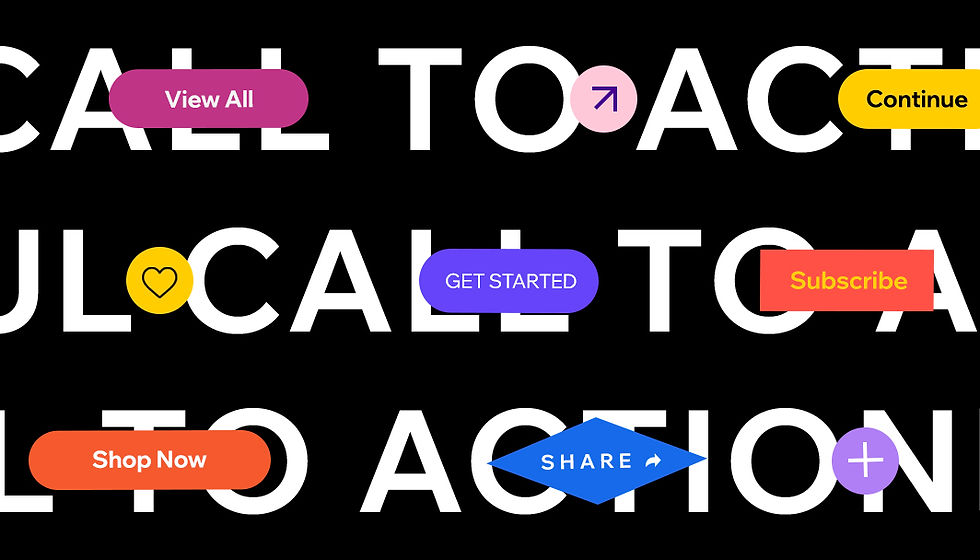
When marketers and business owners create a website, they’re advised to use compelling calls-to-action (CTA) to persuade their target audience that clicking on their content is a must. A powerful CTA directs people to take action — whether to purchase, subscribe, book or do any other activity that serves the business’s goal. And the payoff can be significant, with clear, specific CTAs boosting conversion rates by up to 161%.
Writing and designing effective CTAs isn’t always straightforward. On the one hand, you want your CTA to stand out, but you don’t want to appear too salesy or desperate. On the other, there are only so many words you can use to encourage visitors to buy, register or sign up without sounding repetitive. Through researching other successful calls-to-action examples, you, too, can master the art of crafting your own. To help, we’ve gathered our favorite call-to-action examples and compiled the best practices for writing one.
What is a call-to-action?
A call-to-action is a short phrase that prompts your audience to take the desired action on your website, landing page, email or advertisement. They are often clickable texts, images or buttons that guide the user to the next step you’d like them to take. However, call-to-actions can also be plain text with no link. Implementing good CTAs is essential for your business’s growth as it can significantly impact the success of your marketing strategies, and specifically your conversions, sales and lead capturing efforts.
Definition | Text or phrase that encourages someone to act in a specific way. Tend to be active |
|---|---|
Examples | Create a website,' 'Start a blog,' are common CTAs. |
Types | May be non-demanding requests (learn more, opt in) or more demanding (signup now, buy now) |
Tips for crafting a call-to-action
Did you know that personalized CTAs convert 42% more visitors compared to generic or vague ones? Before we look at some call-to-action examples, let’s first define what makes a good CTA. This will help you understand why we've chosen the examples in this article, as well as make you better equipped to create great CTAs. Using the following CTA tips can help you get more clicks:
Use action words
The best way to build a sense of urgency, thereby encouraging people to take action, is through using action words in your content. Here are some examples of common action CTAs: buy, add to cart, order, shop, try, get started, sign up, subscribe, download, learn more, swipe up, continue and see more.
Write in the first-person
Writing in first-person can grab and hold readers’ attention, thus prompting them to respond to your call to action. It personalizes it also.
Keep it short and simple
Be selective with the number of words you use in your CTA and how many calls-to-action you use on a web page or ad. When you avoid lengthy text, your message is able to stand out because it won’t get lost amongst other less crucial information.
Know what your audience needs
According to Dor Cohen, distribution specialist at Wix, "Make sure your calls-to-action are aligned with your messaging." If you can anticipate your audience's "lead temperature" and readiness, you will be able to best influence their choice in clicking. Is the user realistically ready to "Buy now," or would they prefer to "Download" more information first? You should see your conversion rate and click-through rate increase by showing the most relevant information to a user at the right time.
Make your CTAs easy to find
By contrasting colors, sizes and strategically designing your CTA buttons, you can create the best user experience that could lead to conversions. Wix website templates and landing page templates come with built-in customizable CTA buttons. These templates are arranged to make it easy to grab your audience's attention by being strategically placed on the page layout. They've also been designed in an optimal size and visual colors that nicely contrast with the background.

Best call-to-action examples
Website call-to-action examples
01. Wix.com
CTA: Create a website you’re proud of
When we ask first-time users to create a website, we invite them to start something great for themselves — a business website, an online portfolio, a free blog or a digital CV — all offer opportunities to build a successful future. This is precisely what our CTA on the Wix.com homepage is meant to inspire. We are also tapping into emotions and feelings that can help trigger action. Paired with the message "Get started," this secondary CTA button is meant to convert the lead and motivate them to open an account with Wix.

02. Slack
CTA: Now is your moment to build a better tomorrow
To understand the strength of Slack's call-to-action examples, you need to consider its company mission which is to create “a better future.” Furthermore, they say "Slack is where the future works" and "Now is your moment to build a better tomorrow." These CTAs contrast nicely with the action word "now," thereby motivating you to make a purchasing decision today that will impact your tomorrow.
Slack’s homepage also includes a navigation menu that offers more information, such as pricing and other products. Yet, what stands out here are more CTAs like "Try for free" and "Talk To Sales" buttons. This straightforward web design compels visitors to progress in their customer journey.

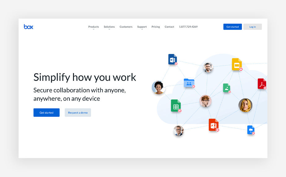
03. Box
CTA: Request a demo
The company Box offers cloud storage servers for large organizations like hospitals, universities and corporations. The company realizes that these types of ventures need to be able to establish personal connections between customers so that they are more willing to commit to the product. This is why the "Request a demo" CTA button is featured prominently on their website. It is a solid call-to-action example that addresses how important demos are in the SaaS world and how valuable it is to have the option to book them without going through extensive steps.
04. Domino’s
CTA: Delivery or carryout
Sometimes, one CTA is not enough to capture all audiences. That's what Domino's figured out when it decided to address visitors with two options, either get a pizza via "Carryout" or via "Delivery." The great thing about both CTAs is that the language is clear and actionable, prompting visitors to move forward with the purchase. While most call-to-action examples nearly always rely on a verb, the invitation to choose between the two is so clear that no verb is needed.

05. Zoom
CTA: Why Zoom
Zoom's CTA success begins with its powerful opening statement on the homepage. In bold letters, the company announces: "Zoom is ranked # 1 in customer reviews." Its reputation as a top video-conferencing platform is well-known. That said, all that remains is for its CTA to make a final appeal for those who may not be customers yet: "Why Zoom" and "Sign up, it's free."
A combined effect of customer testimonials and a powerful CTA can drive users to sign-up and learn more about why Zoom is ranked so high. Afterward, they can simply register to be part of the experience. We are impressed by how Zoom has shown its competitive advantage by "flaunting" its strong reputation in a bid to nurture more trust.

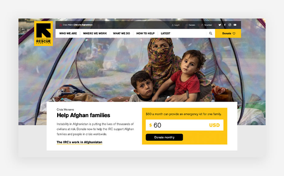
CTA: Donate
When simplicity and creativity meet, you can rarely go wrong. The International Rescue Committee's website makes very simple use of the word "Donate." There's a powerful message behind this word, especially with the bold and complementary color combo of black and yellow. The addition of a little heart icon to accompany it, reminds us of the art of giving and caring. This "Donate" call-to-action example summons our sense of moral duty.
07. Carissa Potter
CTA: Submit
Illustrators aren't famous for sending emails. That is until you see Carissa Potter's newsletter registration, who writes she "will only send you love and sometimes some words to go with it" with a delightful illustration of a hand-drawn envelope. Potter is able to make a personal connection and share her authentic voice in the form of a unique call-to-action. We are certain that many people who visit her Wix website to check-out her projects are more than happy to subscribe to her newsletter based on her heartfelt message.

CTA: Book your private cooking class
If you've ever used a cooking site, you might have noticed that many of them opt for a layout that centers around their most recent blog posts. There's nothing wrong with that, but it does make the process of searching for older recipes or cooking courses a bit more cumbersome. That's why we love The Chef and the Dish's Wix website and call-to-action examples. They highlight the option to "book your private cooking class" as the main element at the center of their homepage.
Also, The Chef and the Dish have added CTA buttons on their site that are customized by cuisine type. This tailored and clearly labeled design makes it extremely easy for a site visitor to find the kind of food they're interested in and immediately be able to move to the next step.

09. Lever
CTA: Let’s talk
Phone sales consultations are essential for digital service providers like Lever, a recruiting and hiring service. The company offers prospective clients the possibility to speak with a representative, thereby giving them a good first impression of the product before signing a deal. That’s why we like Lever's use of "Let's talk" in its CTA. This adds a sense of immediacy to the process using a casual tone that sounds approachable and friendly.

eCommerce call-to-action examples
10. Modcloth
CTA: Shop Halloween
As an eCommerce site, ModCloth knows that it can get more sales using personalization in its messaging, which is adapted to seasonality and shows brand personality. This is why ModCloth's homepage keeps its CTAs up-to-date. For example, it currently has a "Shop Halloween" section with Halloween on the horizon. They've even added a friendly rhyme, "Have no fear, Halloween is here! And we're looking on the fright side with a collection inspired by the scream queens of the silver screen." This playful copy is far from mundane. If there's a way to create CTAs for holidays or big events, then take the extra step of demonstrating relevancy and freshness to customers.

11. Patagonia
CTA: Take action
Patagonia eliminates the need to search through a long list of links on its navigation menu. Instead, the outdoor apparel store guides you right away to the categories that most matter to customers: shop, activism, sports and stories. This is a terrific way to streamline shoppers toward their desired destinations.
On its activism page, Patagonia highlights its environmental efforts using a large CTA that reads "Take action," hoping to prompt site visitors to sign-up for volunteer work with a number of grassroots groups. This call-to-action example uses a nice play on words because by taking action on their site, visitors will also be taking action in improving their community.

12. Saint-Isadore
CTA: Shop online
Saint-Isadore's Wix website has two CTA buttons on it: one is outlined in a black frame that reads "Shop online," and the other is a classic button in pink that reads "Shop all." Both of these call-to-action examples take visitors to the same page, which is a common and effective CTA technique that casts a wider net to gain more clicks.
Different visitors may be attracted to one or the other for various reasons. What's important here is that Saint-Isadore did not simply replicate the button. They slightly altered both text and design so that these buttons remain unique but related.

13. Greek Sandals
CTA: Discover the collection
Wix user Greek Sandals evokes vacation and summer vibes across its website. With product images featured on the beach, site visitors know they're in for an adventure. Greek Sandals connects aesthetics with its CTA language in "Discover the collection." We believe the word "discover" was specifically chosen due to its association with uncovering new places while traveling.

Facebook ad call-to-action examples
14. HotJar
CTA: Understand why users are leaving your site
Hotjar’s Facebook ad immediately informs its audience that the business can create better web experiences. The message “understand why your users are leaving your site” together with the phrase “Try Hotjar free” complement each other perfectly. Hotjar knows what troubles its target market and offers a solution in return.

15. SoundCloud
CTA: Get paid for your plays
Music streaming company SoundCloud, "talks music to our ears" with its Facebook ad copy. Their message is to the point, as it knows exactly what its audience hopes to achieve—get more plays. As being the only text on the page, the words seem too pop. On top of that, "get paid for your plays" rolls off the tongue because the letter "p" repeats throughout.

16. Outreach
CTA: Read now
Many of us say that if we had more time, we would read more. However, Outreach, a sales engagement platform, creates a sense of urgency around reading their guide now.
Outreach also has done a fantastic job using varying CTAs on the bottom right of its ad, "Download," and “Read now” at the top. This small change in wording allows users to choose between what messaging they best respond to, thus increasing the chances of converting.

Instagram ad call-to-action examples
17. Amazon Music
CTA: Get offer
Getting six months of free Disney + sounds magical. But in order to make this Disney dream come true, you have to act fast. Amazon's use of the words "limited-time only" urges people to act on this special deal now. Amazon has done a superb job of tying it all up in a short and sweet final CTA "Get offer."

CTA: Visit Instagram profile
Ever wondered how to get more profile views on Instagram? Apparently, you just need to ask according to the Syntopia Hotel. With an inviting CTA, "Visit Instagram profile," the hotel brand is able to bring its target audience to its page.
If you have a visual product or great hotel views like Syntopia does, then driving users to your Instagram profile is an effective way to promote your offerings. Besides, with a strong Instagram marketing strategy in place, you'll be able to make the most of your paid profile visits. From optimizing your professional Instagram business account, using all of the app's formats, to building robust content pillars, we've covered it all in our guide.
Subscribe to the Wix blog for a weekly dose of fresh web design tips and trends.

Google search ad call-to-action examples
19. Stitch Fix
CTA: Take your style quiz today
Stitch Fix, an athleisure brand, opens with an intriguing offer to its clients. It asks people to take a style quiz to refine the looks and styles they'll show the visitor on the site. Then, using the incentives "Save 25%" and "Free shipping and returns" encourages visitors to take immediate action. Don't be shy to use quizzes in your next ad and CTA.

20. Booking.com
CTA: Quick and secure booking
Hotel website Booking.com knows just what its target audience yearns for when booking a hotel. The website's intro text reads "Quick and secure booking," paired with a smaller font that says "Book your hotel in Chicago now," thereby showing trust and readiness. The Google search advertisement also wraps up the copy with "Read real guest reviews." This intentional step demonstrates confidence in the company's ability to share past customers' voices.

21. Overstock
CTA: Last chance summer savings
The only good thing about summer ending is the sales that follow. Overstock, the furniture and home decor seller, really knows how to jump on the seasonal trend. Its Google search ad shows current relevancy and adds strategic words, such as "Last chance." Even if it's just subconsciously on our minds, the timing strikes us to act fast before summer has ended.

Display ad call-to-action examples
22. Tableau
CTA: Get the whitepaper
Spreadsheets enthusiasts are part of a niche target audience who appreciate advanced products and services. Tableau captures this very well in its choice to use the statement "5 things your spreadsheets can't do." The CTA helps potential clients imagine all the possibilities of Tableau products. Building suspense and hinting that Tableau can make their life easier, they add a final touch with the CTA "Get the whitepaper." We love how few words or imagery are on this ad, yet the message and inclination to click are still high.

23. Volkswagen
CTA: Find a dealer
Sometimes it's good to get straight to the point. In the carmaker Volkswagen's banner ad design, you can click on the "Find a dealer" button, leading you to where you want to go. Instead of a "Learn more" guide about the car's features, Volkswagen is confident it can help people find the perfect vehicle right away.

24. Upstart
CTA: Learn more
Some of the best call-to-action examples are those that spark curiosity. Upstart, a company that provides personal loans, knows just how much information to include in its display ad and still generates interest to click-through.
In its promotion, Upstart lists three of its value propositions with a very noticeable next step: "Learn more." This business knows that it would be best to offer more information for a first-time user as opposed to a "Sign-up today" CTA. It's essential to align your call-to-actions to the customer’s readiness.

Pop-up call-to-action examples
25. Balloon
CTA: Sign up to be notified of screenings in your area
Balloon's Wix website promotes a short film and provides information about upcoming screenings. Its "Watch now" CTA button is intentionally placed to cover the mouth of one of the movie's characters, which sends a strong message about the movie's plot. Additionally, Balloon has a pop-up call-to-action example with a window appearing at the bottom of the website.
This lightbox collects emails and notifies users of screenings in their area. The pop-up is too invasive since it's at the bottom of the page. With the help of a form builder, they've customized (and limited) the information in the required fields to increase their submission rate.

26. Backlinko
CTA: Get the free guide now
Backlinko knows why people come to its site and wastes no time giving them what they're looking for. The company is widely known for SEO training and link-building tips, so the minute you land on the homepage, a pop-up promotes a piece of gated SEO content with the CTA "Get the free guide now."
What Backlinko did in this CTA example was select a highly relevant guide to tempt its site visitors to give their emails. Later it can nurture its email list with marketing emails and newsletters. Who said pop-ups have to be invasive? In the case of Backlinko, we find it extremely useful.

Email call-to-action examples
27. Lyft
CTA: Ride and save
The ride-sharing app Lyft keeps it short and sweet in its email marketing campaign. Lyft demonstrates that brief copy helps the brand's message come across powerfully and allows the "Ride and save" call-to-action example to roll off the page. It’s even designed with a shadow around it to create a 3-D visual effect. Lyft also uses the first person in order to speak directly to its readers with phrases such as "just for you" and "treat yourself."

28. Asana
CTA: Register now
Asana is a workflow solution that keeps projects organized and on track. Its marketing email immediately reveals that Asana can help with burnout, bounceback, and keeping employees motivated. After stating this workforce pain point, Asana calls for a solution that will be shared at its upcoming online event. Furthermore, it gives a glimpse of what you'll learn at the conference and asks you to "Register now." Since we’re all very busy professionals, make sure you, too, can entice people to make time for your next event.

29. Headspace
CTA: Get some Headspace
Meditation and sleep app Headspace use a wonderful call-to-action example that incorporates its brand name into the CTA. After introducing the different capabilities and features the app offers, it signs off with "Get some Headspace."
Typically the word "Get" is followed by phrases like "Get the app" or "Get the offer," but here, it uses the company name "Headspace" instead. They've found a clever way to create a pun with their name because by getting the app, hopefully, you'll get some clarity in your mind.

30. Chipotle
CTA: Get my guac
On National Avocado Day, Chipotle Mexican Grill jumps on the opportunity to make its customers happy with free guacamole. Instead of sounding robotic or mundane, the Mexican American fast-food chain makes this special day feel fun with its CTA: "Get my guac." The shortening of the word guacamole makes the brand's message easily digestible. Having an authentic brand voice, Chipotle succeeds in piquing interest and getting people to take action on its offering. Think of ways you can be playful in your CTAs, whether it's by shortening a word or using slang to connect with your audience.

Types of CTAs and where to put them
Here are some common types of CTAs and their applications:
Lead generation
These CTAs aim to collect user information, such as email addresses or phone numbers, for lead generation purposes. Examples include "Sign Up for Our Newsletter" or "Download Our Free Ebook."
Sales
These CTAs encourage users to make a purchase or transaction, driving direct sales or conversions. Examples include "Buy Now" or "Add to Cart."
Content engagement
These CTAs promote further engagement with content, such as reading blog posts, watching videos or exploring additional resources. Examples include "Read More" or "Watch Now."
Social sharing
These CTAs encourage users to share content on social media, increasing brand awareness and engagement. Examples include "Share This Post" or "Follow Us on Facebook."
Event registration
These CTAs prompt users to register for events, webinars or workshops. Examples include "Register Now" or "Save Your Spot."
Contact CTAs
These CTAs direct users to contact the company or organization for inquiries or support. Examples include "Contact Us" or "Get in Touch."
Download CTAs
These CTAs encourage users to download resources, such as eBooks, whitepapers or case studies. Examples include "Download Now" or "Get Your Free Resource."
Subscriptions
These CTAs prompt users to sign up for recurring services or subscriptions. Examples include "Start Your Free Trial" or "Subscribe Now."
Feedback
These CTAs encourage users to provide feedback, reviews or testimonials. Examples include "Leave a Review" or "Share Your Feedback."
Donation CTAs
These CTAs encourage users to donate to a cause or organization. Examples include "Donate Now" or "Support Our Mission."
CTA type | Purpose | Example phrases |
|---|---|---|
Lead generation | Collect user information (emails, phone numbers) for future outreach | Sign Up for Our Newsletter, Download Our Free Ebook |
Sales | Drive direct purchases or transactions | Buy Now, Add to Cart |
Content engagement | Encourage users to interact with more content | Read More, Watch Now |
Social sharing | Boost brand awareness by prompting users to share content | Share This Post, Follow Us on Facebook |
Event registration | Prompt users to register for events, webinars or workshops | Register Now, Save Your Spot |
Contact CTAs | Direct users to contact your team for inquiries or support | Contact Us, Get in Touch |
Download CTAs | Encourage downloads of resources like eBooks or case studies | Download Now, Get Your Free Resource |
Subscriptions | Prompt users to sign up for recurring services or newsletters | Start Your Free Trial, Subscribe Now |
Feedback | Collect reviews, feedback or testimonials from users | Leave a Review, Share Your Feedback |
Donation CTAs | Encourage users to donate to a cause or organization | Donate Now, Support Our Mission |
CTA buttons and how to use them
CTA buttons play a crucial role in guiding users towards desired actions and achieving marketing goals. They serve as clear instructions that prompt users to take specific steps, such as signing up for a newsletter, making a purchase or downloading a resource. Effective CTA buttons can significantly improve conversion rates and drive desired user behavior. They also allow for tracking and measuring their effectiveness, providing valuable insights for optimization.
How to use CTA buttons effectively:
Use concise, action-oriented language that clearly conveys the desired action.
Make CTA buttons visually prominent using contrasting colors, appropriate size and strategic placement.
Place CTA buttons in prominent locations where users are likely to see and click them.
Ensure CTA buttons are optimized for mobile devices, with appropriate size and touch-friendly design.
Continuously test different CTA button designs, placements and copy to optimize performance.
Call-to-action examples FAQ
How can I make my CTA's more compelling?
Use strong action verbs, create a sense of urgency, highlight the benefits of taking action, personalize the message and offer a clear and enticing next step. Keep it short, simple, and specific to your audience's needs.
What are some common mistakes to avoid when crafting CTA's?
Avoid vague or generic calls to action, don't use too many at once and check the action is relevant to the content and audience. Don't make it too long or wordy and never make the call to action too complicated. Be clear, concise and focused on the value proposition for your reader.
How to test the effectiveness of a CTA?
You can test different CTA variations with A/B testing to see which performs best. Track metrics like click-through rates, conversion rates and engagement to identify what resonates with your audience. Experiment with different wording, placement and visual elements to optimize for maximum impact.
How to write a great CTA?
To write a great call-to-action (CTA):
Use action-oriented verbs
Create a sense of urgency
Keep it concise and clear
Highlight the benefit or value
Personalize when possible
A/B test different versions
Address objections head on
Should I approach writing CTAs for social media differently?
CTAs on social media differ in several ways and these might influence how you choose to plan and write them differently to those on a landing page or website. On social media they often are or use:
More casual and conversational tone
Platform-specific language (e.g., "DM us")
Often shorter due to character limits
Emojis and hashtags
Encourage social actions (like, share, comment)
Time-sensitive due to fast-moving feeds


