Search results
1725 results found with an empty search
- How to make an acting portfolio that gets you noticed
Ready to showcase your best work? Start building your portfolio → An acting portfolio is your personal spotlight, something that showcases your talent, range, and professionalism. This makes it more than a resume, it’s your calling card for casting directors, agents and producers. In this comprehensive guide, you’ll learn exactly how to make an acting portfolio that captures attention, reflects your unique personality and opens doors to new opportunities. Whether you’re a drama student building your first portfolio, a theatre performer transitioning to film or a working actor refining your brand, creating a portfolio will set you apart. TL;DR: How to make an acting portfolio Short on time? Here’s what you’ll find in this guide: Step Summary 1. Gather your acting materials Include a professional headshot, resume, showreel, and bio. 2. Write a strong actor bio Highlight your background, training, and standout roles. 3. Design your online portfolio Use a sleek, performance-focused template (try Wix Actor Templates). 4. Add achievements and press Feature reviews, awards, and notable performances. 5. Keep your portfolio updated Refresh your photos, credits, and reels regularly. How to make an acting portfolio in just 5 steps Your acting portfolio should reflect your professionalism, personality and versatility. The following five steps will help you build a portfolio that not only impresses industry professionals but also tells your story authentically. Choose your acting materials Write a strong actor bio Create and design your acting portfolio Add your acting achievements and press coverage Keep updating your portfolio 01. Choose your acting materials We suggest beginning with the absolute essentials to include: Professional headshots Acting resume Demo reel Contact information Headshots: Choose 2–3 professional images that capture your acting range — for instance, one friendly/commercial look, one dramatic/theatrical and one neutral. Your headshots should be high-quality, well-lit and up to date. Resume: Your acting resume should include your contact details, union status (if applicable), training, education, notable roles, directors you’ve worked with, and special skills (such as accents, dance, or combat training). Keep this concise but detailed. Showreel: A 1–2 minute video highlighting your best on-screen performances is crucial. Include short clips that demonstrate emotion, dialogue delivery and versatility. Bonus materials: You can also include stage photos, self-tape samples or voiceover clips for additional depth. Being able to showcase your acting experience and triumps in one place, is one of the main reasons for why you need a portfolio . 02. Write a strong actor bio Your bio is you chance to really show who you are as an actor. In one or two paragraphs, share who you are as an actor, your background and your passion for performance. It should always be authentic, casting directors want to feel a sense of your character beyond the roles you play. Focus on your training (acting schools, workshops, notable coaches), your specialties (comedy, classical theatre, film), and key career highlights. If you’ve appeared in festivals, commercials or student films, mention those too. For example: “I’m a London-based actor with a passion for emotionally-driven storytelling. Trained at the Royal Academy of Dramatic Art, I’ve appeared in stage productions, indie films, and commercials, bringing empathy and energy to every role.” 03. Create and design your acting portfolio The first step to making an acting portfolio is to choose a portfolio builder. Portfolio builders allow you to easily build a portfolio from scratch, without any coding or design experience. A portfolio maker , like Wix, offers: In-built web hosting , website security A domain name (customizable with a paid plan and free for a year) Portfolio templates, including acting website templates Drag and drop editor, to customize your portfolio easily You should include in your acting portfolio the following: About me: Your bio and a professional headshot. Gallery: Photos from stage productions, headshots, and behind-the-scenes shots. Showreel page: Embedded videos of your performances or demo reels. Resume: Downloadable PDF and web-view version. Contact page: Include links to your representation, email and social media profiles. Some design tips to keep in mind, for portfolio websites , include — focusing on a minimal design, let your acting work shine through. Consider using neutral colors and a clean typography to complement this. Keep your portfolio organized and specifically avoid unnecessary design effects that will distract from your work. Be inspired by this collection of: Acting website examples Model portfolio examples Social media portfolio examples Sample portfolio websites Interior design portfolio websites 04. Add your achievements and any press coverage You can only improve your acting portfolio by adding a section for reviews, achievements and media mentions. Why? Because they add valuable social proof and show that your work is recognized within the industry. If you’ve received nominations or awards, include their logos or certificates in your portfolio. For press coverage, link directly to reputable sources or embed short review excerpts (with permission of course). You should also include testimonials from directors, coaches, or co-stars — their professional perspective adds authenticity and helps casting teams see your reliability and work ethic. You might also think about adding a Current Projects section where you highlight upcoming performances, tours or releases. This shows you’re active and engaged in your craft. 05. Update your portfolio An acting career evolves constantly, so your portfolio should too. It's a good idea, for example, to update your headshots every 12–18 months or whenever your appearance changes significantly. Replace older acting footage with new work that better represents your current style and range. Creating a great professional portfolio doesn't stop once its live. Keep your credits list current and remove early amateur projects if they no longer reflect your level of experience. Regularly refreshing your portfolio signals professionalism and growth — two traits every casting professional values. You might also add seasonal updates, such as new theatre productions, short films, or social media features. This consistency keeps your personal acting brand dynamic and visible. Acting portfolio examples (all built with Wix) Hiro Kanagawa With this content-packed one-page website , actor and writer Hiro Kanagawa manages to craft a professional result that truly shows off his skills. The floating menu is pinned to the top of the page, so that you can easily transfer between sections when scrolling down the site. Hiro has also paid attention to small details, such as adding a downloadable PDF of his CV and links to relevant articles about him and his past performances. You’ll also notice a ‘Back to Top’ button that appears at the bottom of the page - a useful navigation practice for long-scrolling websites. Edit Holländer The split-screen website layout on actress Edit Holländer’s homepage gives her the opportunity to display a photo of herself alongside a short description. Paired with a clean white border and a simple sans-serif typography choice, the overall look is clean and inviting. On top of the other actor website essentials, Edit has also included references. Adding testimonials to your website presents you as trustworthy, letting visitors get to know you further and offering a better understanding of your strengths and personality. Creating another type of portfolio? How to create a dance portfolio How to create a makeup artist portfolio How to make a voice acting portfolio Common portfolio mistakes How to make an acting portfolio FAQ How long should an acting reel be? Aim for a 1–2 minute reel that highlights your range without overwhelming the viewer. Focus on your strongest clips — quality over quantity. Always include clear audio and good lighting. Do I need an online and printed acting portfolio? It's probably a good idea to have. A digital portfolio makes it easy to share links with agents and casting directors, while a printed version (binder or presentation folder) is ideal for in-person auditions and meetings. How often do I need to update my portfolio? Update your photos and credits every few months or after major roles. Keeping it current ensures you’re always presenting your most accurate and polished image to the industry.
- How to make a portfolio for a job: a step-by-step guide for any industry
Turn your ideas into a website you love with Wix → When you're job hunting, a great portfolio can be the difference between getting a callback—or getting ghosted. Whether you're a designer, developer, writer or marketing pro, learning how to make a portfolio for a job helps you showcase your best work, tell your story and prove your value. In this guide, we’ll walk you through why portfolios matter, how to make a portfolio using a website builder and inspiring examples made on Wix that can help you start strong—even if you're just learning how to make a website from scratch . Want help choosing the right platform? Check out the best website builders for portfolios —plus examples of the best portfolio websites to spark ideas. Building a website for your business, passion project or side hustle should be easy and exciting. With Wix, you can customize and launch a professional website in minutes, no coding needed. Wix is all about simplifying the process so you can focus on what matters most–bringing your ideas to life. So why wait? Let’s get started on creating the website you’ve always wanted. What is a work portfolio? A work portfolio (also called a career portfolio or job portfolio) is a curated collection of your best professional work. Unlike a resume, which lists your experience, a portfolio shows your skills in action—through visuals, case studies, results and testimonials . It can be a digital document or, more commonly, a website that you can link to in job applications, emails or social media profiles. Resume vs. work portfolio: What’s the difference? Feature Resume Work portfolio Purpose Summarizes experience and qualifications. Showcases actual work and skills in context. Format Usually one-page document (PDF or Word) Interactive website with multiple sections. Content Job titles, dates, responsibilities. Work samples, project breakdowns, results, testimonials. Design Basic formatting, minimal visuals. Custom branding, images, layouts and user-friendly navigation. Best for All industries. Visual, creative and tech fields (design, dev, marketing, etc.). Interactivity Static. Clickable, scrollable, multi-media rich. Discovery Often shared as an attachment. Can be found online via link or search engine. While your resume tells employers what you’ve done, your career portfolio shows how you do it—with real results. What to include in a job portfolio Wondering what to include in your portfolio? Here’s a breakdown (including several tips from a CMO for creating a portfolio that beats referrals ): Your best work (3–6 strong samples), including any relevant self-initiated work Project descriptions explaining your role and impact About section that tells your story Resume or downloadable CV Skills list or toolset you use Testimonials (optional but powerful) Contact info or CTA How to select your best work samples Not sure which projects to include? Ask yourself: Is this relevant to the job I want? Does it show my strongest skills? Did I have a major role in the outcome? Can I speak confidently about it in an interview? If you’re early in your career or switching industries, include personal projects, freelance work or even mock case studies. Need inspiration? We’ve included job portfolio examples built on Wix later in this post. Learn more: Best resume website builders Best website builders for freelancers Portfolio design How to design a website How to make a business website How to make an engineering portfolio Sample portfolio websites TL;DR: how to make a portfolio for a job Before we dive in, here’s a quick TL;DR to help you visualize the process. Whether you’re learning how to make a website from scratch or using an AI website builder , this table covers the core steps. Step What to do Why it matters Define your goal What job are you targeting? Tailor your context for that role. Help recruiters understand your value quickly. Choose a website builder Use an easy-to-use website builder like Wix to get started in minutes. You don’t need to code. Get a polished look fast. Choose a portfolio template Find a template that resonates with your niche. Easily design your job portfolio with a pre-designed template of your liking. Select and present your best work Upload work samples and explain your role, process and results. Add context—recruiters love this. Include an “About” and add a resume Share your background, skills and values. Make your story clear and human. Optimize for mobile and SEO Make sure your portfolio gets found by recruiters or clients. Implement SEO strategies and optimize your portfolio for mobile. Add a clear call to action Let them know how to contact or hire you. Turn visitors into opportunities. How to make a job portfolio step by step Define your goal Choose a website builder Choose a portfolio template and design your site Select and present your best work Include an “About” and resume Optimize for mobile and SEO Add a clear call to action 01. Define your goals Before you dive into building, clarify what you want your professional portfolio to achieve. Are you applying for a graphic design job? A role in UX? A digital marketing internship? Each goal calls for a different presentation of your skills and samples. Knowing your direction early helps shape everything that follows—from design to messaging to layout. Keep your focus narrow. A strong professional portfolio highlights your best work, not everything you’ve ever done. Think of it as your greatest hits collection—tailored to the job you want most. Pro tip: Keep it tight. This is a highlight reel, not a full archive. 02. Choose a website builder Once your content strategy is in place, it’s time to claim your space on the web. Start by choosing a domain name that reflects your name or personal brand. Not sure where to start? Use a domain name generator or conduct a domain name search to see what’s available and on-brand. Keep it short, memorable and relevant to your industry. After choosing your domain, you’ll need to register a domain and connect it to a host. If you’re wondering what is web hosting , it’s the service that makes your site accessible online. Platforms like Wix simplify this with free website hosting already included—so you don’t need to worry about tech setup. It's a fast, user-friendly option if you're learning how to make a website from scratch. Learn more: How to register a domain name If you’re not a coder, a platform like Wix is your best friend. You can use its AI website builder to answer a few questions and get a full, personalized portfolio site in minutes. "An outstanding portfolio is all about storytelling. It’s not just a showcase of work but a narrative that weaves together a professional’s skills, creativity and personality. Features like dynamic presets, AI setup and beautiful templates let creators bring their stories to life, ensuring that every portfolio not only stands out for its aesthetic appeal but also tells a compelling story about the creator behind it." - Hani Safe, product lead (Showcase) at Wix 03. Choose a portfolio template and design your site Time to bring your brand to life. This is where web design comes in. Start with a website template that fits your field—clean and modern for tech, bold and creative for design. Many portfolio templates are built specifically to highlight work samples, making it easy to plug in your content. Great web design isn’t just about visuals—it’s about structure and clarity. A strong portfolio template will guide the viewer’s eye naturally from your work to your story and then to your contact info. Prioritize easy website navigation , clear labels and section breaks for your projects, “About” blurb, resume and call to action . 04. Select and present your best work Now for the fun part: uploading work samples. Only include 3–6 pieces that reflect your skill set and align with the job you’re targeting. These can be client projects, internships, personal experiments or even class assignments if you're just getting started. Each item should be more than a screenshot. Include short project descriptions with context. What was the goal? What did you do? What were the results? This storytelling element turns static work into a narrative hiring managers can understand and connect with. For each item in your portfolio, go beyond the surface. Briefly explain: The goal of the project Your role Tools or skills used The outcome or impact This turns visuals into a compelling narrative hiring managers can follow. Learn more: What is web design? 05. Include an "About" and resume Your “About” section helps employers connect with the person behind the work. Use a few clear sentences to explain who you are, what drives you and the kind of work you’re looking for. Think of it as your personal elevator pitch—friendly, focused and professional. Make sure to include a downloadable resume or an embedded version. Even if your professional portfolio site is strong, some recruiters still prefer traditional resumes when sharing your info internally. Bonus points for matching the style of your resume to the look of your site. Check out the best resume website examples for inspiration. 06. Optimize for mobile and SEO Most p eople will view your site on their phone—so it must work well on small screens. If you're wondering what is a mobile website , it’s a version of your site that looks great and functions smoothly on phones and tablets. Using a responsive platform like Wix, one of the best mobile website builders , ensures your content adjusts automatically. Knowing how to make a website mobile friendly gives you a serious edge. Clean spacing, readable fonts and thumb-friendly buttons make for better mobile websites —which leads to lower bounce rates and higher engagement. While you're at it, enable built-in SEO features like alt text, optimized URLs and meta descriptions. Wix doubles as a powerful blog maker , so you can also add articles and learn how to start a blog to boost your blog SEO and overall website SEO . Looking for inspiration? Check out the best website builders for SEO and consider how SEO website design can get your site seen by more recruiters. To make sure your portfolio gets found by recruiters or clients, follow these SEO basics: Use a custom domain (e.g. yourname.com) Add alt text to all images Write keyword-rich descriptions for each project Use clear headings and page titles Make your site mobile-friendly and fast-loading 07. Add a clear call to action A great call to action turns curious visitors into opportunities. Whether it’s a “Let’s Work Together” button, a “Hire Me” form or direct links to your LinkedIn or email, make it easy for employers to reach out. This is where conversions happen. Want ideas? Browse some strong call to action examples or skim a guide on call to actions to learn what gets results. Your CTA should be visible, clear and repeated in key areas—like your homepage, project pages and contact section. Don’t be shy—ask for the job or connection you want. “People who just clicked an ad have a very specific intent, so you can’t overwhelm them with information. Give them a very focused, clean, no-fluff page. Just one big, bold header, a CTA and three value propositions. That’s what really works.” - Esin D. Habif, product marketing lead at Wix Check out these niche industry portfolios: Fashion portfolio examples Model portfolio examples Interior design portfolio examples UX portfolio examples Illustration portfolio examples Industrial design portfolio examples Animation portfolio examples Social media portfolio examples Writing portfolio examples Digital portfolio examples What jobs require a career portfolio? Not just for artists anymore, portfolios are a go-to tool in many industries. Here are jobs that typically require one: Industry Why a portfolio helps Graphic design Shows visual style and range. Marketing Displays campaigns, strategy, ROI. UX/UI Demonstrates process and usability thinking. Development Showcases apps, websites, GitHub repos. Writing/editing Highlights tone, audience fit, formats. Architecture Illustrates technical and design skills. Photography/video Showcases style, mood and storytelling. Learn more: How to write a cover letter for a portfolio Job portfolio examples built on Wix + templates Still not sure where to start? Check out these incredible portfolios built using Wix for some inspiration: 01. Ca alto With a clever name that riffs on "call to action," Caalto 's portfolio adds personality to an already standout art portfolio example. The playful CTA right in the center of the homepage draws you in—a perfect branding moment for anyone learning how to make an artist website . The layout spotlights work effectively and gives off high-quality energy, which also makes it a model for creatives researching how to sell art online . It ranks among the best arts and crafts websites thanks to its originality, aesthetic and message. Truly one of the more charming artist websites out there. 02. Kevin Digital Kevin Digital ’s portfolio nails it in both visual flair and UX. As one of the more refined web design portfolios , it features a clean homepage , smooth transitions and a smartly organized navigation bar. The site name itself is snappy and on-brand—ideal inspiration for those researching portfolio name ideas . It’s a strong showcase for designers looking for the best website builder for graphic designers and offers a compelling look at how a graphic design portfolio example can present both personality and professionalism. 03. Jonathan Kelly Jonathan Kelly ’s site is a minimalist website masterpiece that lets the visuals speak for themselves. He uses a simple layout to showcase an architecture portfolio example, with a subtle nod to branding through clean lines and modern typography . His name doubles as his brand—simple, elegant and effective. Pro tip: To get a custom logo design like Jonathan, use a logo maker for added visual identity. If you’re looking into how to design a logo or even how to start an architecture blog , this portfolio sets a strong foundation. 04. Elhm Graphics Elhm Graphic 's vibrant site pairs a sleek graphic design portfolio with a functional online store —perfect for creatives who also want to sell their work. The product pages are visually striking and easy to navigate, showing a solid grasp of eCommerce website optimization . For anyone learning how to make an eCommerce website , this portfolio is a great example of blending personal branding with monetization. Built with Wix, one of the best eCommerce website builders , it shows that a creative portfolio can double as a polished storefront. 05. Jenna M Bianco Jenna M Bianco ’s job portfolio grabs attention with her website color scheme and a pop-art sensibility, making it a memorable photography portfolio at first glance. Each section is visually distinct and she even includes a downloadable resume—great for those curious about combining strong resume design with digital work. The site is a great reference for anyone wondering how to make a photography portfolio or how to write a resume that matches their personal brand. It’s fun, functional and refreshingly original. Free portfolio templates on Wix: Artist portfolio template Photographer portfolio template Illustrator portfolio template Videographer portfolio template Branding portfolio template Graphic designer portfolio template Architecture portfolio template Acting portfolio template Fashion designer portfolio template Art director portfolio template UX designer and web developer portfolio template Copywriter portfolio template 3D designer portfolio template Makeup artist portfolio template Model portfolio template Resume website templates Your portfolio is more than a collection of your best work; it’s your opportunity to make a lasting impression. Give it the care and attention it deserves and it could be the stepping stone to your next big career move. Now that you have the tools to build an amazing job portfolio, it’s time to get started. Try Wix’s professionally designed templates and begin crafting something you’ll be proud to share. How to make a portfolio for a job FAQ How can I create my work portfolio? Start by choosing a website builder that makes showcasing your work easy (hint: Wix can help). From there, pick a template that fits your industry, upload your best projects and add text that explains what you did and why it matters. Organize everything so visitors can explore your skills with ease—think clean layout, clear categories and bold CTAs. How do I build my own portfolio? Building a portfolio from scratch might sound intimidating, but with the right tools, it’s totally doable. First, gather the work you’re proud of. Then, create a website where you can tell your story visually and professionally. With an AI website builder like Wix, you can generate a custom portfolio in minutes—then fine-tune it with your personal style, brand colors and voice. What is a portfolio for a job? A job portfolio is a collection of your best work, presented in a way that shows what you can do. It goes beyond a resume by giving hiring managers a closer look at your skills through real examples—designs, reports, writing samples, case studies and more. It’s your chance to show (not just tell) what makes you the right fit. How do I make a portfolio for my CV? Think of your portfolio as the visual companion to your CV. You’ll want to highlight the same roles and achievements, but with added depth. For example, if your CV says you managed a campaign, your portfolio can show the final deliverables and performance metrics. Link to your online portfolio directly from your CV to give employers a quick way to dive into your work.
- 11 digital portfolio examples that’ll inspire your own
Ready to let your work shine? Build your portfolio → If you’re searching for digital portfolio examples to guide your own, you’ll find plenty of inspiration here. Seeing how other professionals present their work can spark ideas for layout, storytelling and the overall look and feel of your portfolio website . By studying other online portfolios, you can learn how to start a website that highlights your best work and paves the way for your next break. Along with these digital portfolio examples that come from Wix users of a variety of disciplines, we’ll share our feedback on why they’re effective and provide a step-by-step guide for how to make your own. Build a website with Wix. Creating a portfolio has never been this easy. With Wix’s AI Website Builder, you can have a fully personalized website up and running in minutes. Just share a few details about your vision, and let Wix’s AI take care of the design, customization and launch. It’s quick, smart and tailored to showcase your work beautifully. Don’t wait–let AI do the heavy lifting while you focus on creating and sharing your best work. TL;DR: digital portfolio examples Looking to build a digital portfolio that actually does something for your career? This post breaks down the best examples that do it well, plus insights on what makes them effective. You’ll see how real professionals structure their sites, present their work and keep things both polished and personal. We’ve also included practical takeaways to help you build a portfolio that highlights your strengths and gets you closer to your next opportunity. If you’re ready to move from “just a website” to a portfolio that opens doors, this is a good place to start. What makes a great digital portfolio What we looked for Why it matters Clear focus The best portfolios immediately show what you do and who it’s for Curated work A strong selection of your best pieces helps tell a cohesive, confident story Personal touch Whether it’s a short intro or a custom design, personality builds connection Easy navigation Visitors should be able to explore your work without getting lost Clean, responsive design A professional layout makes your content shine—on any device Clear next step Portfolios that include a call to action (like contact or hire links) work harder for you Learn more: What is a portfolio? 11 examples of digital portfolios Kayla Arianne: model digital portfolio example Casa Vilora Interiors: interior designer digital portfolio example George Byrne: photographer online portfolio example Jestine Ware : writer digital portfolio example Dr. Lissa Ramirez-Stapleton : academic digital portfolio example Cami Ferreol: graphic designer digital portfolio example Alex Le: cinematographer digital portfolio example BLYNK Social: marketer online portfolio example Marco Mori: animation digital portfolio example Sasa Elebea: illustrator digital portfolio example Tim Bengel: artist online portfolio example 01. Kayla Arianne: model digital portfolio example Gone are the days of lugging around a book overflowing with tear sheets and test shots to go-sees. Instead, your modeling portfolio will become your all-in-one showcase. Take a cue from Kayla Arianne’s website. The “portfolio” page displays her best shots in a masonry grid, giving casting agents a book that’s easy to scan. When a photo catches an agent’s eye, they can click to enlarge it. In the “digitals” section, Kayla has digitized her comp card, complete with a makeup-free headshot, silhouette shots and measurements. When creating a modeling portfolio or a fashion portfolio , let your work speak for itself. We like how Kayla’s portfolio includes minimal text so casting agents can focus on her images. Explore Wix’s fashion website templates today. Get inspired by these real modeling portfolio examples . 02. Casa Vilora Interiors: interior designer digital portfolio example Interior designers know the power of a well-crafted portfolio—it's not just a collection of beautiful spaces, but a key tool in attracting new clients. Your interior design portfolio should therefore be more than a gallery of images; it should serve as a reflection of your creativity and expertise. The site for Casa Vilora Interiors does so much more than just show off beautiful images. From the get-go, it shines a spotlight on Veronica Solomon, the mastermind behind Casa Vilora who has earned a number of awards and rocognition. The site devotes plenty of space to talk about Solomon's personal journey, philosophy and design tips so visitors can get to know the person behind the work. Be inspired by these interior design portfolio examples to get started. While photos of your projects are essential, remember they can be space-hungry in your portfolio. To keep your portfolio sleek yet informative, take a page from Casa Vilora's playbook. Be selective of the images you choose to display, selecting ones that represent your signature style while still showing your range of experience. Use full-width slideshows to display multiple images without overwhelming the viewer. Find Wix interior design website templates that put your best work forward. Get inspired by real interior design portfolio examples 03. George Byrne: photographer online portfolio example As a photographer, your portfolio is your visual symphony, and its design should play a supporting role, allowing your photos to shine. A minimalist approach ensures that your work, not the website's design, captures the viewer's attention. By giving his portfolio an off-white background and an understated navigation system, George Byrne lets his pastel-hued snapshots do all of the talking. The photographer smartly uses PDFs of publications that have featured his work, drawing attention to glowing press coverage of his work. If you’re thinking of monetizing your art, follow George’s lead and add an eCommerce component to your photographer portfolio . With Wix, you can easily create an online store equipped with print-on-demand functionality. This approach would not only display your talent but also serve as a direct channel to engage with and sell to your audience. Browse Wix’s selection of photography website templates today. 04. Jestine Ware: writer digital portfolio example Gone are the days when writers could make a living writing a weekly column for just one publication (we’re looking at you, Carrie Bradshaw). Today’s freelance writers use their digital portfolios to curate and share their best articles, blog posts, stories, poems and more from various publications. Author and editor Jestine Ware's writing portfolio is a master class on how to sell yourself. Her homepage highlights her impressive professional accomplishments, which include over 40 publication credits in award-winning children's magazines and books. Her website features fun, illustrative graphics that represent her focus in children's books. As you surf her site, you can easily find lists of her published work, available services (with clearly marked prices) and positive reviews from previous clients. As you embark on creating your digital writing portfolio (see writing portfolio examples ), remember to streamline the process for potential clients. Following Jestine's example, offer a clear sheet of services. This makes it effortless for prospective clients to understand what projects you're interested in taking on and gives them even more reason to reach out. Put your best work forward by starting with a literary arts website template from Wix. 05. Dr. Lissa Ramirez-Stapleton : academic digital portfolio example An academic portfolio is essential for showcasing your scholarly achievements, reflecting on your learning journey and enhancing your professional opportunities. The key to building a great one is to consider your audience and find a sweet spot that blends professionalism with a dash of your unique personality. Dr. Lissa Ramirez-Stapleton's portfolio exemplifies this balance. Dr. Ramirez-Stapleton highlights her career having received her PhD from Iowa State University in Education with an emphasis in social justice and now serving as an associate professor at California State University Fullerton (among many other accomplishments) . Her personality is woven into the portfolio's fabric, evident in the warm graphics and inviting copy, which sheds light on her teaching philosophy. Teachers and professors catering to different educational environments and audiences can play even more with design elements. If you’re a kindergarten teacher, for example, you could decorate your portfolio with a more vibrant color palette and even include some of your students’ doodles. Wix’s education website templates are designed for professionals at all levels of academia. 06. Cami Ferreol: graphic designer digital portfolio example Your digital portfolio as a graphic designer is a direct reflection of your creative skills. Therefore, you’ve got the layered challenge of making a unique site that doesn’t overshadow your work samples. By using typography to engage visitors, Cami Ferreol shows off what she can do and lets her digital portfolio take center stage. Instead of featuring an image, Cami’s hero fold uses one of Wix’s animation effects to captivate viewers and introduce herself as a multifaceted professional in one sentence. Remember, graphic design is fundamentally about solving problems creatively. When building your own graphic design portfolio, consider giving a glimpse into your creative process. Cami does this brilliantly by incorporating videos that show her sketching logo designs with a Sharpie. This showcases her raw creative process as well as her proficiency in logo design. Moreover, a simple yet impactful logo made from her initials acts as a testament to her skill in creating memorable brand identities. Customize one of Wix’s graphic design website templates today. 07. Alex Le: cinematographer digital portfolio example Bite-sized content is all the rage these days, so traditional reels don’t pack the same punch that they once did. With that in mind, consider breaking up your reel into shorter clips that interested parties can browse through on your digital portfolio. See this in action on one of the best portfolio examples we’ve seen: Alex Le's . Alex displays his work in a gallery of clips that play automatically when you hover your mouse over them. The added benefit of this approach is that it functions as a visual resume—you can see at a glance that Alex has worked with notable brands, such as Converse and Levi's. If you want to imitate Alex's creative video display, make sure to select a captivating still for each of your video clips. Additionally, ensure that your clips stop playing as soon as your visitor moves their mouse away to prevent the annoying experience of multiple clips playing at once. Use Wix’s film and TV website templates to let clients press play on your best work. 08. BLYNK Social: marketer online portfolio example It’s a widely recognized phenomenon that fantastic marketers often struggle to promote themselves. If this hits you right where it hurts, look to BLYNK Social for an example of how to get it right. BLYNK Social’s portfolio bursts with personality and a results-driven approach, mirroring the case studies featured on their site. Their branding stands out with bold, dopamine-inducing colors like hot pink, candy apple green and baby blue. Their friendly tone of voice emanates from every piece of text on the site. If you're aiming to craft a marketing portfolio that draws more business, take a page out of BLYNK's book and let your satisfied clients do the talking. Incorporate testimonials into your homepage, much like BLYNK's stylized speech bubbles, to give prospective clients a glimpse of the positive experiences others have had with your services. Boost your business with an advertising and marketing template from Wix. 09. Marco Mori: animation digital portfolio example Marco Mori's animation portfolio is an exemplar of modern design principles, deftly incorporating a dark mode aesthetic. The dark background not only brings a sleek and professional look but also ensures that the colors and details of each piece pop, allowing for a more immersive viewing experience. The choice of a dark theme aligns with current design trends and speaks to an audience accustomed to media-rich, visual content, making it as easy on the eyes as it is engaging. Each project is given the spotlight it deserves with an enlarged presentation, allowing viewers to appreciate the intricacies and nuances of the animator’s work without the distraction of a cluttered interface. This focused presentation mimics the experience of a gallery viewing, inviting potential clients to pause and absorb the visual storytelling in each piece. It's a digital equivalent of placing work on an easel, where the art commands the viewer's full attention. Crucially, this animation portfolio is not just a static gallery; it's interactive. Clicking on an image takes the viewer to a dedicated page that houses all the assets of the showcased project along with the creator’s commentary. This adds depth to the visuals, offering insights into the animator’s creative process and the story behind each project. Make your digital art portfolio stand out by customizing a Wix graphic design website template. 10. Sasa Elebea: illustrator digital portfolio example Sasa Elebea’s portfolio paints a vivid picture of a graphic designer who is not only proficient in her craft but also well-versed in the art of self-promotion. Her press page is a standout feature, acting as a testament to her industry recognition and professional acclaim. It's a smart move that adds weight to her portfolio, showcasing her work through the lens of various reputable publications. Sasa’s logo is another element that speaks volumes. It encapsulates her brand identity in a simple, yet powerful visual that is likely memorable and easily recognizable. This kind of branding is crucial for standing out in a competitive field and for creating a lasting impression. The inclusion of a chat box introduces an interactive dimension to Sasa’s online presence, inviting engagement and providing immediate avenues for communication. This feature conveys her availability and willingness to connect with visitors, whether for potential projects, collaborations or just casual inquiries. It's an excellent tool for building relationships and ensuring her illustrator portfolio is both seen and interactively experienced. Want to create a portfolio for your work? Check out Wix’s art and illustration website templates . 11. Tim Bengel: artist digital portfolio example The internet has transformed art accessibility, diminishing the exclusive role of museums and galleries as art world gatekeepers. This digital era has opened doors for artists like multimedia artist Tim Bengel , whose portfolio doubles as his virtual gallery. By arranging his art into thematic collections on separate pages, Tim creates a virtual experience akin to moving through different rooms in a gallery, complete with easy navigation and smooth transitions highlighting his fondness for gold in his work. In this new landscape where traditional gatekeepers are fewer, artists have more opportunities to showcase their talent. However, they also face the challenge of distinguishing themselves in a crowded field. To make a mark, it's vital to build a personal brand alongside displaying your artwork. Tim Bengel sets a fine example of this by enriching his digital portfolio with videos and press coverage, showcasing his art, his journey and his distinct presence in the art world. Get started with one of Wix’s visual arts website templates today. What is a digital portfolio? A digital portfolio is your online space to showcase your skills, achievements and experiences. Think of it as a more dynamic, engaging version of a resume. It’s where you can share project samples, case studies and visuals like photos or videos—customized to your industry. Whether you’re a designer, marketer, writer or developer, a digital portfolio is a powerful way to show potential clients, employers or collaborators what you can do. Learn how to make a PR portfolio that wins over clients. How to create a digital portfolio: complete checklist To help you channel the inspiration you've gotten from these digital portfolio examples, we've compiled a digital portfolio checklist to guide you as you build your own. 01. Choose a portfolio builder Your digital portfolio is the virtual stage for your professional story. As such, the platform you choose to build this type of website on is just as crucial as the work itself. When selecting a platform, scrutinize the customization options it offers. Can you add animations that bring your work to life? Does it provide branding tools like a logo maker to help you carve out your unique digital signature? Do they have portfolio templates for your niche? Beyond aesthetics, assess the platform's functional capabilities. Look for features like AI text generators for crafting compelling copy, forms for easy contact, or even e-commerce systems if you plan to sell your work. For educators and coaches, the ability to integrate courses could be a game-changer. Ease of use is paramount—you want a platform that you can navigate and update effortlessly, allowing you to spend more time creating and less time troubleshooting. While cost is always a consideration, weigh it against the platform's ability to elevate your work. A higher investment might yield richer dividends in how professionally and effectively your portfolio represents you. Sign up for Wix today and follow this guide as you build your portfolio. 02. Select and create your portfolio content Next, curate the work samples that you want to display on your digital portfolio. Gather high-quality samples that demonstrate the type of work you want to do more of, rather than just the type of projects that you currently take on. For example, if you’re a model who does a lot of commercial work but wants to be booked for more editorial photoshoots, focus on gathering samples of your work in print or online publications. In addition to showcasing your best work, enrich your digital portfolio with elements that narrate your professional story: A captivating bio that can help you connect with viewers A CV or resume that illustrates your experience and skills Contact information for potential clients or collaborators Case studies explaining your role, process and results from previous projects Testimonials that serve as powerful endorsements and enhance your credibility Blog or articles section to showcase your knowledge and expertise Easy navigation with clear menu options for visitors If applicable, a clear list of services and rates that set transparent expectations Ready to make a digital portfolio website ? Get started with Wix, which offers an AI website builder and AI tools for organizing your portfolio in just a few clicks. 03. Decide on an appealing structure and layout Now comes the creative part: deciding how to showcase your work in a way that maximizes its impact. This step goes beyond mere aesthetics; it's about choosing a format that truly complements and enhances your specific medium. Be inspired by these sample portfolio websites. For instance, if you're an illustrator, a grid layout might be ideal to display your projects, allowing each piece to stand out while forming a cohesive visual story. On the other hand, if you're an academic, a resume-style list could be more effective. Looking to land your next role? Learn how to make a portfolio for a job that gets noticed. 04. Give your portfolio a unique twist Your digital portfolio is a reflection of you, so make it stand out with distinct branding. To make it truly stand out, infuse it with distinct branding elements that resonate with your unique style. This could mean different things depending on your chosen platform and industry. If you're a creative professional, consider adding a headshot that captures your personality. Custom fonts can also add a touch of individuality, speaking volumes about your style and approach. Don't overlook the power of color, either—using your brand colors consistently throughout the portfolio can create a cohesive and memorable visual experience. And if you have a logo, prominently displaying it not only reinforces your brand identity but also adds a professional touch. Use the Wix Logo Maker to make your digital portfolio stand out. 05. Spread the word and promote your portfolio Once your digital portfolio is ready, it's time to share it far and wide. Share it with your professional network by linking to it on your LinkedIn profile. Add a touch of professionalism to your email signature by including the link there as well. Don't forget to showcase it on your social media profiles, where it can reach a wider audience. Want to demonstrate to potential clients that you prioritize customer service? Consider adding a QR code to your business card so that your portfolio is just a scan away. Create your custom QR code easily with Wix's user-friendly QR code generator . Key components of a digital portfolio A strong digital portfolio should act as a showcase of your skills and experience. To achieve that you'll need to consider including the following elements: About me: A brief introduction highlighting your career goals, unique selling points and contact information. This should be informative but concise. You can also include links to professional profiles such as LinkedIn so visitors can learn more about your experience. Work samples: This is the core of your portfolio. Choose high-quality pieces that best represent your abilities. For fields like design, photography, or illustration, focus on impactful visuals. Writers can showcase excerpts of their written work and programmers might include code snippets or links to functional projects. Project descriptions: Briefly explain the context and goals of each project you showcase. Briefly highlight the challenges you faced and the solutions you implemented. For more complex projects, consider presenting them as short case studies that outline the problem, your solution and the final results. Skills section: List your key skills and relevant technologies you've mastered. Consider using progress bars or icons to visually represent your proficiency level. Testimonials: Positive quotes or short testimonials from past clients or employers can add credibility to your work. Clean design: Keep your portfolio visually appealing and easy to navigate. Use a consistent color scheme and well-organized layout. Check it's mobile-friendly for on-the-go browsing. Downloadable resume: Offer a PDF version of your CV that recruiters can easily save or share. Explore these website building tips to make your site shine. Essential elements of a strong digital portfolio A strong digital portfolio does more than just show your work—it tells the story of your skills, style and approach. Focus on these key elements to make your portfolio stand out: High-quality work: Choose your best projects, not everything you’ve ever done. Quality over quantity shows confidence and expertise. Aim to showcase between 3 and 10 projects to keep your portfolio focused and easy to navigate. Case studies: For each project, explain the challenge, your process, your role and the final outcome. This gives visitors a clear sense of how you work and the results you deliver. Clear contact information: Make it simple for potential clients or employers to reach you. A visible email, contact form or social links can turn interest into opportunity. Personal touch: Let your personality come through. A portfolio that reflects who you are helps visitors connect with you and understand your communication style. Be inspired: Architecture portfolio examples Marketing portfolio examples Art portfolio examples Modeling portfolio examples Graphic design portfolio examples Digital portfolio examples FAQ What's unique about creating a digital portfolio for a student? A digital portfolio for a student should focus on showcasing their skills, projects and achievements interactively. A dynamic, multimedia heavy format works well for highlighting a students creativity, technical proficiency and growth through their studies. Learn more: Why do I need a portfolio? What's unique about creating a digital portfolio for a teacher? A digital portfolio for a teacher must highlight their teaching philosophy, lesson plans and student work. It should represent their professional development, certifications and classroom innovations. It can be something to share with colleagues, other teaching professions, students and parents. What's unique about creating a digital portfolio for marketing? A digital portfolio for marketing professionals should include examples of campaigns, use of analytics and any relevant creative projects. It should highlight results achieved as well as the marketers creativity and adaptability. What are the three types of digital portfolios? The three main types of digital portfolios are showcase, developmental and assessment portfolios. A showcase portfolio highlights your best work and achievements, often used for job applications or client presentations. A developmental portfolio tracks your progress, showing how your skills and work have evolved over time—great for personal growth or academic settings. An assessment portfolio is specifically designed to evaluate your abilities against certain criteria, often used in education or performance reviews. How many photos should be in a digital portfolio? A digital portfolio should include 10-20 high-quality photos, depending on your field and audience. Focus on showcasing your best work, ensuring each photo adds value and demonstrates your expertise. Aim for a mix of styles or projects to highlight your versatility, but avoid overwhelming the viewer with too many options. Quality always outweighs quantity, so choose carefully to make a lasting impression. What is the difference between a portfolio and a digital portfolio? A portfolio is typically a physical collection of work samples, while a digital portfolio is an online version that’s accessible through the web. Digital portfolios can include multimedia elements like videos, animations and links, making them more dynamic and engaging. They’re easier to share and update, allowing you to reach a wider audience and keep your work current. A traditional portfolio, on the other hand, is often limited to print materials and requires in-person sharing. What does a good digital portfolio look like? A good digital portfolio should represent who you are and the work you’re proudest of. It’s cleanly organized and visually inviting, with your best projects upfront to grab attention right away. Use high-quality visuals, descriptions that explain your role in each project and a layout that’s easy to follow. Include a short bio with a photo to add a personal touch, along with your contact details so people can reach out effortlessly. What is the best format for a digital portfolio? The best format for a digital portfolio is one that matches the kind of work you do. For example, designers or photographers might use galleries while writers might use clean layouts with easy-to-read sections. Make sure it’s mobile-friendly and loads quickly—it should feel effortless to flip through. Remember, your portfolio should tell your story clearly and leave a lasting impression. What's the difference between a portfolio and a resume? A resume is a straightforward summary of your education, work history and skills, typically limited to one or two pages, designed to give employers a quick overview of your qualifications. A portfolio, on the other hand, is a detailed and visual presentation of your work, showcasing actual samples, projects or case studies to demonstrate your capabilities. While your resume creates interest, your portfolio brings your experience to life and proves what you can do. Together, they provide a complete picture of your professional story.
- How to create a website from scratch in 10 steps (for beginners)
Turn your ideas into a website → | Claim your domain → Want to learn how to build a website from scratch? The fastest and most beginner-friendly way is to use a no-coding website builder , which gives you all the tools you need to design, customize and publish a site. Looking to create a website fast? If you're looking to create a stunning website fast without coding, there are several ways you can go about it. A free website builder like Wix is a great place to start, as you can choose from over 2,000 pre-designed and highly customizable website templates to easily build a site. Choose your website template by website type, functionality or your business industry. TL;DR: How to create a website To learn how to create a website from scratch, start by defining your website’s purpose and choosing a platform. Next, register your domain , secure hosting and design your site using a customizable template, no coding required. Add content and functionality, test everything across devices and finally, launch your website, promote it to attract visitors and maintain it to keep it up to date. We'll walk you through each step of the process, from planning your site to launching it live. You’ll also get a complete website launch checklist to make sure every detail is ready before you hit publish. Learn more: What is a Wix website? How to make a website from scratch Define your website's purpose Choose your website builder Pick and register a domain name Choose a web hosting plan Pick and customize your template Build your site structure Add useful pages Create engaging content Test and launch Maintain and promote your website 01. Define your website's purpose Every great site starts with a clear website purpose . Are you selling products, sharing your expertise, building a community or showing off your work? Your goal will shape every decision, from layout to content to navigation, keeping your site focused and intentional. Know your audience Understanding your audience is just as important. Who’s visiting your site? What are they looking for? Create personas based on their demographics, interests and challenges. Gather insights through surveys, interviews or even casual chats. The better you know your visitors, the more engaging and relevant your site will be. Learn from competitors Take a peek at your competitors. Check out websites in your space and note what works, what doesn’t and where there’s room for improvement. Then, think about how your site can bring something fresh to the table. Whether it’s a product, service or unique approach, make sure your value is crystal clear. Set measurable website goals Set goals you can measure. Whether it’s traffic, engagement, sign-ups or sales, decide which metrics matter most and use them to guide your strategy. These goals will help you stay on track and see what’s working. Types of websites to consider: Depending on your goals, here are some types of websites you might want to create: Business and eCommerce websites : Sell products, book services or share your offerings. Include clear pricing, testimonials, contact options and chat tools to help visitors take action. Blog: Share your stories, expertise or insights to build a loyal audience. Organize posts into categories, add visuals and make it easy for readers to subscribe. Creative and portfolio websites : Show your work with galleries, blogs and social links. Perfect for photographers, designers, writers and artists. Content and media: Share videos, podcasts or stories. Organized navigation and search tools make it easy for visitors to explore. Educational: Offer lessons, PDFs , videos or certifications. Use log-ins to track progress and blogs or FAQs to expand learning. Personal and lifestyle: Share your stories, events or portfolio. Add galleries, blogs and social links to make your site feel personal and inviting. Non-profit websites : For schools, nonprofits or government organizations. Add features like donations, volunteer sign-ups, livestreams or event details. Some websites juggle more than one purpose, but your main goal should always take the lead. Take Cleverchefs, for example. Their site tells their brand story while also driving bookings. The design and content reflect their values, attracting clients who connect with their vibe. Expert tip from Ian Lawson, Head of User Experience at Slickplan : “Before jumping into design, take time to understand who your audience is and how they look for information. The most successful websites are built around clear user goals—letting that insight guide everything from site structure to navigation to content hierarchy ensures visitors find what they need in as few clicks as possible.” 02. Choose your website builder Choosing the right website builder sets the foundation for your site. The right platform helps you get online quickly without worrying about technical hurdles so you can focus on building your business. Everything you need to design, personalize, publish and manage your site is in one place, making the process straightforward and manageable. One strong recommendation is to look for a builder that includes domain registration and hosting. A custom domain makes your site look professional and easier to remember, while built-in web hosting keeps your pages fast and reliable without extra setup. Templates and design tools give you flexibility to match your brand. A drag-and-drop website builder lets you position text, images and buttons exactly where you want and adjust colors, fonts and layouts for a cohesive look. This makes it easier to create a visually consistent, user-friendly website that reflects your business or project. Built-in business and marketing tools also help you reach your goals faster. From email campaigns and SEO tools to online stores, booking systems and membership options, you can manage everything in one place. AI-powered features, including an AI store builder , can also speed up building and managing your site, helping you generate content, design pages and organize your site with less effort while keeping it unique. Before picking a platform, compare features, ease of use, pricing and integrations. Make sure it fits your workflow and goals so you can spend your time creating, not troubleshooting. The right choice gives you a smooth experience and a website that grows with you. Sign up for Wix today Key factors to consider: Factor What to look for How Wix helps Customizability Flexible layouts, templates, AI-assisted site creation Wix lets you adjust layouts, colors, fonts and images, and use AI to create a fully functional site. Business tools eCommerce, scheduling, inventory, CRM, automation Wix helps you sell products, manage bookings, track inventory and automate tasks. AI capabilities AI for site creation, content, marketing, support Wix’s AI website builder helps you build pages, generate content and organize your site quickly. Third-party integrations Apps, sales channels, marketing tools Wix App Market and Wix Headless let you integrate apps, sales channels and other services seamlessly. Security SSL certificates, backups, monitoring Wix includes automatic backups, secure hosting and SSL certificates to protect your site and visitors. Performance CDNs, optimized code, fast loading Wix ensures fast loading with optimized code and a global CDN, improving user experience and SEO. Support 24/7 help, tutorials, guides Wix offers round-the-clock support, tutorials and guides to help you resolve issues and learn as you build. Expert tip from Esin D. Habif, product marketing lead (outbound) at Wix.com: "As a creator or entrepreneur, you're often wearing multiple hats. You're designing the website, you're optimizing for SEO. This means you need a website builder that makes it easy and very learnable for you to do all of those things, on the same platform and still deliver as if working with experts in those fields." Building a website for your business, passion project or side hustle should be easy and exciting. Wix lets you customize and launch a professional website in minutes. Wix simplifies the process so you can focus on what matters most, bringing your ideas to life. Start today and create the website you’ve always wanted. 03. Pick and register a domain name Choosing your domain name is one of the most exciting steps in building your website. Your domain is your web address, the URL visitors type to find your site. Behind the scenes, the Domain Name System (DNS) translates that name into your site’s IP address so your website loads instantly for anyone who visits. A strong domain name is unique, memorable and easy to spell. It should reflect your brand, tell your story and resonate with your audience. Avoid long or complicated names, numbers or special characters. Use Wix’s domain name generator for creative ideas and to quickly check availability. Next, claim your domain through a registrar. Domains must be officially registered to exist online, usually for a year or more. Domain pricing covers DNS infrastructure and services.Many website builders, including Wix, include a free domain with paid plans, giving you a polished professional web address like yourbusiness.com . Think about the right domain extension for your website, such as .com, .co, .store, .info or .digital. Choose one that fits your brand and audience. A custom domain builds trust, improves credibility and can help your site rank better in search engines. To register a domain on Wix: Brainstorm 5–10 short, memorable names that are easy to spell Check availability using Wix’s domain name search Choose a domain extension that fits your brand, like .com, .net or .org Register your domain for at least one year or claim a free domain with a Wix paid plan Connect the domain to yo ur website through your Wix dashboard and update DNS settings Ready to get a website domain name ? Get started with Wix today. 04. Choose a web hosting plan Web hosting stores your site’s files, images and content on a server so visitors can access your site online. Every time someone enters your URL, the server delivers your site instantly. The simplest way to get started is to use a website builder with built-in hosting. Wix includes free secure hosting with every site, so you don’t need to compare separate hosting plans or manage extra settings. This lets you focus entirely on building your website. When evaluating hosting, consider uptime, security, speed and reliability. Wix’s multi-cloud hosting and global CDN deliver your site content quickly and seamlessly to visitors around the world, keeping your site accessible without interruptions. Hosting options at a glance Hosting type Best for Key benefits Shared hosting Beginners, small websites Affordable, easy setup VPS hosting Growing businesses More resources, better performance Cloud hosting High traffic sites Scalable, handles traffic spikes Dedicated hosting Large enterprises Full control, maximum speed and security 05. Pick and customize your template Your website’s visual layout is one of the most important factors in how visitors perceive your business. Half of consumers say design heavily influences their opinion of a company , so take the time to explore your options before committing to a style. To get started, take a look at professional website templates to see which one fits your vision best. Templates give you a good design foundation, but you have full control to make it your own. You can adjust layouts, section order, spacing, fonts, colors, buttons, images, galleries, headers, footers, menus, backgrounds and even animations. Every element can be customized so your site reflects your brand and feels consistent from top to bottom. Next, gather inspiration for your website. Check competitor websites to see what works in your industry and explore visual platforms like Pinterest and Instagram to discover popular fonts, colors and design styles. Focus on understanding trends rather than copying them, and make sure your choices align with your audience’s preferences. Your template is a flexible website design tool you can shape to fit your brand. Adjust layouts, colors, fonts and images to create the tone that feels right. Branded design shows confidence, professionalism and value, helping visitors immediately connect with your business. Every detail matters, from page speed to visual hierarchy, to make sure your site stands out and feels trustworthy. If designing a website from scratch feels overwhelming, an AI website builder can simplify the process. With Wix, you can answer a few simple questions about your goals and the AI website builder will generate a fully functional, custom website in minutes. From there, you can fine-tune the design, add your own content and adjust pages and widgets to fit your vision. Action steps: Browse website templates that fit your style and goals Collect inspiration from competitor sites and visual platforms Customize your template to reflect your brand’s personality and values Decide on fonts, colors and layouts that match your audience Consider using AI to create a starting point and customize from there Need a website fast? Let AI do the heavy lifting. With Wix’s AI website builder , you can create and launch a complete website in just minutes. Learn more: How to make a website fast How to vibe code a website Expert tip from H ani Safe, product lead (Showcase) at Wix: " Beautiful templates let creators bring their stories to life, ensuring that every website not only stands out for its aesthetic appeal but also tells a compelling story about the creator behind it." Looking for portfolio templates , modeling portfolio examples or templates for an online store ? Explore dozens of customizable options that fit your style. From simple website templates to more advanced designs, there's something for every idea and every vision. You can discover more in this piece: Should I use a template to make a website ? Or check out these templates to get building: Website templates for designers Portfolio templates Landing page templates Blog templates 06. Build your site structure A beautiful website won’t succeed if visitors can’t navigate it easily. Start with a clear site structure by creating a sitemap, the blueprint for your pages. Organize content into logical sections that match your goals and audience and update it as you add or move content. Wix, for example, does this automatically. Next, optimize your navigation menu. Aim to let visitors reach any page in three clicks or less. Prioritize key pages like your homepage, services, products and contact information. Use clear categories and subcategories, consider mega menus for large sites or anchor menus for smaller ones and include a clickable logo to return visitors to the homepage. In the Wix editor, add a menu by clicking the “+” on the side panel, selecting “Menu & Anchor” and choosing your style. Expert tip from Adi Huri, product manager at WOW for Wix.com : "Think of the menu as the map of your website. Adding the right pages in the right order can make it the heart of your site’s success." Highlight your most important content, including services, pricing and contact details, and use clear calls to action to guide visitors toward sign-ups, bookings or purchases. Use the footer for extra links, social profiles or legal pages. In Wix, for example, you can drag and drop elements into the footer and resize them as needed. Plan for growth with flexible layouts that make adding new pages or features easy. Regularly review your site structure and navigation to keep it organized and user friendly. A clear structure helps visitors find what they need quickly and encourages engagement by guiding users to explore and take action. Site structure checklist Step Action Wix tip Sitemap Map all your pages into logical sections Wix automatically updates your sitemap Navigation menu Link main pages, use categories, make logo clickable Use “Menu & Anchor” in the Wix editor Key content Highlight services, pricing, contact info, use CTAs Track engagement with Wix Analytics Footer Add extra links, contact info, social profiles Drag and drop elements in Wix editor Scalability Use flexible layouts, plan for growth Review site structure regularly as you add pages 07. Add useful pages Once you’ve mapped out what pages you want on your site, it’s time to create them. Here’s a quick step-by-step of how to build useful and engaging pages and how to do it in the Wix editor. Open the Page Manager: Click the "Pages & Menu" icon in the left side panel to access the Page Manager. Add page: Click the blue "+ Add Page" button to create a new page and click on whatever template suits your needs. Name your page: Once the page is added to your site, the page name will be highlighted in the left side panel for you to edit. Customize: Customize and build the newly created page by adding your content, adjusting the layout and refining the design. Manage pages: Drag and drop pages in the side panel to rearrange them or click on the ellipsis icon to the right of each page title to duplicate, delete, rename, hide and more. Subpages: Create dropdown menus by adding subpages to your main pages, enhancing site navigation. Save and publish: Save your work regularly and, when ready, hit the "Publish" button to make your changes live on your website. These are the essential web pages pages that every website needs: An inviting homepage . This is the face of your website, which means that you have to make it beautiful, yet informational. You should strive to present all the crucial elements right from the get-go. This way, clients will instantly understand who you are and what you do. A shop or gallery. This is the center of your site where visitors can browse through your products or services. Create product listings, manage inventory and process transactions all from one centralized dashboard. Dedicate time to write product descriptions that will grab potential customers’ attention. The same goes for your product photography to ensure that your items are displayed in their very best light. A personable About page. Use this page as your online business card . It’s the spot where you can present who you are, what you stand for, your strengths, values and any other crucial information you think your visitors should know about your team and your business. An easy-to-find contact section. Don’t leave your site visitors astray by making them search for your contact information. Dedicate a page to list contact numbers, email, social links and any other way users can get in touch with you. In addition, it’s a good practice to add your essential contact details on your website footer. An engaging blog. By starting a blog , you’ll be able to continuously add regular and fresh content to your website. You’ll have the chance to establish yourself as an expert in your field while giving your SEO efforts a well-deserved boost. Give our blog maker a go , when yo u're ready to start. You can also consider adding these pages: Membership area Online courses FAQ page Online booking system Testimonials page Custom 404 page 08. Create engaging website content Your website content should grab attention and keep visitors interested. To do that, focus on its variety, clarity and structure. Mix different content types—text, photos, videos and animations—to make your site more dynamic. Keep your pages organized and place your most important content above the fold so visitors immediately see your value. Structure matters. Use clear headers, concise text and visuals like images or infographics to make your content easy to scan. Avoid overloading your site with too many effects or long blocks of text. Expert tip from Amanda Weiner, CRO expert at Wix.com: " Site hierarchy and the information you provide your visitors with is more than just how your site looks. It directly impacts how many visitors ultimately buy your products. Be clear about your offerings through your content, visuals and buttons right from the get go. " Once your c ontent is ready, make sure it’s optimized for search engines. Every Wix site includes built-in Wix SEO tools that guide you in optimizing your pages to improve their visibility and reach more people online. Nearly 70% of web traffic now comes from phones and tablets, so your content also needs to be optimized for mobile mobile. Wix automatically optimizes your site for mobile, ensuring fast loading and a consistent experience across devices. Wix website templates are also all mobile-friendly by default. What makes a great website What it includes Why it matters Clear purpose Helps visitors quickly understand what your site offers Easy navigation Makes it easy for people to find what they need Fast load time Keeps visitors engaged Consistent branding Builds trust and makes your site look professional High-quality content Provides value and encourages action Strong visual website design Captures attention and reflects your unique brand SEO optimization Helps your site be better positioned to show up when people search Clear calls to action Guides visitors to easily take action on your website, such as contacting you Security and accessibility Protects your site and data, as well as that of your users. Means your website is accessible to all. 09. Test and launch your website Before publishing your website, make sure it’s ready by following a few key steps : Preview your site Start by using Wix’s Site Preview mode to experience your site as a visitor would, checking navigation, layout and visual design. Proofread all text for spelling, grammar and clarity to make a professional impression. Test functionality Next, test every page, link, form, button and embedded media on both desktop and mobile to ensure your site works smoothly across devices. Cross-browser check Don’t forget to check your site on popular browsers like Chrome, Firefox and Safari to make sure it displays correctly for all users. Get feedback Once your site passes these checks, ask a friend, colleague or team member to navigate it and provide feedback on usability, clarity and design effectiveness. Use their input to make any final tweaks. When your site is ready to go live, hit Publish and make sure it can be found on search engines. Use Google Search Console to submit your site and confirm that Google is indexing your pages. In your Wix SEO Settings, turn on the “Let search engines index your site” toggle so search engines like Google and Bing can crawl your content. For step-by-step guidance on improving your site’s visibility, use the Wix SEO Setup Checklist to optimize your site for search results. 10. Maintain and promote your website Update your website regularly by adding new content and keeping existing pages current to improve navigation, SEO and overall performance. Track performance You can track which content performs best with Wix Analytics and use these insights to guide updates, promotion and overall improvements. Listen to your audience Listen to your audience through surveys, forms or conversations to understand what users value most. Combine their feedback with your analytics to refine your website’s navigation, content and features. Protect your site Keep your website secure with Wix’s built-in, enterprise‑grade protection. Wix’s robust website infrastructure includes monitoring of your site 24/7 for threats and safeguards your data with SSL/TLS encryption. Tools like two‑step verification and user roles help you control access and keep your site safe. Wix also makes it easy to recover your work if something goes wrong. Auto backups automatically save previous versions of your site, so you can restore them at any time. You can also duplicate your site for manual backups, giving you full control over preserving your content and design. Drive traffic to your website Promote your website on social media, through email marketing, guest blogging or advertising campaigns. Focus on the platforms where your audience is most active and adapt your content accordingly. Use Wix tools like SEO Assistant , email marketing, blogs and advertising to engage your audience, reach more visitors and boost conversions. Expert tip from business owner Nick Collins, founder of Cleverchefs: "When I ask my clients why they chose us over our competitors, they usually say it's because of our website. I think they can really feel our passion through the way we connect with them and stand out as a creative catering company." Step What to do Define your website’s purpose Decide if it’s a blog, business site, online store or portfolio to guide your design and content. Choose a website builder or platform Wix provides easy-to-use website creation tools . Register your domain name Pick a unique memorable web address that reflects your brand. Get a hosting plan Choose a reliable plan that ensures your site is fast and accessible. Plan and design your site Map out your pages, select a template and customize it to match your brand. Add content and functionality Add text, images, videos and features like forms, online stores or booking tools. Test and launch Check your site on desktop, mobile and tablet, fix any issues then go live. Promote and maintain Share your site through SEO, social media and email and keep content updated. Different ways to build a website from scratch In practice, there are several ways to create a website, each with different levels of flexibility, complexity and ongoing responsibility. Understanding these options helps clarify what building a website “from scratch” really involves and which approach best fits your goals. One option is hand-coding a website using HTML, CSS and JavaScript. This gives you full control over design and functionality, but it requires technical skills and a significant time investment. You’re also responsible for everything from responsiveness and accessibility to hosting, performance and security. Another approach is using a content management system (CMS) or more advanced setups like static or headless sites. These methods make it easier to manage content or optimize performance, but they still involve technical setup, maintenance and ongoing updates, often becoming more complex as a site grows. Each method has its place depending on your skills, time and long-term needs. For many people, website builders offer a practical balance, making it possible to create a professional website quickly without the technical overhead of building and maintaining everything from scratch. How much does it cost to build a website from scratch? Website costs depend on design, functionality, content, hosting and marketing. Custom designs, advanced features like eCommerce or booking systems, and professional content increase costs, while DIY builders like Wix are more affordable. Hosting and domains vary by provider, but Wix plans include both plus 24/7 support. Marketing often adds more than the website itself, so plan for ongoing promotion. Start small, scale later, DIY where possible and keep content and design updated. How much does it cost to create a website with Wix? With Wix, you can learn more about how to create a website for free or choose a paid plan starting at $17 per month, which covers hosting, a custom domain and support. Learn more: What is a custom domain? Plans Monthly price (USD) Ideal for Features Free $0 Individuals just starting out Wix branding, limited storage, subdomain Light $17 Personal websites or small projects needing a custom domain Free domain for 1 year, 2GB storage, multi-cloud hosting, light marketing suite, 2 site collaborators Core $29 Small businesses or freelancers needing basic features Free domain for 1 year, 50GB storage, multi-cloud hosting, basic marketing suite, accept payments, basic eCommerce, 5 site collaborators Business $39 Best for eCommerce sites Free domain for 1 year, 100GB storage, multi-cloud hosting, standard marketing suite, accept payments, standard eCommerce, 10 site collaborators Business Elite $159 Large-scale eCommerce sites or high-traffic businesses Free domain for 1 year, unlimited storage, multi-cloud hosting, advanced marketing suite, accept payments, advanced eCommerce, advanced developer platform, 100 site collaborators Enterprise Custom pricing Large enterprises or businesses needing custom solutions Custom solution tailored to your business needs Editor's note: All pricing in the table is based on annual billing. Pricing information as updated as of November 2nd, 2025. View a detailed breakdown of each plan on our pricing page . How to create a website from scratch FAQ Can anyone create a website from scratch? If you choose a website builder that essentially provides the infrastructure of your site, yes. You don't have to know coding to make a website, you just have to use the right website platform. With Wix, your entire site infrastructure is taken care of, including advanced levels of security, including public key certification via TLS, so you can focus on what matters: your design and content. Can I create my own website for free? Yes, you can absolutely create your own website for free. Platforms like Wix let you start building without any upfront costs. You can choose from designer-made templates, customize your design and publish your site—all for free. As your needs grow, you can upgrade to a paid plan to access a custom domain and advanced features. Do websites make money? They can, and many do. A website can generate income in several ways such as selling products or services, offering paid memberships, running ads or through affiliate marketing. The key is to create valuable content, attract consistent traffic and choose a monetization model that fits your goals and audience. Can a beginner build a website? Definitely. Today’s website builders are designed for beginners with no coding experience. With intuitive drag-and-drop editors, pre-designed templates and step-by-step guidance, anyone can create a professional-looking website. The most important part is having a clear vision for your brand and what you want your site to achieve. What are common challenges faced during a website launch? Some of the most common challenges include unclear site goals, missing content, broken links, slow loading times and SEO oversights. Many first-time creators also underestimate the importance of testing their site on different devices before publishing. Planning ahead and using built-in tools for analytics and optimization can help you avoid these issues and ensure a smooth launch.
- 6 best interior design website builders to bring your portfolio to life
Turn your ideas into a website you love with Wix → Looking for the best website builder for interior design? You're not alone. Interior designers need more than just a pretty website template —they need platforms that can showcase their work beautifully while handling client bookings, project galleries, and professional branding. Whether you're launching your first online portfolio or refreshing an existing site, the right interior design website builder can make all the difference. A well-designed website helps you attract dream clients, display your projects in stunning detail and manage your business operations from one central hub. This guide breaks down the seven best interior design website builders specifically suited to interior designers' needs. We'll walk you through their standout features, pros and cons and what makes each one worth considering. Learn more: What is a website builder? Building a website for your business, passion project or side hustle should be easy and exciting. With Wix, you can design, customize and launch a professional website in minutes. Everything about Wix is built to simplify the process so you can focus on what really matters: bringing your ideas to life. Ready to make it happen? Start creating the website you’ve always envisioned today. TL;DR: best website builders for interior designers Website builder Best for Starting price Templates Standout feature Wix All-around flexibility Free (Premium from $17/mo) 2000+ AI website builder + drag-and-drop editor Pixpa Integrated galleries Free (Pro from $9/month 200+ All-in-one platform Squarespace Visual portfolios $16/month 150+ Gorgeous design templates GoDaddy Building blocks in one place Free (Premium from $9.99/mo) ~200 Whole suite of services Weebly Simple sites Free (Pro from $10/mo) 40+ Easy-to-use interface Format Photography-focused $8/month 80+ Client proofing galleries Editor's note: The information presented in this table is true as of October 24th, 2025, unless mentioned otherwise. 6 best website builders for interior designers Here are the top platforms that will help you create a website for your interior design business. Wix Pixpa Squarespace GoDaddy Weebly Format 01. Wix When it comes to choosing the best interior design website builder, Wix is a powerhouse in the website-building world, known for its flexibility and user-friendly drag-and-drop editor. For interior designers, it offers the perfect blend of creative control and ease of use, allowing you to build a great site without needing to write a single line of code. With hundreds of professionally designed website templates for interior design , you can find a layout that matches your aesthetic and customize it too. Wix’s website builder is packed with features that are ideal for designers. You can create stunning, high-resolution galleries to display your work, add video backgrounds for a dynamic touch and use animations to guide visitors through your interior design portfolio. The Wix App Market also provides access to hundreds of apps, including booking systems for client consultations and forms for capturing new leads. Best interior design website builder for: Intuitive drag-and-drop editor for design freedom. Over 2000+ designer-made website templates , with many created specifically for interior designers. Be inspired further by these interior design portfolio ideas. Extensive app market to add functionality like booking, forms, and more. Built-in SEO and marketing tools to help you attract more clients. AI website builder to get a personalized site up and running in minutes. Pricing: Free plan available. Premium plans start at $17 per month. Learn more: Why use a website builder 02. Pixpa Pixpa is an all-in-one platform built specifically for creatives It combines a website builder, client galleries, a blog and an eCommerce store into one seamless package. The templates are clean, modern and designed to make your images pop. Learn more: How to start an interior design blog One of Pixpa's features is its client-proofing galleries, which allow you to share project mockups with clients for feedback and approval directly on your site. With affordable pricing and a focus on the needs of creative professionals, Pixpa is a worthy contender. Best interior design website builder for: Integrated client-proofing galleries. Designed specifically for creative professionals. Affordable, all-inclusive pricing with no commissions on sales. Pricing : Free plans available. Pricing starts from $5.40 a month. 03. Squarespace Squarespace's templates are modern, minimalist and visually driven for those who want their work to take center stage. The platform is known for its clean layouts and sophisticated typography, which can help you create an elegant and high-end feel for your brand. Squarespace's section-based editor helps your site look polished and professional on any device. Features include portfolio pages, integrated booking tools, and blogging capabilities. Learn more: How to make an interior design portfolio Best interior design website builder for: Stunning, award-winning templates perfect for visual portfolios. All-in-one platform with built-in scheduling, email marketing, and commerce. User-friendly, section-based editor that maintains design integrity. Mobile responsiveness. Pricing: Prices start from $16 a month. 04. GoDaddy GoDaddy offers a simple and fast website builder designed for interior design business owners who need to get online quickly. While it doesn't offer the deep customization of other builders, its simplicity can be a benefit. You get all the essential features you need, including contact forms, photo galleries and an appointment scheduler on higher-tier plans. Best interior design website builder for: Quick setup. Simple and intuitive interface. Includes marketing tools and a content creator for social media. Pricing: Prices start at $9.99 a month 05. Weebly Weebly offers a straightforward drag-and-drop editor that makes it simple to add and arrange content on your page. Its template selection is clean, professional and responsive. For interior designers, Weebly provides all the necessary tools to build a solid portfolio site. You can add image galleries, slideshows and video to present your projects. It also has an App Center where you can find add-ons for things like client testimonials and social media feeds. Get inspired by these portfolio examples. Best interior design website builder for: Drag-and-drop editor. Affordable plans, including a free option. eCommerce capabilities, owned by Square. App Center for adding extra features. Pricing: Free plans available. Paid plans start from $10 a month. 06. Format Originally created for photographers, Format has evolved into a portfolio builder for all types of visual artists, including interior designers. Its strength lies in creating online portfolios with a variety of professional layouts. Format offers a range of tools tailored for creatives, such as private client galleries, a built-in print store and tools for managing your professional workflow. The editor is straightforward to use. Best interior design website builder for: Templates focused on showcasing visual work. Integrated tools for client proofing and selling prints. Easy-to-use editor. Good customer support for creatives. What to look for when choosing an interior design website builder Choosing the right website builder for your business comes down to your specific needs. Here are the key factors to consider: Portfolio features: Your website's main job is to show off your work. Look for builders with excellent gallery options, high-resolution image support and layouts that make your projects look their best. Get inspired by these sample portfolio websites . Ease of use: You're a designer, not a developer and so a builder with an intuitive interface, like a drag-and-drop editor, will let you focus on your website design rather than technical details. Customization: Your brand is unique and your website should be too. Choose a builder that gives you enough control over colors, fonts and layouts to create a site that truly reflects your style. Templates: A great starting point can save you a ton of time. Look for builders with a good selection of professionally designed templates for your business. Business tools: Think about what you need to run your business. Do you need a booking system for consultations? A blog to share your expertise? An online store to sell curated items? Make sure your chosen website builder supports these features. Price: Budgets always matter so compare the pricing plans and make sure you're getting the features you need for a price that works for your business.
- 6 best portfolio website builders of 2026
Want a portfolio that builds itself? Try Wix’s AI Website Builder → A good portfolio can land you a new job, new clients, more money—you name it. So it goes without saying that you should invest time into finding the right platform for building your personal site. If you're not sure how to make a website , the best portfolio website builders can do the heavy work for you. They simplify the process of uploading work samples, adding testimonials and sharing your contact information with prospective clients, employers and collaborators. With so many portfolio website builders on the market, how do you sort through all of your options and find the best one for you? Keep reading to explore the biggest differences and advantages of the top portfolio website builders. Creating a portfolio has never been this easy. With Wix’s AI Website Builder, you can have a fully personalized website up and running in minutes. Just share a few details about your vision, and let Wix’s AI take care of the design, customization and launch. It’s quick, smart and tailored to showcase your work beautifully. Don’t wait–let AI do the heavy lifting while you focus on creating and sharing your best work. What is a portfolio website builder? A portfolio website builder is a tool or platform specifically designed to help individuals, freelancers, artists, photographers, designers and other creative professionals showcase their work online in an organized and visually appealing manner. These builders typically offer templates and features tailored to highlight portfolios effectively. Ready to start building a portfolio? Use Wix to create a portfolio website today. The 6 best portfolio website builders Without further ado, here’s a close look at the best portfolio website builders on the web: Wix Authory GoDaddy Jimdo Weebly Hostinger 01. Wix When it comes to starting a small business , your portfolio is your digital calling card, so it’s important that it reflects your unique professional identity (see digital portfolio examples ). Wix offers a drag-and-drop builder that still gives you tons of creative freedom. You can choose from a variety of professionally designed best portfolio layouts , then customize your design however you’d like. Alternatively, you could use Wix’s AI website builder to create a site from head to toe in minutes. All you need to do is tell the AI what you’d like to achieve with your portfolio. The builder will whip up a site, complete with pre-generated text, images and pages. Once you’ve got a foundation, it’s time to fill it with the goods. Wix’s AI portfolio creator simplifies the process of uploading your content. Just bulk-upload your images, then allow the AI to quickly sort your images into collections with suggested project titles and descriptions. You also have Wix's media manager at your disposal. The sophisticated photo editor makes it easy to cast your imagery in the best light, and a video maker enables you to build highlight reels with minimal or no video-editing experience. You can even experiment with Wixel's AI image generator to craft visuals that perfectly complement your portfolio. Get started with a Wix portfolio template today. Wix’s portfolio builder goes beyond aesthetics; it’s a dynamic platform with robust business solutions that can help you promote your business, showcase your unique capabilities and convert visitors right on the spot. With Wix's scheduling software, you can easily manage appointments and consultations, streamlining your client interactions. The built-in analytics provide valuable insights into how your portfolio is performing, helping you make informed decisions to improve your online presence. Wix simplifies the business side of things too with its invoice generator , ensuring you get paid promptly for your services. Need to network? The business card maker lets you create professional cards to share your contact details. And if you're in need of a standout logo, Wix's logo maker has you covered. Plus, you can engage your audience and establish your expertise with the blog maker, making your portfolio not just a showcase but a dynamic hub for your career growth. Best for: Small businesses Notable Wix features : profession-focused templates, intuitive website editor, logo maker, contact forms, analytics, app for making changes on the go, personalized SEO checklist, video maker, AI website builder Pricing: Free plan ($0): Limited features and ads. Light ($17/month): Basic plan for simple sites. Core ($29/month): Basic eCommerce features and marketing suite. Business $36/month): Geared towards growing your brand. Business Elite ($159/month): Unlocks unlimited storage & scaling capabilities. Enterprise: Custom plan for large corporations. Can be free forever, but you can upgrade to a Premium plan any time for advanced features. (Learn more: How much does a website cost .) Ready to try out Wix? Sign up for free. 02. Authory If you’re too busy to tackle the tedious but essential task of learning how to make a portfolio , consider letting Authory do it for you. This portfolio builder crawls the web for anything with your byline—articles, videos, podcasts, even social media posts—and assembles it in a tidy package. It automatically creates backups for everything you've ever created, ensuring you don't lose your clips if clients shut down their websites. Additionally, Authory self-updates and notifies you when new content bearing your name is published. Unlike other content aggregators, Authory has customization options. If any of your projects aren’t linked to your name, you can add them manually. Don’t like the basic setup? Choose from 12 templates to change up the design and layout. Want to incorporate your branding? Change the colors and fonts, add your logo and use a custom domain. Unlike aggregators like Muck Rack, you’re also in control of the organization of the curation so that you can showcase the different aspects of your work. For example, you can display all of your case studies in one category and all of your blog content in another. Or, if you’re primarily a science journalist but freelance for fashion magazines on the side, you could show off your science articles separately from your fashion work. Thanks to the social media tracking tool, your Authory portfolio can help you prove your ROI to clients. It tracks how many times your work has been shared or liked on major social media platforms. You can sort by platform to understand where your content gets the most engagement. You won’t even need to log in to see how you’re doing, because Authory will email you a metrics digest every week. Best for: Content creators Notable features: Automated self-updating portfolio, design customizations, work sample backups, analytics, content tracking, curated content options, automated newsletter Pricing: Pricing starts at $12 per month for annual plans Learn more: Best website builders for designers 03. GoDaddy While many portfolio website builders allow you to start with a template or an AI-generated site, GoDaddy makes the process even easier. All you need to do is answer a few questions, and GoDaddy will automatically create your portfolio in a few minutes. Afterward, you can simply upload photos, videos or PDFs of your projects and add text to showcase your work. With GoDaddy, you can store up to 250 photos in your portfolio. With a gallery, prospective clients can scroll from work sample to work sample on any device. You can finish up your portfolio website by adding a contact form to get leads, adding a price list for services and writing an “About Me” page. After publication, GoDaddy helps you spread the word about your portfolio with its built-in marketing tools. You can optimize your portfolio for search engines and reach new audiences with social media and email marketing capabilities. For those looking to monetize their portfolio, you can allow visitors to book one-time or recurring appointments and services or purchase featured products. Best for: Job seekers Notable features: AI website builder, content management system, templates, professional email for one year, custom domain name Pricing: Starts at $9.99 per month with an annual plan 04. Jimdo Jimdo is a popular choice for those on a budget. You can show off what you do on a website that looks like it was custom-built for you, without the custom price tag. Unlike other portfolio builders, which may only offer a free plan as a limited trial, Jimdo has a free plan that’s supported by ads. With the free plan, your portfolio will have a .jimdosite.com subdomain, which you can upgrade as your needs grow. Answer a few questions about what you want from your website, and Jimdo’s portfolio maker will generate it for you. Then, all that’s left to do is customize your portfolio. Upload your new logo and images to your website. Use Jimdo’s slideshow feature to display the media assets you upload or pull from your connected social media accounts in an eye-catching way. Put the finishing touches on your portfolio by customizing fonts and colors. Once your online portfolio looks how you want it, Jimdo can help you attract and analyze traffic. Its SEO tools are great for beginners who want to know how to show up on Google search engine results pages. Plus, Jimdo’s built-in analytics help you discover where your traffic comes from. Best for: Personal websites Notable features: Logo maker, portfolio generator, SEO tools, social media, domain name options Pricing: Free plan has ads and a .jimdosite.com subdomain. Ad-free plans start at $9 per month. 05. Weebly Weebly is often praised as one of the best website portfolio builders because it’s equipped with powerful features. For example, instead of displaying your work in the form of static images, you can create a multimedia experience with galleries, slideshows, PDFs and high-definition videos. With unlimited storage, there’s no limit to how much media you can upload. Third-party apps for image and video galleries make your portfolio even more versatile. A portfolio website from Weebly can help you boost your personal brand. You can enhance your portfolio by adding a blog to engage with website visitors beyond your work samples. By connecting a custom domain name, you can add credibility to make your portfolio feel as professional as it looks. Weebly’s SEO tools help your portfolio show up on Google and Bing. Having strong contact forms on your portfolio makes it super easy for folks who stumble upon your work to reach out and connect with you. Best for: Creatives Notable features: Custom domain name, unlimited storage, SEO tools, contact forms, blogging tools, multimedia upload, third-party apps, drag-and-drop website editor Pricing: Starts at $8 per month 06. Hostinger If you're looking to create a portfolio quickly, you might want to check out Hostinger's AI website builder. It asks you three questions, then uses ChatGPT to help create a portfolio for you. Once it's done, you can personalize it with your own branding, images, and content. All Hostinger websites are built to be responsive, which means visitors will be able to see your work in all its glory whether they’re viewing it from a desktop, tablet or smartphone. Additionally, they're optimized with SEO best practices, making your portfolio easily discoverable. When you build your portfolio through Hostinger, you’ll get a free domain, free custom email addresses, web hosting, 24/7 customer support and marketing integrations. While most portfolio builders charge extra for eCommerce capabilities, they come free with Hostinger, so you can sell products you show off online. Hostinger sites can accommodate up to 20 payment methods. And, you can manage inventory easily with Hostinger’s intuitive dashboard. Best for: Beginners Notable features: AI website builder, AI writer, custom domain name, free email addresses, built-in eCommerce Pricing: Starts at $2.99 per month Best portfolio website builders review What are some free websites where I can create a portfolio? Looking to create free portfolio sites? Check out these examples: Wix.com : create a free portfolio site easily with its drag and drop editor and templates. Portofliobox : designed for creatives to create free portfolio websites. Deviant Art : is one of the largest online spaces where artists and creatives can showcase their portfolio sites. Crevado : an online tool that makes it easy for creative professionals like photographers and designers to build a free portfolio website. Behance: a creative network where millions of professionals showcase their portfolios and connect. JournoPortfolio: for journalists and writers to create a free portfolio site and backup published articles. Learn more: How does an AI website builder work What to consider in a portfolio website builder When selecting a portfolio website builder, it's essential to consider several key factors to ensure it meets your specific needs and goals. Here's what to consider: Ease of use Look for a portfolio builder with an intuitive interface and easy-to-use tools, allowing you to create and customize your portfolio without technical expertise or coding skills. Something with drag and drop functionality is always a good idea. Templates and design options Choose a builder that offers a variety of professionally designed templates tailored to showcase different types of creative work. Additionally, consider the level of customization available, including options for adjusting colors, fonts, layouts and adding multimedia elements. Ensure the templates allow you to showcase your best work in an engaging and professional manner, whether through images, videos or other media. Portfolio management features Evaluate the builder's portfolio management capabilities, including the ability to upload, organize and display your work effectively. Look for features such as gallery creation, categorization and easy item arrangement. A good portfolio builder should also enable you to tell a compelling story about your achievements, growth or creative evolution through its presentation tools. SEO tools Check if the builder includes SEO features to optimize your portfolio for search engines, such as customizable metadata, keyword optimization and sitemap generation, helping improve your online visibility and attract potential clients or employers. The ability to make your portfolio searchable and easily found online is a key benefit of having an online presence. Integration options Consider whether the builder integrates with other tools and platforms you use, such as social media platforms, analytics tools or eCommerce solutions , to enhance functionality and streamline workflows. Performance and reliability Choose a portfolio builder with reliable website hosting and fast loading times to ensure your portfolio website performs well and provides a positive user experience for visitors. What often gets forgotten when talking about choosing a website builder is the capabilities of the infrastructure that’s promised to you - the reliability of the hosting, the level of security that’s in order to protect your visitor’s data, and of course your site's speed. Even if infrastructure is not the first thought that comes to mind when it comes to making a website, if it’s not robust enough, it can cause large headaches for website owners when trying to scale a website later on. Esin D. Habif, Product Marketing Lead Outbound at Wix.com Cost and pricing plans Consider the builder's pricing structure and plans, including any free options or trial periods available, as well as the cost of premium features or upgrades. Choose a plan that fits your budget and offers the features you need. With Wix, you can make a portfolio for free, or choose from a paid plan. User reviews and reputation Research user reviews and testimonials to gauge the builder's reputation and user satisfaction. Look for feedback on usability, features, customer support and overall experience to help inform your decision. Learn more: Best freelance website builders and how to build a professional website L earning curve Consider how easy the platform is to learn and how much time you’re willing to invest in mastering it. Some builders are more beginner-friendly, while others may require more technical knowledge or a steeper learning curve. Choose one that matches your skill level and time availability. How to make a portfolio website on Wix Creating a portfolio website is your chance to show off your work and impress potential clients or employers. Follow these steps to build your perfect portfolio website with Wix: Sign up or log in to your Wix account. Click “Create New Site” and select “Portfolio & CV” to browse templates. Choose a template and click “Edit Template” to start customizing. Use the Wix Editor to drag, drop and adjust elements like text, images and galleries. Upload your work, add descriptions and include an “About Me” section. Add a contact form or links so visitors can reach you easily. Switch to Mobile View to ensure your site looks perfect on all devices. Preview your site, then click “Publish” to make it live. Upgrade to a Premium Plan to connect a custom domain for a professional touch. Use Wix’s SEO tools to optimize your site and attract more visitors. Best portfolio website builders FAQ Is making a portfolio website worth it? Making a portfolio website is absolutely worth it as it lets you display your work and attract new clients and job opportunities. Portfolio websites are suitable for professionals who need to show off their work, such as designers, academics and actors. Need inspiration? Check out these examples: Writing portfolio examples UX portfolios Modeling portfolios Photography portfolios Architecture portfolios Model portfolio examples Interior design portfolio examples Sample portfolio websites Art portfolio websites Graphic design portfolio examples Can I make a portfolio website for free? Many portfolio website builders offer free trials or simplified versions of their offerings for free. For example, Wix lets you make a professional website that’s free forever. What is the best portfolio website for designers? Wix Studio is the best portfolio website for designers as it’s built for agencies, helps you scale creation and is equipped with project management and collaboration tools. What is the cheapest portfolio website builder? You can create a free portfolio on Wix. Free Wix websites have Wix branding but no ads. When you’re ready for more advanced features, you can switch to one of the premium plans . What portfolio website builder has the best templates? Wix offers a large library of professionally-designed templates. Wix has portfolio templates for all kinds of professions, including carpenters, video game designers, researchers, actors, academics and makeup artists. What should I put on my portfolio website? At a minimum, your portfolio website should consist of work samples, contact information, your resume and client testimonials. You can make money by adding an eCommerce store and boost engagement with a blog. Is Wix good for portfolios? Wix works well for portfolios because it offers numerous visually driven portfolio templates specifically designed to showcase creative work like photography or design. Its intuitive drag-and-drop editor makes customizing layouts easy without coding as well.
- Web developer portfolio examples: inspiration for your portfolio website
Ready to let your work shine? Build your portfolio → Looking for web developer portfolio examples that truly resonate with recruiters and clients? The strongest portfolio website highlights real-world skills through live projects, clean layouts and clear explanations of how each site was built. With today’s tools, you don’t need to start from scratch: a website builder or even an AI website builder makes it easier than ever to create polished portfolio websites that showcase your technical and creative abilities. So whether you’re learning how to make a portfolio , looking for how to open a website or browsing for inspiration, the right approach helps your work shine in front of recruiters, clients and collaborators. Showcasing your coding skills should be simple. With Wix’s portfolio builder, you can create a professional web developer portfolio that highlights your best projects and technical expertise. Choose from customizable templates designed for web design portfolios, add your code samples or live site links and build a polished site in just a few clicks. With Wix’s intuitive tools, you can present your work with confidence and turn your portfolio into an example that inspires future clients and employers. TL;DR: web developer portfolio examples Boost your web developer portfolio with these quick tips to make a strong impression and get noticed. The best web developer portfolio examples prove that there’s no single formula for success. Some emphasize sleek design, others highlight problem-solving or technical impact. What they all have in common is clarity, professionalism and results, whether built with portfolio templates or blank website templates with a unique domain name . Backing this up: a Forbes report reveals that over 60% of employers specifically look for evidence of problem-solving in candidate portfolios, so showcasing solutions, and outcomes, is more than aesthetic; it's strategic. By exploring these web design portfolios , you’ll get inspiration to create your own professional portfolio that stands out, even if you’re just starting with free website hosting . What top examples have in common: Clean, professional layouts that let projects shine. Memorable domain names that make portfolios easy to find. Use of customizable portfolio templates, like a UX designer website template , or website templates. Clear project descriptions that explain skills and results. Mobile-friendly design and smooth website navigation . Feature How it shows up in examples Why it matters Professional design Sleek layouts using portfolio templates Builds credibility instantly Unique domain name Branded, memorable domains Easy to share and remember Diverse projects Mix of web development portfolios and coding work Shows range of technical ability Smart use of website templates Custom tweaks to stand out Reflects reliability and modern standards Learn more: What is a portfolio? Why do I need a portfolio? 23 web developer portfolio examples Looking for inspiration? The best way to learn how to present your work is by seeing how others do it. In this section, we’ll showcase standout web developer portfolio examples that highlight different styles, niches and career stages. Each example shows how developers use design, storytelling and functionality to stand out in the industry. A quick note about templates: You might notice that the templates used for these portfolios don’t always have names that match “web developer portfolio” or even the tech industry at all. That’s the beauty of website builders: you can start with any template and make it entirely your own. The examples here prove that with a little customization—changing colors, portfolio layouts , fonts and even repositioning elements—you can transform any template into a professional web developer portfolio that feels completely unique to you. Stacy Grenier Alex Meng Maria Wolfe Sophie Bolotin Shannon Michael Douglas Flowers Sabrina Reenan Maria J Pontipe K Lenell White Lauren Niewold Hassan Zaidi Titus Johnson Sarah Morini Michael Cook Ella Abraham Kevin Caballero Amanda Robinson Mel Dyjak Ali Mays Elizabeth Bodzy Design by Corey 01. Stacy Grenier Stacy seamlessly blends product design, UX/UI and full-stack web development into a compelling personal brand. Her homepage emphasizes human-centered values, such as inclusivity and iteration, immediately setting a thoughtful tone. The “My Personal Values” section shows her personality and dedication to her craft. This is a clean, professional presentation of a web developer portfolio with a strategic narrative framing each project. Emphasizes personal values, giving context and depth beyond project visuals. Projects include clearly articulated goals and outcomes. Integrates SEO features , web analytics , social media and web design -to-build process improvements in descriptions. Provides multiple contact paths, making it easy to connect . Want a site like this? The template behind it is available to customize into your own web developer portfolio. Template name: Digital marketing website template 02. Alex Meng Alex Meng ’s site is minimalist yet instantly communicates core strengths: DevOps, tooling and game development. A short, friendly intro feels personal and approachable. Clear navigation: Home, Resume, Projects, Contact, makes it easy to explore. The visual design echoes a tech-savvy aesthetic while keeping content focused. Concise personal branding that communicates both technical focus and personality. Balanced design between visual simplicity and important navigation links. Clean layout that highlights tools and process improvement mindset. Contact details and social links are prominent and accessible. Intentionally sparse styling avoids distraction and reinforces content clarity. Want a site like this? The template behind it is available to customize into your own web developer portfolio. Template name: Business CV website template 03. Maria Wolfe Maria's web developer portfolio highlights her frontend development skills and eCommerce expertise. The portfolio includes diverse projects, from mental health clinics to candy companies. Personal branding (color choices, voice, logo) builds recognition. Creative self-presentation appeals to clients who want fresh thinking. Want a site like this? The template behind it is available to customize into your own web developer portfolio. Template name: Minimal layout website template 04. Sophie Bolotin Sophie’s portfolio doesn’t just display projects—it walks the visitor through the “why” behind her work. Each case study reads like a design journey. Case studies help employers understand decision-making. Showing “process” adds depth beyond polished screenshots. Storytelling makes projects relatable and engaging. Want a site like this? The template behind it is available to customize into your own web developer portfolio. Template name: UX designer website template 05. Shannon Michael This web developer portfolio highlights a boutique design studio, showing how even small teams can present themselves professionally with a well-structured Wix web design portfolio portfolio. Shannon's portfolio beautifully showcases her work as a Wix website designer and web developer. Group portfolios can position a team like an agency. Consistent branding across pages builds trust. Emphasizing “design for clients” over “projects for self” signals service orientation. Want a site like this? The template behind it is available to customize into your own web developer portfolio. Template name: Business coach website template 06. Douglas Flowers Douglas uses bold visuals and a confident brand voice. His web developer portfolio communicates individuality while still feeling professional. Personal logos or motifs help create memorability. A direct tagline clarifies niche and skillset fast. Mixing imagery with text creates balance for different audiences. Want a site like this? The template behind it is available to customize into your own web developer portfolio. Template name: Illustrator website template 07. Sabrina Reenan Sabrina’s portfolio positions her at the intersection of design and web development, using bold project showcases to highlight her hybrid strengths. Portfolios that show both code and creativity appeal widely. Highlighting real-world client work validates expertise. A personal bio builds connection beyond the work. Want a site like this? The template behind it is available to customize into your own web developer portfolio. Template name: Graphic designer website template 08. Maria J This website developer's portfolio is simple, friendly and approachable—proving that you don’t need an overly complex design to get started. Maria's portfolio showcases her projects and even offers services like tutoring for those looking to get into the web development industry. Beginner portfolios can still feel polished with the right tone. A unique animation on the homepage keeps her portfolio looking fresh. Emphasizing enthusiasm can be as effective as experience. Want a site like this? The template behind it is available to customize into your own web developer portfolio. Template name: Academic CV website template 09. Pontipe K Pontipe's student portfolio reflects multicultural influences and a broad design sense, positioning her as a developer who thinks globally. Her experience with nonprofits helps her stand out from the crowd of corporate website developers, making her portfolio one of a kind. Highlighting international projects can set you apart. Multilingual sites expand client reach. Personal cultural branding adds unique depth. Want a site like this? The template behind it is available to customize into your own web developer portfolio. Template name: Creative CV website template L earn more: Student portfolio examples Best website builders for nonprofits Best nonprofit websites 10. Lenell White Lenell’s web developer portfolio delivers an elegant, modern presentation with strong grid layouts. Leveraging a modern builder shows up-to-date skills. Minimalist design draws focus to content. Clean project thumbnails make browsing easy. Want a site like this? The template behind it is available to customize into your own web developer portfolio. Template name: Game designer website template 11. Lauren Niewold Lauren’s UX designer and frontend developer portfolio is approachable and colorful, with a design that reflects her warm, engaging personality. Color choices can communicate friendliness and creativity. Personal introductions make the site feel human. Consistent design motifs tie sections together. Want a site like this? The template behind it is available to customize into your own web developer portfolio. Template name: Creative CV website template Explore the best UX portfolios . 12. Hassan Zaidi Hassan's web developer portfolio feels business-ready, clearly aimed at attracting freelance clients with service-oriented messaging. A professional portfolio can double as a lead-generation site. Service pages build trust and clarity. Testimonials add social proof for freelancers. Want a site like this? The template behind it is available to customize into your own web developer portfolio. Template name: Webinar landing page website template 13. Titus Johnson Titus leans into strong visual branding, showcasing his projects with confidence and flair. A memorable logo anchors brand identity. Bold design attracts creative-minded clients. Mixing design and dev skills shows versatility. Want a site like this? The template behind it is available to customize into your own web developer portfolio. Template name: 3D designer website template Use Wix’s logo maker to start building out your personal brand. 14. Sarah Morini Sarah Morini's web developer portfolio is proof that a clean, straightforward layout can still make a strong impact. A minimalist approach puts projects front and center. Clear navigation removes barriers for recruiters. No-frills design often communicates professionalism. Want a site like this? The template behind it is available to customize into your own web developer portfolio. Template name: Creative CV website template 15. Michael Cook Michael's frontend developer portfolio showcases both personal projects and coding experiments. It feels both authentic and hobby-driven, portraying true professionalism and expertise in the field. Including side projects shows curiosity. Hobby projects often demonstrate creative coding. Personality-driven sites resonate with peers as well as employers. Want a site like this? The template behind it is available to customize into your own web developer portfolio. Template name: Business CV website template 16. Ella Abraham Ella’s portfolio balances sleek design with project depth, giving visitors both aesthetic appeal and substance. It's a great example how minimalist, black and white websites can still make a strong impact. Balanced white space elevates a site’s look. Mixing project visuals with copy explains the context. Professional photography increases visual credibility. Want a site like this? The template behind it is available to customize into your own web developer portfolio. Template name: Editor website template 17. Kevin Caballero Kevin's junior website developer portfolio keeps things simple: quick access to skills, projects and contact info. His portfolio features interactive elements, which help keep visitors engaged and interested in his website's copy. Recruiters love “fast information” sites. Skill lists give clarity at a glance. Contact calls-to-action are immediate. Want a site like this? The template behind it is available to customize into your own web developer portfolio. Template name: Graphic designer website template 18. Amanda Robinson Amanda’s portfolio shows how straightforward structure and thoughtful presentation can highlight technical skills without distraction. The focus is squarely on her projects and developer experience, making it easy for recruiters to quickly assess her strengths. Clear project showcases demonstrate coding ability in a professional way. Minimalist website navigation keeps the site user-friendly. Direct presentation of skills and experience ensures visitors find what they need fast. Want a site like this? The template behind it is available to customize into your own web developer portfolio. Template name: Business CV website template 19. Mel Dyjak Mel's website developer portfolio takes advantage of Wix Studio and positions her as a business-ready designer and developer, with a focus on clarity, usability and client satisfaction. The portfolio feels service-oriented, showcasing her work as solutions to client needs. Case studies emphasize solving problems, not just building sites. Service-first messaging makes the site double as a lead generator. A professional, approachable tone appeals to businesses. Want a site like this? The template behind it is available to customize into your own web developer portfolio. Template name: Digital marketing consultant responsive template Learn more: Wix vs Wix Studio Best low-code no-code website builders Best responsive website builders How to make a responsive website Responsive website examples 20. Ali Mays Ali strikes a balance between colorful creativity and professional presentation. Her site shows that you can inject personality into your portfolio while keeping it business-ready. Playful branding makes the portfolio memorable. Structured layouts keep navigation clear and polished. Combining design flair with coding knowledge demonstrates versatility. Want a site like this? The template behind it is available to customize into your own web developer portfolio. Template name: Start from scratch website template Editor’s note: While portfolio templates are a great starting point, don’t overlook the value of a blank website template. Starting with a clean slate gives you full creative control so you can shape your portfolio exactly around your work. It’s especially useful for developers who want to demonstrate both technical skill and originality, showing potential clients or employers that you can build something custom from the ground up. 21. Elizabeth Bodzy Elizabeth leans into her expertise by highlighting the reasoning behind her design decisions. Her portfolio feels like a case study hub, where every project tells a story of user-centric design. Annotated projects show the “why” behind design choices. UX storytelling demonstrates process, not just results. Clean layouts help recruiters focus on the substance of her work. Want a site like this? The template behind it is available to customize into your own web developer portfolio. Template name: Graphic design portfolio website template 22. Design by Corey Corey’s portfolio positions themselves as an end-to-end creative partner, offering everything from web design to branding. Their site makes it clear, they're more than just a coder—they're a solutions-driven creator. Multi-service portfolios attract small businesses and startups. Consistent branding ties all services together into one story. Simple “what I do” copy keeps messaging clear and direct. Want a site like this? The template behind it is available to customize into your own web developer portfolio. Template name: Design blog website template “A portfolio isn’t just a collection of projects, it’s your opportunity to demonstrate how you approach a problem, analyze the data and transform it into something meaningful. That’s what sets you apart as a true analyst.” - Doreen Weissfelner, head of Wix analytics and home How to design a web developer portfolio that gets noticed Discover the five essential elements every web developer portfolio needs to stand out and impress. After seeing web developer portfolio examples, the next step is shaping your own. A portfolio is more than just a collection of projects, it’s your professional brand online. The way it’s designed can make the difference between someone skimming past your work and someone reaching out with a job offer or freelance project. To make sure your portfolio grabs attention, focus on usability, clarity and personality. A well-designed portfolio website should load quickly, be fully responsive and guide visitors smoothly through your projects. Using customizable website templates or portfolio templates can help you save time while still giving your site a unique edge. “Your portfolio is your chance to direct the narrative. Decide what story you want to tell and build everything else around that.” - Doreen Weissfelner, head of Wix analytics and home Key design elements to focus on Clarity first : Projects should be easy to find and understand at a glance. Mobile-friendly layout : Most recruiters and clients will view your site on a phone. Consistent branding : Stick to a color palette , typography and style that reflect you. Interactive touches : Add hover effects, animations or code snippets to showcase technical skills. Easy contact options : Make it simple for people to reach out (explore contact form designs , email marketing , LinkedIn marketing ). Design feature Why It works for web developers Example in portfolios Minimalist layout Keeps focus on coding projects, not clutter Clean white space & simple nav Strong visuals Screenshots, mockups or GIFs help projects pop Before/after design comparisons Responsive design Works seamlessly across desktop, tablet, mobile Test with different devices Personal branding Colors, logo or tagline that reflect your identity Custom favicon & header design Case study sections Show your process, not just the finished result Problem–solution–outcome format If you’re ready to build your own web developer portfolio, check out our guide to the best portfolio website builders to find the right fit for your goals. Firsthand insights from web developers and employers on portfolios When it comes to building a portfolio that wins jobs or clients, nothing speaks louder than real-world experience. We asked founders, marketers and seasoned website developers what actually makes a portfolio stand out, and their stories prove that substance, clarity and focus matter more than flashy visuals. According to a Hiring Benshchmark Report , over half of hiring professionals are shifting toward skills-based hiring, meaning portfolios that tangibly demonstrate your capabilities are more influential than ever in assessment. Take Riken Shah, Founder & CEO of OSP Labs, who recalls hiring a web designer for a healthcare project: “When we were hiring a UI/UX designer for a critical healthcare project, we interviewed someone whose portfolio didn't boast flashy language or a 10x designer label. Instead, it had three case studies that walked us through the thinking behind their design choices: problem, solution, and results… We hired them, and their first project reduced patient onboarding time by 32% and support tickets by nearly half.” For Shah, the takeaway is simple: depth beats breadth. A few strong projects that clearly explain challenges, thought process and results can outperform the most polished website. Eric Do Couto, Chief Marketing Officer at Visualping, emphasizes another lesson: specialization and clarity. “Don’t build a portfolio that tries to be everything to everyone… A portfolio is a landing page, and the product you're selling is you, and a specific, targeted landing page always converts better than a generic one.” He also stresses the importance of showcasing your best work instantly: “No hiring manager or potential client will take more than 3-5 seconds seeking out answers… We A/B tested a freelancer's portfolio and found the version with an immediate project grid generated over 300% more qualified client inquiries.” In other words: niche down, and show your work above the fold. Finally, Shawn Shameli, CEO of Hyper Web Design, reminds us that portfolios aren’t just about looks, they’re about credibility and problem-solving under real-world constraints. “The biggest portfolio mistake I see is focusing on aesthetics over substance. Your portfolio should immediately demonstrate you understand business impact, not just pretty design… When I started highlighting that my sites integrate SSL encryption and achieve 95+ PageSpeed scores, my conversion rate from portfolio visits to consultations doubled.” Shameli’s advice is clear: demonstrate technical depth, show outcomes and prove you can deliver under pressure. Why trust Wix's experts? This article was written by Wix’s in-house experts, who bring years of experience helping web developers and creatives build effective and visually compelling portfolio websites. Every tip, template suggestion and example comes from real Wix projects, designed to help you present your skills clearly and attract the right opportunities. At Wix, we’ve helped millions of creators build professional websites that reflect their unique talents. Our team stays at the forefront of web design trends, ensuring that the guidance we provide is practical, actionable and backed by industry insights. Rest assured, this blog is a reliable resource you can return to throughout your portfolio-building journey. Check out these top portfolio websites to see how they do it: Fashion portfolio examples Architecture portfolio examples Interior design portfolio examples Model portfolio examples Photography portfolio examples Illustration portfolio website examples Industrial design portfolio examples Animation portfolio examples Social media portfolio examples Writing portfolio examples Digital portfolio examples AI portfolio examples Marketing portfolio website examples Web developer portfolio examples FAQ What should be on a web developer portfolio? A web developer portfolio should include an introduction about who you are, your technical skills and your best projects. Each project should feature a short description, the technologies you used and a link to view it live. You can also add client testimonials, case studies and contact information to make it easy for potential employers or clients to reach you. Do web developers have portfolios? Yes. While resumes list skills, portfolios prove them. A portfolio lets web developers show real-world projects, problem-solving approaches and the results they achieved. Whether you’re applying for a job or attracting freelance clients, a portfolio makes your abilities tangible and builds trust. How do I make a web developer portfolio? Start by choosing a professional website builder or coding your own site. Showcase 3–6 projects that best reflect your skills, add clear descriptions and highlight the value you brought to each project. Keep the design simple, easy to navigate and make sure it works well on mobile. What makes a good web developer portfolio example? The best portfolios are both visually appealing and practical. They include a mix of personal, academic and professional projects, highlight technical skills in context, and present work in a way that’s easy to explore. A good example also shows personality, whether that’s through your design choices, tone or the unique types of projects you’ve built. Do junior developers need a portfolio? Absolutely. Even if you don’t have client projects yet, you can build portfolio pieces from coding bootcamp projects, personal websites or open-source contributions. Employers look for initiative and proof of skills, so a portfolio, no matter how small, gives you a competitive edge.
- How to make money online: 40 ways to generate income
Turn your ideas into income with Wix. Secure your domain name → Freelancers, entrepreneurs and side hustlers can all turn skills and passions into income online. The internet is full of ways to earn, many of them low-cost to start and flexible to grow. This guide shares practical tips and income ideas, plus how a website builder can help you reach more clients and customers. Ready to take the next step? Build your store and start turning your ideas into a thriving online business today. TL;DR: how to make money online Making money online is possible through many options like freelancing, selling products, creating content and offering services. Pick a niche you know, build a website to sell or promote your work and grow your audience with social media and AI tools. Start small, stay consistent, avoid scams and diversify your income streams for steady results. The fastest way to start making money online is by securing a domain name that fits your brand. With Wix, you can register your domain easily, establish your brand and take the first step toward building a website that attracts customers and generates revenue. 40 ways to make money online Make money with content creation Create a blog Start a YouTube channel Get into Vlogging Create video tutorials Start podcasting Publish an eBook Write online reviews Generate income from advertising and affiliates Advertise on your website Engage in affiliate marketing Become an influencer Get paid from freelance and services Begin freelancing Offer transcription and translation services Offer virtual assistant services Manage and consult on social media Become a remote customer service representative Build websites and apps Provide remote tech support Moderate online communities Earn from eCommerce and digital products Sell stock photography and video Offer print on demand Start dropshipping Sell digital products Sell templates or themes Sell secondhand goods Offer paid memberships Sell products online Earn from online teaching and courses Tutor online Offer online courses Become an online coach or consultant Run online workshops Host webinars Profit from side gigs Invest in stocks or cryptocurrency Participate in paid surveys and online market research Rent out your space Play games for money Cash in on AI Sell AI-generated art and digital collectibles Build custom AI chatbots for businesses Create and sell AI-powered tools or plugins Provide AI data labeling and training services Offer AI-driven research and insight reports Make money with content creation Content you create can turn into income if it helps or entertains others. Writing blogs, posting videos on YouTube or running a podcast can attract an audience that supports your work through ads or sponsorships. Even starting small, like posting tutorials or short videos, can grow into a steady stream over time. 01. Create a blog Make money blogging by turning your passion into a profitable venture. Blogging might seem simple at first—write what you love and earn money—but there’s more to it. Successful blogging means consistently creating quality content, growing your audience and building value you can monetize through ads, sponsored posts or affiliate marketing. That’s why starting a blog is a great digital nomad job , giving you the freedom to work anywhere while earning passive income. Get inspired by real blog examples The key to making money with blogging is creating content your readers find valuable. As your audience grows, you can earn through display ads, affiliate links or sponsored posts and even sell digital products like eBooks, courses or templates. Offering memberships for exclusive content, sharing your skills through freelance work or consulting and selling niche merchandise are all ways to turn your blog into a real source of income. 02. Start a YouTube channel YouTube offers a powerful platform to reach a vast audience. By starting a YouTube channel and creating engaging videos, you have the potential to earn through ad revenue, sponsorships and membership subscriptions. According to Backlinko, creators can earn between $1.61 and $29.30 per 1000 views, showcasing the financial opportunities available on the platform. Consistently uploading content keeps your audience engaged and coming back for more. Creativity ensures your videos stand out among the countless others on the platform. Finally, building a connection with your audience encourages loyalty and engagement, further driving your channel's success. Check in with them and see what they want by sending an email blast with a survey. Then, you’ll be able to pinpoint what strikes their fancy and how to monetize those ideas directly on your site. Learn more: How to make money on TikTok How to make money on Instagram How to make money on YouTube 03. Get into Vlogging Vlogging or video blogging, allows you to share personal stories and experiences in a more interactive format. A vlog is a video blog post that details the vlogger’s day-to-day life or any relevant event they think is worth documenting. A vlog generally runs for around 5 minutes, which is just enough time to get viewers to feel an emotional connection with the creator and come back for more. Platforms like YouTube and Instagram make it easy to reach a wide audience with a ready-made audience eager for engaging and authentic content. Not sure what videos to make? Current hot themes for video include video game streaming and unboxing. Successful vloggers often monetize through ads, merchandise and sponsored content. Learn more: What is a digital nomad 04. Create video tutorials If you have expertise in a particular area, creating video tutorials can be both lucrative and fulfilling. Online learning platforms revenue has a projected market volume of $75.52 billion by 2029 . People are eager to learn new skills and platforms like Udemy and Skillshare make it easy to share your knowledge and tap into this growing market. You can also showcase your videos on your website by using Wix Video. 05. Start podcasting Podcasts are booming, with Grand View Research predicting the global podcast market to hit $130.63 billion by 2030 . The US is the fastest-growing market and is expected to hit $32.14 billion by the same year. If you're wondering how to make money with a podcast, the key is building a dedicated audience around a niche topic. An engaged listener base opens up opportunities for sponsorships, giving brands a direct way to reach your audience. Listener donations can also become a steady income source if your content really connects. Plus, offering premium content or exclusive episodes can encourage listeners to pay for special access, giving you more ways to earn. Starting a podcast is about reaching people who value your ideas and enjoy your episodes. Brands may pay to be featured and you can earn from affiliate links or listener support. Paid subscriptions give fans access to exclusive content like ad-free episodes or bonus interviews. You can also sell digital products, merchandise, host live shows or use your experience to offer coaching, speaking or production services. 06. Publish an eBook The eBook market has a projected market volume of $15.33 billion by 2027 , according to Statista. By targeting niche topics, you increase the chances of resonating with specific readers who value your expertise. Platforms like Amazon Kindle Direct Publishing simplify the process of self-publishing, allowing you to focus on creating quality content. Once published, you can start earning royalties, reaching a wide audience and establishing yourself as an authority in your field. 07. Write online reviews Companies highly value consumer feedback because it helps them improve their products and services. When you write online reviews on platforms like Swagbucks or UserTesting, you not only help companies but also have the chance to earn cash or gift cards. By providing detailed and honest reviews, you increase your credibility, making companies more likely to seek your opinion in the future, thus opening up more opportunities for you to earn rewards. Starting an online business begins with finding a product, service or skill people want. Next, set up a website or online store that’s easy to navigate and mobile-friendly. Build your brand with clear messaging, attractive visuals and a consistent voice. Promote your business through social media, email or content marketing to reach your audience. Finally, test your offerings, track results and adjust your approach to grow and earn revenue over time. Generate income from advertising and affiliates Ads and affiliate links let your online presence work for you. Each click or purchase can bring in money without extra effort on your part. Focus on products or brands your audience trusts, place ads on your website or share affiliate links naturally in your content to start earning. 08. Advertise on your website Having a business site of your own is a great way to start earning passive income. There are a few steps to take to build a website that makes money online. Learning how to make a website is the first step to building one that makes money online. Start by choosing from professionally designed website templates , picking a domain name and getting free website hosting . Once your site is live, you can look into ways to monetize it. One popular method is online advertising . With Google AdSense , you can place ads on your site and Google will automatically match them to your content and audience. It’s a simple and free way to earn money with Google AdSense , paying you based on ad views or clicks. Combine this with other revenue streams like affiliate marketing or selling digital products and your website can become a steady source of income. To earn from your website , you can show ads or share products through affiliate links. Brands might pay for sponsored posts, and selling digital products like courses, eBooks or tools brings direct income. Memberships or subscriptions let you charge for exclusive content while freelance services, consulting or merchandise add extra opportunities. You can also host online workshops or offer services through your site 09. Engage in affiliate marketing Affiliate marketing involves promoting others' products and earning a commission for each sale made through your referral link. The key to success in this field is understanding how to effectively drive traffic to your promotional content. Successful affiliate marketers often utilize blogs, websites or social media platforms to reach a broader audience and increase conversions. By providing valuable content or reviews, they build trust with potential customers, which can significantly boost sales. To find affiliate options, take a look at online affiliate programs such as Amazon Associates and the Wix Affiliate Program . Get inspired by real marketing portfolio examples 10. Become an influencer Influencer marketing has grown rapidly in recent years, with brands increasingly seeking authentic connections with their target audiences . This marketing strategy leverages the trust and influence that social media personalities have cultivated among their followers. By building a strong social media presence and actively engaging with your audience through consistent and compelling content, you can attract the attention of brands looking to reach new demographics. According to Sebastian Diaz Mojica ,international growth manager at Wix: "It's crucial for the partnership to align with the brand's values and message. Brands carefully select influencers who have a genuine affinity for their product. This approach ensures that the collaboration is authentic and consistent with the brand identity." Learn more: How to make money as an influencer Modeling portfolio website examples Get paid from freelance and services Your skills can become a flexible source of income. From social media management to web development or tech support, people are willing to pay for help. Pick projects that match your expertise, take on clients gradually and scale your services as you gain experience. 11. Begin freelancing Freelancing gives you the freedom to work on a variety of projects. It’s a great way to take control of your schedule and focus on work that fits your interests and skills. Whether you’re making money as an animator , artist, freelance writer , educator or Wix website designer , there’s a growing marketplace ready for your next freelance idea . If you’re considering becoming a freelancer , you’ll need two things to get started: a well-defined area of expertise and connections to potential clients. Once you decide on what services to offer, you can create a freelance website , choose a pricing strategy and begin taking on job opportunities. You can also showcase your videos on your website by using Wix Video . See real portfolio examples in action 12. Offer transcription and translation services Transcription and translation services are in high demand in today's globalized world. Businesses and individuals need to communicate across different languages and cultures now more than ever. Whether it's expanding into new markets or connecting with diverse audiences, clear communication is key to success. If you have strong language skills, this could be a great opportunity. One of the best ways to make money from a website is by offering these services directly through your own platform. Use your site to showcase your skills, share sample work and feature client testimonials to build trust. Adding a booking or payment system makes it even easier for clients to hire you, turning your site into a reliable source of income. 13. Offer virtual assistant services Virtual assistants provide administrative support to businesses remotely. Tasks may include email management, scheduling and customer service. Establish a reliable workspace with the necessary technology to ensure seamless communication and task execution. Create a professional online presence through platforms like LinkedIn to showcase your expertise and attract potential clients. Freelance job sites for virtual assistants like Belay and Zirtual can help you find clients seeking these services. Learn more: How to make money as a virtual assistant , how to start a virtual assistant business 14. Manage and consult on social media Social media management has become increasingly vital for businesses looking to expand their online presence and connect with potential customers. As a social media manager, your role may include creating and implementing social media strategies, monitoring analytics and engaging with followers. Build your experience by managing your own social media accounts or volunteering for small businesses or non-profit organizations. You can also offer consulting services to teach others how to effectively use social media as a marketing tool. Learn from real interior design portfolio examples 15. Become a remote customer service representative Many companies are now shifting towards remote customer service representatives to handle inquiries and provide support. This presents a flexible opportunity for individuals with strong communication skills. Training is often provided by employers, making it an accessible option for those looking to enter the field. Some companies even offer benefits like healthcare and retirement plans for their remote customer service representatives, making it a viable long-term career option. Websites like Remote.co and Indeed list such opportunities, allowing you to work from anywhere. 16. Build websites and apps If you have the technical skills, building websites and apps for businesses or individuals can be highly lucrative. First, consider the demand for online presence; almost every business today needs a website or app to remain competitive. This demand creates opportunities for skilled developers and web designers . Tools like Wix make web development accessible, allowing you to create professional websites with less effort. If you’re not tech-savvy but have creative ideas, you can always look for a freelance developer to help you build your app. 17. Provide remote tech support Ever feel like the go-to tech buddy when your friends' Wi-Fi dies or their laptop won’t cooperate? Guess what—there’s real money in that. Small business owners and freelancers are tired of tech headaches and willing to pay someone to keep their gear running smoothly. You don’t need to be a tech wizard. If you’re comfortable with tools like Google Workspace, Zoom, Slack, VPNs or basic troubleshooting, you’re already ahead. Offer services like setting up remote work equipment, fixing software glitches or speeding up a slow MacBook. Use tools like TeamViewer or AnyDesk to handle it all from anywhere. Want to level up? Try offering packages like “Unlimited Fixes for $99/month” or quick 30-minute calls for $50. Keep it straightforward and friendly with a clear message like “Tech troubles? I fix your remote setup without the geek speak” or “Remote support that talks like a human not a robot.” 18. Moderate online communities If you spend a lot of time online and enjoy staying organized, moderating communities could be a great way to make money. Platforms like Reddit, Discord and Facebook Groups rely on moderators to keep conversations friendly, remove spam and enforce rules. Some brands and influencers even pay moderators to manage their growing spaces. You don’t need formal training—just good communication skills, patience and a sense of fairness. To start, join communities you’re already part of and offer to help out or check freelance sites like Upwork or PeoplePerHour where community moderator jobs are in demand. If you’re familiar with certain topics like gaming, parenting or tech that can help you stand out. It’s a flexible side hustle you can do from your phone or laptop and it might even grow into a steady part-time job. Earn from eCommerce and digital products Selling online opens your work to a global audience. You can offer digital products, stock photography, templates, memberships or physical items. Start by creating something small, like a downloadable template, a print-on-demand product or a simple online store, then expand as demand grows. 19. Sell stock photography and video If you have a knack for photography or videography, selling stock images and clips on platforms like Shutterstock or Adobe Stock can be a consistent income source. High-quality and unique content that meets current trends will have the best chance of success. Consider focusing on niche subjects or emerging topics to stand out in the crowded marketplace. Additionally, investing time in keyword research and metadata can significantly improve the discoverability of your work, increasing the likelihood of sales. Learn more: How to make money as a photographer 20. Offer print on demand Making money with print-on-demand is a great way to turn your creativity into a business without managing inventory. With print-on-demand, you can design custom products like T-shirts, mugs or phone cases and sell them online without holding stock. Wix eCommerce works seamlessly with print-on-demand services like Modalyst, making it easy to upload your designs and list them for sale. When a customer places an order, production and shipping are handled automatically, so you can focus on designing and marketing . This setup keeps costs low and helps creative entrepreneurs and small businesses start earning with little upfront investment. According to Kevin D'Souza, director of product experience for Vista Corporate Solutions: "Print on demand revolutionizes the way designers, artists and entrepreneurs monetize their creativity. Imagine a seamless extension of your creative process, where your personal print shop, fulfillment center and delivery service converge to bring your ideas to life with minimal to no upfront investment. Kevin also says that, "As your designs captivate more hearts, broaden your canvas by exploring an array of products, from eco-friendly tote bags to designer mugs." To learn more, check out this Print and Ship Design Products Guide from VistaPrint experts . Learn more: How to start a print-on-demand business 21. Start dropshipping Dropshipping is a business model that lets you sell products without holding inventory. Instead of stocking products, you partner with suppliers who handle shipping and fulfillment. When a customer buys from your dropshipping website , the order goes to the supplier, who ships the product directly to the customer. This removes the need for you to manage storage, packing and shipping, making it ideal for entrepreneurs with minimal investment. Wix offers tools and integrations to streamline your dropshipping business, allowing you to set up an online store , manage products and automate orders easily. Discover real eCommerce website design ideas 22. Sell digital products Another form of eCommerce that requires minimal investment and can generate passive income is selling digital products. This could include eBooks, printables, digital art, music or photography. Wix can help by offering an easy-to-use website builder that allows creators to set up an online store quickly, customize their design and manage sales and marketing, all in one place. Learn how to make an eCommerce website to get started. 23. Sell templates or themes Selling templates is one of the smartest ways to turn your skills into assets. It’s not just about creating something visually appealing—you’re solving a problem people face again and again. A budget tracker, an onboarding packet, a website layout, a client proposal—templates save time, improve decision-making and help users present themselves professionally. Start by looking at your own processes. What do you use repeatedly? What structure do your clients ask for? These tools can be turned into clean, customizable templates people are happy to pay for. Once you’ve created them, templates require little maintenance, making this a low-cost efficient way to share your expertise. Creative niches to explore: Templates people never knew they needed The best-selling templates often hide in plain sight. While flashy designs get attention, there’s a growing need for practical tools—think course outlines, hiring kits, weekly team reports or client intake forms. These templates bring order to chaos, making them a game-changer for small businesses, educators and freelancers working in fast-paced environments. You don’t have to be a designer to create a winner. Clear layouts and usability often beat visual flair. Add thoughtful extras like editable instructions, pre-filled examples or basic automation and your template transforms into a practical solution rather than just another file. See real graphic design portfolio examples in action 24. Sell secondhand goods You can declutter your own home and sell items that are in good condition but no longer serve you, source products from thrift stores or garage sales to resell at a higher price or consider consignment . Websites like eBay, Poshmark and Depop offer platforms to list and sell these items online. Utilizing Wix's eCommerce features allows you to easily set up a personalized online store, efficiently manage payments through secure gateways and organize shipping logistics , streamlining the process of running your own small business. Learn more: How to sell vintage clothing How to sell shoes online How to sell print-on-demand t-shirts 25. Offer paid memberships Paid memberships are becoming increasingly popular for individuals and businesses looking to monetize their expertise or exclusive content. This could include access to premium content, online courses, private communities or personalized services. Wix offers a membership feature that allows you to create different levels of membership and manage subscriptions, making it easy to offer paid memberships as part of your business model. 26. Sell products online In addition to selling digital products and dropshipping, you can also sell physical products online. This could be handmade goods, unique items or niche products that people want. DIY things to make and sell , like handcrafted jewelry, home decor or personalized gifts, are especially popular and a great way to turn creativity into profit. You could also source products from local artisans or small manufacturers giving their unique offerings a platform. With Wix, you can showcase your products on a beautiful easy-to-use website, manage orders and inventory and accept secure payments from your customers. At the same time boost your online store's performance with the Wix AI Site Chat . This AI tool bridges the gap between you and customers by answering questions, handling bookings and keeping visitors engaged. It provides a smooth, reliable first touchpoint for potential clients while giving you more time to focus on running your business. You can also check out the Wix AI Site Chat overview for a deeper look at how it works. Earn from online teaching and courses Sharing knowledge can pay off in multiple ways. Tutoring, coaching, webinars, workshops and online courses let you package what you know into lessons others want. Begin with a single tutoring session or a short workshop, then build a course or program for more students over time. 27. Tutor online The demand for online tutors has increased significantly in recent years, with the rise of virtual learning and remote education. If you have expertise in a particular subject or language, you can offer your services by creating a website where you'll conduct your tutoring session. This flexible work-from-home opportunity also allows you to set your own hours and rates, making it an appealing option for students, professionals and retirees alike. Learn more: How to start a tutoring business 28. Offer online courses Set up an online course on your website where you’ll be able to host and stream your classes for all to join. Alternatively, you can sell your course on Udemy or another platform that caters to the e-learning crowd. Once your course is live, focus on promoting it effectively and updating the content regularly. This ongoing effort can lead to passive income streams as more students enroll over time. Whichever option you choose, you’ll want to select a topic that’s in-demand and that people will actually sign up for. Give yourself time to thoroughly research and plan your course and edit your filmed content so that it’s polished and looks professional. Think about the topics you are passionate about and have experience in, as this will help you create engaging content. Learn more: Can I create an online course on Wix? 29. Become an online coach or consultant As an online coach or consultant, you can use your expertise and knowledge to guide others towards achieving their goals. This could include helping individuals with personal development, career advancement or business growth. Use social media and targeted marketing strategies to promote your services and build a strong client base. Add a scheduling software to your site, which lets clients book online sessions and pay you directly. Learn more: How to start a coaching business 30. Run online workshops Forget boring lectures—your goal is to create a hands-on interactive experience that leaves people feeling confident and ready to take action right away. Start with a focused topic you’re excited about like building Notion dashboards, landing freelance clients or using AI to organize your inbox. Plan a few takeaways and include activities or demos to keep everyone engaged. You don’t need fancy gear—tools like Zoom, Butter or Google Meet work great for creating a simple and personal experience. When it comes to pricing, $15 to $100 per seat is a solid range depending on your audience and topic. Early-bird discounts or group rates can help fill seats faster. Always record your sessions so you can sell replays to folks who couldn’t make it or want a refresher. Bonus idea: bundle the recordings with templates, checklists or guides to create a mini-course that keeps earning long after the workshop ends. 31. Host webinars Webinars are a great way to deliver powerful presentations that educate and inspire large audiences. Unlike hands-on workshops, webinars focus on storytelling, expert insights and sharing valuable information efficiently—think of it as your virtual seminar. Pick a topic that solves a specific problem or answers pressing questions in your niche. Plan your content so it flows naturally, using slides, live demos or guest interviews to keep things fresh. Keep your audience engaged with polls or chat features but stay in control of the pace to ensure your message lands. Webinars can be monetized by offering exclusive paid content or used as free lead magnets to grow your email list and guide attendees toward higher-value offers like courses or coaching. Always record them—a high-quality replay can be sold repeatedly or used to nurture potential clients. Profit from side gigs Extra income can come from small, practical actions. Paid surveys, market research, renting out space or testing apps and games are simple ways to earn. These side gigs won’t replace a full income immediately but can add up steadily with consistency. 32. Invest in stocks or cryptocurrency Investing in stocks or cryptocurrency can be a lucrative way to earn passive income. However, it requires re Participate in paid surveys and online market research search and knowledge of the market to make informed decisions. Online platforms like Robinhood, E-Trade and Coinbase offer easy-to-use interfaces for buying and selling stocks or cryptocurrency, making it accessible for beginners as well as experienced investors. Online side hustles let you earn extra money using your skills and free time. You could freelance as a writer or graphic designer, sell digital products like printables or online courses or earn with affiliate links by recommending tools you use. Other options include tutoring students online, managing social media for small businesses or running a small eCommerce shop selling handmade items or merch. 33. Participate in paid surveys and online market research Companies are constantly seeking feedback from consumers and they are willing to pay for it. You can participate in paid surveys and online market research studies to earn money in your spare time. Websites like Survey Junkie, Swagbucks and Toluna offer opportunities to complete surveys and earn cash or rewards. This may not be a significant source of income, but it can provide some extra spending money. 34. Rent out your space If you have an extra room property or even parking spot, you can rent it out. This is a popular option for individuals looking to monetize their space and generate passive income. With Wix Hotels , you can create a listing of the place, manage bookings, accept payments and better yet, allow guests to book in their own language. Learn more: How to start a rental property business Passive income online comes from creating things that keep earning even when you’re not actively working. A blog or website can generate money through ads and affiliate links while digital products like courses, eBooks or templates sell automatically. Memberships, subscriptions and print-on-demand merchandise bring recurring income and even investments like dividend stocks or automated trading can add to your earnings. 35. Play games for money Yes, you really can get paid to play games—though it’s not always as glamorous as it sounds. Apps like Mistplay (Android) or Swagbucks Live let you earn points or small cash rewards for playing mobile games or completing in-game tasks. While the payouts aren’t huge, it can be a fun way to make a little extra cash especially if gaming is already part of your downtime. To get the most out of it, stick to legit apps that are free to join and don’t require upfront purchases. Try combining a few reward platforms to boost your earnings and focus on games that offer bonuses for progress or referrals. Some players even stream their gameplay on Twitch or YouTube, turning a casual hobby into something more serious. It’s an easy, low-pressure way to earn while doing something you enjoy. Learn more: How to make money gaming Cash in on AI AI opens up lots of creative ways to earn money online. You can make money with AI by creating AI-powered tools and apps that automate tasks and boost productivity, selling them through subscriptions or one-time purchases. With an AI website builder , you can quickly build professional websites and make the design process faster and easier. For those with AI expertise, providing consulting services can help businesses integrate tailored AI solutions into their operations. On top of that, investing in AI-driven startups presents opportunities for lucrative returns, provided you research and select companies with robust growth potential. You can also leverage AI for content creation, assisting in generating and monetizing high-quality material for various platforms. 36. Sell AI-generated art and digital collectibles AI can generate unique digital art, illustrations and designs that you can sell or license. Platforms like OpenAI’s DALL·E, MidJourney or Stable Diffusion let you create custom artwork in minutes. You could sell pieces as digital downloads, offer limited edition prints or even mint them as NFTs. For example, a small business might pay for AI-generated marketing visuals or an individual collector might buy a unique digital piece for their personal collection. You can also create AI-driven merchandise. Take an AI-generated illustration and print it on T-shirts, mugs or posters to sell online. Websites like Redbubble or Printful make it easy to handle production and shipping. Even hobbyists can monetize their AI art by building an online shop or sharing collections on social media, attracting clients who want custom never-before-seen designs. Browse real art portfolio examples 37. Build custom AI chatbots for businesses Custom AI chatbots are in high demand for websites, eCommerce stores and customer service. Using platforms like ChatGPT, Microsoft Bot Framework or Dialogflow, you can build chatbots that answer FAQs, recommend products or guide users through services. For example, a local boutique might want a chatbot to answer questions about sizing, availability or shipping in real-time. Beyond customer service, chatbots can help businesses automate bookings, collect feedback or run quizzes and surveys. You could sell fully-built chatbots as a package or offer ongoing maintenance and updates. Even niche businesses like fitness studios or online courses can benefit from chatbots that personalize content, answer questions and improve engagement, making your service highly valuable. 38. Create and sell AI-powered tools or plugins AI-based tools and plugins can solve specific problems for businesses or creators. For instance, you could develop an AI-powered grammar tool for writers, a photo enhancer for photographers or a scheduling assistant for small businesses. Selling these tools as standalone products or subscriptions lets you create recurring income. You can also build plugins for existing platforms. For example, an AI plugin that automatically generates product descriptions or social media captions can save creators hours of work. The key is identifying a repetitive task and automating it with AI, then packaging it so anyone can use it without coding experience. 39. Provide AI data labeling and training services Machine learning models need clean, well-labeled data to work properly, and many companies outsource this work. You can offer services like image tagging, text annotation or dataset organization. For example, a self-driving car company may need thousands of street images labeled or a language model developer might need text categorized for training. This work can be done remotely, in batches or as ongoing projects. By specializing in high-demand areas like healthcare imaging, financial documents or e-commerce product data, you can command higher rates. Platforms like Labelbox or Appen connect freelancers with companies needing this type of work, or you could build your own client base by marketing your expertise. 40. Offer AI-driven research and insight reports AI can analyze trends, summarize large datasets or generate insights that help businesses make decisions. You could offer research services where you use AI tools to produce market reports, competitor analysis or content strategies. For example, a small marketing agency might hire you to quickly generate SEO topic ideas and competitor insights. You can also create specialized AI dashboards that pull data from multiple sources and generate visual reports. A client could get weekly updates on sales trends, social media sentiment or product demand without spending hours analyzing spreadsheets. By combining AI analysis with your interpretation, you provide actionable insights that save time and add real value, making your service highly marketable. Online businesses often fall into a few big categories: selling products through eCommerce or dropshipping, offering services like freelancing, coaching or consulting, creating content with blogs, podcasts or videos and building digital products such as courses, templates or software. Some also use memberships or subscriptions while others combine several of these models to grow multiple income streams. Online income tips for beginners Making money online isn’t the same for everyone. Success comes down to choosing the right niche, staying consistent, providing value and always learning. The internet is full of opportunities but only those who stay committed and flexible can turn it into a steady income. Start small: Jumping into online income full time without a backup plan is a big risk. Start small and treat it as a side hustle first. This lets you try out different options like freelancing, blogging or eCommerce while keeping financial stability. Track your earnings, see what works best and scale up from there. Pick a niche: A common mistake beginners make when starting an online business is trying to take on too much. Focus on a specific niche where you can offer real value. Pick something you enjoy, know well and that has an audience willing to pay. Use tools like Google Trends, Reddit or Quora to research, and check out competitors to see what’s working. Invest in learning: The online world moves fast and staying ahead means learning new skills to boost your earning potential over time. Whether it’s SEO, digital marketing, video editing, coding or social media growth, investing in your education pays off. Start with free resources like YouTube, blogs or free courses on Coursera and then explore paid courses or mentorships. Be patient: Making money online isn’t a get-rich-quick scheme—it’s a process. Starting a blog, an eCommerce store or a YouTube channel requires months of consistent effort before results start showing. Set realistic goals, track your progress and use data to improve. Success comes to those who stay persistent and keep refining their strategies. Avoid scams: The internet is packed with fake job offers and shady schemes promising easy money. Be wary of anything asking for a big upfront investment or guaranteeing unrealistic returns. Before joining a platform, read reviews, check forums like Trustpilot and Reddit and make sure it’s legit. If a job asks you to pay, promises instant wealth or avoids being transparent, it’s probably a scam. Stay organized: Working online means managing your schedule, projects and finances. Without proper organization, tasks can pile up fast and hurt your productivity. Tools like Trello, Notion or Asana help you stay on top of tasks and deadlines. For finances, try Google Sheets, QuickBooks or Wave to track income and expenses. Network smartly: Most online opportunities come from connections rather than cold applications. Join groups, communities and forums in your niche. Participate in discussions, share value and build connections. Networking is key, and many freelancers find work through referrals. Connecting with successful people can also open doors to mentorship or collaborations. Diversify income streams: Relying on just one income source can be risky, especially online. If you're freelancing, think about adding passive income streams like selling digital products, affiliate marketing or online courses. If you have a blog, try monetizing with ads, sponsorships and memberships. The goal is to build multiple income streams so if one slows down, you’ve still got others to fall back on. Focus on quality: Competition online is tough, so delivering exceptional work is crucial. For freelancers this means creating work that keeps clients coming back. For bloggers or YouTubers great content builds trust and audience loyalty. Take time to refine your work, ask for feedback and keep improving along the way. Manage your time: Working online can make it tough to stay disciplined. Without structure, it’s easy to waste time on social media or procrastinating. Stick to set working hours, try time management techniques like the Pomodoro method and remove distractions. Apps like RescueTime or Focus Booster can help track your productivity. Treat it like a real job to stay consistent and get results. Reinvest wisely: Once you start making money online, don’t just spend it—reinvest in growth. Put your profits into better equipment, targeted ads, hiring freelancers or taking advanced courses. Reinvest your early earnings to scale your business faster. Spend on what directly drives growth, not on unnecessary extras. Your path Ways to make money online Turn content into income Blog, YouTube channel, vlogging, podcasting, video tutorials, write online reviews, offer paid memberships, run online workshops, host webinars, run online courses, publish ebooks Offer your skills Freelancing, transcription & translation, virtual assistant, social media management & consulting, remote customer service, tutoring, coaching & consulting, remote tech support, build websites & apps Sell online Dropshipping, print on demand, sell digital products, physical products, subscription boxes, secondhand goods Promote and connect Affiliate marketing, advertise on your website, become an influencer, moderate online communities Get creative Sell stock photography & videos, sell templates or themes, explore AI opportunities, play games for money, create digital art, design printables Engage for cash Take paid surveys, join market research, moderate online communities, play games for money, rent out your space, test websites & apps Invest smart Invest in stocks or cryptocurrency, back AI startups, buy and sell domain names, try peer-to-peer lending Realistic online earning expectations Your first dollars online often come from quick-win activities like freelancing, tutoring or virtual assistant work. These pull from skills you already have and can pay within days but rates stay lower until you prove reliability and quality. More scalable models—blogging, YouTube, eCommerce—require months of building content, traffic and systems before they generate consistent income. Early earnings are proof of concept and growth comes from compounding skills, relationships and exposure. Income potential depends on niche demand, pricing strategy, audience size and the time you put in. Tiered goals help you match your expectations to the earning curve of each model. Mixing short-term cash flow with long-term asset building creates stability while you grow. Immediate income (days to weeks) : freelance writing, tutoring, virtual assistance, transcription, quick-turn design work. Expected range: $15–$75/hour depending on skill and complexity Mid-term income (weeks to months) : affiliate marketing, selling digital downloads, small subscription offers, social media monetization. Expected range: $100–$2,000/month once you have 1k–10k engaged followers or a small email list Long-term income (3–9+ months) : blogging with SEO, YouTube ad revenue, full online courses, niche eCommerce brands. Expected range: $1,000–$10,000+/month after scaling traffic and conversions Hybrid approach : combine fast-cash methods with long-term projects to keep steady income while building sustainable streams Marketing strategies to make money online If you want to make extra money as a freelancer, starting a business or trying a side hustle, the internet offers more opportunities than ever. US e-commerce sales have hit $1.65 trillion and could nearly double by 2030. Social platforms like TikTok and Instagram are reshaping how people shop, with global social commerce projected to reach $6.2 trillion by 2030 —opening new ways to market your skills and products. Utilize social media Social media platforms are powerful tools for reaching a wide and diverse audience. They let businesses creatively showcase their products or services, going beyond traditional marketing. Engage with potential customers through comments, messages and interactive content to build meaningful connections and foster loyalty. Collaborate with other online entrepreneurs Expand your reach by collaborating with fellow online entrepreneurs. Consider partnering up for joint promotions, where you can both benefit from shared visibility or cross-promote each other's products or services to engage new audiences. Collaborations can enhance brand recognition, strengthen your online presence and drive business success. Offer discounts and promotions Everyone loves a good deal. Offer discounts or promotions to attract potential customers and boost sales. It's important to design these offers in a way that is simple, engaging and effective—ensuring they are easy to understand and appealing to your target audience. Additionally, rewarding loyal customers can foster repeat business, as it makes them feel valued and appreciated. This can be achieved through loyalty programs, exclusive offers or personalized discounts. Invest in targeted advertising Invest in targeted advertising on platforms like Google AdWords or Facebook Ads to effectively reach your audience. Tailor your ads based on demographics, interests and behaviors. This approach helps you connect with potential customers who are genuinely interested in your products or services. How to make money online FAQ What are some of the easiest ways to make money online? Looking for the easiest ways to make money? Go for jobs or ways to make money that can be setup fast and with minimal startup costs. Some of the most popular include dropshipping, print on demand, online tutoring and freelancing. How can I make money online from home? Many of the ways to make money online are easily adapted to do from home. Most popular ways to make money online require nothing more than an internet connection and computer, and so can be done from home or anywhere. These include setting up an online store, creating online courses or content writing. Learn more: How to make money from home What are some other popular ways to make money online? There are almost endless ways to make money online. You can join virtual focus groups which help brands test products or ideas before they go to market. Start a business. as a virtual assistant which allows you to work from anywhere. If you have specific skills or knowledge, the options can be even more varied, from personal finance consulting to voice acting or software testing. What are some ways to make money online that don't require a huge time commitment? If you're looking for ways to make money to fit around other work and family commitments you might want to consider: Freelancing: Offer your skills (writing, editing, graphic design) on platforms like Upwork or Fiverr. You can also create your own portfolio to market and sell your services. Online survey's : Earn small amounts completing surveys, but don't expect to get rich. Micro tasks: Platforms like Amazon Mechanical Turk offer small tasks for quick cash. Is it possible to make money online without any investment? Yes, there are many opportunities to make money online without any investment. For example, you can participate in paid surveys or freelance work that does not require any upfront costs. However, some methods may require a small investment to get started, such as creating a website or purchasing inventory for an eCommerce business. So it's important to carefully consider your options and choose what works best for you. How can I avoid scams when looking for online income opportunities? It's important to thoroughly research any online income opportunity before getting involved. Look for reviews, check the legitimacy of the platform or company and be wary of promises for quick and easy money. You can also consult with others who have experience in making money online for advice and guidance. Is it necessary to have a large following on social media to make money? Having a large following on social media can certainly help in generating income, but it is not always necessary. It's more important to have an engaged audience that trusts and resonates with your content. With a strong value proposition and marketing strategy, you can still make money even with a smaller following. Can you make $100 a day online? Yes, you can make $100 a day online, but it takes time, consistency and the right mix of skills or strategies. Some people hit that goal through freelancing, selling products, running a blog or YouTube channel, or combining smaller gigs like affiliate marketing and offering services.
- What is Wix Portfolio and how to build yours
Ready to let your work shine? Build your portfolio → Wix Portfolio helps creators build beautiful portfolio websites to display their work professionally. Whether you're a photographer capturing moments, a designer crafting brand identities or an artist expressing your vision, this built-in feature transforms your creative work into a polished website that attracts clients and opportunities. Think of it as your personal gallery space on the web. Unlike generic website builders that treat portfolios as an afterthought, Wix Portfolio understands what creative professionals need: clean layouts, image optimization and client-friendly navigation that makes your work shine on any device. Wix simplifies portfolio creation, allowing any creator to build a standout p rofessional portfolio with ease. New to websites? Learn how to create a website quickly and easily with our step-by-step guide. Showcasing your talent should be easy. With Wix’s portfolio builder, you can create a professional, eye-catching portfolio that shows your best work in just a few clicks. Wix’s customizable templates and easy-to-use tools let you present your skills with confidence–leaving a lasting impression on anyone who visits your site. TL;DR: What is and how to use Wix portfolio Wix Portfolio is built for creators who want to organize, share and grow their work online in a way that’s easy, professional and adaptable. It stands out for its user-friendly setup, flexible project organization, built-in client features and smart integrations. See the summary below for a quick snapshot: Feature What it means for you Benefits Specialized templates Designed for all creative fields Easy to start, looks polished instantly Project organization Galleries and collections Show off your work the way you want Customization Full control over style and layout Makes your brand and work shine Built-in client tools Password-protected galleries, forms Professional communication, streamlined feedback Integrations Social, analytics, email marketing Grow your audience and insights easily Mobile optimization Works on any device Your work looks great anywhere SEO features Creative portfolio-focused Improves discoverability in search Create your portfolio based on your industry: Video portfolio website Photography portfolio website Music portfolio website Model portfolio website Interior design portfolio website Illustration portfolio website Art portfolio website Architecture portfolio website What makes Wix Portfolio different Wix Portfolio isn't just another website template collection. Wix provides templates crafted for creative professionals but it goes further by offering a specialized system designed around how your work should be presented online. It automatically organizes your projects into collections, creates beautiful galleries and provides client-facing features that traditional websites lack. Here’s what sets Wix Portfolio apart: Creative portfolio templates for photographers, designers, artists, architects and more Automatic image optimization so your work always loads quickly and looks crisp Video support for showcasing reels and motion projects Project collection and gallery organization that adapts to your content Built-in client tools like password-protected galleries and direct feedback options Flexible layouts that suit a wide range of creative fields Most portfolio builders force you to squeeze your creative work into rigid templates. Wix Portfolio takes the opposite approach. You start with your work, then the platform adapts to display it properly. This means your photography portfolio will handle large images differently than a graphic design portfolio, and both will look different from an architectural portfolio. Wix optimizes images automatically, so your photos load fast while looking crisp. Plus, Wix supports video content, letting you feature motion work or reels alongside images, all with simple upload tools. The platform also includes built-in client management tools. You can create password-protected galleries for client review, collect feedback directly through the website and even handle project proposals without switching between different platforms. Why creators choose Wix Portfolio Creative professionals face unique challenges when building their online presence. Your work needs to load quickly, look incredible on mobile devices and convert visitors into paying clients. Generic website builders often fall short in these areas. Best website builders for portfolios , like Wix Portfolio, solves these problems with features specifically built for creative work. The platform automatically optimizes images for web display while maintaining quality. This means your high-resolution photos load quickly, without losing their visual impact. The client experience matters as much as the visual presentation. Wix Portfolio includes features like client galleries, project timelines and integrated contact forms that guide potential clients toward hiring you. These aren't add-ons or third-party integrations, they're core features built into the platform. Wix includes SEO tools designed for creative professionals, so your projects have a better chance of showing up in image searches and local results. Alongside that, Wix Analytics , lets you see which projects get the most attention and how visitors explore your site. These built-in insights help you evolve your portfolio and attract more of the right clients. Discover what is a portfolio and how it can showcase your skills. Setting up your Wix Portfolio step by step Getting started with Wix Portfolio takes less time than you might expect. The platform guides you through each step, from choosing your template to publishing your finished site. Choose your starting point Upload and organize your work Customize your website design Add essential pages Choose your starting point Wix simplifies portfolio creation from the first step. Begin by selecting portfolio layouts that match your creative field. Wix offers templates specifically designed for photographers , designers , artists , architects and other creative professionals . Each template includes pre-built sections and layouts optimized for that type of work. Wix provides templates with structure, flexibility and a visual style you can fine-tune. Don't worry about finding the "perfect" template. You can customize everything later. Focus on finding a structure that matches how you want to organize your work – whether by project type, chronologically or by client industry. Discover how to make a portfolio that stands out. Upload and organize your work Once you've chosen your template, start uploading your best projects. Wix Portfolio automatically creates galleries and optimizes your images for web display, so your work always looks its best and loads quickly. Wix optimizes images as part of its seamless workflow, taking the extra step out of your hands while keeping everything polished. You can organize work into different collections based on project type, client or any other system that makes sense for your business. Quality matters more than quantity here. Choose 15-20 of your absolute best pieces, rather than uploading everything you've ever created. Your portfolio should tell a story about your capabilities and style, not serve as a complete archive of your work. Customize your design After uploading your work, customize the design to match your brand. This includes choosing colors, fonts and layout options that complement your creative style. Wix Portfolio provides design flexibility while maintaining the professional structure your work needs. Pay special attention to your homepage. This is where first impressions happen, so choose your strongest work to display prominently. Many creators find success with a simple hero image or video that immediately shows visitors what they do. Add essential pages Every online portfolio needs certain pages to function professionally. Create an About page that tells your story and explains your approach to creative work. Include a Services page that clearly outlines what you offer and how clients can work with you. Contact information should be easy to find on every page. Include multiple ways for potential clients to reach you – business email , phone and contact forms all serve different purposes in the client acquisition process. Learn how to create different types of portfolios with our step-by-step guides: How to build a freelance portfolio How to build a software engineering portfolio How to create an animation portfolio How to create a marketing portfolio How to create a modeling portfolio How to make an architecture portfolio How to make a business portfolio How to make an event planner portfolio How to make a fashion portfolio How to make a film portfolio How to make a homeschool portfolio How to make an illustration portfolio How to make an interior designer portfolio How to make a journalism portfolio How to make a music portfolio How to make a pr portfolio How to make a tattoo portfolio How to make a teaching portfolio How to make a video portfolio How to make a writing portfolio How much does a portfolio website cost? Making your portfolio work harder A great portfolio does more than display your work, it actively helps grow your business. Wix Portfolio includes several features that transform your website from a passive gallery into an active marketing strategy tool. Client galleries and proofing Wix enables password protection for galleries, so you can set up secure, client-specific spaces for project review. This feature allows clients to review projects privately and provide feedback directly through your website. You can organize images by shoot or project phase, making it easy for clients to navigate large collections. The proofing system lets clients mark their favorite images or request specific edits. This streamlines the review process and reduces the back-and-forth emails that slow down project completion. Wix enhances client collaboration by enabling direct communication, image selections and feedback tools. These features allow you and your clients to move projects forward without friction. Project case studies Transform your best projects into detailed case studies that show your creative process. Include before-and-after images, explain your approach and highlight the results you achieved for clients. These stories help potential clients understand not just what you create, but how you think and work. Case studies also perform well in search engines, because they provide detailed original content about your work. This can help your portfolio appear in searches related to your specific creative services. Mobile optimization More than half of all web traffic originates from mobile devices . Wix Portfolio automatically creates mobile-optimized versions of your galleries, but you should test how your work appears on different screen sizes. Consider how your images will look when viewed vertically on phones versus horizontally on tablets. Some projects benefit from mobile-specific cropping or alternative layouts that work better on smaller screens. Connecting integrations that grow your business Wix Portfolio connects with various tools that help manage your creative business more effectively. These integrations automate repetitive tasks and provide insights into how your portfolio performs. Some of the most useful integrations include: Social media integration: Link your Instagram, Facebook and other accounts to automatically pull recent work into your portfolio. Analytics and insights: Understand which projects attract the most attention, where visitors spend their time and how they navigate your site. Email marketing tools : Capture email addresses and connect with platforms like Wix email marketing to keep your audience engaged. Client management tools: Streamline communication and feedback directly through your site. SEO features: Improve your portfolio’s visibility with tailored SEO tools. Social media integration Wix connects to social media, allowing you to link your Instagram, Facebook and other accounts to automatically pull recent work into your portfolio. This keeps your website fresh with new content, while reducing the time you spend on updates. Social proof matters in creative fields. Displaying your social media presence and follower counts can help establish credibility with potential clients who discover your work through your portfolio. Analytics and insights Understanding how visitors interact with your portfolio helps you make improvements over time. Wix offers analytics as a built-in feature within Wix Portfolio, showing which projects get the most attention, where visitors spend their time and how they navigate through your work. Use this data to organize your portfolio more effectively. If certain projects consistently get more views, consider featuring them more prominently on your homepage or in your marketing materials. Email marketing connections Capture visitor email addresses through newsletter signups and project inquiry online forms . Connect these leads to email marketing platforms like Mailchimp or Constant Contact to nurture relationships with potential clients over time. Wix enhances client collaboration by making it easy to stay in touch, share project updates and gather feedback—all from one place. Regular email updates about new projects, behind-the-scenes content and industry insights keep you top-of-mind when contacts are ready to hire creative professionals. Looking to create a specific portfolio website? See these examples for inspiration: Animation portfolio examples Architecture portfolio examples Digital portfolio examples Fashion portfolio examples Industrial design portfolio examples Illustration portfolio examples Interior design portfolio examples Model portfolio examples Photography portfolio examples Social media portfolio examples UX portfolio examples Video portfolio examples Graphic design portfolio examples Writing portfolio examples What is and how to use Wix Portfolio FAQ Is Wix Portfolio free to use? Wix offers a free plan that includes basic portfolio features but you'll need a paid plan to remove Wix branding, connect a custom domain and access advanced features like client galleries and analytics. Can I use my own domain name? Yes, all paid Wix plans allow you to connect a custom domain name to your portfolio. Wix supports custom domains, giving you a more professional web address like yourname.com instead of yourname.wixsite.com . How many images can I upload? Storage limits depend on your Wix plan, ranging from 500MB on the free plan to unlimited storage on premium plans. Most creative professionals find that the mid-tier plans provide plenty of space for their work. Can clients download images from my portfolio? You control download permissions for each gallery. You can allow downloads for client review purposes, while protecting your work from unauthorized use in public galleries. Does Wix Portfolio work well for video content? Yes, the platform supports video uploads and streaming—Wix supports video content so you can create video galleries, embed work from Vimeo or YouTube and include video in project case studies. How do I get my portfolio found on Google? Wix portfolio includes SEO features , so you can focus on creating descriptive titles for your projects and writing detailed about pages that include relevant keywords for your creative services. Can I password-protect my entire portfolio? While you can't password-protect the entire site, you can create password-protected pages and galleries for private client work or work-in-progress reviews.
- How to make an architecture portfolio
Want a portfolio that builds itself? Try Wix’s AI Website Builder → Putting together an architecture portfolio is about juggling sketches, plans, renderings and finished work while showing your thought process and style—all in a way that makes sense to someone who’s never stepped on a construction site. Many architects struggle to make their work clear, compelling and easy to explore. Well-planned portfolio websites fix that, letting projects speak for themselves while giving viewers a clear sense of your approach and expertise. This guide will help graduates, freelancers and experienced architects learn how to make a portfolio that highlights their work and use a website builder to bring it to life. Showcasing your talent should be easy. With Wix’s portfolio builder, you can create a professional, eye-catching portfolio that shows your best work in just a few clicks. Wix’s customizable templates and easy-to-use tools let you present your skills with confidence–leaving a lasting impression on anyone who visits your site. Creating a high-impact architecture portfolio used to take weeks. But thanks to AI website builder , you can now launch a sleek, customized portfolio in just hours. With Wix AI , you get intuitive design tools, industry‑ready features and built‑in SEO, plus AI-powered support to help you bring your portfolio to life without writing a single line of code. TL;DR: how to make an architecture portfolio Your portfolio shows your work, process and design style. Start by defining who it’s for, then pick 5–10 strong projects and organize them with visuals, sketches and short explanations. Include About, Projects and Contact pages and add blogs or case studies if useful. Keep layouts clean, storytelling clear and images high-quality. Optimize for search, test your site, publish it and update regularly to stay visible and credible. Learn more: What is a portfolio , Why do I need a portfolio? Ready to start? Get to know the best website builders for portfolios and search through hundreds of customizable free website templates . How to make an architecture portfolio in 11 steps Your digital portfolio is your brand, your pitch deck and your resume in one. Whether you're launching your career, starting a studio or scaling your practice, here’s how to build a standout architecture portfolio website. Know your audience: design for the right clients Find the perfect website builder for architects Pick a domain that reflects your brand Choose hosting that supports your portfolio Select a template that showcases your work Customize your portfolio with style Add pages that highlight your projects and process Create engaging content Be discovered: SEO for architects Test and publish Stay relevant: maintain your portfolio 01. Know your audience: design for the right clients When planning your architecture portfolio, start by thinking about who will see it and what matters most to them. Residential projects attract clients ready to invest in thoughtful design, so make them feel livable and functional while reflecting your sense of beauty. In commercial work, efficiency, branding and smart planning take center stage, showing businesses and stakeholders the value you can deliver. Interior projects capture attention through clever layouts and material choices that enhance the user experience, while urban and landscape designs demonstrate strategic thinking and sustainable solutions that resonate with developers and municipalities. Experimental or conceptual projects, whether for academic audiences, competitions or award panels, reveal your innovative approach and creative thinking. These projects can also build trust and confidence with potential clients or collaborators, showing that you bring fresh ideas and real-world insight to every design challenge. "Knowing your target audience is fundamental to crafting an effective SEO strategy. By understanding their preferences, behavior patterns and pain points, you can tailor your content and optimization efforts to resonate deeply with their needs. This targeted approach not only boosts engagement but also fosters stronger connections and loyalty among your audience." - Idan Cohen, SEO growth specialist at Wix Tailor your strategy: Applying to jobs? Focus on clarity, range and storytelling (see: how to make a portfolio for a job ) Building a freelance brand? Highlight service offerings (see: how to build a freelance portfolio ) Starting a firm? Treat your site as a business website , this is step one in how to start an architecture business 02. Find the perfect website builder for architects When choosing a website builder for an architecture portfolio, think beyond basic layouts. The platform should support high-resolution images and galleries so every rendering, photo or model is displayed clearly without slowing down the site. Slideshows and interactive sections let visitors move through projects naturally, while interactive plans, 3D models, videos or virtual tours help explain complex designs that static images alone cannot show. A variety of portfolio layouts gives architects the flexibility to match the portfolio’s design to their brand and the concept behind each project. Drag-and-drop editing and customizable layouts make it easy to arrange projects, adjust typography and maintain a consistent visual hierarchy without coding skills. Mobile optimization ensures the portfolio looks professional on any device, and performance features like fast-loading pages, image compression and built-in SEO tools make the work discoverable by clients, collaborators or employers. A strong website builder combines these capabilities, letting architects showcase creativity, technical skill and design thinking effectively. "Choose a website builder that allows you to make fast pivots based on your business needs. If, from one day to the next, you need to add events or an online store, make sure your website builder makes that possible for you." - Esin D. Habif, product marketing lead at Wix Why Wix works for architecture portfolios Wix gives you design freedom, smart tools, and stunning visuals, all without code. Drag-and-drop website builder or AI-generated layouts ( ai portfolio examples ) Tools built for visual storytelling: grids, parallax, sliders, galleries Industry-ready designs for photography portfolios , interior design portfolio ideas and more Explore the best website builders: Best website builders Best resume website builders Best website builders for service businesses Best AI website builders Best website builders for photographers Best website builders for designers Best website builders for graphic design portfolios Best one page website builders Free website builders Best website builders for freelancers Best website builders for small businesses Easiest website builders Best low-code no-code website builders Best website builders for marketing agencies 03. Pick a domain that reflects your brand Your domain name is your digital identity, short, memorable and aligned with your brand. Wix makes it easy to search for a domain name or use its built-in domain name generator if you’re not sure what to choose. Domain tips: Use your full name, studio name or explore relevant architecture business names Use Wix to learn how to register a domain seamlessly during setup Avoid punctuation and stay on-brand (explore portfolio names ) "The best rule of thumb for choosing a domain name is to keep it short, simple and easy to remember. Long or confusing names lose people fast and make it harder for customers to find you again." - Ramzy Humsi, Founder & CEO, Vortex Ranker 04. Choose hosting that supports your portfolio Not sure what is web hosting or how to compare providers? Wix simplifies it. Every site comes with fast, secure, free website hosting built in, no tech stress required. Hosting benefits with Wix: Automatic backups and website security Free SSL certificate (helps with SEO) Lightning-fast content delivery "What often gets forgotten when talking about choosing a website builder is the capabilities of the infrastructure that’s promised to you—the reliability of the hosting, the level of security in place to protect your visitors’ data and, of course, your site's speed. Even if infrastructure is not the first thought that comes to mind when creating a website, if it’s not robust enough, it can cause major headaches for website owners when trying to scale a website later on." - Esin D. Habif, product marketing lead at Wix 05. Select a template that showcases your work When selecting a template, think of it as the framework for how your work will be experienced. The template should guide viewers naturally through your projects while reflecting your architectural style. For clean, professional projects, minimalist layouts with clear spacing and subtle typography work best, letting the work speak for itself. For conceptual or experimental work, consider templates that allow creative arrangements, asymmetrical grids or bold visual elements that highlight innovation. Flexibility is key. The template should let you mix different types of content from process sketches and diagrams to final renders without breaking the design. Sections should be adaptable so you can emphasize storytelling for each project, integrate context or client information and maintain visual consistency across the portfolio. Beyond aesthetics, the right template helps communicate your design philosophy, reinforces your personal or firm brand and ensures every project is presented in a way that feels deliberate and curated. "An outstanding portfolio is all about storytelling. It’s not just a showcase of work but a narrative that weaves together a professional’s skills, creativity, and personality. Features like dynamic presets, AI setup and beautiful templates let creators bring their stories to life, ensuring that every portfolio not only stands out for its aesthetic appeal but also tells a compelling story about the creator behind it." - Hani Safe, product lead at Wix Explore free architecture templates: Architecture firm website template Residential architect portfolio website template Architect website template Interior design hub website template Interior architecture website template Commercial architecture portfolio website template Architecture portfolio website template 06. Customize your portfolio with style After choosing a template, the real work begins in making it reflect your unique design style. Start with visual elements: adjust colors, fonts and spacing to create a consistent aesthetic that complements your work rather than competing with it. Consider how each section flows into the next—your homepage should introduce your approach, project pages should balance images and explanations and process sections should guide viewers through your design thinking. Customization also includes the content itself. Highlight standout projects, add sketches, diagrams, 3D models or behind-the-scenes notes and show the narrative behind each design decision. Use layouts that allow you to mix media types without cluttering the page and think about hierarchy so important work catches attention first. Small details like consistent typography, subtle visual cues and intuitive navigation make the site feel polished and professional. Not sure where to begin? Wix includes a logo maker to help you craft a consistent visual identity or explore tutorials on how to design a logo . Customization features: Use scroll effects, grid layouts and animation to bring your work to life Match your design system across pages for professional consistency Use Wix AI tools to auto-generate text and layouts if you're stuck 07. Add pages that highlight your projects and process These core pages are essential for credibility, user experience and conversion. Wix templates include these by default, just plug in your content. Recommended pages: About us : Tell your story Projects : Include strong case studies with visuals and descriptions Contact us pages : Offer forms, clickable emails or online scheduling options Process/work in progress: Show sketches, diagrams, models or concept development to highlight your design thinking. Services/offerings: Outline what types of architecture or design services you provide for clients or collaborators. Awards & recognition: Highlight competitions, grants, publications or exhibitions to build credibility. Blog: Share design ideas, project updates or industry commentary to demonstrate expertise and improve SEO. Testimonials /clients: Include feedback from past clients, collaborators or professors to add social proof. Media/press: Showcase articles, interviews or features that mention your work. Downloads/resources: Provide downloadable PDFs of your CV, portfolio or project sheets for employers or clients. Learn more: What to include in a portfolio website Does a portfolio have to be a website Architecture website templates 08. Create engaging content Strong visuals are a must—but content keeps people on your site and tells the story behind your work. Use Wix's blog maker to add case studies, articles or personal updates. Content ideas for architects: Start a blog: learn how to start a blog or more specifically how to start an architecture blog Establish your expertise : Share project insights, design tips or industry trends to show your knowledge and build trust with clients and collaborators. Project highlights: Break down individual projects with challenges, solutions and key design decisions. Video walkthroughs or time-lapses: Show construction phases, model making or virtual tours to give a dynamic perspective. Client stories or case studies: Share how your work solved real problems for clients or communities. Tips and tutorials: Offer advice on design, drafting, or architectural tools to position yourself as knowledgeable and approachable. Industry insights or trends: Discuss new materials, sustainability strategies or urban design developments to show awareness of the field. Personal reflections: Write about your inspirations, design philosophy or lessons learned from projects to make your portfolio more relatable. Collaborations and team work: Highlight joint projects and your role to demonstrate versatility and teamwork. 09. Be discovered: SEO for architects If you're serious about being found, SEO matters. Wix walks you through keyword suggestions and on-page improvements as you build. SEO must-dos: Add alt text and image titles Use keywords like digital portfolio examples, website architecture and how to make money as an architect Link to your blog and project pages for internal linking strength "Leveraging SEO and integrating it into the website creation process is vital. Various studies have shown that organic search is the single greatest provider of traffic to websites, which is even more pronounced in the B2B context. Additionally, traffic from organic search, when done correctly, is essentially built to last (with proper maintenance over time, of course) and forms a crucial part of a site’s long-term growth." - Mordy Oberstein, head of SEO branding at Wix 10. Test and publish Once your content is in place, preview your site on desktop and mobile. Check image speed, layout responsiveness and calls to action. Testing checklist: Test contact forms and menu links Confirm mobile layout isn’t cutting off images or buttons Run a quick SEO check using Wix’s built-in tools 11. Stay relevant: maintain your portfolio Your portfolio isn’t static. Keep it current by updating projects, adding new content and promoting it through the right channels. Ideas for ongoing growth: Add project blogs Share updates on social and through your newsletter Continue optimizing for visibility with smart marketing strategies What makes a good architecture portfolio A good architecture portfolio stands out not for the number of renderings but for how it reveals your perspective as a designer and your understanding of real architectural challenges. It shows how you think—how sketches evolve into structures and how ideas respond to space, light and materials. The best portfolios balance concept, craft and clarity, blending creativity with technical precision to tell a cohesive design story. Get inspired by real architecture portfolio examples Architecture service type Portfolio best practices Residential architecture Emphasize lifestyle and personal touch. Use photo galleries showing interiors, exteriors and before-and-after shots. Highlight design process and client stories to make projects relatable. Include clear contact options for inquiries. Commercial architecture Show functionality, scale and innovation. Use categorized galleries for offices, retail or public spaces. Highlight problem-solving, project impact, and measurable results. Include strong calls to action for consultations. Landscape architecture Focus on transformation and context. Display aerial shots, renderings, and plant or material details. Tell the story of environmental integration and sustainability. Use immersive visuals to capture experience of space. Interior design Highlight atmosphere and material choices. Use interactive sliders, mood boards and detailed room photography. Show process notes on color palettes, lighting and furniture selection. Make consultation booking easy. Urban design / master planning Emphasize vision and strategy. Include maps, diagrams and phased timelines. Show how your designs shape communities, improve flow, or respond to urban challenges. Use storytelling to connect scale with impact. Sustainable / green architecture Showcase eco-friendly innovation. Highlight energy-efficient systems, certifications, and green materials. Include measurable impact, project narratives and visual icons for quick comprehension. Industrial / infrastructure Focus on technical precision and efficiency. Include structural diagrams, workflow layouts and problem-solving examples. Emphasize durability, functionality and innovative engineering solutions. Renovation / restoration Show craftsmanship and respect for history. Use before-and-after visuals, detailed notes on materials and methods. Highlight preservation challenges and creative adaptations. Storytelling should convey care and expertise. Freelance architecture services Highlight versatility and adaptability. Focus on diverse projects, fast turnaround, and client satisfaction. Keep layouts flexible, easy to update, with clear service offerings and contact options. Architecture studio / firm Emphasize team, philosophy and signature style. Showcase a curated selection of projects, awards, and client collaborations. Use consistent branding, cohesive visuals, and navigation that guides visitors through capabilities and expertise. How to make an architecture portfolio with no experience Even without professional experience, you can build an architecture portfolio that showcases your potential. Focus on your unique ideas, your design process and your understanding of space, materials and structure. Your goal is to demonstrate that you can think like an architect. Start with your school projects and sketches. Studio assignments, class models and technical drawings are perfect for a portfolio. Pick pieces that show a mix of skills: conceptual thinking, planning, drafting and 3D modeling. Even small projects can stand out if you show your reasoning behind each design. Next, create personal or hypothetical projects. Design a house, a small public space or redesign an existing building. Think about real architectural challenges like site conditions, lighting, circulation and materials. Document every step: sketches, diagrams, floor plans, elevations and 3D views. Show how your ideas develop from concept to finished design. Highlight your process and problem-solving. Architects want to see how you approach design challenges. Include rough sketches, iterations and studies of form or structure. Even hand drawings photographed clearly can show your thinking and creativity. Use simple software like SketchUp, AutoCAD student version or Blender to make clean visuals without spending too much time learning complicated tools. Architecture portfolio website examples built with Wix 01. EMC2 Architecture LLC EMC2 Architecture LLC 's homepage presents a striking grid of high‑resolution project images balanced with clean white space . The projects are categorized by typology, making website navigation intuitive. Minimalist web design with focus on visuals Structured grid layout that highlights key projects Parallax scrolling adds depth Inspired? Here’s the exact Wix website template behind this architecture website. Template name: Construction company website template Pro tip: Don’t stress about template names, they’re just starting points. You don’t need an “architecture” template to build an architecture site. Any design can work as long as it fits your layout, content and style. 02. Allen Pepa Architects Allen Pepa Architects 's portfolio uses a full‑width slideshow on page one to pull in viewers, followed by curated gallery categories and a clean about section. Engaging full‑page slider intro Clear categorization of residential vs commercial work Focus on narrative and process through case study pages Inspired? Here’s the exact Wix website template behind this architecture website. Template name: Marketing agency website template 03. Philip Ewald Philip Ewald ’s architecture portfolio emphasizes storytelling, every project includes sketches, plans, renderings and finished photography. Comprehensive visual narrative per project Hover‑reveal project titles for interactive feel Integrated contact CTA after each project Inspired? Here’s the exact Wix website template behind this architecture website. Template name: Architecture firm website template 04. John R Mastera + Associates Architects Mastera Architects ' portfolio website strikes a balance between modern minimalism and timeless elegance. The homepage uses a full-screen image carousel to immediately draw visitors into their world, with subtle hover states that reflect attention to detail. Full-screen visuals that let the work speak for itself Scroll-based animations that add polish without distraction Strong “About” section that outlines both philosophy and experience Inspired? Here’s the exact Wix website template behind this architecture website. Template name: Photography forum website template 05. Redditt Architecture Redditt Architecture ’s site presents a calm, confident aesthetic that mirrors the studio’s architectural style. The homepage is understated but strategic, with a grid of project thumbnails that immediately conveys depth and variety. Focus on project photography, with minimal distractions Subtle hover interactions and scroll pacing add polish Simple contact and about sections that build trust without overselling Inspired? Here’s the exact Wix website template behind this architecture website. Template name: Residential architecture website template Learn more: How to create a marketing portfolio How to create a modeling portfolio How to make a tattoo portfolio Explore these portfolio examples for more inspiration. Why architecture professionals choose Wix Architecture professionals need websites that can: Showcase high‑resolution images without slowing down Offer custom layout flexibility to match visual identity Highlight storytelling, from sketches to finished builds Integrate online forms , bookings or online orders With Wix, architects can take advantage of these features: AI Website builder generates layouts and text tailored to architecture needs Wix Images handles high-quality imagery with lazy loading Architecture portfolio website template geared toward architects, with sections for project galleries, about, contact Built‑in SEO features , mobile‑optimized design, and hosting included Online store supports services or merchandise sales How to make an architecture portfolio FAQ What's the best template on Wix for architecture portfolios? Choose from over 2000 free website templates on Wix, including the best templates that architects use, like an architecture firm website template or interior design website templates . Wix's templates are built for large image galleries, narrative sections and clean layouts. How many projects should I include in my architecture portfolio? Include 5–10 projects in your architecture portfolio, balancing variety and depth. Feature 3–5 of your strongest projects with full process and final designs, add 1–2 personal or experimental projects to show creativity and include 1–2 smaller or supporting projects to demonstrate versatility. How can Wix help with SEO for my architecture portfolio? Wix’s built-in SEO guides you through metadata, structured data, mobile optimization and page speed enhancements to help your site rank for keywords like “architecture portfolio” and “architect website builder”. What sections should an architecture portfolio include? Include an introduction about yourself, your standout projects, process work and a contact section. Add optional sections like awards, publications or client testimonials to strengthen credibility. Keep the layout clean so viewers can focus on your work. How do I show my design process in a portfolio? Include sketches, diagrams, models and iterations alongside finished projects. Write short captions explaining your decisions and challenges. This gives viewers insight into how you think and problem-solve. How do I get my architecture portfolio found on Google? Use descriptive titles, headings and metadata that include relevant keywords like “architecture portfolio” or your specialty. Optimize images with proper alt text and compress them for faster loading. Adding a blog or project updates can also improve search visibility. What file formats are best for portfolio images? Use JPEG or PNG for high-quality images that load quickly. For sketches or vector work, PDF or SVG can preserve clarity. Keep file sizes optimized to balance quality and performance. How should I structure my portfolio for mobile users? Use a simple vertical layout with easy-to-tap navigation. Ensure images scale correctly and text remains readable on smaller screens. Avoid heavy animations that slow down mobile performance. How do I make my architecture portfolio load quickly online? Compress images and use modern formats like WebP for faster loading. Limit large files, reduce unnecessary scripts and use a reliable hosting solution. Fast load times improve user experience and SEO. What to write in an architect bio? An architect bio should include your name, title and design specialty. Highlight your experience, notable projects, awards or education and share your design philosophy in a clear approachable way. End with a personal touch or how people can contact you. Free portfolio templates on Wix: Artist portfolio template Photographer portfolio template Illustrator portfolio template Videographer portfolio template Branding portfolio template Food photography portfolio template Graphic designer portfolio template Designer portfolio template Architecture portfolio template Acting portfolio template Fashion designer portfolio template Art director portfolio template UX designer and web developer portfolio template Fashion journalist portfolio template
- Why do I need a portfolio? 4 reasons why
Want a portfolio that builds itself? Try Wix’s AI Website Builder → Why do you need a portfolio? A portfolio is more than just a collection of your work, it's a strategic online tool that can help with your career growth, with establishing your professional identity and with winning new projects and jobs. In fact so effective are portfolios at helping with this, it's hard to argue why you wouldn't need to make a portfolio . Psychologically, portfolios create trust through transparency. When someone can see examples of your work, they experience reduced uncertainty about your capabilities. This transparency creates confidence in your abilities before you're ever hired or contracted. With Wix’s portfolio builder , you can create a professional, eye-catching portfolio that shows your best work in just a few clicks. Wix’s customizable website templates and easy-to-use tools let you present your skills with confidence–leaving a lasting impression on anyone who visits your site. Why do I need a portfolio? 4 reasons why Tangible demonstration of your skills Career development tool Personal brand builder Networking accelerator 01. Tangible demonstration of your skills Resumes tell employers what you can do but portfolios show them and that's what makes them so necessary. In a competitive job market, the ability to demonstrate your capabilities through actual work samples gives you a significant advantage over candidates who only offer written descriptions of their skills. We're using this videographer portfolio example to show how this works in real-life. Rey Film ’s portfolio uses case study formatting, giving potential clients insight into the process and results of each project. That adds major credibility. Looking to land your next role? Learn how to make a portfolio for a job that gets noticed. 02. Career development tool Your portfolio serves as an archive of your professional journey. By documenting your growth over time, you can identify patterns in your work, recognize your strengths and pinpoint areas for improvement. Just make sure to use old projects wisely, you don't want to clutter your portfolio with work that isn't relevant any longer. Balancing current and older projects is key. Take inspiration from this photography portfolio example by Fei Luo Photography . Fei splits her portfolio into four categories: landscape, fashion, dancers and shadow work. When hovering over “Portfolio” in the top navigation, visitors can find pages showcasing Fei’s work in film, advertising and more. By organizing her portfolio by industry, she can show off both the breadth and depth of her expertise in different subject matters like fashion. Get inspired by these sample portfolio websites . 03. Personal brand builder A carefully thought out portfolio communicates your unique professional identity. It showcases not just what you can do but how you approach problems, the quality of your execution and what sets you apart from others in your field. Its not just the projects you display but how you build your portfolio that helps set your brand apart. This example of one of our best portfolio websites to show just this. Brand designer and creative director Ryan Haskins ’ portfolio website is full of surprises, starting from the expressive typography on his homepage. Blending more than three typefaces on one interface is generally seen as a big design no-no but Ryan has taken font pairings to the extreme in order to showcase his unique skills. 04. Networking accelerator Having a polished portfolio creates conversation opportunities with potential employers, clients and collaborators. It provides a concrete reference point that makes networking interactions more meaningful and memorable. It also gives you something to share once you connect with the right person. This digital portfolio example by model Kayla Arianne shows just how long gone are the days of models around a book overflowing with tear sheets and test shots to go-sees. How important is a portfolio by industry For the longest time portfolios were the domain of creatives, however they've increasingly become valuable across virtually all industries. Designers and artists use portfolios to showcase their creative capabilities and stylistic range This art portfolio example by Lissa Brandon showcases her work with a bold style that is all her own. Writers and content creators need portfolios to sample their writing, unique or flexible voice, writing versatility and range of expertise This writing portfolio example by Jeff Donahue does just that. Developers and engineers rely on portfolios to demonstrate their code samples, technical projects including both the solutions and outcomes. Learn more: How much does a portfolio cost? How to build a web developer portfolio Marketers should build portfolios to show their campaign results, strategy documents and performance metrics achieved. Influencer marketing agency Incast facilitates partnerships between brands and social media influencers and uses their portfolio to show this clearly and effectively. Learn more: How to make a marketing portfolio , Marketing portfolio ideas , How to make a business portfolio , How to make a PR portfolio Create your portfolio based on your industry: Video portfolio website Photography portfolio website Music portfolio website Model portfolio website Interior design portfolio website Illustration portfolio website Art portfolio website Architecture portfolio website Not sure what type of portfolio you need? Here are a few to inspire you. Graphic design portfolio examples Architecture portfolio websites and examples Web design portfolios Interior design portfolio websites Model portfolio examples Looking to create a portfolio? Learn more about the best portfolio website builders to choose from What are the advantages of having a digital portfolio? Global accessibility: Creating a professional portfolio for potential employers or clients to read anywhere, anytime widens your pool of clients by a lot. Constantly updated: They're easy to refresh with your new work and projects. This means as your skills and experience grows, you can easily show this by updating your portfolio. Integrating multimedia: Videos, interactive elements and other diverse media types can all be used to show just what you can do and how well you do it. This makes digital portfolio's more effective at engaging the right people. Analytics and measurement: On a Wix portfolio, for example, you can use in-built Wix Analytics to understand who visits your site and how well (or not) they engage with it. This can help you to constantly improve it to improve engagement.
- How to make an interior design website to mirror your style
Turn your ideas into a website you love with Wix → Creating an interior design website today is all about showcasing your work online with portfolio websites . A digital portfolio lets you highlight your style with photos, videos, 3D models and interactive content, making it easy for clients and employers to see your skills at a glance. Whether you’re learning how to build a website or ready to update your existing portfolio, this guide will show you how to make an interior design website that reflects your unique vision and helps you stand out. Building a website for your business, passion project or side hustle should be easy and exciting. With Wix, you can customize and launch a professional website in minutes, no coding needed. We’re all about simplifying the process so you can focus on what matters most–bringing your ideas to life. So why wait? Let’s get started on creating the website you’ve always wanted. TL;DR: How to make an interior design website In this guide, we walk you through creating an interior design website that reflects your style and attracts clients. You’ll learn how to choose a domain and a best interior design website builder, showcase your portfolio with high-quality visuals and add content that highlights your expertise. We’ll also cover tips for promoting your site and keeping it up to date so it always feels fresh and professional. Key element Why it matters Tips for implementation Visual portfolio Showcases your design style and skills Include high-quality images, videos and 3D renders of your projects Clear navigation Helps visitors easily explore your site Keep menus simple and label pages clearly Responsive design Ensures your site looks great on all devices Choose a responsive template and test on mobile, tablet and desktop Informative content Highlights your expertise and services Add project descriptions, blog posts and design tips relevant to your audience Call-to-action (CTA) Guides visitors to contact you or book services Include buttons like “Schedule a consultation” or “View portfolio” strategically What is an interior design website? An interior design website is an online footprint that showcases the work and services of an interior designer or design firm. The best way to illustrate your work as an interior designer is to invite individuals into the spaces you've created. A professional online portfolio allows viewers to fully immerse themselves in your work and explore your designs from the comfort of their own homes. How to make an interior design website Set the goal of your interior design website Select a domain name and website host Choose a website builder Design key pages and functionality Add design portfolio and visuals Curate informative content Promote your interior design website Keep your website up to date 01. Set the goal of your interior design website When creating your website, think about what you are looking to achieve. You may be starting a business and aim to increase brand awareness and establish yourself as a skilled interior designer. Or perhaps you want to expand your business and attract new client inquiries. Maybe you're seeking strategic collaborations with architects and contractors to take your business to the next level. Keeping your goal in mind will guide your website design , ensuring it aligns with your business objectives. It's all about using the right calls-to-action and deciding which pages to include when you create a website to reflect your brand image. For example, if your goal is to connect with potential residential clients, you can create a blog about style and design trends. This showcases your expertise in the field. On the other hand, architects and contractors might be more interested in seeing examples of your interior design jobs rather than reading these types of posts. Focus on services you want to offer Be clear about the services your interior business will provide. If your focus is on office and corporate spaces, make that clear from the start. For a complete interior design experience, you can include painting pallets, mood boards, 3D rendering, shopping lists and more. By outlining the focus of your services, this will make the website creation process more streamlined and intentional, and aligned with your business. 02. Select a domain name and website host In order to make an interior design website, you'll need a domain name . It's like your website's address on the internet. Consider using keywords related to interior design in your domain name to help with search engine optimization (SEO). Here’s a simple guide on how to pick a good domain name: Keep it short and easy to remember Avoid numbers or special characters Use your name or company name Utilize keywords related to interior design Perform a domain search to check for availability For inspiration, use a domain name creator Learn more about what is a domain name and get started with Wix’s free web hosting . Once you’ve selected a domain name, you’ll need to choose a hosting website . A web host is a company that provides the technology and services necessary for your website to be visible on the internet. Research different hosting options and think about factors such as cost, storage space, customer support and website-building tools. 03. Choose a website builder A website builder , like Wix, simplifies the process of creating a site by providing user-friendly tools and website design templates . It requires no coding skills, saving time and effort. It's great for individuals and small businesses looking to make a website. Learn more about some of the best AI website builders . Website template Using website templates for design can save you time and effort in making your interior design website. When selecting an interior design website template , review the overall layout and style to confirm it aligns with your brand voice. You'll also want to look for customization options that allow you to add your own distinct touch. Learn more: What is a template Website design Your website is like a mirror for your brand. When someone enters your website, every element they see influences their decision to trust and hire you. Your brand personality heavily influences the web design elements of your website, such as color palettes, typography and aesthetic. Before building your website, you'll want to spend some time defining your style, target audience and creating a cohesive visual representation of your brand. For instance, if you want to draw high-end interior business, make sure your website features sophisticated and polished copy. On the other hand, if your signature design style is casual and eclectic, let your voice and content be warm, friendly and light-hearted. Learn more: What is web design? Fonts and color palette Your choice of fonts and color palettes can have a significant impact on your website's look and feel. Stick to a maximum of three fonts, with one for headings, one for body text and one for accent or call-to-action buttons. When it comes to colors, go for a cohesive palette that speaks to your brand strategy and interior design vibes. You may want to incorporate colors that represent the emotions you want to evoke in your clients. As an interior designer you already know that warm tones can create a cozy and inviting atmosphere, while cooler tones can convey a sense of sophistication and elegance. Navigation Site navigation is all about helping users effortlessly navigate your site and find what they're looking for. It's important to have clear menu options on every page and check that all links are working correctly, leading to relevant and valuable content. As you develop your website, pay attention to the user journey and make it as easy as possible for individuals to access the details they need. Mobile-friendly design A user-friendly and captivating mobile interface enhances the user experience. With clients constantly browsing for design inspirations on their devices, it's vital that your website and its designs are aesthetically pleasing on both mobile and desktops. By prioritizing seamless mobile functionality, you'll retain more viewers, broadening your reach and sustaining their interest. Logo A logo helps form trust and recognition. If you don't already have one, use a logo creator to craft a professional and visually appealing logo that reflects your individual style and vision. Make sure it's prominently displayed on your homepage, favicon and consistent with the rest of your branding choices. Learn how to make your own logo that speaks your interior design language and represents your brand. 04. Design key pages and functionality Before you start building your website, determine the content you want to publish. Your pages should communicate your style, skills and background to prospective clients. Homepage Capture your visitor's attention here as they decide to explore further. Illustrate your interior design proficiency with a selection of high-quality photos on your homepage . Choose one or two captivating images or create a slideshow to highlight your style and design abilities. This is particularly useful if you specialize in multiple types of interior design. Struggling to decide? Seek input from friends, family and colleagues to identify their favorite images that best represent your individual style. Their insights will help you curate a collection that successfully conveys your design mastery. Contact page A contact page is important for your customers to easily reach you. It should list key details like your business email , business phone number and business location. You might also want to create a form that enables viewers to send inquiries or requests directly from your website. Incorporate an email opt-in option to keep your clients updated on your business. Every visitor has the potential to become a client, whether it's today or in the future. By providing a regular newsletter, you can give a better understanding of your work and initiate yourself as an industry expert. Additionally, make it easy for clients to contact you by placing your contact information on the footer of every page of your website. This way, they won't have to look for your contact details, especially when they're on the go. About page As an interior designer, you'll spend plenty of one-on-one time with clients and collaborators. You want them to get a sense of your personality to ensure a productive working relationship. The about page is your chance to share your story and exhibit your brand's personality. Share your background, experience and values that set you apart from other interior designers. Add personal touches like pictures of yourself or your team to foster a human connection with your clientele. Services page A dedicated page that explains your offerings ensures decision makers understand what you offer and if it aligns with their needs. Make it easy for them to take the next step by including a prominent call-to-action button like "Contact us for more information." This allows interested individuals to reach out and discuss costs. It's also an opportunity to begin a personal connection with the customer and follow up on any inquiries. Online scheduling Set up an appointment scheduler to encourage visitors to book your services on your site. This gives a convenient and hassle-free way to schedule appointments, encouraging them to work with you. Using a scheduling platform that can be linked to your website and synced with your calendar will make it easier for both you and your clients. 05. Add design portfolio and visuals Your interior design expertise should speak for itself through your portfolio and graphics. Your portfolio should reflect your perspective on interior design. Feature only your best work to impress the user and illustrate your proficiency as a designer. This gives an idea of the types of designs you specialize in and your skill level. Get inspired by these sample portfolio websites . Organize your portfolio Displaying your portfolio in a user-friendly way allows the viewer to browse your projects easily. Categorize specific activity into groups like residential and commercial. Using a title generator , provide each image with a clear title and a brief description, so users can explore and click on what interests them. Prioritize visuals Engage your audience with story-like images and content. Pair professional photos with extra visual materials like mood boards, hand-drawn sketches or 3D renderings. Post before-and-after shots to highlight your designs' impact and transformation. It's also important to verify that the images used on your website are optimized for web viewing. Use an image resizer to ensure fast site loading and maintain visual appeal without losing quality. Tip: Create engaging videos with a video maker to bring your content to life in a whole new way. 06. Curate informative content Use your website to share your philosophy, knowledge and expertise on interior design. Your website’s content is your chance to connect with clients and show them why you’re the right interior designer for their business. Case studies Writing case studies of your previous jobs to demonstrate your design process and showcase successful collaborations with clients. Share insights on client requests, challenges you faced and how you overcame them to achieve the final result. This not only demonstrates your skills but also builds trust. Design blog A design blog is an excellent way to share your thoughts on the latest trends, tips and tricks in interior design. Using a blog maker to consistently publish educational content can signify you as an industry expert and keep your website relevant. A blog is a great way of directing traffic to your website, particularly if you post about it on social media. Social media links In addition to interesting website content, you should have a strong social media presence. Share links between your business website and social accounts for customers to view your work. Stay updated on TikTok or Instagram trends, using popular music bits and video filters to feature your projects. If you have more followers or connections, you’ll find it easier to build your brand and drive traffic to your website. In addition, if you have Pinterest boards that show your work and aesthetic, consider including links for more opportunities to show off your work. You can also try to incorporate user generated content, (UGC) from spaces you’ve already designed. Get happy clients to show some BTS content, before and after or other fun ways to show off your work in action. Testimonials Dedicate a section on your website to post reviews from happy customers. It's a certificate of your excellence and professionalism that goes a long way in building your brand. This builds credibility and trust with clients, making them more likely to choose your offerings. You can dedicate an entire web page to testimonials or add them at the bottom of other pages, such as the Homepage and your portfolio pages. Press and awards Don't be shy about showing off any press features or awards you have received. This adds credibility to your brand and expertise and customers will appreciate seeing your work recognized by others in the industry. Include logos of publications and organizations you've been featured in on your website, along with a brief description of the recognition. This can also entice new clients who may have seen your work in a publication or heard of your awards. 07. Promote your interior design website Your website is an essential component of your marketing strategies for your interior design business. After you launch your website, you will want to promote it effectively. Here are a few ways to get the word out about your website: SEO optimization Ensure that your website has proper SEO features , so users can easily find you through Google or other search engines. Use relevant keywords throughout your content, optimize page titles and descriptions and write alt tags for your images. This will help improve your website's ranking in search results and drive more organic traffic. Collaborate with other businesses Partner with complementary businesses like furniture stores, home renovation companies or real estate agents. Offer to showcase their products or services on your website in exchange for them promoting your design business on their platforms. This can help expand your audience reach and increase traffic to your site through backlinks from their websites. Network at industry events Attend industry events such as trade shows, conferences or webinars to network with other designers and potentially collaborate on assignments or receive referrals. These events can also be an opportunity to feature your portfolio and hand out business cards to clients. Email marketing Use email marketing tools to reach out to prospects and keep them updated on your recent projects, blog posts and offerings. Create a mailing list and send out regular newsletters to communicate your work and keep your brand top of mind. You can also offer special promotions or discount codes to incentivize new clients to hire your services. Read more: Interior design marketing 08. Keep your website up to date Your website is a live portfolio that should always display your recent work and ideas. Regularly update your website with new activity, blog posts and any changes in your services or contact information. By consistently refreshing your content, you show others that you are an active and dedicated designer who is always improving and staying on top of the latest trends. Website analytics There's always room to enhance your pages or layout once you see how it performs. Get feedback from clients and colleagues on your site’s appearance, usability and messaging. You can also tap into website data available through Google and Wix Analytics , included free with every Wix site. View traffic, the most visited pages and bounce rate to tailor your site to your audience needs. Read more: How to create an interior design business plan How to start an interior design blog in 6 steps Interior design portfolio examples (plus pro tips) How to start an interior design business in 7 simple steps Examples of interior design websites Before you start building your own site, check out your peers' websites on Wix for website ideas to discover what you like, what you don’t like and how you can stand out. Interno A studio that combines creativity and technical expertise, Interno transforms ideas and concepts into beautiful spaces. The landing page features a captivating picture that highlights their work, drawing viewers in. Casa Vilora Interiors Casa Vilora Interiors is an award-winning Houston interior design firm specializing in accessible luxury design. On the weekly blog, Lux Living Weekly, users will find her take on bold, modern, and eclectic interiors that are both luxurious and practical. On the homepage, viewers will spot a prominent call-to-action button for booking now. Samantha Pynn Samantha Pynn is known for her friendly, vibrant style, with rooms that blend classic elements and her own modern twist. Her aesthetic is featured in an image gallery on her homepage along with a short blurb about her design approach. Tracy Turco Tracy Turco , an artist, designer, author, hotelier, entrepreneur, and style icon, is based in NYC and Palm Springs. Her website features vibrant colors and design that align with her brand image. An online shop is seamlessly integrated into the website for clients to purchase her products directly. Studio ETN Eitan Cohen of Studio ETN specializes in designing urban spaces using light and natural materials, functional design, and maximizing the space's characteristics. This expertise is showcased in the beautifully curated homepage gallery. The website features an easily navigable menu at the top, offering dedicated pages for services, projects, press, and contact information. Get started with an AI generated website today. Why does an interior designer need a website? Businesses in various industries have begun developing these types of websites . A well-crafted website is key to effectively reaching and engaging with your audience. Here are some compelling reasons. Showcase your portfolio As an interior designer, your portfolio plays a vital role in your business. A website lets you exhibit high-quality images of your work and highlight various styles and designs. Plus, your site can provide inspiring web content , offering consumers ideas and insights for their projects. Reach a wider audience Having a website opens up your business to the entire online world. Keeping your site updated and SEO optimized helps you connect with individuals worldwide, expanding your business reach. With your website available around the clock, customers can explore your services, portfolio and reach out at their convenience. Establish credibility A website acts as a virtual business card, demonstrating your brand and services. It adds professionalism to your business and helps build trust. By building an informative website, you can set yourself up as an expert in the industry and inspire more clients. Stay competitive In today's digital age, having a website is almost expected for any business. A beautiful, optimized website can help you stand out from the competition and find clients who are looking for interior designers online. Other types of websites to create How to make a winery website How to make an art portfolio How to make an auto repair website How to make a bakery website How to make a booking website How to make a car dealership website How to make a car rental website How to make a car wash website How to make a carpenter website How to make a church website How to make a coaching website How to make a construction website How to make a consulting website How to make a dog breeder website How to make a donation website How to make an electrician website How to make a fashion website How to make a finance website How to make a florist website How to make a furniture website How to make a gaming website How to make a handyman website How to make a landscaping website How to make a laundromat website How to make a locksmith website How to make a medical website How to make a pet business website How to make a plumbing website How to make a real estate website How to make a sports website How to make a subscription website How to make a taxi service website How to make a toy website How to make a trucking website How to make a vacation rental website How to make a veterinary website How to make a website for bookkeeping How to make a dance studio website How to make an interior design website FAQ What is a work sample vs. an online portfolio? A work sample is a small snippet or example of your work, while an online portfolio is a comprehensive collection of your best work. A work sample may consist of one assignment or design, while an online portfolio can portray multiple projects and styles. How long should an interior design portfolio be? An interior design portfolio should be long enough to display your best work and highlight your skills, but not too long that it becomes overwhelming for viewers. A good rule is to aim for 10-15 projects in your portfolio. Quality over quantity is key, so curate the best representation of your work. Additionally, make sure to regularly update your portfolio with your recent jobs and remove any outdated work. Do I need coding skills to create an interior design website? No, you do not need coding knowledge to build an interior design website. Wix offers a drag and drop builder and templates specifically designed for interior designers. This enables you to customize your website without any coding knowledge. You can also hire a website designer to help you bring your vision to life. Can I sell products on my interior design website? Yes, many interior designers also offer products such as furniture, home decor items or design services on their websites. With Wix, you can set up an online store with online payment processing to sell your goods and services directly to customers. Build an eCommerce site to generate additional income and offer a one-stop-shop for consumers. Should I invest in professional photography for my interior design website? Yes, professional photography can make a huge difference in featuring your work and drawing clients. High-quality photos of your projects will give visitors a better understanding and appreciation for your design skills. If you are unable to hire a professional photographer, invest in a good camera and learn basic photography techniques to capture quality images yourself.


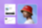


Never miss another article
For any queries to privacy concerns, please contact us at blogs@wix.com
This blog was created with Wix Blog