- Sep 17, 2025
- 10 min read
Updated: Apr 28

When we got into the web design game, we started small, making our mark with a few classic website templates. As time went by, we began to understand that people needed a site for all kinds of reasons.
Some needed it for their restaurant. Some needed it for their bed and breakfast. Others needed it for their dog walking service, jewelry shop, freelance gig—the list went on and on. According to IBISWorld, 27.2% of business in the U.S. was conducted online in 2025.
Our user community grew beyond our imagination. And today, Wix offers over 2,000 website templates, powerful built-in business solutions and another fan favorite: an AI website builder that lets you create a new website with a simple chat.
Our favorite part is seeing how people embrace our tools to create a website or start a business that they’ve been dreaming of. So, we thought we’d shout out some of our users’ greatest creations. Check them out.
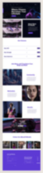
Get inspired by eCommerce website design ideas.

Need inspiration for your website? With Wix, building a standout site is easier than ever. Choose from hundreds of customizable templates and use Wix’s easy drag-and-drop website builder tools to make your vision come to life. Turn your ideas into reality and see just how simple it is to create a unique, professional website.


TL;DR: outstanding Wix website examples
Looking for fresh ideas to bring your website to life? This post features standout Wix websites that showcase a variety of styles, industries and creative approaches. These examples highlight how Wix’s versatile tools help entrepreneurs and small business owners build unique, professional websites that connect with their audiences.
You’ll discover real-world inspiration paired with insights on design choices, functionality and branding—perfect for sparking ideas whether you’re just starting out or ready to refresh your site.
How we selected these Wix website examples
Criteria | Why it matters |
Design excellence | Each site features a polished look that reflects the brand’s personality. |
User experience | Clear navigation and responsive layouts make sites easy and enjoyable to use. |
Creativity and originality | Unique design elements and innovative features that stand out in their niches. |
Functionality | Effective use of Wix tools like eCommerce, booking and multimedia integration. |
Inspiration potential | Examples provide actionable ideas for entrepreneurs across industries. |
"The most important thing before building a website is good research. Know what you want to do and collect good inspirations that will contribute to your design." - Anna Suntsov, blog and social design team lead at Wix
15 best Wix website examples
Explore the website examples below to see the kind of professional results you can achieve when learning how to make a website with Wix.
01. Roee Ben Yehuda

Whoever came up with "jack of all trades, master of none" simply hadn’t met someone like Roee Ben Yehuda. This talented designer’s portfolio showcases all types of creative projects, ranging from product design to branding. To ensure all of them live in harmony under the same homepage, Roee uses a combination of full-width stripes and asymmetrical columns, connected through smooth scrolling effects. When building a homepage, this is a great way to display everything clearly in one place.
Like what you see? Build your own website using this same template.

Template name: Graphic designer website template
02. Izzy Wheels

This vibrant website embodies the spirit and mission behind the Izzy Wheels brand. True to its slogan “If you can’t stand up, stand out!,” Izzy Wheels presents its stylish wheel covers for wheelchairs on an equally stylish site. Visitors can shop for wheel covers directly on the site, or learn more about the brand’s story, collaborations and community of spokespeople.
Like what you see? Build your own website using this same template.

Template name: Sporting goods store website template
Learn more:
03. Mane

If you run a service-based business, a website can save you the back-and-forth of fielding questions about your pricing, treatments and qualifications. Mane’s website is a great example of this. Created by an ethical hairdressing salon, the Mane site welcomes online bookings, while describing all the treatments and products they use in great detail. Customers aren’t left guessing what a “balayage” service entails; from the site, they can see that it includes a complimentary consultation, hair treatment, styling and toning.
Like what you see? Build your own website using this same template.

Template name: Start from scratch website template
Learn more: What is a Wix website?
04. Keta Tov

Roni Sagi, runner-up of America’s Got Talent Season 19, has made her Wix website a pillar of her business, Keta Tov. From the first click, you're greeted by a picture of Roni and her best mate, Rhythm. The site invites you to learn more about her online courses for teaching your dog how to dance. True to her art, Roni's website incorporates subtle movements—from elegant hover effects to video loops. Learn more about Roni Sagi's journey from AGT to building a brand online.
Like what you see? Build your own website using this same template.

Template name: Start from scratch website template
05. Isshī

Isshī’s website (purposefully) breaks all the rules. As we learned in our interview with Isshī’ founder Rolly Robínson, the site is built to look like “you dumped a toy box on the floor.” There’s no traditional structure or uniformity in the design, which is reflective of Rolly’s vision as a jewelry artist—that every piece is true to Rolly’s sense of self and goes against the grain.
Like what you see? Build your own website using this same template.

Template name: Jewelry store website template
Learn more: How to choose a website template on Wix
06. Sonja van Duelmen

The striking colors and typeface choices, paired with an extraordinary body of work, make Sonja van Duelmen’s portfolio one of the best website design ideas you can find. In addition to showcasing examples of her best work in the various disciplines she specializes in, Sonja decided to learn how to make a blog to share her passion for fashion, modern design, photography and art.
Like what you see? Build your own website using this same template.

Template name: Design Studio website template
Be inspired: Luxury website examples
07. Sharon Radisch

A mix of captivating, magazine-like images sets a trendy tone for Sharon Radisch’s photography website. The site cleverly places a hamburger menu within the homepage title, emphasizing Sharon’s artistic eye. The majority of Sharon’s site features a minimalistic black-and-white color scheme, allowing her to guide the eye with strategically placed visual accents and colors.
Like what you see? Build your own website using this same template.

Template name: Illustrator website template
View other minimalist websites for inspiration.
08. Dopple Press

Risograph printing studio Dopple Press's website is appropriately colorful and full of texture. Every animation, illustration and button is thoughtfully designed to hold your attention and keep your eyes engaged. You'll find yourself clicking around and exploring all the content that this delightful website has to offer.
Get inspired by Dopple Press studio website design example
Like what you see? Build your own website using this same template.

Template name: Chinese restaurant responsive template
09. Rafael Varona

One simply cannot talk about animation without mentioning Rafael Varona’s jaw-dropping Wix website. This illustrator, animator and art director has created a vibrant site that combines dynamic and static projects to maintain visitors’ interest without overwhelming them.
Like what you see? Build your own website using this same template.

Template name: Illustrator website template
Looking to create your own art portfolio or site? Check out these other artist websites for inspiration.
10. Mirona

On her online portfolio website, Mirona plays with shapes, vibrant colors and scrolling effects to bring her unique take on the latest web design trends to life. This allows her to leave a lasting impression on visitors while showing her creativity and skills across several different forms of expression.
Like what you see? Build your own website using this same template.

Template name: Graphic designer website template
11. Evolve Clothing

Online retail is growing at an unprecedented rate, which means brands need to ensure their online presence is as unique and personal as their products. Evolve Clothing has managed to do so by creating a site that perfectly balances the boldness and refinement of the different collections they sell. The site also features live chat, emulating the personalized attention that customers would ordinarily get at one of their brick-and-mortar stores.
Like what you see? Build your own website using this same template.

Template name: Shoe store website template
12. Animal Music

Straightforward and to the point, Animal Music’s web design instantly shows you what the studio is capable of. Browse their video clips and you’ll quickly find that their music and services are top-notch, plus trusted by brand giants like Pepsi, Kia and Netflix.
Learn more: What is web design?
Like what you see? Build your own website using this same template.

Template name: Wedding photographer website template
Editor’s note: Don’t worry about the template’s original niche. Wix templates are fully customizable, so choose a design that feels right and adapt it to your brand.
13. Hila Rawet Karni

Hila’s original industrial jewelry is made from unconventional materials and aims to help women celebrate their individuality and manifest their uniqueness. This powerful statement is embodied within its eCommerce site through parallax scrolling effects, professional product photography and subtle animation. Hila additionally appeals to shoppers from all over the world, offering currency conversion directly on the site. If you're opening a store, explore these eCommerce website examples.
Like what you see? Build your own website using this same template.

Template name: Grocery store website template
14. Barton Artistry

A product of the Wix AI website builder, the Barton Artistry website elegantly shows off the work of makeup artist Tera Barton. Tera’s warmth can be felt throughout the site, where photographs of her latest weddings and photoshoots are sprinkled among cheerful messaging. Visitors can read testimonials at their leisure and submit a request when they’re ready.
Like what you see? Build your own website using this same template.

Template name: Makeup artist website template
15. Ice Cream Dream

Nonprofit organizations have the tricky job of getting people to support—let alone care about—causes that may not be a part of their everyday lives. The Ice Cream Dream Foundation uses a mix of whimsical and realistic imagery, alongside thought-provoking copy, to grab attention. The foundation uses its site to illustrate the power of ice cream in underprivileged communities and to collect donations, right when people are paying attention.
Like what you see? Build your own website using this same template.

Template name: Construction company website template
Wix website templates to get you started
Looking to get started with your own site? Below are a few popular picks from Wix's template collection.
See simple website design examples that get straight to the point.
Fashion photographer
Photography is an art that requires a special stage. That’s why this specific fashion photographer template was built to showcase pictures in their highest quality—and it does so with a beautiful full-width gallery that displays the most significant pieces of any photographer's portfolio. Of course, there’s more to it than that. This template includes an About Us page, making it easy to learn more about your work, peek at behind-the-scenes content, get in touch and visit your social profiles.

Cocktail delivery service
Designed to get you in a party mood, this cocktail delivery service template is perfect for any type of food service that offers online deliveries. You’ll be able to create a professional delivery service or restaurant website where your location and hours are clearly visible. Customers should be able to easily find your menu and place orders from your site too.

Gym
As gyms and studios take to the online world, having a specialized fitness website has become an absolute must. In addition to allowing you to build a solid virtual presence and strengthen your brand, this fitness studio template will enable you to provide a better service for your clients. This website template helps facilitate that growth by not only sharing images and videos of your services, but also allowing clients to sign up for classes via the Wix Bookings feature—plus purchase memberships.
Shoe store
This delicate template for shoe stores is built to increase sales. Its website features have been carefully placed in order to optimize your visitors’ experiences and turn potential buyers into customers. Visitors can choose to browse your entire catalog or view highlighted items, such as new collections, items on sale and best sellers. Furthermore, the live chat feature brings the brick-and-mortar feeling to the online world, allowing customers to ask questions to your team.
Need a better eCommerce solution? Check out Wix’s eCommerce website builder.

Fashion blog
In recent years, blogs have taken the internet by storm. That initial spark was further fueled by the increasing number of opportunities to make money blogging, including anything from membership plans and virtual summits to affiliate content and ads. This fashion blog template lets you capitalize on this opportunity, whether you’re looking to make your blog a focal point or an extension of your business.

Or, want to go the AI route?
If you’re looking for a bespoke website design, we invite you to see Wix’s AI website builder up close. Simply chat with AI to get a custom site, complete with all the content, business apps and pages that you need.

Wix’s full suite of AI tools includes solutions for:
Start-to-finish website design
Image generation and editing
Text generation and editing
Portfolio creator
SEO metatag creator
AI product descriptions and recommendations
Blogging
Google Ads
Social captions
Email marketing
And more…

AI website builders help you launch simple sites quickly with less effort but they might not give you full control over customization. Traditional website builders offer more design freedom and technical options for complex sites but they take more time to learn. Your choice depends on your project’s needs and how much time you have.
Learn how to use Wix as a website builder and to manage your business.
Learn more:
Wix website examples FAQ
What is the most beginner friendly website builder?
Wix is one of the most beginner-friendly website builders because it combines an intuitive drag-and-drop editor, professionally designed templates and step-by-step guidance that makes website creation simple for anyone. With Wix, beginners can launch a fully functional website without needing coding skills, while still having access to advanced customization options, built-in apps and SEO tools to grow their site. This balance of ease of use and flexibility is why Wix is often recommended as the best website builder for beginners.
What is the best Wix plan for beginners?
The Light plan is best for beginners. It's super easy to use, removes Wix ads, gives you a custom domain and has plenty of storage and bandwidth. It's perfect for personal sites, portfolios or small businesses.
For beginners who want more features:
The Core plan adds extra storage, premium support and the ability to run a small online store.
The Business plans are suited for full ecommerce sites, offering advanced sales tools, more storage and professional marketing features.
Learn more about Wix premium plans.


