- Mar 8, 2023
- 6 min read
Updated: Nov 7, 2023
Lips on the cusp of a kiss. Reflective bubbles frothing over a bar of soap. A vibrant slice of tomato glistening with water droplets, beckoning a bite. Over the past two years, brands have been getting up close and personal, with macro product imagery offering a photographic tease consumers can almost feel, touch, or taste.
You’ve probably seen this approach to product photography, which uses a macro lens to capture tightly cropped, super high-resolution shots, cross your feed lately. Categories as widespread as food & beverage, home furnishings, consumer packaged goods, beauty, cannabis, and fashion are embracing the zoomed-in look, using it to convey a sense of immediacy, highlight product quality, and provide consumers with an up-close-and-personal view of their offerings. The popularity of this style has grown exponentially as brands have begun to recognize its ability to create a high-end, editorial aesthetic that is both enticing and hyper-clickable—bringing us closer to the objects we desire.
The use of contemporary macro photography in branding is grounded in the work of editorial-forward photographers like Bobby Doherty and Grant Cornett, who cut their teeth in the publishing world in the 2010s before making the jump into brand creative. While working in editorial, both photographers captured a wide range of products with close up, high dynamic range (HDR) shots. (Consider this seductive photo of a glazed ham, by Cornett for Gather Journal in 2018, or this $18,000 diamond bracelet by Doherty while he was on staff at New York Magazine.)
Photographs by Bobby Doherty for DTC skincare company Soft Services. Images courtesy Soft Services.
The same year that Gather published Cornett’s photo alongside its glazed ham recipe, then-Chobani creative director Lisa Smith commissioned him to shoot the photography for Chobani’s rebrand, making the yogurt company one of the earliest to lean into the photographic style, and the company one of Cornett’s earliest brand-side collaborations. Doherty in particular has become the secret weapon for many high profile brands; he’s shot the hero photography for On Rye (2017; a now defunct Pentagram project), followed in quick succession by Cometeer (2020), Pure Beauty (2021), Soft Services (2021; founded by alumnae of Glossier, another brand that loves its close-ups), and most recently, Starface (2022). Cut to present day, and a slew of kindred-spirits have tapped into this previously niche editorial aesthetic in order to imbue their commercial offerings with a more elevated tone.
The most immediate example of this trend is in the food & beverage space. In addition to the previously mentioned Cometeer and On Rye, recent rebrands by JKR for Popeyes, Heinz, Dunkin’, and Burger King—the last of which elicited near universal admiration from extremely-online designers everywhere upon its launch in January 2021—have all utilized macro product shots.
Images 1-4 by Bobby Doherty for DTC coffee company Cometeer. Courtesy Creech Studio, which developed the company's brand identity. Images 5-6 for skincare company F. Miller, which mimics the wavy product hover interactions on its site. Courtesy F. Miller.
For Burger King, a new approach to art direction was part of an effort to communicate the company’s updated mission to remove artificial ingredients, pivot consumer perception, and showcase fresh ingredients; all by “maximizing craveability” with up-close-and-personal photography, says Lisa Smith, who is now executive creative director at JKR. “Macro allows us to simply show these new, higher quality ingredients directly,” Smith says.
As to the approach’s broad industry appeal, Smith speculates that within QSR (“quality service restaurants,” aka fast-food) especially, macro photography connotes elevation and luxury, making customers feel more at ease indulging in products traditionally associated with lower-quality and cost.
Macro captures the ephemeral textures of a fresh meal. Images 1-2 for Burger King courtesy JKR. Images 3-6 by Bobby Doherty for On Rye, courtesy Jesse Reed.
In an era of online shopping, close-up photography can also be a powerful tool to show the craftsmanship of physical products, too. If you’re shopping for a wedding ring in person, you can take the time to touch the metal and examine the gemstones carefully to gauge whether they’re worth the price—even using a magnifying glass if you need to. Macro photography serves the same purpose, with the camera serving as appraiser, mediated on screen. In this way, macro photography is almost synesthetic, or cross-sensory: the hyperreality of showing the texture of a beauty product in high definition is an approximation of putting the product on your hand to feel the texture, or a close-up of a juicy burger a placeholder for the ability to walk into a restaurant and smell the grill at work.
Ali Ozden, creative director at Sydney-based Universal Favourite, points to this sensory-blending aspect of macro as the driving force behind its inclusion in the studio’s recent work for Australian sexual wellness company LBDO: “by seeing the soft silicon of a vibrator, glistening with spots of moisture, you get a feel for what it might be like in your hand, or how the products might move across your skin.”
Images 1-3 by Daniela Spector for intimate wellness brand Maude, courtesy Daniela Spector. Images 4-6 for digital-first sexual wellness brand LBDO courtesy Universal Favourite, which developed its brand identity.
The seductive, sensorial potential of macro photography is something several other brands have tapped into for their art direction as well, like intimate wellness brand Maude, for their recent wheatpaste campaign, or body-based skincare brand Soft Services, which utilizes cheekily soft-core close-ups of knees, backs, butts, and crotches in brand photography in an effort to highlight the efficacy of products. In all three cases, macro close-ups allowed these brands to nod to the erotic nature of their products without actually showing anything explicit—in a tight crop, a close up of a knee can feel just as sultry as cleavage, eliciting all the attention of a full-body nude without actually freeing the nipple.
To that end, while the current love for macro photography is certainly aesthetically driven, it’s also heavily bolstered by the broad versatility of close-up photography. In an era of multi-channel activations, zoomed-in and densely patterned imagery is extremely flexible—you can crop it, rotate it, or resize it without repercussion, making a single image asset suitable for an Instagram tile and a billboard alike (meaning less budget needed for image licensing, wherein brands have to partially or fully buy the rights to imagery from photographers).
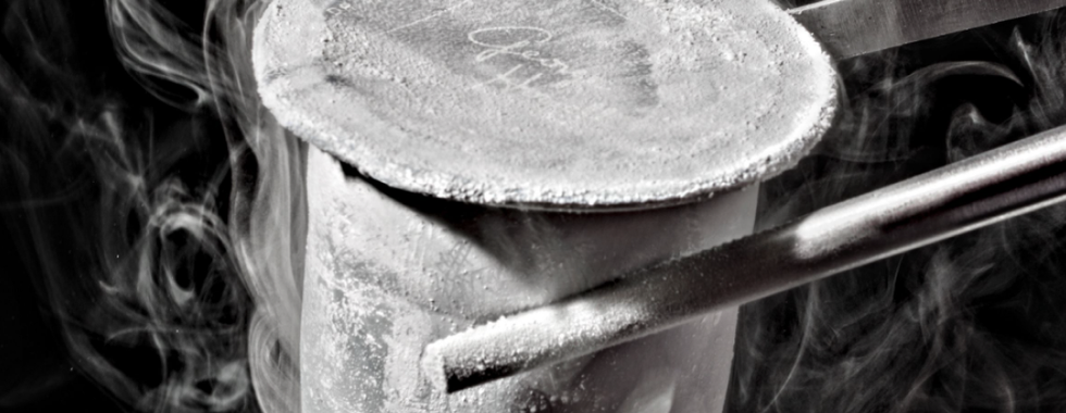
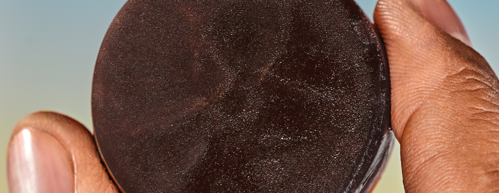
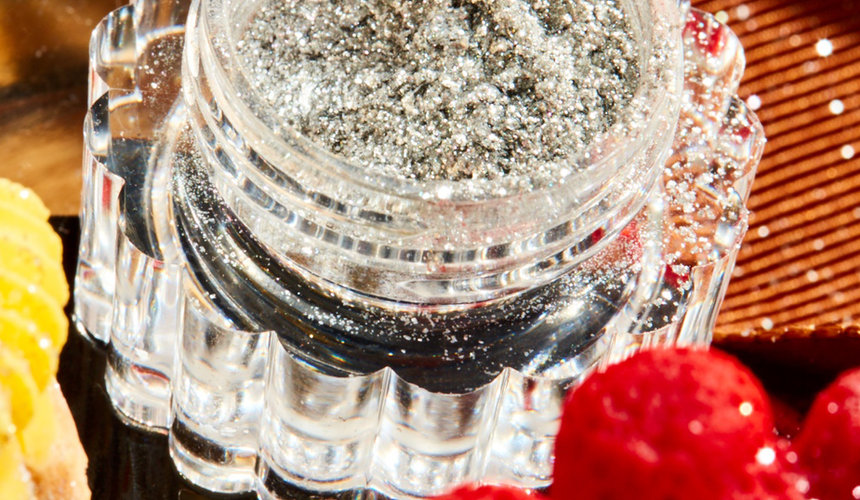
Product photography for Australian food coloring company Colour Mill, courtesy Universal Favourite.
The allover “full-bleed” effect of a tight repeated texture, as in Creech Studio’s bubbly work for Zero Acre Farms, is also highly versatile in applications that require both text or logo and image. Whereas a standard distance lifestyle photo might have high contrast between lights and darks and a range of colors, the relative flatness in tonal variation and cover of a textural macro shot means it holds up well against overlaid content. This use case is especially salient given the general increase in brands producing blog content in recent years.
Shooting macro photography requires specialized lenses, a good food or prop stylist, and most of all, a skilled photographer. To borrow a concept from renowned photographer Irving Penn, a photographer is like an expert surgeon, and the camera a knife; framing a scene, especially such a close-up one, requires constant, thoughtful choices about what to cut from the world and what to keep.
That said—shooting a single object with a tight crop is in some ways lower-lift than having a stylist spend hours sourcing props and staging a full environmental scene, scouting and securing locations, or paying models and licensing their likeness for several years. For small brands, macro can be an economical way to capture just a few assets with the help of a small team and limited studio space. It also plays well with 3D-rendered elements, allowing brands to rely on a wide range of image generation methods, and even fewer collaborators, without feeling “off brand.” JKR’s work for Kraft Mac & Cheese, where CGI drips of cheese and photos of fields of noodles utilize the same visual motifs being one such example.
Macro photography for Kraft Mac & Cheese, with 3D-rendered elements and CGI cheese sauce drips. Images courtesy JKR.
Photographer Daniela Spector, who shot the macro-oriented campaign for Maude mentioned above, thinks this convergence of real and unreal is par for the course with extreme close-up. She explains that the human eye is more akin to a 35mm lens than a macro one—meaning that viewing a macro version of a scene isn’t something we can do naturally.
“Macro photography delves into the abstract,” she says. “It mystifies the viewer and creates curiosity. Even if it’s only for a moment, until the eye adjusts and understands what it’s seeing. The imagery is a discovery process before the product itself. And who doesn’t love a bit of mystery?” Or, she adds, “Maybe the popularity has something to do with everyone’s increasing desire to suspend belief and disassociate from the never-ending barrage of reality.”


