

- Aug 2, 2023
- 6 min read
Updated: Nov 1, 2023
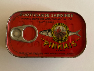
An old-school food with a modern convenience, tinned fish isn’t just gathering pace with foodies. The pantry staple now has design-devotees.
That’s because a crop of new brands are offering a fresh take on its packaging. Some display folksy hand-drawn 1930s illustrations in cerulean blue and sun-flower yellow. Others adopt mid-century geometric forms in muted palettes. Brands such as Nuri, Tricana and Tenorio are crafted in aesthetically-pleasing, vintage-inspired designs, styled like a Wes Anderson movie flat-lay, and photographed in carefully curated pantries.
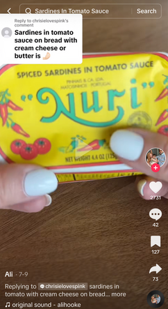
All in all, the industry’s distinctive graphics are popping off on social media. At 72.4M views, the taste for sardines and vintage, brightly-hued packaging on Tiktok isn't slowing. U.S. canned seafood sales soared by 9.7% to $2.7 billion in 2022, in part thanks to highly visual social media marketing. A crop of new design-forward brands, such as Scout Seafood and British Sea Sisters, have joined the fray. Subscription boxes have launched and experts like The Sardinfluencer are now a thing.
But successful DTC start-up Fishwife, with its elaborate, folksy hand-drawn logo and Recoleta typeface, printed in azure blue and bubble-gum pink, has seen its doodled maximalism become its biggest differentiator, able to slice through the visual noise of social media. At time of publication, the brand has 63.6k Instagram followers and 13.7k followers on Tiktok, where the fishwife hashtag has a whopping 6.4 million views, including both brand and user generated content (UGC).


Fishwife product imagery courtesy Danbo.
Bringing new life to old traditions
Fishwife founders Becca Millstein and Caroline Goldfarb were partly inspired after a trip to Europe, during which Millstein was introduced to conservas, or Portuguese tinned goods, according to the brand’s illustrator Daniel Miller.
In Portugal, conservas are a part of the national identity, revolving around maritime history and politics. By continuing elements of that design heritage, but with a unique twist through Miller’s sea symbolism, simple line work, and reduced RGB color palette, the brand has introduced a timeless Portuguese tradition to a modern American audience.
Danbo, as Miller is known professionally in design circles, began working with founder Becca Millstein just before the pandemic, when she approached him to rebrand what was once the “corniest thing imaginable,” he says. He began by plumbing the depths of Pinterest and came across visual depictions of the hardy fishwife: a historically rough figure in European folk history, whose vulgar language and balanced baskets of fish made her a perfect logo for the female-led, sustainable brand.


Historical depictions of the varina, or fishwife. A 1912 article; a postcard that reads "Costumes de Portugal - OVARINA." Courtesy Conservas de Portugal.
Tinned fish’s long (and lesser-known) Portuguese past
The fishwife figure has a long history. It dates back to the 16th century, and originally referred to the daughters or wives of fishermen who sold catch at the market. In Portugal, she is famously known as O Varina, and is usually painted balancing large baskets of catch upon her head.
The way she is depicted has evolved over the years, from seemingly realistic photo documentation in 1912, to illustrations of the figure as a folk icon on tourist postcards, to a pin-up brand representative for companies like Lucas’s Sardines later in the century, as cataloged in the digital archive of CAN THE CAN, a Lisbon-based restaurant and museum that advocates for Portugal’s national canning industry. (The organization's digital heritage project, Conservas de Portugal, has grown over the past decade to include 3000 tinned fish brands, dating from 1854.)


Ca. 1950s Lucas sardine brand imagery. Courtesy Conservas de Portugal.
“In the beginning, designs were imported from France,” says director of special projects at CAN THE CAN Victor Vicente of the earliest Portuguese tins. “But as Spanish, Italians and some Greeks started companies in Portugal, a national style quickly developed.”
That style was laden with symbolism. In addition to the Fishwife, the Greco-Roman goddess Minerva and the fisherman of Matosinhos, a Northern Portugese city known for its seafaring and industrial heritage, quickly became household staples. Heroes and famous figures, like Baron de Rothschild, were worked into designs. “It's a very emotional business full of histories and memories,” says Vicente.
Portugal’s dictatorial Estado Novo regime found its national symbolism valuable, too. Starting in 1933, it threw its weight behind the country’s booming canned goods industry and its more traditional branding styles as part of its interest in the “preservation of traditional customs and practices,” according to Luis Mendonça, graphic designer and owner of cannery Ati Manel, which his grandfather founded in 1922. This visual culture, which showcased folk heritage and the Portuguese idyll, was propped up and mostly preserved until the Estado Novo was overthrown in the ‘70s.
But the ongoing strength of this visual tradition is also because many of today’s canneries are family-owned, according to Patricia Sousa of Conservas Pinhais, one of the oldest canneries in Portugal (which produces the brightly packaged tinned fish brand Nuri).


Images 1-3: Vintage sardine tins. 4: Current packaging. Courtesy Conservas Pinhais.
“Generations passed on their knowledge to their children through the experienced hands of fishermen and ladies who packed fishtins,” says Sousa. This makes them more immune to external influence and corporatization, allowing them to stay true to a visual identity over decades, should they choose to.
Today, this visual history, both good and bad, lives on in the branding detail of the conservas that continue to serve as oily, saturated bite-sized tokens of Portugal’s past.
Pragmatic eating with modern, aspirational positioning
Mendonça, who has a background in graphic design, has stayed close to the original Ati Matel packaging designs through the alphabet typography and bright color palette, but modernized other elements, like the marine icons, which seem to leap out from the packaging thanks to their flat, geometric shapes reminiscent of Saul Bass.
In combination, these rather bespoke design elements make each tin an object’d art; a miniature canvas depicting sentimental icons found in Portuguese life. “Eating involves life stories, emotional, family, political, economic and educational relationships,” Mendonça says. “It is a cultural attitude and a symbolic act.”


Modern tinned fish packaging designs. Images 1-13 courtesy Ati Matel. Images 14-15 courtesy ABC+.
It’s also a shareable one. “People want to embody that European ideal of minimalist, simple, casual elegance,” Fishwife’s founder Rebecca Millstein recently told Nylon. “What is sexier than sitting on your veranda with a glass of wine and a toasty baguette and a glug of olive oil?” She describes a romanticized ideal of European summers that has taken root on social media recently, adopted by American Gen-Z consumers with a desire to travel across the Atlantic but with limited financial means.
The magazine went on to dub this vacation-ready aesthetic as “Europecore,” citing it as “as a state of mind rather than a continent.” It’s easy to see why. The continent is ranked high on the quality of living scale, and scores have headed to Portugal for what the New York Times calls “the good life.”
[Related: What's next for the bookstagram aesthetic?]


Modern tinned fish packaging designs. Courtesy Jose Gourmet.
As such, tinned fish, traditionally a humble food, isn’t just pragmatic; it’s become part of an aspirational lifestyle in the eyes of international audiences. It’s why Fishwife can form DTC partnerships with trendy clothing brands like Lisa Says Gah, while pairing with cult-favorite foodstuffs Fly By Jing. Next, the Fishwife team is working on a cookbook.
In the world of online micro-trends, “Europecore” has since evolved further to what is now “tomato girl summer,” which Slate describes as “a way of performing a sort of effortless-looking elegance without being a member of the leisure class,” and Forbes claims is “fueling Mediterranean travel obsessions.” (Same idea as Europecore; different packaging.)


On Tiktok, tinned fish packaging (and related UGC) is part of broader lifestyle content and micro-trends within online culture: "girl dinners," "Europecore," and "tomato girls."
Highly-detailed, exquisite packaging also signals rarity value. Mendonça regularly sends tins to friends abroad as if they’re postcards. Danbo describes customers’ inability to throw away Fishwife packaging. Online, it’s the chicest way to share your “girl dinner,” or a simple, filling, somewhat chaotic snack plate for one (a 28-year old showrunner’s assistant first coined the term on Tiktok in May).
The attention to every tiny detail in Fishwife’s branding elevates the consumer experience into a small luxury. We’re swimming in choices when shopping online—and this is the latest example of a resurgence of bold CPG in the name of stopping scrolls. It’s like a gift to be opened, and the internet and its many influencers are ready to unwrap it and take a bite.


