- Nov 16, 2022
- 5 min read
Updated: May 13, 2025
Goopy typography of all shapes and sizes is at a fever pitch, with squat bubble letters and viscous handwriting popping up as logos for new and old brands alike.
You might even say we’re in the midst of an expressive type boom. But while the larger spirited type movement we’re zeitgeisting our way through includes many rounded forms, including even 3d lettering, these so-called “squishy sans” carve out a distinct niche: unlike the broader Jugend-ish category, they almost never contain unexpected angles, narrow spots, or sharp edges to balance out their roundness. They’re unselfconsciously voluptuous and revel in their softness. All sugar, no spice. They’re the opposite of blanding—a welcome and friendly foil to the overt seriousness of the buttoned up branding from the past decade (and the general ennui of the pandemic era).
The typographic framework underlying these squishy forms is varied: some feel like typical modernist sans serifs inflated with a bit too much air, while others are more like a traditional script that’s been sitting out too long on a hot day. This trend towards doughier logos is often supported by brand systems that also use bright, saturated color palettes, similarly rounded or soft secondary typography, and other irregular and organic elements like droplets and curves.
Images 1-2 courtesy Adùn. Image 3 courtesy: Date better. Images 4-6 courtesy Nonny Beer; photos by Bree Avery.
One clear influence for these squishy letterforms is their direct predecessors of bygone consumer packaged goods (CPG) past: the candy and drink packaging of the 1970’s (or should I say, the Wonka era). Type of this era was personality-driven and bold, arguably in response to the more buttoned up mid-century aesthetics of the ’50s and ’60s (see: Massimo Vignelli et al and the slate of consumer packaging with minimal color and modernist sans serifs à la Hersheys, M&M’s, or Life Savers).
This current iteration of expressive, bulbous type emerges from a similarly reactive impulse, but in response to the posh, Scandi-leaning sans serif typography that dominated the food, beverage, and wellness spaces of the 2010s. (That was really the era of minimalist DTC-everything, honestly, with Casper, Outdoor Voices, and Ritual being a few immediate examples.)
Images 1-2 courtesy Djelissa Latini. Image 3 courtesy Swear Words. Image 4 courtesy Andreas Pedersen.
“The style of the 1960s and 1970s feels familiar and reassuring, while still reading as fresh to modern consumers," explains Djelissa Latini, who designed the bubble letter-forward brand identity for Belgian chocolate brand Kyoot. Latini says that her branding aimed to be “cheeky and disruptive” within the often serious world of dark chocolate, providing an unexpectedly retro levity without sacrificing a sense of contemporary cool. But squishy sans can be as versatile as they are disruptive, according to Latini, who adds that they can bring happiness to anything, “from a vinyl cover to a recipe book or a laundromat.”
Or suncare, for that matter. The creative agency RoAndCo recently developed the brand identity for new suncare brand Bask with an undulating logo evoking a rolling wave. (I assisted RoAndCo with logo and packaging refinements.) RoAndCo creative director Roanne Adams, who led that brand development, suggests that this push towards punchy type isn’t just a pendulum swing aesthetically, but a form of conceptual industry progress. She believes we’ve outgrown the need to have serious brand identities to reflect serious values: “We're smarter and more curious consumers now, so we can still have our kitchen or bathroom filled with quality products—they just don't have to all follow the same austere aesthetic formula.”
Images courtesy RoAndCo.
The squishy type trend has shown up everywhere from fashion to media (consider Skims and Naomi Osaka’s production company Hana Kuma), but has proven to be especially heavy-lifting in the brand identities of consumer goods, and even more so within food, beverage, and beauty—especially with products often taken on-the-go like jello cups, protein bars, or canned drinks.
That’s no accident. Before the internet and the ensuing saturation of online shopping (roughly two decades of progress if we begin our stopwatch at the founding of Amazon in 1995), the shelves of a grocery store or your friend’s pantry were two of the main touchpoints for brand discovery. The shift towards DTC in the 2010s exploded this model, solidifying websites, not on-shelf packaging, as the main entry point for a brand. But as social media grew, it became more difficult for brand’s to control their visual world—their brand identities were quickly subjugated by that of the app serving up their content. They had to find another way to catch a consumer’s eye.
[Related: What's next for the bookstagram aesthetic?]
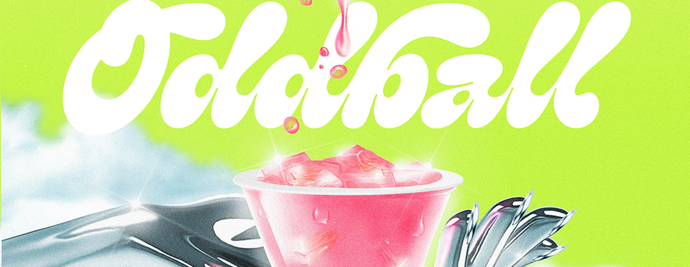
Image 1 courtesy Oddball. Image 2 courtesy Skidmore Studio. Images 3-5 courtesy The Collected Works.
As such, packaging has become the dominant touchpoint again—this time, in the hands of the influencer, served up via the algorithmic feed. Just as social media invented the unboxing, it created the unwrapping: a product’s packaging had to represent and sell the whole brand. What better way to do that than having a logo that embodies the whole brand (and the joy of consuming it) more immediately and efficiently?
On a purely functional level, the boldness of the squishy, splash-like logo also allowed it to be more heavy lifting in brand applications: At a small scale on screen, two sans serif logos or two minimalist paper-wrapped bars are going to look similar—but packaging with a bigger, squishier, more distinctive logo will stand out in an instant. The Collected Works, designers of the Slug Club branding & packaging, echo this sentiment of type-as-defining trait, saying that “typography has a unique capacity to capture your attention as it can be both beautiful and functional at the same time.” (Related: K-Pop designers are using sans serifs, too.)
There’s another factor at play here. The vast increase in independently produced consumer packaged goods that market themselves as uniquely high-quality, and the sharing of these goods on social feeds, has also created a new purchasing phenomenon: CPG as luxury good. Organizations like Snaxshot and Thingtesting track and rate new food and beverage drops with the same fervor as sneakerheads, and CPG pop-ups and bougie grocery stores like L.A.’s Erewhon have lines out the door (and their own memes.)
The near universal buy-in of the idea that consumption can be a form of self care coupled with the seemingly impending recession, has made candy bars the new lipstick index—so it’s no surprise that brands are putting the same attention and expressiveness into the look and feel of their products as luxury fashion does. After all, being photographed with the right sunscreen can boost your image as much as wearing a pair of Miu Miu ballet flats can now. The squishy sans just happens to be the current trend du jour.
Images 1-3 courtesy Dakota Light-Smith. Images 4-6 courtesy Zan Goodman.
Dakota Light-Smith, who designed the logo for protein bar Dirtbag as a senior designer at Day Job, references another visual world as a key touchpoint for her squishy type: the zine and DIY aesthetic. Light-Smith says that the Dirtbag wordmark is custom and done by hand, “like it could have been drawn on a binder in high-school.” This angle into the goopy lettering trend treads the same nostalgic territory as callouts to the 70s, but with a wider lens, and likely one more appropriate for a younger Gen Z audience that didn’t directly experience the disco era.
Perhaps it points to what might also be one of the most important factors in the squishy sans trend as well: anything that references the hand-drawn doodles of youth is bound to feel reassuring, friendly, and honest—a surefire way to build intimacy and connection in a saturated and often fraught brand ecosystem.


