

- Dec 15, 2021
- 8 min read
Updated: Apr 30, 2025
There’s one surprising thing romantic partners and typographic trends have in common: you don’t know what you have until it’s gone.
As in, you often don’t know you’re in a movement until the movement is over. Sometimes a movement is self-conscious, and even names itself (think: Dada, Bauhaus, Free Jazz). Other times a canny reporter coins the term that will go down in history, as was the case for Cubism, Surrealism, and Abstract Expressionism. Mostly, though, we don’t quite know what we’re up to until we’re onto the next, swept up in the pendulum swing of something new. Only then can we look back and clearly say, with capital letters, oh, yes, Modernism, Expressionism, Art Nouveau. But sometimes, mid-movement, you can feel something stirring.
I’m not the only one who has put a wet fingertip to today’s typographical breeze and taken the temperature as: expressive. It’s selling you tights, bread, music, and magazines—from fashion to drugs. Designers themselves refer to it by a number of terms: Nouveau Hippie, Jugend-ish, and Avant Basic. (These aren’t quite right, but give it time).
But you know what I’m talking about: the swoopy, sometimes goopy fonts, with thin stems and bulbous, blobby terminals. The letterforms are irregular, illustrative, and often (intentionally) hard to read. They aren’t quite ‘70s, not quite Art Nouveau, not quite liquid metal, but some kind of unexpected, heady brew that’s now reached its boiling point. We’re at the end of a decade of tech and startup-driven minimalism gone stale; still trapped inside our homes, confined to the 90-degree angles of our on-screen life, and busting at the base line, primed and ready to stretch our collective ascenders and descenders to the max.


Goliagolia typeface by Alex Valentina. Images courtesy Alex Valentina.
Reactive aesthetics: a brief history
If you follow the pendulum swing from type trend to type trend over the past century or so, it’s easy to see the progression. After the rise of machine-driven industrialization, the creative community reacted with the decidedly decorative, languid, handmade, and organic styles that characterize the Art Nouveau and Arts & Crafts movements. Once we’d had enough of that, we whiplashed into the geometric splendor of Art Deco, and then pushed those clean lines further with Modernism, a long period when one of its leading figures, legendary graphic design Massimo Vignelli’s penchant for Helvetica (plus five other select typefaces) ruled the day and brought order to a time of post-war unease.
Those who felt confined by the cold comfort of the grid took a trip to the psychedelic, with neon-bright Op art patterns and swirling letterforms. Some detoured, preferring a maximalist approach with a Deco edge, and thus the Memphis style was born in the early 1980s, led by Italian architect and designer Ettore Sottsass. Even more thrilling was the new wave of technology that washed over the ‘90s, replacing the slow, cumbersome mechanics of rapidographs and Diatype machines with accessible desktop computing. A fertile, if chaotic period of experimentation followed, when Neville Brody’s Emigre and April Greiman’s Wet, The Magazine of Gourmet Bathing pushed the grid-breaking energy of the era to the max.


Screenshot: Wet Magazine; screenshot: Emigre.
But by the late ‘00s we were exhausted by all this typographical excitement, and came back to a cozy kind of restraint. Modernism made a reappearance, but it was a softer, warmer, cozier version of itself. This retelling of mid-century classics was clean and spare, but colorful and friendly, too, and altogether more human. Suddenly, it began to sell us leggings and toothbrushes, personalized vitamins and mental health. We trusted its clarity, its straightforward and honest approach—making it the ideal feeding ground for the onslaught of startups that may have had a business plan but not a brand identity or, more importantly, consumer trust. And what better, more convenient signifier for truth and transparency than stripped-back simplicity.
Soon it was everywhere, applied to everything, a blank slate upon which a user could project anything they wanted. Inundated with empty-feeling brands targeting our feeds with promises of smoother skin, healthier gut flora, workout gear that will actually work this time, and ideal romantic partners all just an easy geometric sans-serif button click away, it's no wonder we all want out. “It’s a rejection of tropes and trends from before—the clean cut, trying-to-be-trustworthy sans serif,” says Jesse Reed, co-founder of Brooklyn-based design agency Order. “Major corporations—from tech to fashion—want to be neutral because they’re too afraid to be expressive. They want the users to determine how they feel about the company. Doing anything else is too much of a risk.”
Inundated with empty-feeling brands targeting our feeds with promises of smoother skin, healthier gut flora, workout gear that will actually work this time, and ideal romantic partners all just an easy geometric sans-serif button click away, it's no wonder we all want out.
So will they stay the stale geo sans-serif course, or adopt some other, newer signifier of corporate responsibility? “Designers are testing how far they can push against that, to distort legibility to a point where it feels anti-establishment,” says Garrett Corcoran, a graphic designer who works with Reed at Order (which coincidentally just launched its own foundry of “practical typefaces for longterm applications.”)
Embrace personality. Reject practicality.
Before the pandemic fully set in, I taught a month-long class in publishing at The University of Texas at Austin’s Design and Creative Technologies Department, and was struck by the illustrative nature of many of the student’s hand-drawn typefaces. Two of those students who have since graduated, Anna Sing and Ben Zerbo, say they try to avoid being overtly referential to current trends, looking instead to IRL design archives, used bookstores, and record shops for undiscovered sources of inspiration. Their font explorations came from a more personal, authentic place, landing somewhere between weird and pretty, off-putting and yet at the same, alluring.
There’s a term for this in Japanese, kimo-kawaii, or “creepy cute.” Picture a sweet animated bear with ecstasy-eyes that will either stroke your hair or rip your throat out at any moment. When done right, the combination pulls us in, but keeps us on our toes. And after years of innocuous sans serifs and dayless bleeding months of lockdown, dulling our faculties, this heightened form of expression is precisely the jolt we needed.


Images 1-2 courtesy Oh No Type Co; Image 3 screenshot: @teenvogue; Image 4-5 screenshot: @outdoorvoices; Image 6 screenshot: @weirdoughbakehouse.
During peak pandemic, sales for home furnishings and cosmetics soared. We were all already beautifying our homes and our faces, why not our type design, too? The move towards more expressive typefaces was already in the air—the pandemic just pressed the fast-forward button on its evolution. Now, mid-pandemic, “designers have had the time to actually open their file folders of ‘visual inspiration’ and make that typeface they always said they were going to make one day,” says graphic designer Jaimey Shapey. “That day just happens to be now.”
While the rest of us were cultivating our sourdough starters, designers, always pushing themselves to do something new, downloaded the Glyphs app and got busy. In the before times, the motivation to make a new typeface may have been more motivated by market forces. “Most of the people who are making these fonts aren’t trying to sell them. They’re trying to make something fun and cool,” says Erik Carter, a graphic designer and illustrator. Still, the aesthetic is creeping its way into corporate use (even Outdoor Voices has jumped on the bandwagon) and a few font foundries are striking while the iron is hot; Oh No has a “Psychedelic Sampler Pack,” and Future Fonts has a growing repository of on-trend typefaces ready to deploy, most notably Eckmannpsych (also by Oh No).
We were all already beautifying our homes and our faces, why not our type design, too? The move towards more expressive typefaces was already in the air—the pandemic just pressed the fast-forward button on its evolution.
But most of the letterforms you see designers playing with are created for very specific case uses. The intention is not to create a fully formed font family, but a fun one-off. “And now,” says designer Zipeng Zhu, “there are so many more individual creators who are not part of that brand world, who are making things on their own. There’s a natural longing to make something different—and now that means working in natural, organic forms that have a lot of humanity, warmth, and authenticity. They all shout ‘personality.’ They say ‘there’s a real person behind this.’”
Pair that with a societal shift towards inclusivity and more progressive action, and you have a fertile ground for unabashed experimentation and rebellion. “We’re seeing new type design challenge old school Western Modernism,” Zhu adds. “This is not Josef Müller Brockman. This is not Helvetica. This isn’t even Virgil Abloh. People are sick of the super slick work in the brand world. I genuinely don’t think people are consciously making anti-straight white man design... We’re just sick and tired of looking at the same brand treatments and formulas we’ve seen repeated for years now.”
[Related: Learn more about psychedelic fonts and expressive sans serifs.]
The short cycle of creativity
Sure, these typefaces are less legible and therefore impractical. But that’s precisely why they’re so exciting. Sometimes you need to know the rules in order to break them, and sometimes it helps not to know the rules at all. Almost anyone with computer literacy and the Glyphs app can have a go. We’re seeing the results of both approaches now. But no matter what your means or background, “it takes a lot of time to draw a font,” says Carter. “If you’re going to make that commitment, you’re typically going to create something that’s marketable, so it’s nice to see people draw fonts that have less classic applications and are more about expression. Those feel like they’re coming from a real, honest place as opposed to something that’s intended to sell a brand.”

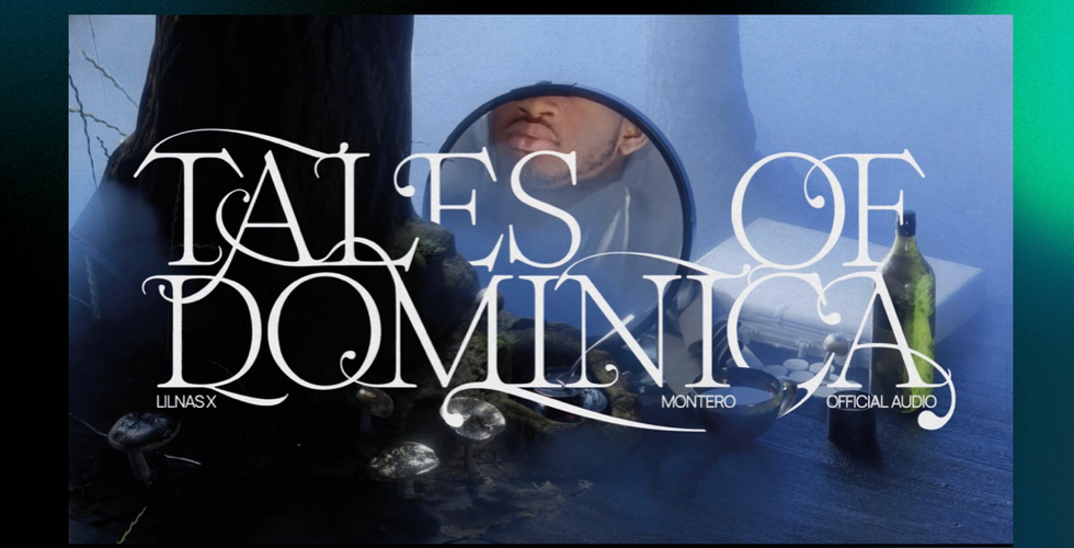


Image 1: Title card by Min Kim for Lil Nas X's Tales of Dominica, using Romie typeface by Margot Lévêque. Image 2: Titles for Ariana Grande’s 34+35 remix using ABC Marya, designed by Margot Lévêque with Dinamo. Courtesy: Margot Lévêque.
But isn’t that, in the product-driven world of graphic design, a marker of success? It can be a proud moment when a rough-and-tumble type design experiment gets some recognition, lands on an album cover or an ad campaign. But from there it’s only a matter of time until the dilution phase of the trend cycle sets in. “Graphic design both embraces amateurism and eats it up alive,” says Zhu. “It becomes cold and sellable. It’s a process that happens over and over. That’s just the sad nature of the cycle of creativity right now. Everything is forced to be as fresh as possible but the shelf life is shorter. It’ll be everywhere and then it will be nowhere.”
"Everything is forced to be as fresh as possible but the shelf life is shorter," says designer Zipeng Zhu. "It’ll be everywhere and then it will be nowhere."
For now, though, “there are people who are doing this well and in a considered way,” says Davis Ngarupe, co-founder of design studio and book publisher Actual Source, “but it can also be a quick shorthand to create an instant ‘look’ or ‘feeling.’ It can feel like a gimmick, an easy way to make something ‘cool.’” His partner, JP Haynie, agrees: “It’s so specific, you can apply it without considering the whole design. It’s not necessarily subversive. It’s a copy-paste job—or it can be.”
If the typographic opposite of a neutered tech logo isn’t subversive, what can be considered subversive anymore? Or at the very least, truly expressive in the expansive, limitless meaning of the word? Corcoran has a compelling answer, but you might not like it. “Neutrality makes for more expression in the long run,” he says. “If I have a calligraphic ornament, there’s a limited number of ways I can push that. But if I have a simpler base, there’s a lot more I can do. Give me a square—there are a million things I can do with that.”

