

- Jun 6, 2023
- 8 min read
Updated: Oct 4, 2023
Picture an animation of a 3D-modeled cocktail getting poured into a sparkling coupe.
The glistening, pinkish-purple glass is garnished with three maraschino cherries. Its lighting and color editing aren't identifiable to a specific era. Instead, it offers a vaguely aspirational feeling: It’s alluring, stylish, and romantic. It has a kind of illustrative style that creates an inviting ambient mood to lure a person into a brand’s world. (And stay for a second round.)
Brooklyn-based CG artist and creative director Haruko Hayakawa crafted this particular CG cocktail, and a catalog of other 3D product visualizations that are quickly gaining the attention of the fellow designers who follow her R&D posts on Instagram, as well as the attention of brands. Hayakawa’s digital trompe l'oeils offer a new counterpoint to hyperrealistic brand photography. If you’re building a brand world, why limit yourself to reality?
Though Hayakawa has now carved out a distinct niche for herself, that hasn’t always been the case. “I’ve had anything but a linear career,” she says. Hayakawa has worked as a graphic designer, photographer, food stylist, and creative director, creating imagery for brands like Fly By Jing and Casa Malka tequila, and editorial for Bon Appétit, the New York Times, and Telegraph.
Here, Hayakawa shares her top tools, advice to create a style that stands out, and how she delivers client work that makes everybody happy.
Video courtesy Haruko Hayakawa.
Your work has such a distinct style. What are your biggest influences?
HH: When it comes to the CG work, I'm really influenced by art direction, photography,
and illustration.
A lot of my work has this nostalgic, retro feeling to it, and a lot of that comes from things I saw in my childhood. My parents are from Japan. So when we came here, we had all of these Japanese albums and magazines. There's just such a look to [these things] from Japan in the ‘80s. It's kind of airbrushed, kind of hazy. There are a lot of skewed products.
A lot of the work that I do now has come full circle. I'm really inspired by things that feel familiar to me in some way. We're in a place in the creative industry where this idea of nostalgia is very much the thing. So it fits the work I enjoy doing.
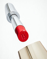
One of my favorites is your Tom Ford lipstick rendering, which is covered in bubbles, and appears to be lit by a strong spotlight. It feels nostalgic in a different way.
HH: Yeah, totally. That was really inspired by cosmetics advertising. The way I cut and composed those images, and even used those bubbles, is actually nothing new, but I try to see things from a different lens because I'm using CG. If you're gonna do something photo-real, you might as well hire photographers.
When it came to this imagery I was thinking, how do I make this look like it came from a different era?, or that it's current in a way, but not in some ways? I always look for that edge to the work because that’s what makes something interesting. My work tends to live in the space of being slightly surreal, with an illustrative hyperrealism to it.


Personal test work inspired by the beauty sector. Images courtesy Haruko Hayakawa.
Which tools or programs do you use the most, and what are they best for, respectively?
HH: My number one tool is Cinema 4D. That's the 3D program that I use, and it's for modeling, texturing, and visualizing products and rendering them. I use Redshift as my GPU render engine. And then a ton of Photoshop. That's for creating the textures that go onto the models [as well as] doing work in post: bringing up the contrast; color saturation; and editing in the image.
The other program that I use quite a bit is a sculpting program called ZBrush. That helps me if I'm modeling a product or building a set or scene for my clients. It allows me to go in and mold models like clay if I need to create something organic.
I sketch a lot, so I use Procreate on my iPad a lot. I work half-renders, half-sketches in the beginning of a project, so I might render out a general scene with the product, and then use Procreate and sketch on top of it. And I'll explain to the client, “this is what it’ll look like if we have a splash coming through,” or “if there's plants growing around it,” or “there are clouds here.” Things like that.


WIP sketches and final images for Hayakawa's clients the Telegraph and Casa Malka. Images courtesy Haruko Hayakawa.
What are your tips for securing clients?
HH: I don't necessarily reach out to brands to get work. I create work that could become work with those brands. That's what's driven my entire career. The Tom Ford [rendering] was actually personal test work. I was trying to get some beauty work at the time, so I needed beauty work in my portfolio.
There are different ways to move in your career. I was a creative director for a while at a brand agency. When I left that job and decided to go independent, I wanted to get hired for my own point of view. So creating personal work is extremely important, because it builds a body of work to showcase to clients and art directors that I have a perspective, and this is what it looks like across a wide range of industries.
You can really drive your career if you start making the things you want more of. What's on your website? What's in your portfolio? That's what you're getting hired for. So, who do you want to work with? What kinds of brands do you want to be aligned with? Start making that work and over time you'll see that you'll move towards that place.

Describe your creative decision-making process. Once you accept a project from a new client, what happens next?
HH: The one thing I've really focused on throughout my career is how I set myself up for success. When a client approaches me for work, I always have a beginning sketching phase. Clients will typically come to me with some inspo imagery, and I'll model their product, and then start setting up this sketchy work-in-progress scene for them. I'll then render that out, and show the composition. I always show a range of things to my clients. That's the way my brain works, and how I like to work. I work very iteratively.
Let's say the final deliverables are three illustrations. In this beginning phase, I tend to do way more, like maybe nine or ten. I'm not belaboring each of these nine images. It's moving very rapidly. So set it up to change the angle, move things around, render it out, sketch it, and then have a lot of options for the client.


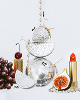
Various product compositions for Everology. Images courtesy Haruko Hayakawa.
And what’s the benefit of providing a lot of options?
I find that when I do that, we're able to align faster—because sometimes a client might say, “Oh, what if you did this?” or “What if we move this around?” or “What if we saw it from this perspective?” When you come in with options to show that you've explored the range of where a project could be pushed, I find that projects run smoother.
It can be overwhelming to clients sometimes, depending on how they like to work. So, if I'm delivering a lot of options, I'll say what I think is ideal. A lot of the time, art directors want to hear my perspective on what’s working.
Time lapse video of Hayakawa's process from sketch to final layout for her client Bon Appétit. Courtesy Haruko Hayakawa.
Why would a creative director go for CG-rendered product images rather than photographs?
HH: There's a multitude of reasons. One reason why a creative director might want to bring on a CG artist is if they don't have the product on hand, like if they are going to put these images on VC fundraising decks. This is really great for that.
Another reason is if a creative director wants to work a bit faster. You don't have to wait until you get the product to photograph it. Plus, with CG, you can do things that are highly imaginative. I can play around with the material of a product.
I did this for one of my clients recently. I'm working with a water bottle brand, and the packaging is cardboard. A lot of consumers don't make the immediate connection that there's water inside. So we took the box and made the material clear so you can see the water inside the product, and you know exactly what's inside the pack. You can't do that in real life. That's what makes CG really strong.

Did you design your own portfolio site? If so, what was your design strategy?
HH: Yes, I did design my portfolio. I wanted to have a website where the image thumbnails were able to be really large and showcased. I wanted to work with a serif typeface because I wanted a portfolio that was a bit feminine in some ways; like a little bit romantic. For the past couple years minimalism has been really desired in a portfolio. You know, playing with scale, and it's quiet, and it just didn't quite feel like me.
My strategy was to make something that feels like me. There’s an element of myself as a person, and of my work, that’s “more is more.” More fun. I wanted that to come through in my website, and in a subtle way that doesn't overtake the work itself.
What’s one of your favorite projects?
HH: I really love the Blueland work that I did. I had the worst creative burnout when that project came in. The project timeline was very healthy, but it wasn't until three days before the first creative presentation that I figured out what I was doing.
I was literally, for a whole week and a half, just moving things around and tinkering. And I just thought, this is all crap. Like, everything I'm making is garbage; none of this is good. I was banging my head against the wall for that project.
And then I finally did something really super surreal and weird. It unlocked what that entire campaign was going to look like. I enjoyed that because, in a way, even though it looks like a lot of other things that I've done, it unlocked something for me when it came to composition because the florals have this weird flow, and the product holds the space in a way that is different from the way I typically do things.
I really think fondly about that project because it's always nice when you push through your creative boundaries in order to tap into something.

What's your advice to designers who want to create distinctive work that stands out?
HH: One of the things that makes my work look like my work, even if the subject matter changes, is composition. I try to build something that's interesting, and that came through exploration.
Try and create a creative practice throughout your week. That looks different for everybody. I have a daily routine. Every day I will do an hour or two, sometimes, like five hours of personal creative work, and that's my time to do some R&D and play around and experiment.
The other part is to take a look at all sorts of creative. Take a look at photographers, graphic designers, illustrators, and other CG artists. When you see something that you think is interesting, you can implement it into your work. It's not about ripping someone off. But if there's color usage or some technique you find interesting, try and play with it.
What makes really strong creative work is bringing something unexpected. Over time you'll build something that really feels like you.
.jpg)


