Search results
1728 results found with an empty search
- Is your site lovable? 7 ways to make your site irresistible
Here at Wix, we think a lot about how to help people create websites their audiences won’t be able to resist. When it comes to this pursuit, you could say we walk a fine line between passion and obsession. For Valentine’s Day, we’re putting a romantic twist on our usual advice. Think of your website as a Valentine’s Day card for your crush. Just like these festive cards, your website is aimed at making your shoppers feel valued and eager to explore a relationship with your brand. Follow these seven web design tips from our experts, and you’ll have your crush swooning over your website in no time. Get started with your website design with Wix. 7 ways to make your site irresistible Make it love at first “site” with a gorgeous hero design Smother your content with the right SEO attention Bring it to life with animation Spread the love by making your website accessible Choose typography that speaks to the heart Unconditional love with reliability Take the next step with a CTA 01. Make it love at first “site” with a gorgeous hero design Although a long-lasting connection is about more than just looks, a great first impression can kindle the spark that’s needed to kick off a strong relationship. A compelling hero design—the banner that is displayed above the fold —can lead to love at first sight. If you’re in the early stages of learning how to design a website and are still familiarizing yourself, you can read more about website header design or how to design a website with AI . "A good hero design just makes [a website] much more beautiful," says Wix Marketing Designer Johnny Orel. Take the hero design of Wix user Generation She , a career resource for Gen Z women in tech, as an example. The split-screen website layout is giving us the feels thanks to its sleek, informative design. At the top of the page, your gaze is drawn to the eye-catching lime green bar advertising GenShe’s podcast. Below that, the brand’s logo sits next to descriptive categories. The main section of the hero design is the pièce de résistance. It’s home to the brand’s catchphrase, a CTA to sign up for the newsletter and a photo that resembles the website’s target audience. The neutral website background ensures all the hero design’s elements pop. Thanks to this strategic, informative hero design, visitors to Generation She’s website can immediately see what it’s about and who it’s for. Apply techniques from this example on your website to reel in your crush. 02. Smother your content with the right SEO attention Looking for a recipe that will get your crush to notice your website and make it Google’s favorite? Cast a love spell with some search engine optimization (SEO) magic. "Make your website absolutely irresistible with blog posts smothered in intent, sprinkled with on-page optimizations and backlinks,” says Wix Blog’s SEO Expert Rebecca Tomasis. Use SEO features like researching keywords relevant and adding them strategically into your website content. By appearing higher on search engine results pages, you can grow the visibility of your website. Tip: Go one step further and start a blog to showcase your expertise and authority to bring more visitors to your site. 03. Bring it to life with animation Chances are, your boo has a lot of options. Ensure you’re the apple of their eye by incorporating one of the top web design trends on your homepage: web animation and interactivity. While doing this, it’s important to strike the right balance between too little and too much interactivity to avoid seeming uninterested or too desperate. Wix web designer Ella Joel recommends leveraging “strong interactions that aren’t annoying” on your website. In other words, go for interactivity that keeps your Valentine engaged, but isn’t too flashy. We’re obsessed with how Wix user Lennnie , an animated character that discusses mental health in an approachable way, masters this balance. The interactivity on Lennnie’s website piques your interest, and makes you want to keep exploring to uncover all of its secrets. Click the poster to buy Lennnie’s book. Click on the closet to shop Lennnie’s online merch shop. Or, click on the laptop to sign up for the loveable blob’s newsletter. Tip: To add animations to your site, you can add and customize an animation or use a tool like Lottie Files . Read more about importing Lottie animations to your site . 04. Spread the love by making your website accessible Put yourself in your lover’s shoes and guarantee your Valentine reaches them by implementing website accessibility best practices . “Over 17% of people in the world have a disability, so, if you want them to be able to enjoy and interact with your website, you want to make sure that you have great content that's easy for everyone to understand,” says Wix’s Accessible Content Specialist Tammy Salomon. The best websites are informative, look great and are accessible. So, how can you spread the love? Tammy recommends using clear, descriptive headings, as opposed to vague language. For example, if your website is an eCommerce store, name your best sellers category “Bestsellers” rather than something clever like “Top Picks” or “Your Faves.” Tammy also suggests using high-contrast colors to increase visibility. Not only is contrast one of the most important principles of design , it’s also one of the top factors in web accessibility. Not sure if your website has enough contrast? Use this contrast checker tool . Another way to ensure everyone can enjoy your website is to add alt text to your images. Alt text is text that describes images to website visitors who use screen readers, a standard practice of good website accessibility . “Consider the people who aren't necessarily like you when you're building your website to make sure everyone can use the web on an equal basis," Tammy says. 05. Choose typography that speaks to the heart Ben Riback from Wix’s motion design team says you should use “really good typography, a big title and lots of colors” to capture your lover’s attention. See typography in action on social media agency Pink Chili’s website , which uses a bold red serif font contrasted against a cool purple-pink background to capture your attention and keep you staring. Everything from the scale of the text to the weight of the font and the colors are designed to captivate you. Play around with the hundreds of fonts preloaded onto Wix and various website color schemes until you find the combination that speaks to your Valentine. 06. Unconditional love with reliability Nothing says love quite like reliability and dependability. Knowing that your site is up and running and offering visitors the best possible experience is a win-win for both parties. With Wix’s site reliability , you can have limitless scalability—all fully-managed for you. By following web design best practices , you can design with your visitors in mind. With 99.99% uptime, what can be more dependable and romantic? 07. Take the next step with a CTA Are you waiting for your Valentine to finally commit to your brand or make a grand gesture? Don’t expect them to read your mind. Instead, tell them what you want them to do with a call to action (CTA). Including CTAs is an important part of learning how to make a website that’s action-oriented. "You should have a super clear call to action visible on your site,” says Gal Admon, a product designer for Wix Code. Perhaps you want the object of your affection to add a product to their cart or subscribe to your love notes (i.e., your newsletter). Experiment with different CTA copy and button designs until you find combinations that resonate most with your sweetheart. However, when it comes to matters of the heart and web design, Gal says it’s important to know your own intent before you expect action or commitment from others. “You should also understand what you want your users to do on your site,” he advises. “What's the goal?" Follow design business coach Abi Connick’s lead. We love how every part of her homepage drives visitors towards the next step, from the wiggling blue arrow above the fold that encourages you to keep scrolling, to the action words highlighted with cursive typography to the circle animation around the “Learn More” button at the bottom of the page. Learn more: What is web design?
- How to make money as a graphic designer in 15 ways
Ready to let your work shine? Build your portfolio → Graphic design isn’t just a job—it’s a money-making playground when you know where to look. You can create sleek logos, eye-catching merch or scroll-stopping social media graphics , finding endless ways to turn your creativity into cash. The best part? You don’t have to stick to one income stream. From freelancing and selling digital products to designing for businesses and content creators, you can combine opportunities to build a steady or even passive income doing what you love. Think beyond traditional client projects, your designs could make money while you sleep. Sell ready-made templates, launch a print on demand store or teach design online. The key is tapping into high-demand markets and creating work people actually need. If you’re looking to take on clients, start a side hustle or dive into digital sales, this guide will show you smart ways to make money as a graphic designer, without burning out. Showcasing your talent should be easy. With Wix’s portfolio builder, you can create a professional, eye-catching portfolio that shows your best work in just a few clicks. Wix’s customizable templates and easy-to-use tools let you present your skills with confidence–leaving a lasting impression on anyone who visits your site. 12 ways to make money as a graphic designer Logo design Web design Print design Social media graphics Brand identity design Illustration Packaging design Merchandise design Infographic design Motion graphics App design eBook cover design Passive income and digital products Education and consulting Niche and specialized design 01. Logo design First up is logo design. Crafting unique and memorable logos is a crucial asset to any graphic designer's repertoire and is a great way to make money online . By collaborating with businesses and individuals, you have the opportunity to shape their visual identity, creating a symbol that not only reflects their ethos but also leaves a lasting impression on their audience. Logos are often one of the first things a customer sees about a company, making it one of the most important features of any brand. So, stay on top of any design trends and fonts to make sure you’re delivering fresh work. 02. Web design As a web designer, your role extends beyond aesthetics to the very core of online experiences. You'll be tasked with creating visually captivating and user-friendly websites, ensuring that the interface not only appeals to the audience but also enhances their interaction with the content. Responsive web design might also be worth exploring, given that 60.08% of web traffic comes from mobile devices. You’d just have to know which layouts work best on smartphones or tablets throughout the website design process, whether your clients are bloggers or run an online store . You can also start a web design business to help you turn your experience into a way to make money. Learn more: What is web design? 03. Print design Diving into the world of print design includes creating tangible materials such as brochures, business cards, stickers and other printable materials. Your designs will grace physical spaces, making a tangible impact and leaving a lasting impression on those who encounter them. Timothy Goodman is an award-winning example of a graphic designer in the print design world. His art has populated walls, packaging, clothes, products, magazine covers and even a sanitation truck. Print design also stands out as one of the few ways to earn genuine passive income as a designer. You can create a few T-shirt designs, and thanks to print on demand services , you can make money off the same design with very little work. Creating and selling custom products has never been easier. With Wix’s on demand printing , powered by Printful, you can design and launch personalized apparel, accessories, home goods and more—made to suit any style, niche or need. No extra tools, no complex setup. Just pick a product, upload your design and start selling—all from your Wix dashboard. With seamless Printful integration, you get a streamlined way to build, brand and sell—without ever leaving Wix. 04. Social media graphics Social media posts play a crucial role in brand communication. By crafting eye-catching static posts, engaging stories and compelling banners, you can contribute to a brand's online presence, helping them connect with their audience on platforms like Instagram, TikTok and YouTube. Just make sure to tailor your services to platforms that may need them. For instance, Emplifi found Instagram and TikTok had median interactions more than twice that of X (formerly known as Twitter) and Facebook in 2023. Since both are highly visual platforms, learning what you need to make high-quality designs on them is a good place to start. That said, different social media networks require different templates , so you’ll find that many of the challenges in designing for social media come from trying to balance your clients' expectations with the limitations of the network they need to post on. Learn more: How to make money on Instagram How to make money on TikTok How to make money on Youtube 05. Brand identity design Brand identity design goes beyond logos—it involves developing a holistic visual language. This includes defining color schemes, selecting visual elements and creating a cohesive identity that resonates with the brand's values. Your work will contribute toward creating a consistent and recognizable brand presence across various mediums for customers—a presence they want to be instantly recognizable and come across as authentic. After all, consumers value authenticity and actively look for it when deciding whether they want to purchase from a specific brand. 06. Illustration Offering illustration services allows you to bring concepts to life through visual storytelling. From creating captivating prints to providing editorial illustrations that enhance written content, your artistic skills add depth and creativity to a diverse range of projects. You can also offer digital illustration services, like Jasmine Craciun . Her work lends a unique look to all sorts of digital products and customers looking for a specific style can browse her portfolio website to see if she might be a good fit. 07. Packaging design As a packaging designer, your focus is on creating visually appealing and marketable product packaging. Your designs not only protect and present the product but also serve as a key marketing tool, catching the consumer's eye and influencing their purchasing decisions. If you get into packaging design, you’ll need to pay attention to the purpose of your package in addition to the looks. Colors, typography and graphics are important, but you’ll need to make sure that any required information is also included. Learn more: Types of designers 08. Merchandise design Merchandise design is about transforming your designs into tangible merchandise. Whether it's designing T-shirts, mugs or other promotional items, your creative input adds value to physical products and reinforces brand messaging through wearable or usable art. You can sell products directly or design items for other companies. You might also find you do best with certain products. T-shirt design, for example, has a lot of competition, but there are other categories, like tarot cards or ceramics, with lots of opportunities. 09. Infographic design Translating complex information into visually engaging infographics is a specialized skill. As an infographic designer, you simplify data and concepts, creating a visual representation of the information. Venngage even found that 43% of marketers reported original infographics were their best-performing content in 2023. Whether for educational purposes or marketing campaigns, it’s easy to see why infographics are so useful. 10. Motion graphics In the dynamic world of digital content, motion graphics breathe life into visuals. Producing animated graphics for videos, presentations and online content adds a layer of dynamism, capturing and maintaining the audience's attention through visually compelling storytelling. 11. App design As an app designer, your focus is on creating seamless and visually pleasing user interfaces for mobile applications. Your designs contribute to an intuitive and enjoyable interaction, enhancing the overall user experience in the competitive landscape of digital applications. 12. eBook cover design In the realm of digital publishing, eBook cover design is a niche that marries artistic creativity with marketability. By offering your services for digital books and publications, you’d play a crucial role in attracting readers and conveying the essence of the written content. Many design tools lend themselves to eBook covers and you’ll be able to use the skills you develop in several other niches as well. 13. Passive income and digital products Selling digital products is a great way for graphic designers to earn money without trading time for dollars. Templates, fonts, stock illustrations and UI kits can be sold over and over with little extra effort. Platforms like Creative Market, Envato Elements and Gumroad make it easy to connect with buyers around the world. Evergreen products like Instagram templates for businesses or resume templates for job seekers can bring in steady income. Bundling assets and offering multiple file formats like AI or PSD makes products more appealing and boosts sales. Marketing plays a big role in selling digital products successfully. Sharing visually engaging content on platforms like Pinterest and TikTok can help drive traffic. Promotions, limited-time discounts and free lead magnets are great for attracting new customers. SEO-optimized product listings make sure your designs show up in marketplace searches. Staying on top of trends like minimal branding, hand-drawn illustrations or retro designs helps keep your products fresh and in demand. 14. Education and consulting Teaching is a great way for designers to turn their expertise into income. Online courses, workshops or coaching programs are all solid options. Platforms like Skillshare, Udemy and Teachable make it easy for designers to create courses on topics like logo design or typography. YouTube is another popular choice, where designers can earn through ads, sponsorships and memberships while growing an audience. Offering downloadable resources like design cheat sheets or tutorial PDFs adds even more value for students. Consulting is another profitable path, especially for designers with branding or marketing experience. Businesses often need help with visual branding, like picking color schemes or typography. Design audits—where a designer reviews a client’s website, branding or social media—are becoming more popular. Sharing knowledge through blog posts, LinkedIn articles or speaking engagements can also attract high-paying consulting clients. 15. Niche and specialized design Focusing on a niche is a great way for designers to stand out and land higher-paying projects. Growing fields like YouTube thumbnail design, Twitch graphics and social media branding are in high demand as creators look for polished, professional visuals. Game asset design, including characters, backgrounds and UI elements, is another booming area fueled by indie game development. Designers can also work with musicians, podcasters and event organizers to create album covers, podcast artwork and invitations. Emerging areas like NFT art and AR/VR design offer exciting opportunities for creative, forward-thinking designers. Selling NFT artwork on platforms like OpenSea or designing AR filters for Instagram and Snapchat are great ways to combine creativity with tech skills. How to get started making money as a graphic designer In addition to looking into some of these niches recommended, you want to be smart about how you approach your work as a graphic designer. Here are some tips to help you make the most of your time. 01. Assess your skills The journey to a successful freelance graphic design career begins with assessing yourself. Take the time to evaluate your graphic design skills and pinpoint a niche that not only plays to your strengths but also aligns with current market demands. Are you great at creating abstract designs but struggle with creating lifelike images? Illustration might not be the best match for you compared to work in app or web design. When you approach your design strategically, you’ll be better positioned to choose jobs you can do well in and deliver quality designs for. 02. Build a design portfolio Once you’ve narrowed down your field, you need to learn how to make a website and create a professional showcase highlighting your best work, incorporating samples or links to completed projects. This portfolio serves as a visual representation of your skills and becomes a powerful tool for attracting potential clients and opportunities. Wit180 is a great springboard for inspiration for you to build your own. The designer cleverly showcases some of the companies he has worked with in an animated box, highlighting both his focus on branding and his skills in motion graphics. 03. Set up professional profiles Now that your website is set up, you should set up professional design profiles across freelance platforms, design-specific websites and several social media channels. An omnichannel approach enhances your visibility, making it easier to connect with potential clients and collaborators in the expansive world of graphic design. 04. Understand business basics Learn the basics of how to start a business , including setting competitive rates, generating invoices effectively and managing taxes. This foundational knowledge will help you achieve a professional and sustainable freelance practice, setting the stage for a flourishing graphic design career. Tips for making money as a graphic designer Thriving as a freelance graphic designer requires some pretty specific skills and traits. For instance, being skilled in design software like Photoshop and having an eye for aesthetics lets you command a good wage for your services. That said, it’s not all about being a great artist. Making money as a graphic designer also requires time management, self-discipline and effective communication skills to negotiate with clients and meet project deadlines. Moreover, to promote your graphic design career effectively, you need to create a graphic design portfolio to showcase your work. A website that acts as an online portfolio makes it easy to share your work across job platforms and social media to attract potential clients. Lastly, specializing in a graphic design niche can also be a game-changer, allowing you to focus on a specific style or genre while making money as a freelancer . By specializing, you can also establish yourself as an authority, command higher rates and increase your chances of finding targeted gigs. To sum it up, you’ll need to keep a few things in mind when you’re trying to learn how to make money as a graphic designer: Learn in-demand programs Promote yourself effectively Take advantage of social media Specialize in a niche or two With these in mind, let’s dive into 12 of the best ways to make money as a graphic designer. Ready to build your website? Sign up for Wix for free . How to make money as a graphic designer FAQ How do I find freelance graphic design gigs? Start by creating profiles on popular freelance platforms such as Upwork, Fiverr and Envato. You should have a portfolio linked both on these platforms and your own website. Networking on social media, particularly platforms like Behance and LinkedIn, can also uncover opportunities. Additionally, reaching out directly to businesses and agencies with a specific pitch can be effective. What should I charge for my freelance graphic design services? Research industry standards and consider factors such as experience, niche and the scope of the project when setting your rates. You want to make sure your rates cover all of your expenses and help you make money, too. How do I identify profitable freelance graphic design niches? Identify niches aligned with your design style, skills and market demand. Specializing in specific areas, such a s web design or branding, can lead to higher-paying opportunities. Can I make a full-time income from freelance graphic design? Yes, many graphic designers successfully make a full-time income by securing consistent gigs, building long-term client relationships and expanding their services. It’s important to remember that, in many countries, self-employed workers are responsible for additional taxes, so make sure you make enough to cover this as well. How do I ensure I get paid for my graphic design work? Use clear contracts for every project, specify payment terms and consider using secure payment platforms. Building professional relationships and a strong online presence can also contribute to reliable payment for your graphic design services. For first-time clients, you may consider sending over watermarked samples or requiring a deposit.
- Meet 3 LGBTQIA+ websites growing the pride community online
As the online world becomes increasingly entwined with our day-to-day lives, LGBTQIA+ leaders like Julio Roman (founder of Out Agency ), Jason Katternhorn (founder of Sassify Zine ) and Christian Parker (founder of Gay & Sober) , work to ensure everyone is represented and cared for in the digital sphere. To celebrate Pride month, I sat down with each of these three personalities to discuss the unique challenges and joys of being a leader in the LGBTQIA+ community, what that looks like in the online sphere, and what it’s like to create a website that manifests pride all year long. Tip: Help make the web a more inclusive place by learning how to create an LGBTQIA+ friendly website , donating to LGBTQIA+ causes, or hosting inclusive events. Out Agency [ @theoutagency ] Julio Roman , founder of Out Agency, creates environments where LGBTQIA+ people can express themselves 100% authentically, without fear of harm or prejudice. Using a peer-led, peer-driven model, his agency partners businesses and organizations with LGBTQIA+ community leaders to create safe spaces that better service the LGBTQIA+ population. “We help organizations understand that in order to create a safe space, their team, staff members, and leadership must represent those values,” Roman says. “We inform them about their policies and procedures, their branding, the way they communicate, the words that they use, and more.” The author of Out of Space, Roman has 20+ years of experience making “safe space in unlikely places.” Together with his business partner Raphael Cuello, the artistic mind behind Out Agency’s web design, we discussed what it means to create a safe space today, and how their website design helps facilitate growth and inclusion online: Wix: How does Out Agency’s peer-driven model work? Julio Roman: We bring different LGBTQIA+ community leaders who are willing to share their voice together to talk about what safe space messaging looks like to their community and what programs will serve them in terms of structure, availability and staff. Sometimes, for an organization, this leads to changing policy or training the staff for cultural competency or safer language use. Did your support for the LGBTQIA+ community change during the pandemic, as many people shifted online? The pandemic put a fire under all our plans. We had to reinvent almost everything. With all of these LGBTQIA+ centers shutting down, the community didn't have a physical place to go. We looked for alternatives to safe spaces and saw that the community was already connecting via the internet and social media. Moving online and building a website is the new safe space. We learned that we had to centralize and adapt our in-person services, like one-on-one counseling sessions, to an online format to make them just as available—if not more easily available. What role did your web design play in your shift online? Raphael Cuello: Practically speaking, we use fantastic scheduling and bookings tools that allow audiences to book services and pay for it right on the website. It’s easy for them and easy for us to keep records. Building our online presence also meant rethinking how we presented ourselves to the LGBTQIA+ community. I have a very clean aesthetic, so keeping both our desktop and mobile website pretty and with a minimalist website design was really important to me. In addition, we wanted visitors to both the Julio Roman and Out Agency websites to feel welcome, seen and supported. For the Out Agency, I wanted allies looking to learn to feel just as welcome as an LGBTQIA+ person. And I wanted LGBTQIA+ people to feel that our services were created for their needs, so we used language and visuals that would captivate them. I incorporated our own graphics, but we also used the Wix Editor library which had a fantastic array of LGBTQIA+ imagery. In your book, Out of Space , you write that a safe space doesn’t necessarily imply a physical space. This seems more relevant now than ever—can you elaborate on this idea? The premise of my book was challenging everyone to think outside the bounds of the physical location when it came to safe spaces and to put that ownership on ourselves. If we truly represent the values of a safe space, no matter where we go, people will understand that you represent and respect these values. That’s ultimately my message at the end of the day with anyone I work with: In order to create a safe space, you need to be one first. Sassify Zine [ @sassifyzine ] Jason Katternhorne started Sassify Zine 2017. The award-winning project gives a voice to queer artists and exposes queer art culture by printing artworks from LGBTQIA+ artists in a zine format and online platform. “Originally, Sassify was a way for me to showcase my own artwork and the work of those I admired,” explains Katternhorne. “It was around this time that I started to explore my own queerness—and as I did that, the zine explored it as well. I've learned a lot about my own queerness through the zine, and I think other people can learn, too— within and outside of the queer community.” says the artist. Each issue of Sassify has its own theme and features 30 queer artists from around the world—both up-and-coming and established. In addition to print issues, Katternhorne uses his website and social media presence to connect new audiences to queer art and promote artists by showcasing their work and encouraging collaboration. “I'm very visual. That's why I use artwork and illustration to convey information,” adds Katternhorne. “It’s easier for me to process something if it’s really beautiful, and I hope that's the same for other people.” Katternhorne spoke with me about what queer art is, the pros and cons of selling art online and the importance of building a presence in the art world—on and offline—to strengthen the queer art community: Wix: How do you define queer art? Jason Katterhorne: Queer art is bold, defiant, and challenging to the viewer. For me, illustration is an accessible visual that can make someone challenge their own perceptions of the queer community. Others may define queer creativity through photography, collage, painting. Whatever medium used, I hope that queer art gives everyone the tools to become better allies. The community has a strong visual story to tell. I’m exploring highlighting disabled bodies that you don’t see in mainstream illustration. I want to convey to those not used to seeing this that queer bodies are beautiful. I've worked with a lot of queer and straight artists, and I think anyone can create queer art if they’re respectful and embrace the community. Why is it important to have a platform like Sassify Zine? Sassify has evolved into this platform where I can give other LGBTQIA+ people the motivation to get more creative, too—and the opportunity to showcase their work. It's not easy for queer kids now, although it's a lot easier than what it was. And Oxford, where I’m based, has a good queer community, but it's not necessarily creative or art focused. There’s also a lot of disparity within the queer community itself, and older queer person might not understand a non-binary person or a transgender person, because it's a completely different sort of queer community than what it was when they were younger. So I think it's important to use art to help bridge this gap, not only between the LGBTQIA+ community and outside of it, but also within it. When it comes to our audience, I think it's important to give access to this sort of information and to see the artwork. People often ask me what is queer? It’s something they really struggle with. I believe you have to see it to understand it. Now I can say, “just have a look.” Sassify can be a tool to give everyone like access to this information and they can form ideas about the queer community Much of the art world—including galleries, art book fairs and zine fairs—was put on hold during the pandemic. How did you adapt your platform to better suit a growing online audience? Before Covid, I was publishing annually—I published my last physical copy in 2020. That led me to start focusing on how to feature art and artists using my digital assets, like my website, Zoom meetings and Instagram. When I started my website five years ago, it was much simpler, with mostly my own work. Over the years, I’ve worked with so many artists, so put up an artist page for them too. There are 30 artists on there at the moment and I’m in the process of adding on more. It’s a database for anyone looking for queer artists. Visually, the site has evolved too. I started with a black and white background, but over the years as I’ve explored my own queerness and built the platform, the web design started to represent the boldness of Sassify zine itself—with lots of color and patterns. Learn more: What is web design? What were the added benefits of this online shift? Tools like social media, eCommerce and email marketing have been instrumental in promoting the artists and selling zines. For me, it’s also really important for people who can’t get out of their house, especially queer disabled people, to have access to this art and connect with the community. I’ve organized online events and given talks on Zoom. I also constantly email with artists who want advice on how to create their own zines. My next goal is to make the zines digital, so they can be free and accessible on the website. How can we support queer art and culture all year round? Start by searching for queer artists on the internet. You can find so many just by typing in “queer artists” into Google or searching the hashtag “queer art” on Instagram. You can also buy artwork, zines and art books from LGBTQIA+ creatives. If you can’t afford to purchase, share their work via Instagram story and tag their account. When it’s relevant, I think bigger platforms and companies should give the space for more LGBTQIA+ individuals to share their stories year round. I’d love to see more interviews with queer artists who are not necessarily influencers, and those from Black and Native American queer communities. Gay & Sober [ @gayandsober ] 33% of LGBTQ+ community in New York is sober or struggling with their sobriety. Christian Parker started a private Facebook group in 2009 to connect those who self identified as gay men looking for safe and fun events during Pride week. Now, Gay & Sober is a non-profit organization spanning all major cities in the U.S., in addition to London, Mexico City, Berlin, Dublin and Tokyo. The non-profit provides online support, resources, in-person gatherings and other events during the year that show these people they can find their tribe, outside of the bars and clubs. Apart from their annual, inclusive LGBTQ+ Pride Celebration , the group hosts an annual Men’s Conference coinciding with Pride month, featuring events, activities, and workshops geared toward gay men in recovery. In the midst of these preparations, Parker spoke to me about the work he does year-round and what it takes to keep the momentum online. Wix: In addition to on-site groups and events, how do you support the Gay & Sober community online? Christian Parker: In March of 2020, as soon as the lockdown started in the United States, our team mobilized. Within 48 hours, we had a nightly, community drop-in center on Zoom. Anyone and everyone who is LGBTQIA+ and in recovery—whether they're already sober, newly sober, or curious about getting sober—can participate in the hour-long session. Our social media presence has expanded, with Gay & Sober’s Instagram following jumping about 40% in 2020. We also have our private Facebook groups where people can share when they don’t have a physical place to go and do that. We launched our website a few years ago and the traffic has just been incredible. With it, we’ve expanded our services and reached more people. Anyone who comes to our site can also join our mailing list and stay informed. What is the importance of building an online presence for the sober LGBTQIA+ community? Big cities like New York, LA, and Tel Aviv have huge existing LGBTQIA+ communities. But elsewhere, support is harder to find. I recently had a man reach out to me from East Africa. He’s gay and sober, and it’s illegal to be gay in his country. He connected with us to find online resources, virtual meetings and advice. I see our online assets as a bridge. We hope that once they find us we can eventually connect them with someone in-person, or that they can come meet us and join one of our events. Can you sum up some of the unique joys that come along with the challenges of being an LGBTQIA+ leader? Even though there is no paycheck involved, it’s absolutely rewarding. We have more than 100 volunteers working all year for June. Sometimes preparing for Pride month means sleepless nights and being busy all the time. But on Pride Sunday, when I go to the top of the cruise ship party we organize, for example, and I look out at the 600 people dancing, laughing and having an amazing time, it’s beautiful. Especially when I think about all those individual people being sober—they're not drunk, they're not high, they're not in jail, they haven’t overdosed—they're really living their full life. This interview was edited for length and clarity. Learn more about how to make a website .
- Responsive web design vs. adaptive: Which should you use?
As of 2018, consumers are more likely to visit a website from a mobile device than a laptop or desktop computer—meaning it’s been increasingly imperative for business owners to create a website that looks and works great across all devices and platforms. Two mobile-friendly strategies have risen to the challenge: Responsive and adaptive web design. Responsive web design is a fluid approach whereby a page rearranges itself based on the detected screen size. Adaptive web design is a type of web design whereby the browser loads a layout created specifically for the given platform. As you sit down to create a website , which mobile-friendly design strategy will work best for you? In this post, we’ll explore the differences between the two, as well as the pros and cons of each. We’ll also dive into design best practices to ensure your website provides a stellar experience for modern consumers. Responsive vs. adaptive web design: What’s the difference? For a website to succeed, it needs to be designed with all users in mind. Screen sizes, however, can vary from large corporate monitors to teeny-tiny smart watches, making it challenging to provide the same good UX design for a site on every device. Both responsive and adaptive web design remove this obstacle, allowing designers to create great website experiences for every user. Let’s look at the key differences in how these design techniques accomplish this: What is responsive web design? Responsive web design enables a web page’s design and layout to automatically adapt to any screen size. The design technique uses CSS media queries (a tailored style sheet) to inspect the end user’s device characteristics. The website then renders itself accordingly. Toyota 's website exemplifies responsive design. Thanks to the fluid grid design, the homepage content flows into smaller screens with no issue. If you were to start with the mobile or desktop version of the site and slowly change the size of it, you would actually be able to see the design break and rearrange itself when the screen reached a certain percentage of the original. The same content appears in the same order. However, some content has scaled up or down to best fit the new space. What’s more, some of the functionality has changed (like how the horizontal scroller works) based on which platform the visitor uses. Responsive design entered the web design practice in 2010 when Ethan Marcotte introduced it at An Event Apart in Seattle . He explains what led him to name the new design approach: “In the years leading up to the talk, I’d been working on more design projects that’d asked me to work on separate, standalone mobile websites. Heck, not even that: frequently, they’d ask for an ‘iPhone website.’ And something about that didn’t quite feel right to me. And it definitely didn’t feel sustainable — were we going to create separate websites for every new device that came along? Besides, I’d always been interested in creating layouts that were flexible and beautiful.” Since then, this fluid web design technique has enabled consumers to do more with their smartphones. It’s also allowed businesses to reach more consumers, across more devices. What is adaptive web design? Adaptive web design enables a web page to load a static, pre-made layout based on the detected device. To make this happen, a designer must create different designs based on varying screen widths. The most common widths are (in pixels): 320 480 760 960 1200 1600 Apple has a good example of adaptive web design, which requires a custom design for using the most common breakpoints. If this were a responsive design, the same content would probably appear on every visitors’ screen and in the same order—but adaptive designs aren’t dynamic. The page’s structure is more or less identical, with the same number of sections. However, the content differs slightly between desktop and mobile—not so much in terms of text, but in its website imagery. There’s nothing lost in terms of the user experience. In fact, adaptive web design allows the designer to use imagery more precisely than if they were fitting everything from the desktop screen onto a mobile device. Adaptive design was introduced by Aaron Gustafson, after responsive design. He wrote about it in his book Adaptive Web Design: Crafting Rich Experiences with Progressive Enhancement. When he re-released the book in 2015 , he had the following to say: “The philosophy of progressive enhancement works and only continues to demonstrate its brilliance with each new Web-enabled screen that debuts in the ever-expanding global marketplace. In fact, I’ll go out on a limb and declare that progressive enhancement is probably even more relevant today than it was when I wrote Adaptive Web Design in 2010.” Adaptive design has been permanently imprinted on the web design space, as companies increasingly want to control how their content appears on smartphones. Responsive web design vs. adaptive web design: Which is better? When it comes to mobile website design , there's no real winner in terms of technique. It depends on your needs, wants and resources. You can experience an effective design process from concept to production with website builders (like Wix ) which create adaptive designs for the most commonly used devices. While web design platforms like Wix Studio run on responsive CSS powered by smooth drag & drop. Let’s break down the pros and cons of each: The pros and cons of responsive design Pros: Consistent content experience across all platforms Works on new devices, even those with non-standard screen dimensions Cons: Less control over how the site renders on each device Can hinder visual hierarchy if elements reflow in the wrong order or size Requires more design expertise, cross-platform testing and design tweaks Hinders website performance as dynamic content takes more work to load The pros and cons of adaptive design Pros: Creates a perfectly-tailored experience for each platform and context High performing, as the design is optimized for the target device Easy to perfectly fit advertisements and other third-party integrated content Cons: Can negatively impact SEO if content inconsistent across all devices Mobile-first web design To get the best results from either of these mobile-friendly design strategies, it’s a good idea to take a mobile-first design approach—or creating your first design for the smallest screen size to avoid common mobile design issues. Comparing Wix Studio: Wix vs. Wix Studio Wix Studio vs. Elementor 10 things to consider when designing a versatile website In web design , the trick in creating a stellar responsive or adaptive website is to focus on your site’s individual elements and consider how a site change may impact them. Try to focus on including or optimizing these main components when planning out how to make a website mobile-friendly : 1. Header content At first glance, the header can tell visitors a lot about a website: What the brand is What it offers Which actions to take How to search through all content A desktop layout has plenty of room to display all this information on its website header . On mobile, less so—and your responsive or adaptive design needs to account for this. Ask yourself which elements should be visible in your mobile website navigation. For example, a logo should be there for fostering strong and consistent brand identity. Other common items include a navigation menu, or if you’re building an eCommerce site, including a shopping cart icon. 2. Text legibility Website text can be a tricky element to handle: You want it to look good and to reflect your brand’s style, but you have to make sure that your design choices don’t impact legibility. When designing for different devices, you also have to consider that the size and style might not scale as the screen size moves up or down. Needless to say, it’s important to test this before you launch your site. 3. Hamburger icon Navigation plays a critical role for every website, so it’s important to think about how users may interact with it differently based on their device. For starters, think about using a hamburger menu . A hamburger menu refers to a three lined icon typically placed on the top right or left hand corner of a website. At this point, most people know what those stacked horizontal lines do, and trusted choice for navigating a mobile web design. 4. Navigation placement The growing popularity of mobile apps has influenced the way website owners structure their mobile navigation. More than ever, we see designs going beyond the hamburger menu, which we’ve already recommended. With a smaller set of top-level navigation links (no more than three or four), some brands will consider adding them to the bottom of the screen as a sticky horizontal menu, or within the website header. Another popular navigation method is creating a full-screen pop-up menu using a lightbox . 5. Sticky header In adaptive design, you can keep your mobile pages relatively short. In responsive design, however, all the desktop content flows into the mobile web page unless otherwise modified. If your mobile pages run long despite your best efforts, think about making the header sticky. This way, users can access your navigation at all times. 6. Visual hierarchy A website’s visual hierarchy refers to the path a visitor’s eye follows on a page. Cluttered website layouts make it hard for visitors to know what details to focus on or where to go next, especially on a mobile site. You can add headers and subheaders, image blocks, white space, navigation tools and more to web pages in order to: Break up large amounts of content and complex subjects Create a structure for information on a page Ensure you have a well-balanced design Establish relationships between different sections You can account for this in adaptive design as you plot out the visual details for each version. In responsive design, you have to be careful as elements may resize or restyle as the screen scales down. The best bet is to set global styles for desktop, tablet and mobile—ensuring the responsive restructuring process doesn’t interfere with your content’s integrity. 7. Page length One last matter concerning your site’s content is its length. The navigation possibilities at hand may make a long page easier to scroll through on a mobile device—but when browsing on a phone, fewer scrolls will help as well. With adaptive design, you can remove sections of text or images on mobile layouts. This way, you can allow more content to be perused on a desktop, while keeping the mobile version readable. 8. Imagery Website imagery can be a very useful tool in design, branding, storytelling and sales. In responsive and adaptive design, pay attention to the impact these images have on your pages' performance. While the weight of imagery doesn’t tend to be a problem for adaptive sites, it’s still a good idea to only use the images you need, so they don’t slow down your pages. 9. Embedded content It’s not uncommon to use external content like embedded social media widgets, videos or banner ads. In adaptive design, you can place these external elements within the boundaries of the containers they appear in. In responsive design, you should make sure to customize the embedding code to say within the confines of your container. 10. Interaction Interactive design elements should be: Easy to identify as interactive Findable on the page Interactive with without error Consider the various micro-interactions visitors will expect have with your site, and the ways of these interactions may differ. For instance, let’s say you’ve put the phone number to your business in the header of the site. Desktop users will likely dial it into their phones. Mobile users, on the other hand, will expect to tap-to-call. Interactive gestures or designs continue to differ between platforms. For example, an image slider may look the same for all users. However, only the mobile visitors can tap-to-swipe the slider left or right. Desktop visitors will use a mouse. So whether you’ve chosen to use responsive web design or adaptive, don’t just focus on how to reposition, resize or represent your content on different platforms. Also think about how the context affects content interaction. Learn more: What is web design? Responsive vs adaptive web design FAQ What are some of the main principles of adaptive web design (AWD)? Multiple fixed layouts: AWD relies on predefined, fixed layouts that adapt to different screen sizes. The design changes at specific breakpoints, so that the website looks good on various devices. Device-specific designs : AWD involves creating different versions of a website for different devices. Each version is tailored to the screen size, resolution and capabilities of the device accessing the site. Server-side detection : The server detects the type of device accessing the website and serves the appropriate layout. This process is known as server-side detection or adaptive delivery. Website performance optimization: Since the server delivers a specific layout for each device, adaptive web design can optimize performance by serving only the necessary resources, such as images and scripts, for that particular device. Flexibility and control: AWD allows designers to have more control over the design and functionality of each layout, meaning that the user experience is consistent and optimized for each device. Consistency across devices: By tailoring designs for specific devices, AWD ensures that the user experience is consistent across different screen sizes and resolutions. User-centric approach: AWD focuses on providing the best possible user experience for each device by considering the unique needs and constraints of different screen sizes. While adpative web design can be highly effective in creating optimized and device-specific experiences, it can also be more complex and time-consuming to implement compared to responsive web design (RWD), which uses a single, flexible layout that adjusts to different screen sizes using fluid grids and CSS media queries. What are the main principles of responsive web design (RWD)? Fluid grids : RWD uses flexible grid-based layouts that use relative units like percentages instead of fixed units like pixels. This ensures that the layout can adjust proportionally to different screen sizes. Flexible images and media: Images, videos, and other media elements are made flexible by using CSS techniques like max-width: 100%. This ensures that media scales appropriately within its containing element, preventing overflow and maintaining a consistent look across devices. CSS media queries: Media queries are used to apply different CSS styles based on the device's characteristics, such as width, height, orientation and resolution. This allows designers to create tailored experiences for different screen sizes without changing the HTML structure. Viewport meta tag : The viewport meta tag in HTML is used to control the layout on mobile browsers. It helps in setting the viewport width to the device's width and scaling the content appropriately. ```html ``` Mobile-first design : RWD often follows a mobile-first approach, where the design process starts with the smallest screen size and progressively enhances the layout for larger screens. This ensures a solid foundation for mobile devices, which can then be expanded for desktops and tablets. Content prioritization and display: Content is prioritized based on its importance and the context of use. Essential content and features are highlighted for smaller screens, ensuring users get the most relevant information first. Progressive enhancement: This principle involves starting with a basic, functional layout and adding enhancements for more capable devices and browsers. This ensures that all users, regardless of their device, get a usable experience. Touch-friendly design: Considering the prevalence of touchscreens, RWD incorporates touch-friendly elements like larger buttons and touch-sensitive navigation, ensuring ease of use on mobile devices.
- The ultimate guide to responsive website design
Turn your ideas into a website you love with Wix → Web design has changed a lot over the years. In the beginning, the primary goal of web design was to create a smooth browsing experience for desktop users—it was the only way people accessed the internet, after all. But since then, the mobile revolution has drastically changed the way we design for the web. When you design a website today, you need to make sure it looks great, functions well and communicates the right message across all sorts of browsers and devices. It’s pretty much guaranteed that website design clients will ask for a mobile version of their site. Responsive web design principles, tools and responsive website templates make it possible. In this comprehensive guide, we’ll cover everything you need to know about responsive web design—from the history surrounding it, to the best practices and strong examples to learn from. Building a website for your business, passion project or side hustle should be easy and exciting. With Wix, you can customize and launch a professional website in minutes, no coding needed. Wix is all about simplifying the process so you can focus on what matters most–bringing your ideas to life. So why wait? Let’s get started on creating the website you’ve always wanted. What we'll cover: What is responsive web design? The evolution of responsive web design Responsive web design methods How to accommodate different viewports Resizing images Responsive use of typography Mobile-first vs. responsive design Responsive website examples What is responsive web design? Responsive web design is an approach to how to build a website from scratch that makes it possible to render web pages on various screen sizes. This is an example of user interface plasticity—the capacity of an interface to be fluid and present itself in an ideal arrangement based on the available screen space. ( See lots of responsive website design examples here. ) But responsive design is more than just a technical approach, it’s the backbone of good user experience. Instead of thinking about screen size and resolutions as design constraints, think of your content as fluid, giving users complete control of how they want to view it. Learn more: How to make a responsive website What is web design? Responsive web design changes the layout of a site to best fit the viewport the user is viewing it through. Illustration by Anita Goldstein. Responsive design requires a combination of fluid grid, flexible images and media queries, which work together to reformat web pages according to the user preferences and provide the best possible web experience: Fluid grid A grid is a two-dimensional structure of intersecting lines that lets you arrange web content in columns and rows. In a fluid grid, each element of a grid is expressed as a proportion relative to its container, so it resizes depending on the size of the container it sits within. That means the exact number of columns in a grid can vary depending on the size of a user’s viewport (the visible area on the user’s device where content can be seen). For example, you can display a three-column layout on desktop and a one-column layout on mobile. Relative units Web page elements such as content blocks or buttons are sized in relative units like percentages. Relative units make it possible to size elements according to the size of a viewport. Media queries CSS (Cascading Style Sheets) media queries can change a page’s style based on the characteristics of the viewport, like its display resolution and the actual size of a browser window. The evolution of responsive design The proliferation of smartphones in the aughts prompted the web design community to think about how to display content on various display sizes and resolutions, without sacrificing usability or performance. Web designer Ethan Marcotte first introduced the term “responsive design” in his 2010 article, Responsive Web Design. Marcotte was inspired by responsive architectural design, whereby a space automatically adjusts to the number of people within it. As the name suggests, responsive designs respond to changes in browser width by adjusting the layout elements to fit within the available space. A second, more tailor-made approach emerged in addition to responsive design: adaptive design. With adaptive design, coined a year earlier in a book by web designer Aaron Gustafson, designers create a layout for each breakpoint (typically 320px, 480px, 760px, 960px, 1200px, and 1600px). The design adapts to different sizes of a viewport using media queries to define what properties will be changed for small and large screens. So each web page has multiple versions of fixed layouts fit for different screen sizes. When we compare responsive vs adaptive design, responsive is often a more effective approach for advanced designers. It takes less work to implement and maintain the design, since you don’t need to create multiple versions of layouts. With responsive design, the content of the page arranges itself optimally for each browser window. Responsive web design is also better for search engine optimization since it saves resources when Googlebot crawls your site. A single Googlebot user agent only needs to crawl your page once, rather than crawling multiple times to retrieve multiple versions of your design. Learn more: Responsive website examples Static vs dynamic websites Responsive web design methods CSS media queries are the basic tool for making a responsive website. All modern web browsers natively parse CSS media queries, so you won’t face trouble adjusting your design to a particular platform. But just because they’re a basic tool doesn't mean you should start your CSS media queries from scratch. Insead, use a CSS framework like Bootstrap, Bulma, or Foundation CSS. The great thing about this approach is that the framework comes with a predefined set of breakpoints and visual styles for basic objects, such as body text, buttons, and input fields. Of course with advanced low code platform s like Wix Studio , you can craft dynamic websites seamlessly without all that code, using smooth drag and drop tools and advanced design features like flex and grid layouts and full breakpoint control. Another method that can be used for responsive design is JavaScript . JavaScript detects the size of a browser window and loads relevant style sheets, and can be applied to devices that don't support CSS media queries. CSS media queries and JavaScript aren’t competitive methods, they can work nicely together. Here is a code that can be used to calculate the current size of a window: $(window).height(); $(window).width(); The following JQuery code will be triggered every time the user changes their browser window and it will load relevant styles on the fly: Comparing Wix Studio: Wix vs. Wix Studio Wix Studio vs. Elementor How to accommodate different viewpoints with responsive web design From the giant TV screens to the tiny screens of smartwatches, there are manifold ways that people can access the web today. It's important to accommodate different viewports to create a comfortable browsing experience for users. Responsive design addresses this issue by allowing designers to target specific device classes and various screen sizes. To create a responsive design, web designers need to do two things: 1. Add “viewport” meta tag to all their HTML pages: This tag gives the browser instructions on how to render the web page, defining its dimensions and scaling. 2. Use media queries to tailor their layout to a particular viewport. For example: Increase the size of functional controls such as buttons or a relative distance between them on mobile. It will help to comply with Fitts’ Law on touch devices and create more comfortable user interactions. Show or hide particular elements in a website layout. Change visual attributes of certain elements (such as font color) on a particular type of device. Defining media queries CSS media queries modify a website’s design according to a user’s specific browser and device preferences. The syntax of CSS media queries may seem complicated initially, but as soon as you familiarize yourself with the structure, it becomes easier to decode the message. Here’s a sample of a media query in the CSS file: @media screen and (max-width: 480px) and (orientation: portrait) { .footer { float: none; width: auto; } } The part after the @media and before the first open { bracket defines conditions. Let’s review the conditions of our example: Media type: A media type is a type of device where we want to apply CSS setting. It's possible to define four categories of devices:screen (desktop, mobile and tablet), print (printers), speech (for screen readers that read the page out loud for visually-impaired users), all (for all media types). If you don’t specify this property, CSS will apply the all property by default. Media feature: The min-width sets a minimum browser or screen width that certain styles will apply to. If a browser or screen width is below this limit, the styles will be ignored. The max-width property does just the opposite, anything above the maximum browser or screen width would not apply to the respective media query. Orientation : Device orientation can be portrait (vertical orientation) or landscape (horizontal orientation). This property mostly applies to mobile devices and tablets. Inside the parenthesis, a style condition can be applied when all conditions are met. In our sample, we’re checking three conditions: Is the type of device desktop, mobile or tablet? Is our device in portrait orientation? Is our device screen resolution (max-width) equal to or less than 480px? If all conditions are met, it means that the user is likely viewing our work on a small-screen mobile device in portrait mode. In this case, the device will load the CSS instructions for the footer object—otherwise, the instructions in this section will be ignored. CSS media queries There are two common approaches for structuring CSS styles, either placing them in one file or using different files for different types of devices. Each approach has its pros and cons. For example, by placing media queries all in one CSS style sheet with the rest of the CSS styles for the website, you will minimize the number of systems required to render a web page . In addition, by distributing media queries between different files (i.e. desktop.css, mobile.css) will make it easier for developers to navigate in code, since all styles relevant to mobile viewport will be located in the same file. Breakpoints The resolution that we’ve defined in our media query example above acts as a breakpoint. Breakpoints are the building blocks of responsive web design in website development , as they help designers define categories of devices and adjust design for each group. “Which breakpoints should I use for my website?” is a typical question among web designers. There is no universal set of breakpoints since all projects are different and might require different resolutions. It’s possible to rely on screen resolution stats worldwide to define a few common groups of screen resolutions: 360 x 640px (small mobile device screen): 10.10% 1366 x 768px (average laptop screen): 9.3% 1920 x 1080px (large desktop screen): 8.35% When using Wix Studio design features, you’ll have 3 default breakpoints to start with: 350 - 750px for mobile devices 751 - 1000px for tablets 1001px and larger for desktops But these breakpoints aren’t set in stone. If you want to adjust, you can easily edit them or add custom breakpoints to fit your project’s needs, without diving into code. Here are two essential rules to remember when selecting breakpoints for your project: Choose breakpoints based on the content you have. The layout you use to showcase your content should dictate what breakpoints you want to use. Try to use the least possible number of breakpoints. Remember that you will need to adjust content to match each breakpoint. Three or four breakpoints will give you enough flexibility to frame your content. Learn more about web design trends and web design statistics . Resizing images for responsive web design Images are an essential element of the modern web. The quality of images greatly affects the perception of a design—irrelevant imagery or pixelated assets are likely to create a bad impression on your visitors. It's not only important to handpick relevant images (ones that communicate the right messages to your audience) but also to ensure that images scale nicely to fit any browser size. There are two types of images, raster images (JPG, PNG, TIFF) and vector images (SVG). The first group represents most images on the web, and the key problem with this group is that they are not naturally fluid. Unlike vector images that can scale in size without losing quality, raster images have to be modified for different resolutions. Images need to be responsive, just like the rest of your layout. That means scaling in size—without sacrificing quality. Three ways of optimizing raster images for different resolutions Let’s learn more about image optimization and get practical tips on how to resize images. You can optimize your images for different resolutions using CSS properties: 1. Resize images with image width attribute. The width property defines the fixed width of the image. The following CSS rule will define the width to 500px: img { width:500px; } The downside of this approach is that it uses fixed width for your images, so it will be displayed at the exact same size across all devices. This approach is not very usable for responsive types of websites because improperly sized images can easily break layouts. 2. Resize images with CSS width property set to 100%: img { width:100%; } The key difference with the previous method is that you don’t specify the precise width of the image in code, but instead let the browser resize the images as needed. With the width: 100%; property the image will scale up and down automatically. The downside of this approach is that the image can become pixelated when scaled up. 3. Receive with CSS max-width property: img { height: auto; max-width: 100%; } Max-width property allows the image to maintain its aspect ratio and proportions. When the max-width is set to 100% the image will fit to the full width of its container. As long as no other width-based image CSS styles override this rule or the viewing area is narrower than the image’s original width, this image will load in its original size. This approach can be very useful for responsive web design. Display size and visual assets It’s also important to consider how different types of devices render images. While it’s possible to use the same file on all types of devices, the process of image resizing for small screen devices requires extra computational power, so using large files in their original resolution might cause performance degradation. At the same time, high-resolution displays such as Apple “Retina” and Android “hDPI” might require you to provide visual assets at two or three times the normal resolution to achieve decent visual quality (@2x, and @3x). To solve both problems it's recommended to use a special tool such as Responsive Breakpoints that will allow you to prepare individual images for every breakpoint. If you use Wix Studio to build a responsive website, you don’t have to write CSS code to make your raster images display correctly in different viewports. The platform allows you to set an exact width or height, set a max width or height percentages, and set a max width or height in pixels. You can also set an image focal point, so the visual stays centered when viewed in different formats. Learn more: How does AI work Types of AI AI tools for business Responsive use of typography People visit websites for content, and written text represents the vast majority of this. That means that it’s essential for text to be legible at any viewport size. So when it comes to responsive type, there are a few things to keep in mind. (Before anything else, make sure you know the difference between typefaces and fonts .) When making type choices, consider the fact that your user may view a page on desktop, mobile, or tablet—and the text has to be legible in all of them. Responsive type is essential. Never put text within graphics By putting text within graphics, you immediately make it less responsive. Text cannot be enlarged without loss of quality, therefore you’d have to re-create visual assets for every breakpoint. Select fonts that scale The process of optimizing typography for responsive web design starts with selecting the right fonts. To do this, web designers need to ensure font size is large enough to be legible at a glance. This is especially important for mobile devices—users should never have to double-tap or pinch-to-zoom in order to be able to read the text. Choose fonts that scale clearly and are equally legible on a large TV screen and the tiny screen of a smartwatch. Generally, it's recommended to use web-safe fonts like Helvetica because they are optimized to look good at different resolutions. Size text properly Fonts can be sized in two different ways on the web: Absolute values (pixels, points) Relative values (percentages, em/rem, viewport width or height vw/vh) Let’s start with the most popular option—pixels. Pixels are absolute values. The font size defined in pixels will be based on the pixel size of the user’s screen. Modern browsers are capable of making your design look similar across different resolutions when you use px. Since most designers use pixels, this unit is very popular among product teams. However, pixels won’t enable users to adjust the text for their own needs and make your design less accessible. Another popular option is a relative value called em . When you use em, the actual size of an element’s em is computed relative to the font-size of its parent element. Em relative values provide two significant benefits: Benefits for designers : Relative values allow nesting font sizing. Em inherits its size from its parent, while rem inherits from the root styling. Benefits for users : When you use relative values, you give users an opportunity to change their preferred default font size and the website will adjust automatically to suit their needs. Now let's talk percentages. With a font-size of 100%, all the elements in one page are sized relative to the browser’s default type size: body { font: normal 100% Roboto, sans-serif; } Last but not least, when the font is defined in “vw” units, the text size will follow the size of the browser window: Hello World Another thing to consider is that font sizes need to be different across different devices. It should be larger on desktop and smaller on mobile. Again, the benefit of using relative values is that you can define not just the desired size of a particular element, but also the relationship of that size to the sizes of other elements, maintaining nice proportions in your layout. The following CSS will set a default font size for a h1 element to 3.5 rem for desktop and 2 rem for mobile: h1 { font-size: 3.5rem; } @media only screen and (max-width: 480px) { h1 { font-size: 2rem; } } While there are no exact rules for font sizing, it's recommended to apply the golden ratio to find exact font sizes. For example, if the base-font text for desktop is 16px, the size of a header h1 will be calculated by multiplying base-font size to 1.618 (it will be approximately 26px). You can also set the text to scale between different ranges of maximum and minimum size for different breakpoints to make your website typography fully responsive. This will ensure your text will scale smoothly as you resize the screen. Line length and line spacing To achieve good readability, you need to limit the length of text lines. A good rule of thumb is to use 50 to 60 characters per line for desktop and 30 to 40 characters per line for mobile devices. It's possible to limit the number of characters per line using a width property of the content container or using a “length value”of ch. Ch represents the width of the glyph "0" (zero, the Unicode character U+0030) in the element's font. p { overflow: hidden; max-width: 40ch; } Also, you shouldn't squeeze lines because line spacing that is too tight can cause eye strain. It’s optimal to use 120%-140% line spacing for good readability. The line-height CSS property is commonly used to set the distance between lines of text. We can set this property in percentages to make it relative to the font size of the element itself. p { line-height: 34%; } Mobile-first vs. responsive design The role that mobile devices play in our daily lives has changed drastically in the last decade. In fact, 56% of all website traffic comes from smartphones . Optimization for mobile design is a crucial part of the web design process—because a website that’s not optimized for mobile devices is losing out on approximately half of its website traffic . Making a responsive website doesn’t imply it is mobile first, and there are several differences when it comes to mobile first vs. responsive design . Mobile-first design is an approach that suggests designers create a layout that works well at the smallest breakpoint, before adjusting it for larger viewports. Differences between mobile and desktop design: Size of display. On mobile, you have less room for your content, and need to carefully prioritize what you want to display Interaction methods . Since users interact with content using their fingers on mobile devices, animation like hover effects won’t work well. Context of use. People can interact with content on the go (e.g., while waiting for a train), so mobile sites should be designed for shorter user sessions and a smaller attention span. Benefits of using the mobile-first approach: Makes responsive design easier. It will help you prioritize content and features, and remove everything that isn’t absolutely necessary. As a result, you will likely reduce the user's cognitive load on mobile and any other platforms you design for. Good for search engine optimization. Google evaluates websites rankings mostly based on the content of their mobile versions. Google might not judge a page as mobile-friendly if it requires extra interaction from mobile users, such as scaling content up to make it readable. You can take the Mobile-Friendly Test from Google to check your site’s design. How to design a responsive website with a mobile first strategy: Practice arranging content-first The process of creating a responsive website should always start with planning a layout. Organize your content and functional elements in a way that offers the best possible experience for visitors. That doesn't mean that you need to create a final, pixel-perfect design right from the start. In fact, it's recommended to create a schematic representation of a future design to show where each block with content and functional elements will be located on the page. This way, you can evaluate different variations of the layout with your team and stakeholders, and select the one that you think will work best for your users. Use conditional loading When prioritizing content, you might want to hide some content on mobile devices. CSS property display: none; allows you to do it. You can apply this property in CSS for specific elements that need to be hidden. For example, you might have two CSS styles,desktop.css for desktops and mobile.css for mobile devices: Desktop.css: #content { width: 100%; } Mobile.css: #content { display: none; } Note that display:none sometimes confused with visibility: hidden . These are two different CSS instructions. Visibility: hidden just hides the content, so it becomes invisible (not drawn) and cannot receive focus although it’s still on the page. Display: none on the other hand gets rid of the content entirely. Design for comfortable interactions Users interact with the desktop website via clicks, but the mobile version via finger taps and swipes. People also use their mobile devices with only one hand, and it's important to optimize web layouts so that all key functional elements—such as call to action buttons—are located in a thumb-friendly zone (the user shouldn't have to stretch their thumb to reach for an important element). All tap targets should be sized appropriately. The size of functional elements such as call to action buttons should be at least 9mm, which is equal to the size of a user thumb. If you place two interactive controls side-by-side, you need to add enough whitespace between those interactive options. Thumb-friendly zone is colored in green. Screenshot: https://alistapart.com/article/how-we-hold-our-gadgets/ Use clear visual indicators Touchscreens have no capability to display hover effects, since there is no cursor. Clarity of UI plays an even more important role on mobile devices, and it's important to design every element in a way that maximizes the chances that users will understand its function. It's possible to achieve this goal by using a consistent visual style. For example, you can use a particular blue color for all interactive elements. Adapt navigation for mobile Most of the time, web designers rely on hamburger menus on mobile. However, it's possible to utilize a more beneficial pattern such as prioity+ navigation pattern . This pattern guarantees that the top-priority options will always be visible for the user while the remaining options will be hidden behind a “more” link. Minimize typing Responsive web design isn’t just about making content fit, it's also about creating more comfortable interactions for your users. In the case of mobile devices, typing is one of the most painful parts of the user journey. Small screens make typing hard and error-prone on mobile devices. Whenever possible, try to use pre-fill data in online forms. The great thing about mobile is that you can utilize some of its hardware capabilities. Here are a few tips to minimize typing on mobile: Use GEO-location data to pre-fill user city in shipping and billing information. You can use Google’s Places API to offer accurate suggestions based on the user’s location. Use a device camera to allow users to take a photo of their credit card and fill-in credit card details automatically. Use Touch ID / Face ID instead of asking the user to type their credentials. Use voice input in search forms. Optimize responsive design for mobile device capabilities Slow loading time is a common reason why people abandon web sites. Jakob Nielsen defined three response-time limits : 0.1 seconds gives the feeling of instantaneous response. Ideally, your website should respond in 0.1 seconds. One second keeps the user's flow of thought seamless. 10 seconds is about the limit for keeping the user's attention. But according to Google research , as page load time goes from 1s to 3s, the probability of bounce increases 32%. Mobile devices are less powerful than desktop computers. That’s why when you design for mobile you need to avoid heavy visual content, fancy animated effects and complex visual transitions because they might have a negative impact on system performance. The correlation between loading time and bounce rate. Image: https://www.thinkwithgoogle.com/marketing-strategies/app-and-mobile/mobile-page-speed-new-industry-benchmarks/ Use these tips to optimize your design for mobile: Define key performance metrics. Focus on metrics that will tell you how fast content renders. The key metric is Time to Interactive (TTI), which defines the state where your layout is stable:all fonts are visible, and the UI is ready to handle user input. You should also consider Speed Index (how quickly the page contents are visually populated) and CPU time spent (how often and how long the main thread of a central processor is blocked). Evaluate animated transition and motion effects. Ask yourself “Is this visual effect worth the time it takes to load on mobile?” Optimize image delivery. If your product serves a large number of images, it's worth considering what content could be served statically from a content delivery network (CDN). Cloudflare and Cloud CDN are two popular options. Optimize animation and videos. Avoid using animated GIFs because they consume significant hardware resources and start using looping HTML5 videos . Use lazy loading for images and video. Most of the time, you don’t need to load all visual assets all at once. The content located below the fold can be loaded dynamically, as the user scrolls below the fold. This practice is called lazy loading. You can use LazyLoad library for this purpose—this library is written in plain JavaScript and supports responsive images. In Chrome 76+, you can use the loading attribute to defer the loading of offscreen images that can be reached by scrolling. Here's an example: Always measure your site performance. Use tools like Google’s Speed Scorecard and Dexecure to track your current performance,such as the time required to load your site on mobile. Check Front-End Performance Checklist to learn more about performance optimization. Test your design on real devices and in different browsers At the time when you finish working on your website, you should invest time in testing it on a real device. Create a list of common tasks that users are supposed to complete on your website and invite individuals that represent your target audience to a usability testing session. During the testing you can see how your website works on different platforms (Android, iOS), and it’s cross-browser compatibility (Chrome, Safari, Firefox). If you doubt that some CSS style instruction is supported by a particular browser, you can check it in Caniuse . The testing will show you where users face friction and what areas of your website require optimization. Pro tip: If you're just starting, a web design tutorial can help you apply these concepts to your website. 4 responsive web design examples Explaining how responsive web design works is one thing, seeing the practice in action is another. Check out the responsive website design examples below and change your browser size to see how each design responds to the change. 1. KT Estep Award-winning multidisciplinary designer KT Estep has an outstanding example of a responsive web design. The full screen web layout is flexible with your browser’s width, aligning the content with the relevant size screen space. When you open the design on mobile, you’ll notice none of the content is removed, rather it is arranged into one column which provides a better viewing experience and easy scrolling on small screens. Screenshot: https://www.ktestep.com/ 2. Ja1da Official Ja1da is a producer and songwriter with one exciting responsive website. Using handwritten type, one-of-a-kind vector graphics, Video Boxes and scroll effects throughout the site are all ways in which the artist injects personality into his design. None of this is lost when we view the desktop version compared to mobile. On mobile, Ja1da rearranges the website imagery and changes its proportions in order to maintain the site’s theme and ensure visual balance. The responsive switch to a hamburger menu also provides more screen real estate on the small mobile device. 3. Melitas The responsive web design for venture capital fund Melitas relies heavily on images to communicate its message. In this case, the mobile version adjusts the design to feature a cropped hero image, and rearranges the homepage’s galleries into a vertical format. The additional white space on the mobile site works well to frame and break up content for visitors viewing on a smaller scale. Screenshot: https://www.melitasventures.com/ 4. Domaine Alepin We see a similar approach with developer Domaine Alepin's website . The one page site utilizes a zig-zag layout on the homepage, but adjusts to a simplified symmetrical layout as the viewport size changes to mobile. As is the case in many responsive web designs, Domaine Alepin’s written content is adjusted for the smaller screen. One neat feature in particular is the way we interact with the business’s map on mobile vs. desktop version—when viewed from a smartphone, visitors can tap their fingers to zoom in on the image. Domaine Alepin uses a zigzag layout on its homepage, which converst to a one-column layout on mobile. This simplifies the viewing experience, while keeping the content. Explore these website design tips and web design best practices . Learn why website design is important .
- 5 best startup websites that impress
Bring your inspiration to life with a Wix website → One of the best free tools to promote a startup is creating a website . A professionally-designed startup website will encourage people to learn more about your unique product or service idea and, with proper web optimization, help rapidly expand your market reach. To help plan your website, here are some startup websites that inspire innovation, motivate taking action and lead in both UX design and web content. Need inspiration for your website? With Wix, building a standout site is easier than ever. Choose from hundreds of customizable templates and use Wix’s easy drag-and-drop website builder tools to make your vision come to life. Turn your ideas into reality and see just how simple it is to create a unique, professional website. What is a startup website? A startup website is a website created for a new and emerging business or venture that is in the early stages of its development. It's often one of the first ways potential customers, investors, partners and users learn about the company's products, services, mission and goals. The primary purpose of a startup website is to establish credibility, generate interest and provide essential information to various stakeholders. It can also be used to attract new investors in the business. Pro tip: Use an industry-specific logo maker to make sure your startup website has the perfect logo. For example, if you're in tech, use the Technology Logo Maker to explore your options and create your own. Create the perfect site for you with Wix's website builder . 5 best startup websites Modalyst Cinco De Mayo Cinera V Labs Lengo.Ai Understanding UX design for startups UX design is a process used to create meaningful products for users. Wix design expert Jenna Romano tells us to consider UX, “as a field of design whose ‘human-first’ approach emphasizes supporting users as they interact with a particular product from start to finish.” In effect, a good user experience is good for business. UX can help you better meet your target audience’s needs, thereby gaining their trust and potentially resulting in more referrals, better conversion rates and increased revenue. Read also: Best AI website examples Best startup websites 01. Modalyst Over 350,000 online businesses and entrepreneurs have used Modalyst , an eCommerce solution to finding reputable dropshipping suppliers and products. This startup website design is clean, has non-intrusive page layouts and two guiding colors that all work together to exude authority. Upon landing on the Modalyst homepage, a single call-to-action button immediately directs visitors’ eyes to “View Products.” Two other prominent sign-up CTAs exist above the fold (“Start for Free” and “Log In”) on the website navigation bar, but Modalyst knows its target market wants to see the goods before converting. To reaffirm the point, the right side of the page shows a moving image showcasing the designer brands, eco-friendly suppliers, and private label manufacturers to expect when working with Modalyst. 02. Cinco de Mayo This digital marketing agency uses a professional website template as a solid foundation for growing a business . Cinco de Mayo ’s multilingual website also successfully caters to both its English and Spanish-speaking clients, displaying how localized content can lead to more satisfied customers. Even before potential clients begin to browse through the agency’s website, the homepage offers up a good first impression of the business and what it stands for. The site’s moving hero image flashes the agency’s principal offerings: digital marketing, corporate identity, branding and web design. Scrolling down, visitors find a horizontal strip hosting some visualizations of the company’s legacy, number of projects and clients. Wix graphic designer Anna Suntsov summarizes this startup website as being both trendy and professional. “Using parallax effects and animations really add professional value to the website,” she says. Also, since the company is a service-based business and doesn’t have product images, their use of abstract images is a smart way to add visual interest to the page. Read also: How to create a blog 03. Cinera Right on its homepage, Cinera sells its unique cinematic experience with headphones that bring nightly-Netflix binging to the next level. With a main photograph featuring a user wearing the innovative headpiece, Cinera tells visitors a story about fashion and technology and invites them to invest in the vision via a crowdfunding CTA. If a still image doesn’t capture a site visitor’s interest, they can experience the product through video, infographics, and professional photographs, too. Suntsov adds that, “The product not only looks impressive, but the company has done a smart job in showing it off from different points of view.” To help sell their “futuristic” vision, Cinera also uses gradients , a popular website design trend. Pro tip : Create a website privacy policy from your Wix dashboard. 04. V labs Two years after the world’s offices went remote during the COVID-19 pandemic , businesses experimented with everything in their day-to-day operations. V labs , a virtual meeting enhancement tool, embraces this history through its use of a chemical beaker in its website logo and favicon . Though high-tech in concept, V labs products are marketed towards the universal office worker. Because of this, Suntsov says the use of geometric shapes on this startup website help present the products as friendly and approachable. 05. Lengo.AI Lengo.ai makes a strong first impression by doing exactly what a startup website should—clearly explaining its value, fast. The web design is clean and confident, with zero fluff: just smart copy, slick motion and a clear path to action. Right away, you understand that Lengo helps brands test product ideas quickly using real consumer feedback. Client logos and press mentions build trust without stealing focus, and the animated hero keeps things dynamic without getting in the way. It’s the kind of site that feels built for busy people—which is exactly the point. Learn more: What is web design? The websites featured here were built with Wix and show what’s possible with real, DIY designs. They represent functional, effective and thoughtfully crafted options that help people run their businesses. What should be included in a startup website? In order to build a startup website that helps you meet your business goals consider including the following: Start with a clear and concise description of your startup's mission, vision and values. Then add everything about your startup's offerings, including features, benefits, and how they address customer needs. It's crucial you include on your homepage, or somewhere else prominent the problem your startup is designed to solve and how your product or service is the solution. Highlight what sets your startup apart from competitors and why customers should choose your solution. A business website, and a startup website is no exception, should always encourage visitors to take specific actions, such as signing up for updates, requesting a demo or making a purchase. This means including clear CTA's and site navigation. Also provide ways for visitors to get in touch, including a contact form, email address, links to social media profiles and phone numbers. Once you have them, add customer reviews, success stories and case studies to your site in order to build your business credibility. Another way to do this is by using your site to introduce your key team members, founders, as well as their expertise. Then consider publishing and sharing industry insights, updates about your startup's progress including thought leadership content to establish your authority in your field. Use this content to highlight any media coverage, awards or recognition your startup has received. Why does a startup need a website? For startups a website can serve many purposes - for some it's a way to show potential investors the strength of your growing brand and product, for others it's a way to start to generate customers, for others its about establishing a brand name and reputation online. Some of the most common reasons include: Establishing and building brand credibility: A professional startup website establishes your brand and builds trust with potential customers. Securing brand control: It's your platform to tell your story, showcase your products or services and build brand identity. Generating leads: Capture leads through contact forms, email signups or e-commerce functionalities. This can be leads for investors and, or customers. Centering your marketing efforts: Integrate your social media and marketing campaigns in and from one online space, making it easier to reach your target audience. Gaining an SEO advantage: Websites optimized for search engines can increase your online visibility, attracting organic traffic. Startup websites FAQ How much does it cost to build a startup website? Startup website costs are: DIY builders like Wix: $0-$500/year including domain and hosting Custom development : $5000-$30000+ How can I make my startup website stand out? Make your startup website stand out with a unique value proposition which should be clearly stated on your homepage. Create clear and compelling messaging, with a professional design including high-quality visuals. User-friendly navigation is a must, as is engaging content and a mobile-friendly site. Do I need a blog for my startup website? Starting a blog for your startup can be a good idea. Blog benefits for startups include showcasing your expertise, improving your SEO, engaging the right audiences, building a brand voice, supporting other marketing efforts, encouraging return visits and potentially generating leads too. What's the best platform for creating a startup website? Wix is a great platform for startup websites due to its user-friendly interface, customizable templates, DIY website builder, built-in SEO tools, mobile optimization and app market. How often should I update my startup website? A potential schedule for updating your startup website could be: 1. Content: weekly or bi-weekly 2. Products/services: as changes occur 3. Design : annually 4 . Security/software : immediately when available 5. Team info: as needed 6. Reviews: regularly How can I measure the effectiveness of my startup website? Measure your website effectiveness by: 1. Tracking traffic 2. Monitoring conversion rates 3. Analyzing user behavior 4. Measuring bounce rate 5. Tracking load time 6. Conducting user surveys 7. Monitoring SEO rankings
- Website builder vs web developer (and which to use)
Creating a website is a crucial step for any business aiming to establish a strong presence online, it's also crucial if you plan to sell online. Before deciding how to make a website , it's common to wonder, should you use a website builder or hire a web developer? Choosing the right method for how you build your website is important as it affects not only the initial setup but also the long-term functionality and scalability of your site. Understanding the differences between these two options will help you make the best decision for your company. What is a website builder? A website builder is a tool that allows you to create a website without needing to write code. These platforms provide user-friendly interfaces with drag-and-drop functionalities , making it easy for anyone to design and launch a website . Popular website builders like Wix are known for their simplicity and accessibility, meaning you can create a professional-looking (and functioning) site with minimal effort. Website builders typically offer a range of features, including customizable website templates , SEO tools and integration capabilities with various third-party applications — like bookings or print on demand integrations . What are the advantages of using a website builder? Cost-effectiveness and efficiency : Website builders are generally more affordable than hiring a web developer — they can be used to create a website for free, or with Wix for examples paid plans start from $17 a month. They allow you to create a site quickly (and with an AI website builder in minutes) which is ideal for businesses looking to launch a site quickly. Ease of use : Designed for non-developers, these platforms require no technical skills and their intuitive interfaces make it easy for anyone to build and manage their site. This is a strong pro when deciding why to use a website builder. Integrations : Many website builders offer seamless integration with tools like email marketing services, e-commerce platforms and social media channels. This means you can add a lot of business and marketing functionality to your website without the need for complex coding. Learn more: How to choose a website builder What are some of the limitations of a website builder? Customization : While convenient, website builders often have limitations in terms of customization. You may find it challenging to implement unique designs or advanced features as your business grows. This isn't true of all website builders however and there are many, including Wix Studio that allow for more advanced design capabilities. Professionalism : For businesses requiring highly specialized or complex websites, the lack of customization options can result in a less professional appearance compared to custom-built sites by web developers. It might also limit functionality in some cases. What is a web developer? A web developer is a professional skilled in creating and maintaining websites. They play a crucial role in web development, using programming languages like JavaScript , HTML and CSS to build sites from scratch. Web developers are adept at front-end development, which focuses on the user interface, as well as back-end development that handles the server-side operations. What are the benefits of using a web developer? Highly customized websites : Web developers can build websites that are uniquely tailored to your business requirements. This customization ensures that your site can grow and evolve with your business. A highly skilled web developer should be able to build almost anything you ask for in terms of design or functionality. Professionalism: Developers bring a level of professionalism to your website that is hard to achieve with standard templates. They focus on enhancing user experience by optimizing site performance and design quality. What are the challenges of using a web developer? Higher costs and longer development times : Hiring a web developer can be more expensive than using a website builder. Plus the process often takes longer due to the custom nature of the work involved. Ongoing maintenance : Working with a developer requires regular communication with them to ensure that the project aligns with your vision. Additionally, ongoing maintenance may be necessary to keep the site updated and secure. You will also need to arrange your own hosting, domain name registration and security potentially — website infrastructure that is a given with a website builder and is maintained by them, not you. What often gets forgotten when talking about choosing a website builder is the capabilities of the infrastructure that’s promised to you—the reliability of the hosting, the level of security in place to protect your visitors’ data and, of course, your site's speed. Even if infrastructure is not the first thought that comes to mind when creating a website, if it’s not robust enough, it can cause major headaches for website owners when trying to scale a website later on. Esin D. Habif, product marketing lead (outbound) at Wix What are the main factors to compare between a website builder and web developer? Cost When deciding between a website builder and a web developer, cost is a significant factor. Website builders are generally more budget-friendly, offering subscription-based pricing that includes hosting and support. This makes them an attractive option for small to medium businesses with limited budgets. In contrast, hiring a web developer involves higher upfront costs due to the custom nature of their work. Prices can range from several hundred to thousands of dollars, depending on the scale and customization of the website. Flexibility Website builders might offer limited customization options, which can restrict your ability to create unique designs or implement specific functionalities. This is changing however and there are many advanced website builders, like Wix studio that offer headless CMS , responsive website templates and capabilities such as custom CSS and breakpoints for more advanced web design . Web developers provide greater flexibility, allowing you to achieve bespoke designs and complex features that align with your brand identity. Learn more: What is web design? Scalability As your business grows, your website needs may change. Website builders can be limiting in terms of scalability, as they may not support advanced features or high traffic volumes effectively. This is not always the case however — if your website builder has reliable site infrastructure (Wix has 99.99% uptime, for example) it can handle scale both in terms of traffic, sales or whatever you need. The most important consideration is to choose a website builder that grows and scales with you and your business. Esin D. Habif, product marketing lead (outbound) at Wix Web developers can build scalable websites from the start that accommodate growth, so that your site remains functional and efficient as your business expands, without too many changes or upgrades. How to make the choice between a website builder and web developer? When choosing between a website builder and a web developer, consider the following in relation to your own business: Budget : Assess your financial resources and determine how much you can allocate to website creation. Business goals : Identify your long-term objectives and how your website will support them. Complexity of your needs : Evaluate whether your site requires advanced features or custom designs. Timeframe : Consider how quickly you need to launch your website.
- The conversion mistakes I see on almost every small business website
Turn your ideas into a website you love with Wix → Let me guess. You started your business to do what you love, not to fuss over website tweaks. I get it. Most days, your to-do list is long enough without worrying about conversion rates or button colors. Still, after looking at hundreds of small business sites, I keep seeing the same simple mistakes that quietly chase away customers. The good news? Most of these are easy fixes. You don’t need a tech degree or a pile of spare time. Just a few practical changes. Let’s chat about eight common website slip-ups I see all the time, and how you can start turning more visitors into loyal customers today. Poor site performance A failure to address user concerns Too difficult to read Distracting imagery and video Conflicting calls to action Overly complicated forms No targeted landing pages Not iterating post-launch Learn how to create a website or build yours with Wix’s website builder today. 01. Poor site performance Your website’s speed has a direct impact on how many visitors stick around. Recent research shows that even a single second of delay in website load time can reduce conversions by as much as 7% . More than half of mobile users abandon a site if it takes longer than three seconds to load, and 63% of all visitors will leave if a page exceeds four seconds. Sites that load in five seconds have conversion rates that were up to three times lower than those loading in just one second. Slow servers, large unoptimized images and bloated plugins all contribute to sluggish pages. I also find that small business sites are often built on outdated hosting platforms or cheap budget plans, which add to the problem. To combat these issues, start by running a speed test with tools like Google PageSpeed Insights . Identify the biggest bottlenecks (like images or scripts) and optimize or remove them. Consider web hosting with a platform built for performance, like Wix, which can make all the difference. Wix automatically applies global CDN, image compression and caching to keep your site running smoothly. That means visitors get fast loading across devices without extra configurations on your part. With performance being so critical to conversion, it’s important that your hosting provider is configured for fast delivery. Finally, a word of warning: Web design trends are great for keeping your site feeling fresh and current, but be careful they don't impact performance. Trends like large animations or auto-play videos can slow things down if not used carefully. This article on web design trends is a good place to spot both what’s popular and what to approach with caution. 02. A failure to address user concerns Your visitors arrive with questions and doubts. This is triggered by a variety of psychological factors, ranging from an animal instinct to look for danger, to choice paralysis, and even a fear of missing out. Not answering them leaves people guessing, and guessing rarely leads to a sale. Common objections include price, return policy, installation times and customer support availability. I’ve seen product pages that hide shipping details or leave out warranty information entirely. That lack of transparency erodes trust. To fix this, build an FAQ section or incorporate answers directly into your product descriptions. For example, after outlining features, add a simple heading like “Questions you might have” and list three to five bullet points with clear answers. Note how Ottoline , a fabric and wallpaper design company, addresses common user questions and objections directly on their product pages. 03. Too difficult to read Most people skim web content rather than reading every word. Long, dense paragraphs and complex language put readers off. I’ve seen sites where walls of text bury the main message. Keep your language simple. Write at roughly a ninth-grade reading level by breaking paragraphs after two to three sentences, or using clear headings and bullet lists to guide the eye. For example, instead of: Our team of seasoned professionals leverages a bespoke methodology to deliver transformative digital solutions. Try: We help you build websites that work. Our proven process guides you from idea to live site in four clear steps. That change alone makes your message easier to digest. And that means more people actually read it. If you’re planning a full overhaul, remember the advice in this step‑by‑step guide on how to design a website , which says: While having plenty of material on your website is great, remember to always put quality over quantity. In an era of decreasing attention spans, the best way to catch your visitors’ attention is to showcase only your best content. If you want more help with writing and layout, this article on web design tips for small businesses is packed with practical suggestions. 04. Distracting imagery and video Visuals can be your best friend or your worst enemy. A beautiful photo or a short demo video can convey trust, show off products and set the right mood. But oversized image files, auto-playing videos or generic stock photos can distract from—and even slow down—your site. As another example, video backgrounds might look impressive, but they can destroy performance and distract a user while they attempt to read text on the page. These factors undermine conversion. So, you’ll want to bear these tips in mind: When you choose visuals for your website, ask yourself, “Does this help tell my story?” If the answer is no, it might just be decorative clutter. Optimize image sizes before upload . Consider using modern formats like WebP. If you must use video, keep it short, on mute by default and host it on a platform that supports lazy loading. A well-placed product photo gallery or a quick ‘how it works’ clip can boost engagement without overwhelming your visitor . Done right, media adds authenticity and clarity. For more examples of what works well, the article on the science of first impressions in web design is worth a read. 05. Conflicting calls to action Every page on your site has a goal: to get visitors to take a specific action. But if you give too many options, you risk analysis paralysis. Too often pages will have three or more buttons competing for attention; each button has its own CTA, like “book a call,” “download a PDF” and “sign up for the newsletter.” The visitor ends up paralyzed by the choice and unsure of which is right for them. Focus on one primary CTA per page. Make it large, clear and action-oriented—like “Get your free quote.” Secondary actions, like “Learn more,” should be smaller and placed below the main option. That hierarchy guides your visitor’s eye and clarifies the next step. Notice how the Wix website focuses all attention on a single clear CTA—“Get Started.” Consistency helps too. Use the same button style and phrase across your site for similar actions. That builds familiarity and reduces friction. 06. Overly complicated forms Forms are one of the last hurdles before conversion. Yet, I often see forms with unclear labels, too many fields and non-descriptive error messages. These issues frustrate users and derail sign-ups. Start by auditing your forms. Ask yourself what information you really need. If you can follow up later via email or phone, skip those fields for now. Limit forms to three to five fields whenever possible. Label fields clearly. Instead of “Name,” try “Full name as it appears on your credit card.” And test your error handling. When someone enters an invalid email, the message should explain exactly what’s wrong, not just “Error.” Keep forms mobile-friendly. Enable autocomplete and ensure fields stack vertically. The easier it is to fill out, the more completions you’ll see. Image source: Dorjan Vulaj on Medium 07. No targeted landing pages Running ads without matching landing pages is like fishing without bait. Sending all traffic to your homepage wastes momentum. The more landing pages you use, the higher your conversion rates tend to be because each landing page can be customized to the ad, audience or specific offering. In fact, companies that grow their total number of landing pages from 10 to15 see a 55% increase in leads according to HubSpot . Each campaign deserves its own landing page tailored to the ad’s message and audience. That means matching headlines, images and offers. You cut down on distractions and keep your visitor focused. Platforms like Wix make spinning up new pages fast. You can clone an existing page, tweak text and images, and go live in minutes—no coding required. Learn more: What is web design? 08. Not iterating post-launch Your website isn’t a brochure. It’s a tool you shape over time. Unfortunately, all too often business owners treat their site like a checklist item. Once it’s live, they move on. But the best sites evolve. Use analytics tools (such as Wix Analytics or Google Analytics) to monitor performance. Look at metrics like bounce rate, page time and goal completions. Identify underperforming pages and run simple A/B tests on headlines, images or button colors. Small tweaks add up. Even changing a button label from “Submit” to “Get My Info” can increase clicks. For example, I once saw a 6% increase in checkout completions by replacing a Verisign logo, which confirms that a site is secure, with a message telling users the same thing using text and an image of a padlock. Turns out users just didn’t understand what a Verisign logo meant. I would therefore recommend scheduling a monthly review to track changes and plan your next round of tests. The wide range of Wix website features includes built-in tools for testing and analysis, no separate plugins needed.
- 9 common website maintenance costs to keep in mind
Here’s a side of learning how to make a website from scratch that most people don’t like to talk about: website maintenance. While it isn’t the most exciting topic, regular maintenance is essential for making sure that your website remains secure and up-to-date. It encompasses unique tasks, as well as its own costs. In this blog, we’ll review what maintenance entails and associated costs that you should be aware of. What is website maintenance and why is it important? Website maintenance is a process of regularly updating and monitoring your site to ensure that it remains functional, provides up-to-date information and doesn't have any security vulnerabilities. Maintenance operations can include updating your content management system , adding fresh content and removing broken links (among many other things). Maintaining a website is vital for several reasons: Improving the user experience. It goes without saying that to deliver a positive user experience, your site must function properly. Visitors expect sites to be fast, reliable and easy to use—and many will form their impressions about your website in a matter of seconds. Improving SEO. Search engines prefer websites that are regularly updated with fresh, relevant content and that are fast to load. By keeping a website well-maintained, website owners can improve their chances of ranking higher in search engine results. Improving security. Websites can be vulnerable to hacking, malware and other security threats; regular maintenance of your website development infrastructure can help to identify and address these vulnerabilities before attackers exploit them. Pro tip: Use a website heatmap to understand how visitors interact with your site. This tool helps you identify key areas to optimize for better engagement, encouraging users to stay on your page longer. How much does it cost to maintain a website on average? The cost of website maintenance can vary widely depending on several factors, including the size and complexity of your website, the frequency and scope of maintenance tasks, and the level of expertise required to perform those tasks. For example, the cost of maintaining a website without a content management system (CMS) and a lot of content distributed in individual static files will be much higher than for the same website with a centralized CMS in place. Generally, the cost of maintenance ranges from $5 (for personal websites with limited CMS-backed content) to thousands of dollars (for large enterprise websites or online shops with a lot of content). 9 common website maintenance costs Here are some of the most common costs associated with building and maintaining a website. Domain name Web hosting SSL certificate Website design and development Content creation CMS license and updates SEO and online marketing Plugins Email service 01. Domain name A domain name is the address (or URL) that people use to get to your website. A domain name is a mandatory cost for your website because, without a domain name, users can't visit your site. Registering a new domain name costs around $1 to $100 annually. The price can skyrocket if a domain name is taken by someone else and purchased at an auction. Domain names should be renewed every year (the renewal cost is around $10 per year). Looking for domain name ideas? Try Wix’s free domain name generator . 02. Web hosting Web hosting is a service that stores your website's files and makes them accessible to visitors on the internet. Web hosting costs vary depending on the size and complexity of your website. It typically ranges from $5 per month for shared hosting (i.e., one physical machine is used to serve multiple websites), which is popular among small and medium websites—and hundreds of dollars per month for a dedicated private server that is required for large and complex websites. Before selecting a particular hosting plan, you need to understand how much hardware resources your website will consume and what traffic level it will likely have. If you opt for a hosting option that doesn't meet your current website traffic levels, you can end up with a slow-loading site. Most people expect websites to load instantly, and when they don't satisfy this expectation, they leave. 03. SSL certificate Secure Sockets Layer (SSL) is a data transfer protocol that enables encrypted communication between a server and a client. Most websites nowadays have SSL certificates. Having SSL is mandatory if you want to collect user input (e.g., your website includes a “contact us” or payment forms). Without an SSL certificate, the browser will show an alert message “Not secure connection.” The price for an SSL certificate for a domain generally starts from $5 per year. To save money, you can get a web hosting plan with a free SSL certificate or generate an SSL certificate yourself. 04. Website design and development Web design is the process of creating the look and feel of websites. Web design includes creating a sitemap for the website, designing individual web pages and filling them with content and functionality. The cost of website design and development can vary widely depending on the complexity of the website. A website with a few static pages created from existing templates may cost a few hundred dollars, while a website with unique design and complex functional elements (such as a web portal) can cost thousands of dollars. Learn more: What is web design? 05. Content creation Content is the reason why people visit websites. The more you invest in content, the more likely it is for people to visit your website again. Content creation includes the cost of creating and publishing website updates , such as texts for individual pages, new blog posts and images/videos that support the text. Depending on your needs, this may include the cost of hiring not only a professional copywriter but also a graphic designer and photographer who will accompany the text with relevant imagery. 06. CMS license and updates A content management system (CMS) is a system used to manage content on your website. A CMS makes it easier for site owners to control the content available for users, but requires regular maintenance. Regular CMS maintenance is essential for ensuring that your website remains secure, is up-to-date and functions properly. Depending on the level of service required, website maintenance costs can range from a few dollars per month (if you use a free CMS with default settings) to several hundred dollars per month (if you use a paid CMS with some customization). 07. SEO and online marketing Search ranking has a direct impact on conversion level. The higher your site is ranked for high-intent keywords, the higher your chance of attracting high-quality traffic. If you want your website to rank well in search engine results, you may need to invest in search engine optimization (SEO) and online marketing. SEO tasks can include the cost of hiring an SEO specialist, purchasing SEO tools and hiring a marketing manager who will create and manage online advertising campaigns. 08. Plugins Your site may utilize a variety of third-party apps and plugins to enhance the user experience. For example, if you own an eCommerce store, you might choose to install shipping automation software to your site. Some apps, like many within Wix’s App Market , will be free to install—while others will have their own recurring fees or monthly costs to account for, as you weigh all of your day-to-day costs. 09. Email service If you plan to create custom emails using your domain name, such as username@yourdomainname.com you should expect to pay for email services. One popular option is Google Workspace which offers email service for $6 per month per single mailbox. How website maintenance costs vary by the type of website The types of website maintenance required can vary depending on the type of website. Here are some examples: Blog websites As the name suggests, a blog website is a site that lists blogs. Blog websites require regular content updates to keep visitors engaged and improve search engine rankings. It may include creating and publishing new blog posts that the target audience finds valuable, updating existing content, and promoting content on social media. Average monthly blog website maintenance cost: Personal blog: $5 to $25 Professional blog: $25 to $100 Corporate websites A corporate website is by far the most common type of business website. The complexity of a corporate website can vary from a small site with a few pages to a large website with hundreds of pages and many functions. Corporate websites may require regular updates to ensure that the company's branding, messaging and products or services are accurately represented. It may include updating the website's content and design, adding new pages or sections and checking that all links and forms work properly. It's also vital to keep your hand on a pulse with the latest web trends and consider a website redesign every few years to make the design look fresh and trendy. Average monthly corporate website maintenance cost: $200 to $2,000 Ecommerce websites If you plan to sell something online, you will need to build an eCommerce website. Ecommerce websites require regular maintenance to ensure the online store remains functional and secure. It may include updating product listings, managing inventory, ensuring that payment processing works fine and addressing any customer service issues that arise along the way. Average monthly eCommerce website maintenance cost: $1,500 to $5,000 Government websites Government websites require regular updates to check that visitors are informed about the latest government policies and can access public services. This may include updating information about government officials, publishing reports and documents and providing access to government services. Average monthly government website maintenance cost: $200 to $5,000 Learn more: Website migration How to curb your costs with a website builder A DIY website often requires lots of hands-on maintenance. Fortunately, a website builder can minimize your costs by offering the tools, support and expertise for keeping your site up to snuff. As an example, Wix includes: Built-in enterprise-grade security A reliable infrastructure Native payment solutions Native marketing, content management and SEO tools Native lead capture forms Free domain for one year 24/7 customer care And much more The above is included with a monthly subscription, starting at $16 a month. Explore all of Wix’s pricing plans and the benefits of making a website on Wix .
- When is it time to redesign your website? 8 signs to keep an eye on
No website is ever fully complete because, when you first learn how to create a website , chances are you can’t predict how your brand will evolve or how your customers’ preferences may change over time. This begs the question, is your site due for a redesign? How often should you be redesigning it? While some folks may recommend revisiting your website every year as part of regular website maintenance , the truth is, every site is different. You may find yourself revamping your website more often—or perhaps making smaller changes here and there, and reserving larger revamps for more specific occasions. Whichever camp you fall into, this blog will help you identify the factors signaling when it's time to redesign your website. Need a little help with your site? Design a website with Wix today. But first, what is a website redesign? A website redesign usually refers to a major overhaul of your website structure, your web design , the user experience or other core components (both to the code and aesthetics) of your site. It’s intended to help your site look and work better than before. It is not to be confused with a website refresh, which involves more minor tweaks to the appearance of your site. A website refresh may happen in tandem with a redesign—however, a redesign involves updating the “engine” behind your site (think: switching your content management system or rearchitecting an online shopping experience to increase revenue). It takes more time and effort to roll out because of the intricacies involved. We often notice that Wix’s enterprise-level users redesign their sites every two to three years for both brand and functionality purposes. But, as noted earlier, your timing may look different depending on the nature of your brand, your customers and your definition of a successful website. Learn more: Website migration 8 signs that it’s time to redesign your website So, how can you tell if your site is due for a makeover? Keep an eye out for these essential signs. You have a high bounce rate You’re not meeting your KPIs You’re scaling up your business Your site looks sloppy on mobile devices Your site loads at a snail’s pace Your customers are complaining You’re going through a rebrand Your site looks old and outdated 01. You have a high bounce rate One of the most telling statistics about a site is how many users stay on it. Your bounce rate can tell you the percentage of site visitors who land on your site but leave it without viewing any other page. Tools like Wix Analytics can show you your bounce rate—and even tell you how it compares with other sites that are similar to yours. There’s no magic number, but a bounce rate below 40% is generally considered solid, with the average bounce rate landing somewhere between 26% and 70%, according to HubSpot . There are a variety of reasons that contribute to a high bounce rate, like slow site speed, poor design, bad links or a lack of connection to your content. It may take some trial and error to find the exact causes, but if your users are bouncing, there is room for site improvement. Here are quick tips to reduce bounce rates: Review your site navigation and make sure it’s easy for visitors to find the pages they’re looking for Incorporate strong calls-to-action on your site that encourage exploration Add visuals and interactive assets—pictures, videos and testimonials—to your site to invite more engagement with your page Craft content based on what your users are searching for Identify the pages where your visitors are bouncing the most from and focus on improving those first Get inspiration from the pages where your visitors hang out the longest or where they continue their search Pro tip: Use a website heatmap to understand how visitors interact with your site. This tool helps you identify key areas to optimize for better engagement, encouraging users to stay on your page longer. 02. You’re not meeting your KPIs Your site holds critical information about what’s working and what’s not working for your brand, site and audience. Maybe your content isn’t performing up to expectations. Could that be attributed to a lack of visibility? Is your customer acquisition low? Or, are your eCommerce sales low? If so, are customers dropping out on certain product pages or at certain points of the sales funnel? Are they even making it to your checkout page? Consider different access points or product offerings that could help move the needle in the right direction. There are likely a multitude of things worth testing (be it a change to the information hierarchy of your site, your images or your overall branding) that can help you meet your business goals. 03. You’re scaling up your business Your site is an ideal place to show off case studies, services, product lines and other information about your growing brand. A redesign can help to ensure that your online presence keeps pace with your business, especially as it takes on new forms and functions. When you’re updating a website , it’s important to remember both the front end and back end. As part of your website redesign, you may choose to add new pages, new features or new integrations. Or, perhaps you’ve grown your business and added a new franchise or offering, and needed to rethink the customer flow. Any of these changes may impact both the UX and backend performance of your site. As you do so, you’ll want to keep things like site security, speed and reliability in mind as you anticipate larger spikes in web traffic. Similarly, you’ll want to bear in mind any new roles and permissions that you need to set up to help your team work more responsibly and efficiently. Did you know: Wix Enterprise offers solutions built for scale. You can rest assured knowing that no matter how quickly your business grows, your site is ready to handle any growth in traffic while keeping your visitors safe and happy. 04. Your site looks sloppy on mobile devices The ubiquity of smartphones demands that sites are built with mobile in mind. In fact, in the last quarter of 2023, mobile devices accounted for about 58.7% of all global web traffic . Not offering a pocket-sized version of your site would alienate a good chunk of your visitors. So, if your site doesn’t already have the best possible mobile experience, you may want to consider carving out time to work on your mobile site. Good mobile-first design allows your users to do what they want to do: browse your content, buy products and navigate to different pages without feeling overwhelmed. Other best practices include: Make sure buttons are large enough to click with a thumb Use large, easy-to-read fonts Declutter your page, i.e., simplify menus and space out content so that both are easier to navigate on a smaller screen Show the most important information first and be strategic about website hierarchy Tip: Use Wix’s Mobile Editor to optimize your page's layout and add mobile-only elements, such as a “Back to Top” button and a “Quick Action” bar. 05. Your site loads at a snail’s pace Site visitors want to see content, fast. According to a 2023 Statista survey , 54% of users won’t stick around if a site takes five seconds or longer to load. Beyond losing potential customers—a slow-loading site could hurt your search engine rankings. That said, a slow site can be the symptom of various issues, including “Frankensteined” sites that have garbled code, large files or poorly maintained integrations. It could also be the result of cluttered content and overall poor infrastructure. Tools like Wix’s Site Speed Dashboard can help to diagnose the issue by showing which of your pages take the longest to load (alongside your Core Web Vitals), based on real visitor data. As you seek to address problems, here are some website speed optimization strategies to keep in mind: Compress large image files or use a system like Wix, which automatically crunches images down for you Limit the use of big files like GIFs and unnecessary animations Place larger or higher resolution elements lower down on your page Remove any plugins or tracking codes that you’re no longer using Learn more about Wix site performance and our commitment to making industry-leading performance a reality for every site. 06. Your customers are complaining Your main goal in running a site is to attract and maintain the attention of site visitors by serving their needs. If you’re receiving complaints from users about the functionality of your site, then you’ll want to pay attention. Your customers can offer a perspective about your site that you may not otherwise have (or maybe one that you can’t consider because you’re too “close” to your site or product). Common complaints—like the site speed, poor design and confusing navigation—can be addressed with a site redesign where you can give proper attention to these bottom-line issues. 07. You’re going through a rebrand There’s perhaps no better time for a redesign than a rebrand. The two pair perfectly together, and oftentimes, it’s easier to tackle both in one fell swoop. Consider a redesign if your site does not match the caliber or standards of your brand. This will ensure your site is a true reflection of your brand; consistency is what separates good brands from great brands. Learn more: What is web design? 08. Your site looks old and outdated First impressions matter. Visitors may form an opinion about your site in a split second, so you’ll want to make sure that your site is instantly memorable. If your site appears outdated, you run the risk of customers immediately writing off your brand as stale. To avoid this issue, use your redesign as an opportunity to weave in more contemporary, future-proof design. Study competitors’ sites for visual inspiration, research design trends and/or consult a professional. You can either redesign using drag and drop templates and designs that website builder incorporate in their editor or you could even use AI tools, like Wix’s AI image creator , for fresh ideas. Keep in mind that your site doesn’t need to have everything all at once. As Wix user and founder of floral studio Moonwake Meadow , Nicole Oliveira, advises, you shouldn’t try to be everything for everyone. “I want people to come to me because they like my specific style, so I try to push that out into the world,” she says about her own website, which she redesigned after switching to Wix because her original site felt too cookie-cutter. “I decided to invest in something more in line with who I am as a person.” “I loved Wix because it’s so much more customizable [than other website builders I’ve tried],” she adds. Ready to take Wix for a spin? Create a free account today.
- 5 web design tips for an outstanding site
When it comes to website design , there are so many different styles and directions in which your website can go: it can be anywhere from classy to minimalistic, from playful and vibrant to sleek and modern. While your final look-and-feel should exude your personal style, line of work, and brand identity, there are a few ground rules that are always applicable regardless of whether you're creating a new site or updating your website. Great web design feeds into your user experience and functionality, while being easy to understand at first glance. Below we’ve gathered five simple website design tips (for even more, check out website design best practices ) to help you learn how to make a website effective and compelling, whether it feels ready for a website redesign or not: Ready to put your website design skills to action? Start designing your site now . Web design tips for an outstanding website Keep your homepage minimalistic and free of clutter Design with visual hierarchy in mind Create easy to read website content Ensure your site is easy to navigate Stay mobile friendly 01. Keep your homepage minimalistic and free of clutter Your website’s homepage should communicate your core message instantaneously. After all, we rarely read every word on a website. Instead, we quickly scan the page, picking out keywords, sentences and images. With these known behaviors in mind, it’s better to appeal to emotions rather than word count. The less site visitors have to read, click on, or remember, the better they’ll be able to process and evaluate your content. By designing for decreasing attention spans (and according to web design statistics ) and going for a modern website design , it’s more likely that users will do what you intend them to do. When learning how to design a website , these simple website design tips will help you break up your content and make for a presentable and inviting homepage design : Keep important content above the fold: Visitors should understand what your website is all about as soon as possible, without having to scroll or click anywhere. Space out your content: Employ whitespace in between elements. By leaving some areas blank, you’ll give the design a much more spacious, well-balanced feel. As for your text, write in bite-sized, legible paragraphs. Add imagery: High-quality media features such as beautiful photographs, vector art or icons , will do wonders as alternative ways to communicate your point. Include a call-to-action: From making a purchase to signing up, encourage site visitors to perform the action you intended by placing a call-to-action (CTA) button on your site’s homepage. 02. Design with visual hierarchy in mind Hierarchy is an important principle of design that helps display your content in a clear and effective manner. Through the correct use of hierarchy, you’ll be able to lead site visitors’ attention to certain page elements in order of priority, starting with the most significant piece. The main components of visual hierarchy are: Size and weight: Highlight your top assets, such as your business name and logo, by making them larger and more visually prominent. Readers tend to naturally gravitate towards large and bold titles first, and only then move on to smaller paragraph text. modern Element placement: Use the right website layout to steer your visitors’ eyes in the right direction. For instance, you can place an important call-to-action button at the very center of the screen, or position your logo at the website header . Once you establish a clear hierarchy for your information, readers can’t help but unconsciously follow the breadcrumbs you have left for them. Then, apply color, contrast, and spacing for further accentuation (as well as things like symmetry vs asymmetry ), remaining mindful of what is drawing the most attention and making sure that it’s always intentional. Consider using slideshows for maximum impact. Some powerful web design elements to help you achieve a strong visual hierarchy are strips or grid layouts, such as that of the Wix Pro Gallery . For more ideas and inspiration, check out our designer-made website templates , or read about how to make a site irresistible . Learn more: Web design tips for a small business or 10 high-end website design tips (feat. advice from an art director) 03. Create easy to read website content “Readability” measures how easy it is for people to recognize words, sentences, and phrases. When your site’s readability is high, users will be able to effortlessly scan, or skim-read, through it. This way, taking in the information becomes effortless. Achieving website readability is relatively easy; try these key rules: Contrast is key: Sufficient contrast between your text color and background color is important for readability, as well as for website accessibility . While your website color scheme is likely to be representative of your brand colors, make sure that there’s sufficient contrast between your elements. To do so, try using an online tool, such as Contrast Checker . Large letter size: Most people will struggle to see smaller fonts. A typical rule of thumb for web design is to keep your body text at least 16pt. That’s a good place to start, but keep in mind that this number completely depends on the fonts you choose for your website . Type of fonts: The world of typography offers many types of fonts at our disposal. You can choose between serif fonts (that have little projecting lines on the ends of letters, like Times New Roman) to sans serifs, which literally means “without serif.” Sans serif fonts are typically the best choice for lengthy online texts – like the one you’re currently reading. You can also create interesting font pairings by mixing these different types together. There are also many display fonts that are more on the decorative side, such as script fonts that look handwritten. If you’re going for one of those, make sure not to over use it, so as to avoid an overwhelming effect. Limit the number of fonts: Don’t use more than three different typefaces throughout a single website. Some projects may call for more elaborate font combinations, but too many varied typefaces usually appear cluttered, distracting from your brand identity . Utilize text themes: To establish a clear hierarchy, make sure that your written website content is varied in size and weight - from a large title, to smaller subheadings, to the even smaller paragraph or body text. This handy website design tip can ensure that there’s always something drawing readers’ attention. 04. Ensure your site is easy to navigate It may be in your nature to break the mold, but website navigation is not the place to be avant-garde. After all, you want your users to easily find what they’re looking for. In addition, a site with solid navigation is one way to integrate your website design with SEO —helping search engines index your content while greatly improving the user experience: Link your logo to the homepage: This website design tip is a common practice that your visitors will be expecting, saving them some precious clicks. If you don’t already have one, it’s highly recommended to create your own logo as part of your branding efforts. Mind your menu: Whether opting for a classical horizontal list, hamburger menu, or anything else, your website menu should be prominent and easy to find. In addition, be sure that it’s structured according to the importance of each section. Offer some vertical navigation: If your site is of the long-scrolling variety, such as a one-page website , use an anchor menu . With one click, viewers will be able to quickly jump to any section of the site. Another option to consider is the ‘Back to Top’ button , which leads visitors to the top of the page wherever they are on your site. Work on your footer: Your website footer is probably the last thing to be seen on your site, and it’s a good idea to place all of your important links there. This may include your contact information, social media icons and a shortened version of your menu, or any other relevant links that visitors may need. 05. Stay mobile friendly All of your site visitors should be able to enjoy your professional website at its very best, no matter the device they’re browsing. When designing a website, Wix automatically creates a mobile-friendly version of your site, so that you can keep pace with the increasingly mobile world. Go over your site’s mobile version while putting yourself in the position of the user, and test out every page, user action and button. Your mobile website should be cleaner and less cluttered than your desktop version, so consider minimizing page elements and scaling down some assets, like the menu. There are also unique mobile features that you can use to boost your mobile design. One last tip for the road: One of the most important website design tips is in fact the simplest - look around for website inspiration. Browse through some of the best website designs and read up on the latest web design trends . You can also explore some of these outstanding Wix websites to get your creativity going. Learn more: What is web design? Website design requirements Website design requirements encompass a comprehensive set of specifications and guidelines that define the desired appearance, functionality and user experience of a website. These requirements serve as a roadmap for web designers and developers, ensuring that the website aligns with the business goals, target audience and technical constraints. Essential elements of website design requirements: Objectives and goals: Clearly define the website's purpose, target audience and desired outcomes. This sets the foundation for all subsequent design decisions. User personas: Develop detailed user personas that represent the different types of users who will interact with the website. This helps designers understand user needs and preferences. Functional requirements: Outline the specific functionalities the website must offer, such as user registration, eCommerce, content management or interactive elements. Non-functional requirements: Specify the website's performance, usability, accessibility and security requirements. These factors ensure the website meets user expectations and technical standards. Content requirements: Define the type, format and quantity of content the website will feature, including text, images, videos and interactive elements (such as website gamification or website animations ). Visual design requirements: Establish the overall visual style, including color palette, typography, imagery and layout guidelines, to create a cohesive and appealing user experience. Technical requirements: Specify the technical infrastructure, programming languages and compatibility considerations to ensure the website functions seamlessly across different devices and browsers. Testing and deployment plan: Outline the testing procedures and deployment schedule to ensure the website meets all requirements and is launched smoothly. Maintenance and updates: Define the ongoing maintenance plan for updates, bug fixes and security patches to keep the website up-to-date and secure. Performance metrics: Establish key performance indicators (KPIs) to measure the website's effectiveness in achieving its objectives and goals. Common webpage design mistakes Common webpage design mistakes can hinder user experience, undermine brand image and ultimately prevent a website from achieving its goals. Avoiding these pitfalls is crucial for creating an effective and engaging online presence. Neglecting user experience (UX): Prioritizing aesthetics over usability is a common mistake. Websites should be designed with the user in mind, ensuring easy navigation, intuitive interactions and a seamless experience across devices. Content overload: Bombarding users with excessive text or overwhelming visuals can be overwhelming and off-putting. Concise, relevant and well-structured content is key to capturing attention and delivering value. Inconsistent design: Inconsistency in color schemes, typography, and layout can create a disjointed and unprofessional user experience. Establish a cohesive visual identity and maintain consistency throughout the website. Poor mobile optimization: With a significant portion of web traffic coming from mobile devices, neglecting mobile optimization is a major mistake. Adapt the website's layout, interactions and content to ensure a seamless mobile experience. Slow loading times: Sluggish page loading times can frustrate users and lead to high bounce rates. Optimize images, minimize page size and utilize caching techniques to improve loading speed. Lack of clear calls to action (CTAs): CTAs are essential for guiding users towards desired actions, such as signing up, purchasing or contacting. Make CTAs prominent, visually appealing and clear in their messaging. Inadequate error handling: Unhandled errors or poorly designed error pages can leave users confused and frustrated. Implement clear error messages, provide helpful suggestions and facilitate easy recovery from errors. Overlooking accessibility: Failing to consider accessibility can exclude users with disabilities. Ensure the website adheres to accessibility guidelines, including proper color contrast, alt text for images and keyboard navigation options. Disruptive advertising: Excessive or intrusive advertising can detract from the user experience and damage brand perception. Use advertising strategically and prioritize user experience over ad revenue. Ignoring analytics: Failing to analyze user behavior and gather feedback can prevent ongoing improvement. Use analytics tools, conduct user surveys and actively seek feedback to identify areas for refinement. Explore old-school website layouts in nostalgic web design and Y2K website design for more inspiration.
- How to become a web designer
With so many brands launching websites for credibility, efficiency and immediate growth, there’s never been a better time to become a web designer. This high-demand job is projected to grow by 13%, between now and 2030, according to the US Bureau of Labor Statistics . If you’re mulling over a career in website design , you’re also wondering what you need to know to start. In our guide, we’ll break down what a web designer is, how to become a web designer and go over what you can expect to earn at different points of your career. Use this design name generator to name your new business. What does a web designer do? Web designers create and maintain websites. They are responsible for developing websites and testing them to make sure they are attractive, responsive and have intuitive user interfaces. That being said, a web designer’s days aren’t strictly filled with designing. If you work as a freelancer , your day may look like this: Morning: Create new client contracts. Morning until midday: Develop a sitemap and wireframe for a client as part of making a website . Afternoon: Run cross-platform tests on different clients’ websites. On the other hand, if you work at an agency or organization, your day will consist of web design-specific tasks. Whether you want to be 100% design-focused or enjoy dealing with the management side, you’ll want to choose which type of web designer—freelancer or full-time employee—you want to be. Learn more: What is web design? How to become a web designer in 9 steps The web design field has evolved over the past decades. In the mid-1990s web designers gave us the first chatrooms and the ability to order pizza online. By the 2000s and the birth of Web 2.0, web design became about content and search engine optimization. And today, UX design has become the most important aspect of building a functional website. In effect, web design is more refined. You’ll need to learn web design theory, understand how the web works today, and find the right design tools to become a successful web designer: Study design theory Get a basic understanding of how web works Hone more skills for becoming a freelance designer Create a design toolkit Carve out a specific career path Create your portfolio website Apply to web design jobs Network Create content 01. Study design theory A web designer uses design theory to make every one of their decisions. For example, designers use color psychology as a framework to create a mood, influence a user’s emotions or elicit certain actions. Today, you can master web design theory without leaving your home. You’ll find free courses on YouTube, for instance, doing a site search for “web design theory course” will bring you accessible, in-depth tutorials by well-known course creators and thought leaders. If you want a more comprehensive education, take a course at your local college. Top educational institutions also offer high-quality, self-paced online courses and issue certificates which you can use to bolster your web design portfolio and resume. Tip: Take free online courses on website design best practices with Wix Learn . You can also purchase books on web design theory. While the basics are evergreen, sites like Smashing Magazine and A List Apart ( A Book Apart ) regularly publish books by top designers on the latest topics and technologies. Many designers regularly publish blogs, too, on both evergreen and newsier topics. Tip: Subscribe to the Wix blog to stay up-to-date on everything related to web design trends , theory, principles, resources and more. 02. Get a basic understanding of how web works While you don’t need to be a skilled coder to build websites today, understanding the technical structure of the web will ensure your designs can be developed into functional web pages. There are three basic languages you should learn: HTML, which forms the structure of a web page CSS , which dictates the styling of the web page and all its components JavaScript, which manipulates HTML and CSS so you can bring a website to life with interactivity Tip: Get complete design freedom and advanced features like innovative transparent videos, custom animations and vector act without having to know code with Wix . Or make your site even more dynamic with custom interactions and functionality with Velo by Wix , our open dev platform. You’ll find plentiful resources on website coding on the same platforms that cover web design theory. There are also a number of platforms dedicated strictly to coding and often include playgrounds, projects and quizzes. 03. Hone more skills for becoming a web designer Generally, a web designer’s skill set falls into two types: hard skills and soft skills. Hard skills are the skills you learn to design websites. For example: Web design theory UX research Visual (UI) design Responsive design Wireframing Prototyping HTML & CSS A/B testing SEO website design Platform-specific tools, templates, plugins, etc. Soft skills are professional management skills you learn throughout your career. For example: Communication Negotiation Active listening Empathy Sales acumen Project and time management Client management Collaboration Accounting Which skills you need depends on the role you’re in. For instance, if you work as a freelance designer, you’ll need client management skills. However, if you work for an employer, you’ll benefit more from active listening and collaboration skills. You’ll also find that many of the resources you use to study web design also offer training on soft skills with exercises to apply them in your day-to-day work. You can also find web design tutorials here . 04. Create a design toolkit Adopt a toolkit that enables you to work as efficiently as possible while creating the best results. To find the right web design tools for you, you need to experiment with what’s available. Tip: Start creating with Wix Studio 's advanced design features to experience a seamless process from concept to production with responsive CSS powered by smooth drag & drop. In addition to filling your toolkit with web design tools, you’ll also want to add other tools that help you create websites. Consider your workflow and the tools that’ll streamline those tasks. For instance: UX research User personas Sitemaps Wireframing Prototyping Testing Start by trying out the 8 best UI and UX design software adding what you like into your day-to-day toolkit. Don’t forget about tools to enhance your soft skills. For example, business software can streamline both your administrative tasks and client interactions. 05. Carve out a specific career path While you don’t need to set anything in stone right away, it’s much easier to find clients and charge higher rates with a specialization. Here are four common web design career paths: Graphic designers focus on the branding and marketing side of web design, designing logos, creating marketing materials, and developing style guides or design systems with other design teams across an organization. UX designers use information gleaned from user research and testing to develop user persona profiles, map out user journeys, wireframe optimized layouts, design visual interfaces, and create working prototypes for websites and apps. Interaction designers research and learn how users engage with websites to create helpful and pleasing interactive experiences on a website. Hybrid front-end engineers tend to work on more complex website projects that require custom design and coding. They’re able to take a concept, translate it into a visual design—usually with design software—and then bring it to life through programming. The other way to specialize is by choosing a niche. For instance, you can narrow down by: Industry B2B vs. B2C Enterprise vs. small business Design platform Website type (e.g., business vs. eCommerce) This is something that will develop over time and it may even change, too. Usually, web designers find their niche at the crossroads between what they’re good at, what they enjoy, and where there’s a lot of demand. Learn how to start a web design business. 06. Create your portfolio website When you start applying to jobs, employers and clients want to see your demonstrated capabilities. Because you’re a web designer, your body of work shouldn’t consist of an e-mailed list of links or a third-party where you have to compete for attention. Create a portfolio website to easily allow potential employers to assess your skill level and gauge how well your style and approach aligns with their business needs. Your own portfolio website will help: Show off your work in the best light (i.e. not using a predetermined format from another platform.) Include a broad sampling of your website designs and organize them based on type, industry, etc. Give prospects an introduction to who you are, your design training and qualifications, as well as how you like to work. Impress visitors with the design of your own website and give them a preview of the kinds of features you can create for them. Optimize your site and portfolio for search engines so that people looking to hire a web designer can find you. Learn how to make a website that highlights your unique skills and captivates potential clients today. 07. Apply to web design jobs Before you start applying, come up with a list of criteria you care about. This will help you choose the right platforms and to narrow down how many gigs or positions you apply to. For example: Remote or on site Local company or global Entry-level, mid-level, or senior role Contract or permanent employment Agency or in-house Part-time or full-time You may also want to narrow down your search based on the type of design software, work hours, job responsibilities, and so on. Tip : If you prefer to go the freelance route, try Wix Marketplace , a platform that allows you to show off your best work, set your rates and match with qualified leads looking for a professional designer just like you. 08. Network You never know what opportunities you’ll discover when you network. You might meet prospective clients to keep your skills razor-sharp, find creative partners to collaborate with, or simply a group of designers to commiserate with. Look within your local community for groups of designers or find and join web design groups online. Tip: Host a community meetup or workshop with Wix Partners and share your knowledge and expertise with others around the world. For instance, you might find a Facebook group dedicated to your favorite website design software. Discussions would focus around troubleshooting errors, improving your process, and learning new strategies. There are also web design industry groups focused on gathering to share stories, communicate about clients, and trade information about open gigs. If you want to hone your design skills while meeting others, a conference or webinar is another effective way to network. Look for in-person and online events to learn about new design trends, get more from your existing tools, and hone your skills. 09. Create content Last but not least, you’ll need to do some marketing. Aside from your website, Facebook, Twitter and LinkedIn also offer you a place to: Comment on the latest web design trends, practices, and news. Build an audience around your web design “brand” and establish yourself as an authority. Get in front of prospective clients or employers. Grow your following and expand your network. Just a few minutes every day sharing content and lightly engaging with others on social media will inevitably pay off. And you can link all your social media accounts on your website. The average web designer salary in 2022 Now that you know how to become a web designer, let’s briefly talk about earnings. Similar to how your responsibilities and career path differ depending on a number of factors, the same goes for your salary. Let’s start with the average annual salary for web designers in 2022 as reported to top job and salary sites: $52,296 ( PayScale ) $50,198 ( Indeed ) $58,644 ( Glassdoor ) $60,202 ( ZipRecruiter ) These are the average annual salaries expected for senior web designers: $72,757 ( PayScale ) $78,143 ( Indeed ) $85,265 ( Glassdoor ) $82,417 ( ZipRecruiter ) This is what UX designers are expected to earn, on average, this year: $75,373 ( PayScale ) $89,644 ( Indeed ) $101,768 ( Glassdoor ) $98,816 ( ZipRecruiter ) Keep in mind that these are not guarantees of earnings. These numbers are based on what existing designers have reported to these websites. That’s why there are such big differences in the salary ranges. Some of these designers could be building and managing enterprise websites for companies while others make their living off designing small business websites. Your level of expertise, niche, location, employment type will impact what you earn.


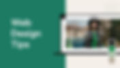

Never miss another article
For any queries to privacy concerns, please contact us at blogs@wix.com
This blog was created with Wix Blog