

- Aug 1, 2024
- 7 min read
“Design system” and “style guide” are two of the most common terms in design. When designers discuss web design and branding, they often mention one or the other. And although neither term is new, there’s still a lot of confusion regarding what they mean and how they differ.
Ahead, you'll learn the distinction between a design system vs style guide, plus how to use each to make your process more efficient when building Wix Studio websites.

What is a design system?
A design system is a collection of reusable functional elements, including components and interaction patterns, that allows product teams to create a unified, consistent experience across all digital products that an organization offers.
Components, design tokens, pattern libraries and guidelines are the four main categories that make up a design system. Let’s dive into more detail.
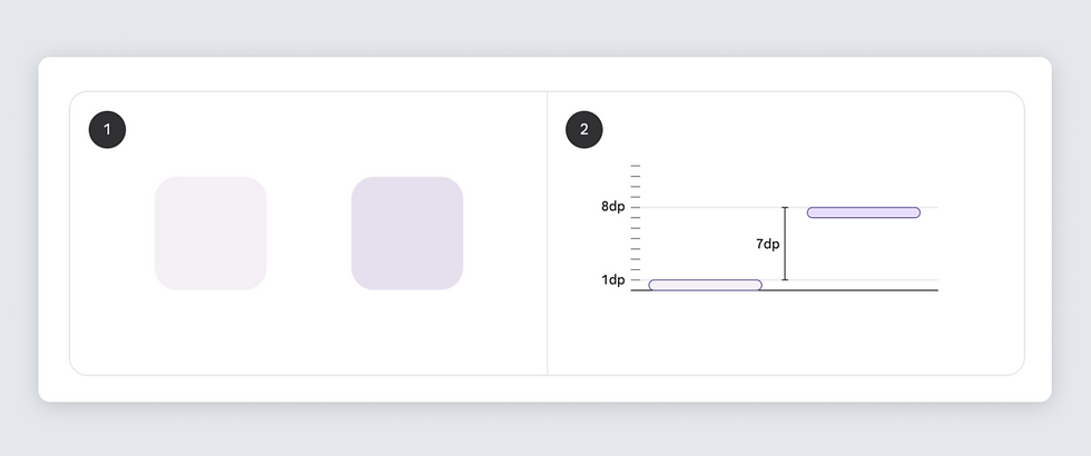
01. Component
A component is a modular piece of a user interface, such as a button, card or data table. Think of a component as a building block that allows designers to create a product. Well-designed components share two integral properties: reusability and modularity.
First, components in a design system are designed to be reusable, meaning they have a visual consistency that allows them to be used across a brand’s multiple products and projects, without having to be redesigned each time. For example, the same call to action button can be used for a contact form or as a primary call to action button on the landing page.
A component’s second necessary property, modularity, means that it's possible to combine a few components to create a new component. For example, you can combine a button and a card and create a component card with a button.

02. Design token
Design tokens are the visual design elements of a user interface, such as color, typography and spacing, represented as variables in a common format, such as CSS style property, that are used to construct and maintain a design system. No matter what design the team creates, whether it’s a mobile design or CMS web design, design tokens make it easier to turn the design into code.
For example, suppose you specify a token with a name “primary-color” and set a value for it. When developers implement your design, instead of hardcoding a value, they should use the token “primary-color.” So that the CSS code will look like this: “h1 { color: primary }”.
03. Pattern library
A pattern library is a subset of a design system; it's a collection of design patterns that can be used to build user interfaces. Common examples of design patterns are navigation menus and data input forms. The goal of a pattern library is to provide a repository of well-designed patterns that can be used to create consistent and efficient user interfaces. A pattern library allows designers to create specific components and write guidelines for using them to create consistent and efficient user interfaces.
04. Guidelines
Guidelines are the set of rules and best practices that advise how product teams should use components and visual styles. Unlike style guidelines, which we’ll get into more below, design system guidelines describe how components should behave functionally, and how users are expected to interact with them. Explicitly written guidelines help onboard new designers to the product since they help them understand how to make the interface functional and visually consistent.
Within guidelines is a subcategory called brand guidelines, or a set of rules and standards that define an organization's brand identity, including its visual elements (such as the brand's logo, typography and color palette) and the tone of voice that the organization uses to communicate with its audience.
Why do designers use a design system?
There are several reasons why product teams and designers should use design systems.
Design systems become a single source of truth for all designers involved in the product design process. Whenever designers need to create a new design or modify an existing one, they rely on the design system to get all the required information. Having a single source of truth is especially important on large-scale projects when multiple designers or design teams work together to create a product.
Design systems help to avoid situations when different team members do the same work twice (i.e. design the same component) or when team members create their own unique set of components that conflict with other parts of the designed product (visual or functional inconsistency).
02. They allow for scalability
Design systems make it easier for the design team to update design elements. As a product grows and becomes more sophisticated, the ability to introduce changes in the design without significant reworks becomes integral.
Well-crafted design systems result from the co-creation of designers and developers involved in the product design process. Since both parties contribute to the design system, it helps to establish a strong bond between two teams. Not only do the teams share the same visual and functional language when building a product, but they also actively collaborate during product design and development.
What are some examples of design systems?
Here are a few design system examples so you can see what we mean.
01. Wix Studio design system
Wix Studio's design system offers a comprehensive toolkit for designers and developers to craft beautiful and intuitive product experiences. We use it to create our website pages and Wix Studio applications. Read more about in in this piece on design system examples.
02. Material Design by Google
Material Design is a comprehensive design system that includes visual design guidelines, interaction patterns and a library of reusable components for designing and building digital products. Material Design was originally designed for Google's web products and Android, but because this design system is so versatile, it can be used for different product types.
03. Atlassian design system
Atlassian, the company behind Jira and Confusion, has a solid design system that provides guidelines, components and style guides for creating visually and functionally consistent experiences across the Atlassian product suite.

What is a style guide?
As the name suggests, a style guide is a collection of visual styles used in a product design, including colors, typefaces, imagery and negative space. A style guide is a part of the design system that defines the visual language of the product. Style guides can serve as a reference for designers and developers, providing a guide for creating new design elements that align with the established standards for the visual language.
Why do designers use style guides?
Similar to design systems, there are a few reasons brands rely on style guides to communicate how their brand should manifest.
01. They maintain brand cohesion
By adhering to a style guide, designers can create cohesive and professional-looking products that resonate with the audience and effectively convey the brand's message. Style guides not only streamline the design process but also help maintain brand integrity across all touchpoints.
02. They create a visual rulebook
While they don’t extend beyond aesthetics, style guides encompass the entire look and feel of a company. They're mostly the designer’s domain, as it’s their responsibility that the finished product is visually on brand.
03. They’re evergreen
Once a style guide is created, it forever dictates how a brand manifests (that is, unless said company goes through a rebrand). Even if designers change or you’re working with multiple designers at a time, the longevity of style guides remain intact.
What are some examples of design style guides?
Here are a few style guides to inspire your own.
01. Wix Studio
The Wix Studio style guide is intended for agencies, partners and enterprises that feature our assets. It includes all the info they need to honor our brand and logo.
02. Starbucks
The Starbucks style guide is a unique and expressive experience in and of itself. The brand includes a ‘theory’ tab and case studies, as well as logo, color, voice, typography, illustration and photography. The interactive brand style guide visualizing how their creative assets can be used across different channels.
03. Spotify
Spotify’s style guidelines state that they want to make it easy for their partners to integrate Spotify into their platform while respecting their own brand and legal licensing restrictions. This ensures cohesion across all experiences, and the guidelines and assets provided are platform agnostic (meaning they apply to all devices and software).
The difference between a UI kit and a design system
Don’t confuse a design system with a UI kit. A UI kit and a design system are both tools for organizing and managing the design of a product, but they serve different purposes. A UI kit is a collection of pre-designed graphical user interface elements, such as buttons, forms and icons, that can be used to create user interfaces.
On the other hand, a design system is created specifically for a particular organization. The goal of a design system is to provide a unified and consistent design experience across all products and platforms that this organization offers so that every element in a design system aligns with the brand's established standards.
Quick recap: design system vs style guide—what's the difference?
A style guide is a subclass of a design system that defines the visual language of the product. A style guide only covers visual styles such as colors, typefaces and white space (like kerning, leading, margins and padding). On the other hand, design systems go beyond just the visual design; the components are created on top of the visual styles defined in the style guide.
The design system also specifies the rules that help product team members use design consistently. For example, a design system might determine the exact font size that should be used in a component, like an input field.

Ultimately design systems are an umbrella within which style guides are contained. The benefits design systems bring to the organization are mainly consistency, efficiency and scalability. Design systems offer direction that make it easier for designers and developers to create cohesive and user-friendly products even as products and platforms evolve and grow over time. By establishing a solid foundation for a product's visual and functional design, design systems can help streamline the design process and support collaboration between people involved in the design process.
Start creating your website now on Wix Studio.

