- Mar 8
- 15 min read
Get started by: Creating a website → | Getting a domain →

Deciding on the right layout is one of the first steps in website design. Serving as the foundations of your site, a website layout can greatly impact how communicative and intuitive your site is.
From asymmetrical designs to classic patterns and split screens, this article includes 10 website layout ideas that will help you get it right the first time when figuring out how to build your website.
TL;DR: best website layout ideas
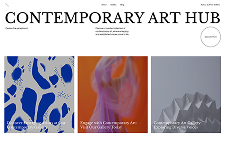
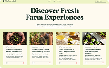
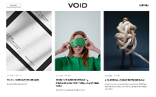
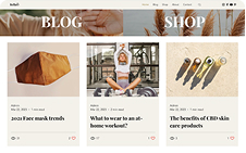
We selected these website layout ideas for their clarity, balance and ability to guide visitors through a seamless browsing experience. Whether you're building a portfolio website, online store or business site, these website layout examples show how the right structure can improve your website and help it function better too.
Here’s what we looked for when choosing these layout examples:
Visual hierarchy that makes content easy to follow
Layouts that balance imagery, text and whitespace
Navigation that feels intuitive and unobtrusive
Clear page goals supported by smart design choices
What makes a great website layout
Feature | Why it matters |
Clear visual hierarchy | Guides the visitor’s eye to key content |
Balanced use of space | Improves readability and makes content easier to digest |
Intuitive navigation | Helps users find what they need quickly |
Mobile-friendly structure | Ensures smooth experience across devices |
Purposeful CTA placement | Encourages users to take action without distraction |
Consistent alignment | Brings polish and professionalism to your design |
Adaptive layout styles | Supports different content formats and site goals |
What each example brings to the table:
Layout strategies tailored to different website types and audiences
Use of grids, cards and split screens to organize information
Strategic placement of calls-to-action and visual focal points
Flexible designs that adapt well across desktop and mobile
What is a website layout?
A website layout is the arrangement of all visual elements on a webpage. Through the intentional positioning of page elements, we can control the relationship between them to better guide the user experience.
Acting as a key component of web design, a layout determines the sequence in which page elements are registered among visitors, which elements draw the most attention, and the visual overall balance of the site. Because of its visual significance, a website layout can enhance a website’s message and usability.
Did you know that nearly all first impressions, 94%, to be exact, are shaped by a website’s design? This just goes to show how much your layout influences how visitors perceive and interact with your site. Put plainly, a good website layout can lead visitors’ focus in the right direction—gravitating them toward what matters most first, and then continue to the following sections in order of significance. A layout can also be used to enhance your design, create interesting interactions and show that you’re up-to-date with web design trends.
How to choose the right website layout
When approaching the task of choosing a website layout, there are two main factors to take into account.
Accommodate your content
The layout you choose should be fitting for your type of content. Why? A website layout needs to help tell the story you wish to deliver to visitors.
"[Observe] the balance of text versus images on any given page," writes Wix Template Designer Kobi Michaeli in his guide for selecting the right layout. "Some homepage designs are very design-heavy. They’re only meant to include a few lines of text next to a large, full-scale image. Forcing more text into these areas could throw off the balance of the whole page if you’re not careful.
"As another example, let’s say you’re working with a template that has big text blocks and proportionately small images. If you end up writing minimal content or adding large images in spaces better suited for icons, then things can start looking awkward."
Some types of website layouts are best used for showcasing products or works, making them more suitable for an eCommerce website or portfolio websites. Others convey factual information quickly and efficiently, and might work better for creating a blog or news platform.
Use common website layouts
While there’s room for creativity, the most well-known, tried-and-tested website layouts are usually the best option. These classic layouts tend to feel familiar to users, as they build on existing expectations, past experiences and the principles of design.
It's also worth considering some more general and commonly respected design principles. Gestalt psychology is often applied to website design and is especially relevant when it comes to the design of website layouts. This is because how elements are grouped, in order to create a positive user experience, lies at the heart of Gestalt theory. The main principles are:
Proximity: Elements that belong together, such as menu and navigation bar, should be grouped together for usability.
Similarity: Elements that look the same and behave the same should also be positioned together.
Continuity: This focuses on providing an easy flow for users through a webpage through continuity between elements. One way to do this could by implementing pagination.
Closure: This means users are not left with nowhere to go, or without another element to lead them through a page. Overlapping images are a good example of closure applied to a website layout.
Figure-ground related: Making sure the main elements of the site layout stand out from the background.
You might also want to consider applying the rule of thirds to your website layout. This a fundamental principle in photography and visual composition. It suggests dividing an image into a grid of nine equal parts by drawing two equally spaced horizontal lines and two equally spaced vertical lines, resulting in four intersecting points. It encourages designers to place key elements of interest along these lines or at the points of intersection. The idea is that by doing so, the composition becomes more visually appealing and balanced, as it avoids placing the subject or important elements directly in the center of the frame.
Since a familiar layout will result in a more intuitive, easy-to-use interface, we’ve highlighted 10 of the most effective layouts below. We’ll explain what makes them work and which type of website is the best fit for each. The visual examples included are all Wix website templates, which are fully customizable to match your style and needs.
Expert tip from Dafna Rabin, Wix Templates design team lead:
"Once you pick the right layout or template for you, it's really important to take the time to customize all your content. Many people overlook this step. Make sure you remove any unrelated images or paragraphs, and focus on creating a clear flow for the content that tells the story you want to share with your audience."
Read also:
10 best website layout ideas
01. Z-pattern layout
When coming across a new webpage, we immediately glance over it to take in the gist of things. This speedy scan, called skim reading, is often done in the shape of the letter Z or in zig-zag form. Our eyes move from the top left corner to the top right corner, then down to the bottom left, and finally to the right again. The Z-pattern website layout utilizes this reading habit through asymmetry by spreading important information across a Z shape.
Using this layout, a logo is usually placed in the upper left-hand corner of the homepage, so that it registers first. Across from it, in the rightmost corner, it’s common to place the navigation menu along with a prominent call-to-action.
The diagonal part of the Z-pattern, spanning across the page from top to bottom, is where the most attention-grabbing information should go - and this is where you can really use typography and emphasis to your advantage to make this impact count. This can be achieved by use of captivating visuals and a concise line of text that represents what the website is all about above the fold.
Toward the bottom of this Z-pattern, users should find your most important call-to-action (CTA). Whether you’ve been building up anticipation to purchase a product or book a service, now’s the time to get visitors on board and encourage them to take action.
This website layout idea is great for pages that are highly visual, and landing pages that serve a specific conversion purpose are usually a perfect fit.
02. F-pattern layout
Much like the Z-pattern layout, this design is also based on a common page scanning behavior. With webpages that are more text-heavy, we tend to skim or read the information in an F shape. This means that the top horizontal part of the page gets the bulk of our attention, and our eyes go vertically downwards from there, with the left-hand side tending to serve as our focal point.
When using the F-pattern layout, make sure to invest resources on the top fold of your page, where visitors are likely to linger longer. This usually includes a headline, subtitle and featured image—content that can introduce the remainder of the site in a compelling manner. You can also include anchor texts to lead visitors towards information and a navigation menu to guide them to the parts of your website that are most relevant.
The vertical line of the F-pattern on the left-hand side of the page can help make the text more appealing. This can be done using imagery, icons, your color palette or with formatting elements such as bullet points or numbering.
An F-pattern layout is suitable for websites that mainly revolve around text. When creating a blog, for example, this website layout is applicable for both the homepage and the individual blog post pages.

03. Fullscreen image layout
With an extra large visual placed front-and-center, a fullscreen image layout can result in an eye-catching and immersive homepage design. Large media features can convey a lot about who you are and what you do in as much as a glimpse. The great thing about this layout is that it looks great on mobile devices, too.
The visual you use can be anything from a photograph to an illustration or video. Either way, it should be high quality and relevant to your service, product or overall feel in order to take full advantage of this layout.
Your fullscreen image should also be accompanied by a short line of text to further explain what the site is all about. Craft a strong header or a catchy slogan to introduce what you offer as a business, exciting visitors to explore more.
A fullscreen image layout is great for businesses that want to highlight a specific niche or product and who have great visuals in their arsenal of marketing assets. For example, photography portfolio websites will proudly reveal new series or styles of photographs for sale, while a wedding website can make a heartwarming impression with a photo of the happy couple.
04. Split screen layout
By vertically splitting the screen down the middle, a split screen layout creates a perfectly symmetrical balance and avoids the presence of negative space. This neat division into two parts allows for each section to express an entirely different idea—or alternatively, to support one idea from two different angles.
The website layout template shown here presents a dining experience with an eye-catching visual to the left, and text and matching vector art to the right. The layout enables both sides to fully complement each other, rather than compete for attention. This same design can also work well in cases where site visitors are asked to choose between two opposing options, such as ‘Men's’ and ‘Women’s’ categories in an eCommerce website.
To make the most of the split screen layout, consider incorporating some motion by making each half of the screen behave slightly differently. For example, you could employ parallax scrolling effects on just one side of the screen. Another option is to extend this layout onto the second fold of your design too, but swap the content on the two sides of the screen for added visual interest.
A split screen layout is ideal for websites that offer two significantly different types of content, or websites that want to evenly combine written copy and imagery. Online stores that segment users by age, gender or behavior are a good fit for this layout.

05. Asymmetrical layout
Similar to the split screen, this stylish website layout also divides up the website composition—but this time, the two parts are not equal in size and weight. This asymmetrical shift of balance from one side to the other creates visual movement, making the entire design feel more dynamic.
Through a non-uniform distribution of scale, color, space and width across the page, visitors’ focus can be drawn to specific elements over others. To achieve this in your own website layout, you’ll want to give certain elements more visual weight—making them bigger, bolder or brighter—so they act as focal points.
Decide which part of your content you wish to highlight. This can be anything from a photo of a product to call-to-action encouraging people to sign up. Then, make it stand out using high color contrast, enlarged proportions, and other types of visual emphasis.
An asymmetrical layout is ideal for websites that are going for the contemporary and innovative look, and are interested in driving user engagement. A business website or online portfolio of a design agency are good examples.

06. Single column layout
This website layout includes all of its content in one vertical column. It’s a simple, straightforward design (and in fact, it’s the one used on this very page).
Navigating a single column layout is easy —visitors immediately know to scroll down the page for more information. However, there’s one important website navigation tip to keep in mind using this layout:add a “Back to Top” button or a fixed menu to help users explore your site further.
When using the single column layout for text-heavy sites, remember to break up the text every so often with imagery, line breaks, headers or sub-headers. This is a great layout idea for long-form content websites, or websites that display content in chronological order— anything from blogs to social media feeds.
07. Box-based layout
The box-based, or grid-based website layout merges multiple pieces of content into one geometric design. With each bit of information neatly constrained into a box, the elements don’t overshadow one another—resulting in a unified look. Each box leads to a different webpage, where users can learn more about the topic they’re interested in most.
A recommended practice is to add one large featured box to serve as your website’s header and tie different boxes together below. The featured box can include the page’s title and a brief explanation of its content, along with a menu for navigation. Another tip is to curate the visuals in each of the boxes so that they work together well, creating a cohesive brand identity.
If you’re building a website on Wix, the Wix Pro Gallery is a great way to create this layout. With quality images displayed, you’ll enjoy full control over your box-based layout, starting with the number of columns and rows, down to their size and spacing.
This is an ideal layout for a website that includes many important pages. For example, it’s a good solution for a graphic design portfolio, where you can conveniently link each box of the homepage design so that it leads to a different project page.
08. Cards layout
Much like the box-based layout, a cards layout uses multiple boxes or other rectangular-esque containers to display diverse content. This website layout is for the most part non-hierarchical, meaning that no one item truly stands out over the others, and all of the information is treated equally.
With all cards carrying identical features (in terms of size, font, etc.), it’s easy to import your content into each one. This results in a modular design that’s a good fit for all screen sizes, and allows for intuitive and approachable browsing despite the large amount of information, improving the user experience.
A cards layout is a great idea for a content-rich website, especially perfect for a vlog or online store.
09. Magazine layout
Deriving inspiration from printed newspapers, the magazine website layout is based on a multi-column grid to create a complex visual hierarchy. By implementing containers that can be modified individually, a magazine layout lets you prioritize major headlines over smaller articles.
This can be done by playing with the size of your elements (larger images and headlines are the first to command our attention), placement (the article at the top of the page will usually be the first we read), or with the amount of design detail provided (an article with an added photo draws more focus than one with just plain text).
Note that the magazine layout also utilizes the F shape skim reading pattern, as mentioned earlier, catering to readers’ decreasing attention spans. Combining the F-pattern with a more complex grid enables large quantities of information to be broken down into digestible reads, while retaining a sense of order and a clean, uncluttered design.
The magazine layout is a fantastic choice for content-heavy websites such as news publications or blogs.

10. Horizontal strips layout
This website layout breaks up the long scroll of the webpage into full-width strips. With each strip functioning as a fullscreen fold (or close to fullscreen), the diversified composition builds user anticipation with a different surprise each time they scroll.
To make each strip different from the one before, try using a different shade from your website color scheme in each strip, or by including images on some strips and written copy on others. In addition, by incorporating effects like parallax scrolling on your strip, you’ll be able to infuse this layout with a sense of motion and depth in the website background.
This layout is particularly beneficial when it comes to one page websites, especially with long scroll designs.
Learn more: What is web design?
What are the main elements of a website layout?
A website layout typically comprises a header, containing the logo and navigation menu; a main content area, presenting the core information or services; sidebars for additional content or navigation; a footer with supplementary links and copyright information. When planning your website layout it's important to be with consistent with your use of color, typography and spacing for visual cohesion. These elements collectively create an intuitive and engaging user experience.
Firsthand insights from a wedding entrepreneur

A strong website layout should feel intuitive and organized, just like running a smooth event. Rob Corrall, co-founder and CEO of Second Song, emphasizes the importance of adaptability: “You have to be adaptable, intuitive and comfortable navigating all kinds of personalities and last-minute changes.” Similarly, a well-structured website layout anticipates user needs, guiding visitors effortlessly through your content without confusion.
The right tools can bring your layout to life while enhancing functionality. “Dynamic pages allow us to build out personalized content, like individual DJ profiles and location-specific service pages, without needing to recreate layouts each time,” Rob shares. Features like these make your website feel personal and efficient, creating a seamless experience for visitors while supporting your business goals.
Why trust Wix’s experts?
This article was created by Wix’s in-house website experts, with years of experience helping people build and grow successful websites. The tips, templates and examples shared here come directly from real Wix projects, so you can be confident they’ll help you create a website that looks professional, functions smoothly and supports your long-term goals.
At Wix, we’ve guided millions of entrepreneurs, creators and business owners in bringing their ideas online. Our team stays up to date with the latest in website design, user experience and SEO, making sure the advice you get is both practical and proven to work in real-world projects.
Think of this blog as your trusted resource for every stage of website creation, from building your first page to growing a site that reaches your audience and evolves with your goals.
Website layout ideas FAQ
What is a good layout for a website?
A good website layout is one that is easy to navigate and understand. It should be visually appealing and engaging while highlighting your most important content. Make sure to consider your target audience, the purpose of your website, the content, the navigation and the design when you are planning your website layout.
What are some tips for designing a website layout?
Keep it simple. Don't overload your website with too much information or too many features.
Use white space. White space is important for creating an easy-to-read layout.
Use a consistent design throughout your website. This will help create a sense of unity and make your website look better.
Use high-quality images and videos. Images and videos can help break up your text and make your website more aesthetically pleasing.
Make sure your website is responsive. This means that your website will look good on all devices, including desktop computers, laptops, tablets, and smartphones.
What are some examples of popular website layouts?
Single-page scroll: Present all content on a single page, enhancing simplicity and flow.
Grid layouts: Organize content in a grid for a clean and balanced look.
Card design: Use card elements for modular content, facilitating easy navigation.
Minimalist mesign: Embrace simplicity with ample white space, emphasizing key elements.
Split screen: Divide the screen to showcase contrasting content or features side by side.
Full-screen imagery: Capture attention with impactful, full-screen visuals as a background.
What are the 4 main parts of a website layout?
The four main parts of a website layout are the:
Header: The top section, usually containing the website logo, navigation menu, and contact information.
Content body: The main body of the website, where you display your most important content.
Sidebar: A vertical or horizontal section on the side, often used for widgets, navigation or additional information.
Footer: The bottom section, typically showcasing copyright information, links to other pages and social media icons.
What are some of the most commonly used website layouts?
Some of the most popular website layouts are:
One-column: Simple and clean, ideal for minimalist designs and content-heavy websites. It works well on blogs, for example.
Two-column: Provides a balanced layout for content and sidebars, offering flexibility with visual hierarchy. A two-column website layout is great for websites that need to balance content with additional information or features. This can include blogs, ecommerce sites and online news publications.
Grid layout: Uses a grid system for organized and visually appealing content arrangement. A grid layout is a great choice for websites that need to present information in a structured, organized and visually appealing way. Portfolio sites often use it.
Asymmetrical layout: Offers a dynamic and creative approach, breaking traditional grid structures. An asymmetrical layout is a good choice for websites that want to break away from traditional structures and create a sense of dynamic energy and visual interest. This makes it a good choice for art portfolios, fashion websites and websites for creative agencies.
These layouts are popular due to their flexibility, ease of navigation, and visual appeal.
How do I register a website domain name?
To register a website domain name, start by choosing a domain name that reflects your brand or purpose and is easy to remember. Next, search for availability using a domain registrar like Wix. Once you find an available name, follow the registrar’s steps to complete the registration process, which involves providing your details and paying the required fees. You may also have the option to add privacy protection to keep your personal information private.


