- Mar 17
- 4 min read

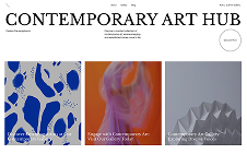
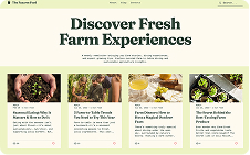
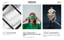
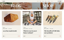
Above the fold refers to everything website visitors see on a web page before scrolling. In most cases, this includes the website header as well as the hero section.
Technically, every page on a website has an above-the-fold area. However, since the many visitors see an above the fold on a home page as their first website interaction, it often requires the most attention in web design.
“Above the fold” is a term that originated in newspaper publishing. When newspapers are placed in a newsstand, they get folded in half. Because of this, people only see the top half of the front page when walking by a newsstand. As a result, publishers and editors put a lot of work into deciding what goes above the fold. This includes not just the news headlines and photos, but also the header which contains important branding information like the paper’s logo and publication data.
Use Wix's website builder to create your site from above the fold to the end.
Where is the fold on a website?
The location of a fold line on a website varies, as users visit websites from different devices and browsers. Device type, screen size, browser dimensions and resolution can all impact where the fold lands.
Responsive website design platforms will indicate where the fold should go. Typically, a website builder will gives three responsive breakpoints to customize.
For example:
Desktop: 1920px x 1080px
Tablet: 960px x 540px
Mobile: 360px x 640px
The breakpoint length is the invisible fold’s location.
Why is the website above the fold area so important?
Since the above-the-fold area is the first thing visitors see when they come to a website, it makes this important digital real estate. It takes a fraction of a second for users to form an opinion about a website and it more often than not happens above the fold.
Websites are a lot like books. They contain a lot of information and require a big commitment from a user. The above the fold area on a home page serves a similar purpose as a book cover. Everything from the imagery to the excerpt tell the user what they can expect to find within its pages.
Studies from Missouri S&T, Human-Oriented Technology Lab and Google found that consumers will form a first impression of a website in less than a second. Users can afford to make these snap judgments because they can easily find another site that offers similar content.
When designing a website’s above the fold, designers also have to account for the many reasons why a user may lose interest, including:
The design is boring.
The content takes too long to load.
The text is hard to read or uninteresting.
The offer is irrelevant.
The entire section has too much content and is difficult to navigate.
As a result, the a modern website design's above-the-fold experience has to be as close to perfect as possible.
Best practices for above the fold design
As far as how to design a website, keep these best practices for effective above-the-fold designs in mind:
01. Make it load fast
Internet users have no patience with slowing loading websites. An above-the-fold section must load in under three seconds to connect with the most visitors.
02. Design for mobile first
Above-the-fold designs can vary across devices, but they must contain the same content, according to Google’s indexing best practices.
Start with designing the mobile experience to prevent over-designing a hero section or navigation and focus on the most critical content and features. More elaborate designs for bigger screens can be completed later.
03. Make the logo prominent but not overwhelming
The logo plays a crucial role in establishing a brand identity. Regardless of which page people land on, ensure the logo is above the fold, visible and legible.
04. Declutter the header
Don’t allow a website header’s design and contents to drown out the rest of the above-the-fold content. Only include what’s needed in the header and keep the design minimal. Try to keep the number of elements in the header to no more than seven.
05. Design the hero section to support current business goals
The hero section is the big banner that stretches from the header down to the fold. This is the first thing visitors see and interact with, so ensure messaging that offers clear value. For instance, eCommerce sites commonly showcase new products and advertise sales above the fold.
06. Create a clear textual hierarchy
On the home page, the hero section typically contains a minimal amount of text, for example just a headline or a sub-headline/description. Regardless of text amount, the above the fold should establish a clear hierarchy through font size, weight and legibility. This hierarchical structure also helps optimize a page for search engines.
07. Make the design memorable but minimal
A hero section needs just one strong visual element to support messaging. An embedded video to elaborate on a high-tech concept would work, for instance. So would a friendly, web design trend forward illustration that sits beside a headline.
08. Include a call-to-action or scroll button
A hero section should provide visitors with guidance after they finish reading content. One option is to include a call-to-action button taking them to an internal page or helping them complete an action, like adding a product to their cart.
Another option is to add a scroll button or arrow. If the home page has a compelling story to tell about a brand or product, then scrolling beneath the fold can make sense.
09. Don’t place ads above the fold
Visitors first encounter the above-the-fold section of a site, so don’t promote another company’s site or product. Also save sales pitches for lower down in a website. Some visitors need time to read and digest before they want to convert.
10. Use data to optimize the above-the-fold experience
Once a website is live and collecting data, start to analyze the above-the-fold performance with certain metrics. If a home page has a bounce rate over 80% as well as an average time-on-site of less than a few seconds, that can mean the above the fold area doesn’t hook visitors right away.
Use this data in conjunction with user research to hypothesize about what could be wrong. Then do A/B testing to validate. Performing these tests regularly can incrementally improve a hero section and header over time.
Learn more about how to make a website with our extensive guide.


