

- Aug 16, 2023
- 5 min read
Updated: Apr 30, 2025
Back in May, HBO Max and Discovery+ officially merged into Max, a streaming supergroup with a huge catalog of content.
Of course, this quantity and range of programming poses a messaging challenge: how can you be everything to everyone while also building a cohesive brand? To signal the change, the platform adopted a new tagline, “the one to watch,” and new, bright blue visuals—a big switch from HBO Max’s previously moody royal purple—by London creative studio DixonBaxi.
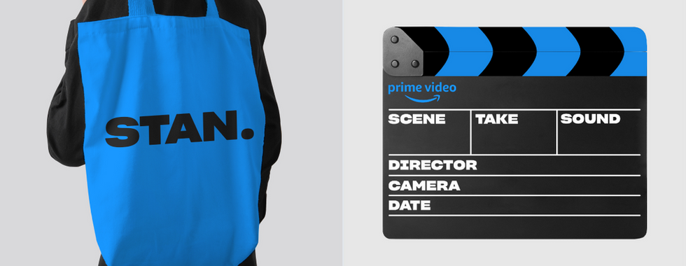
Max isn’t the only streamer in its blue period. Take a look at your dock and you’ll notice that aside from Netflix and Hulu, all the major streaming platforms have gone blue: Amazon Prime Video, Disney Plus, Paramount+, Warner Bros. Discovery, and finally, its subsidiaries HBO and Discovery+’s 2023 merger and rebrand as Max.
More and more streaming companies are taking color theory cues from corporate industries that have vied for mass appeal in the past—namely, aughts-era tech companies, and the auto and banking industries before them—and buying into blue as their brand color of choice.
This comes at a time when the business of streaming is scaling up: streamers are getting larger, acquiring each other, merging with broadcast conglomerates and legacy mega-studios, and becoming increasingly like other corporate behemoths. In order to compete for market space, streaming services need mass appeal and mass buy-in.


Images courtesy DixonBaxi.
Blue’s not niche, and that’s why it’s the right choice for big streamers
Blue provides this mass appeal, says Sagi Haviv, a Chermayeff & Geismar & Haviv (CGH) partner, who led the rebrand for Warner Bros. Discovery’s family of brands following parent company WarnerMedia’s 2022 merger with Discovery. And CGH knows a thing or two about corporate and entertainment branding: the famed agency crafted the logos and identity systems for NBC, National Geographic, Animal Planet, Discovery+, PBS, Hearst and Univision, among many others.
“Blue has properties that can work for many different brands and many different audiences, and fulfill many different personality traits,” Haviv says. “From our conversations over the years, if you ask people their favorite color, blue is mentioned the most. The person that doesn’t like blue is an unusual voice.” That’s important for a streamer like Max that’s vying to appeal to lots of different user personas.

It seems then, that streaming services could be defaulting to blue because of its relative inoffensiveness: it’s friendly but not brash, serious but not maudlin. It’s the safe option for brands that want to be seen to be authoritative, trustworthy—ultimately, inoffensive. Few potential users would see a brand with blue at its core and assume it’s not for them.
“Blue can be perceived as a neutral—it doesn’t have a point of view on things,” says Italian graphic designer Riccardo Falcinelli, author of the best-selling book about all things color, Chromorama. He points out that blue jeans aren't really seen as blue at all—you can happily pair them with anything. “Blue isn't linked to particular feelings: it’s used as a mark of seriousness and authority.” Blue has the capacity to be both bright and subdued; corporate and optimistic; striking but subtle enough to let other brand elements stand out.


Images courtesy Chermayeff & Geismar & Haviv.
For legacy companies, blue signals brand cohesion
When it comes to Warner Bros.’ rebrand specifically, color choice was all about “the tradition of the brand,” according to Haviv. (Though they modernized it by making the logo adaptable so it could take on different colors depending on the context.) When you think WB, you think of the WB shield. That’s not brand equity you want to give up.
It seems a secondary use of blue branding in modern streaming is simply due to the fact that many of the legacy studios and TV networks (like Warner Bros. Studios, Paramount and Discovery) have historically used the color as a core component of their brand, and when they acquire other, smaller platforms and bring them into their fold, they also bring them into their brand world. Super-streamers are carrying over elements of the original visual brand, like color, to create a sense of cohesion across formats on the part of the user.
The hue was also already part of the Amazon parent company’s brand world, according to Pentagram partner Emily Oberman, and it was ultimately the client that pushed Pentagram to use the color for Prime Video.
“When we started leaning into the blue, our approach was to go at it really hard: we let that blue tell the story and be really vibrant—as recognizable as it could be,” she says. “It’s meant to be the voice of the brand—to speak to the audience and say ‘we’re in this with you, we’re fans too, we’re charmingly nerdy, we’re here to be your guide and your friend.’” The color also seeps into the platform itself in a more subdued way than in the marketing assets, she says.
Video courtesy Pentagram.
Functionally, it streamlines streaming
According to Oberman, whose portfolio includes a long list of entertainment clients (30 Rock, The Tonight Show Starring Jimmy Fallon, Saturday Night Live, Bupkis, and Wonka, among others) blue’s popularity in the streaming world could also be attributed to the fact that the color is “sort of optimistic,” she says. “It feels cool and calm. Maybe people just want something simple, clean and easy to grasp.”
On a functional level, that sense of simplicity is vital for streaming branding, which ultimately needs to let the individual programs, rather than the branding, do the talking. “Blue doesn’t get in the way of the content—it doesn't feel overpowering. It’s safe, but it's bright,” says Oberman. (Read more about color meanings here.)


Images courtesy Pentagram.
Haviv draws a comparison between color use in the early days of social media and color use now, in what he calls the early days of streaming. Both, in an effort to build a wide, appeal-to-everyone user base, went for blue. “It’s almost like nobody wants to make a bold move—nobody wants to be the tall daisy,” he says of the current era.
But eventually, someone will. It all depends on the context of the work and the goal of the client. “We’ve created entertainment brands of all colors and shapes: NBC is a total multicolor thing,” says Haviv, referring to then-CGH partner and current design legend Steff Geissbühler’s 1986 rebrand of the broadcast network’s iconic Peacock logo. “For us, it’s about what’s appropriate. It’s really trying to appeal to as many people as possible, and everybody is under pressure to get the most viewers and the most subscriptions.”
With that, he points to the biggest outlier in the market: “Netflix is red: over time, you’ll start seeing more services break that blue streak—so expect that, because it’s going to happen.”


.jpg)

