Monitor organic performance with GSC data in Wix Analytics
- Feb 9, 2023
- 8 min read
Updated: Nov 7, 2023
Updated: March 13, 2023
Author: Mordy Oberstein

Google Search Console (GSC) is one of the most crucial tools for site owners that care about search visibility. Not only does GSC data come directly from the source itself (Google), it also offers a 360° view of your site, from how well it’s performing to the links it has acquired.
By integrating Google Search Console’s Performance reports into Wix’s analytics reports, we’ve made actionable SEO data far more accessible for site owners who want to use these insights to improve their site functionality and gain more organic traffic.
Let’s explore what the integration brings to the table and ways you can take advantage of the insights it offers. In this guide, we’ll cover:
Wix Analytics Search Console Reports: An overview
This integration brings with it a trove of potential data, so it’s worthwhile to understand how the reports work and what is contained within them.
Before we do, let me first tell you what Search Console Performance data is all about.
The Performance data in Search Console (upon which the Wix Analytics GSC Reports are built) helps you understand what’s happening with your website on Google. You can use it to find out the following (and more):
Is Google ranking my pages? Which ones?
How often are those pages being shown to people searching on Google?
How often are these visible pages being clicked on and bringing people to my website?
All of this is part of what makes GSC the seminal SEO tool.
Functionality
You can access Wix’s analytics reports by selecting Analytics & Reports within the left-hand navigation menu of your Wix Dashboard (as shown below). Next, select Reports within the submenu to bring up the full array of analytics reporting available to you.

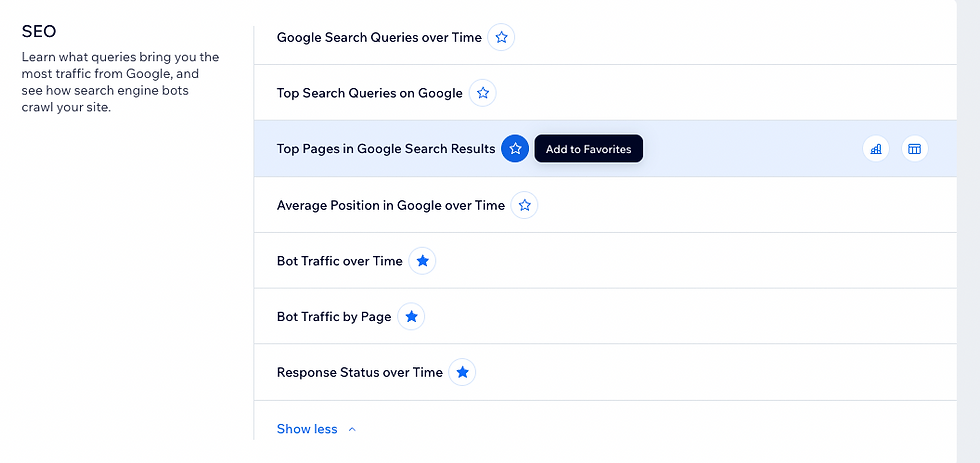
Within the SEO section of the main analytics dashboard are four reports that pull in GSC data:
01. Google Search Performance Over Time
02. Top Search Queries on Google
03. Top Pages in Google Search Results
04. Average Position in Google over Time
Depending on the report, you will have the option to visualize data as a line graph, a line split graph, a combo chart, or a table.

Each data view has its own particular advantages, which we’ll explore more of later in this article.
The top section of each report lets you filter and adjust the data to your needs. This includes setting a reporting and/or comparison period, selecting primary data metrics, etc.

You can also use these settings to drill down and refine the data you want to analyze by filtering by device, country, etc.

Further, you can schedule reports to automatically get sent to your email address or to download the data for further customization.

Lastly, should you customize the way the data is displayed, you’ll have the option to save this as a preset for the next time you visit and review the report.

The performance data available in Wix’s GSC Analytics reports
Before we explore what’s contained within each of the GSC Analytics reports, let’s briefly review the data metrics available within them. These are the foundational metrics you’ll encounter:
Impressions — The number of times a link to your site appeared in Google search results.
Clicks — The number of times someone clicked a link to your site in Google search results.
Click-through Rate (CTR) — The percentage of impressions that were clicked.
Average Position — Your site's average position in Google search results (excluding paid search).
These metrics are the same ones you’ll find in the Performance reports within GSC itself. If, at any time, you’re unsure as to what a metric means, simply click on the link to View report definitions located under the report’s name.

Understanding the data in your Wix Analytics GSC reports
Now that we’re aware of the data we’ll be working with, let’s explore the actual Wix Analytics GSC reports in greater detail.
Google Search Performance over Time
As opposed to the other two reports we’ll discuss, the data here (while it can be refined) offers a top-level understanding of what is happening with your site as it pertains to Google’s search results.
The line chart within the Google Search Performance over Time report provides you with a historical look at how your site has performed on Google. For example (in the image below), I have the report set to show trends reflecting how many clicks my site received per month during a six-month period, compared to the previous six-month period.
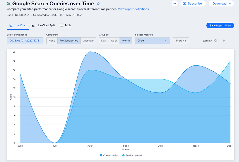
I can use these insights to evaluate if my SEO efforts have been effective in attracting more clicks to my site over time.
The report lets you do the same for both impressions and CTR, and can be filtered to show data for a specific device, region, or search query.
As an example, I’ve filtered the report to only show clicks that came from a mobile device (as shown in the image below). Right away, I can see that the dip in clicks during the previous period did not occur when desktop data was excluded (compare to the image above). That might be a good starting point to dive deeper into the data to find out what the cause might be.

As I mentioned, the line chart helps me see data in aggregate—I can look at aggregate data for multiple search terms, but I would not be able to see them displayed individually. That’s where the line chart split comes in. Here, I can see impression, click, and CTR trends for specific search terms in comparison to others.
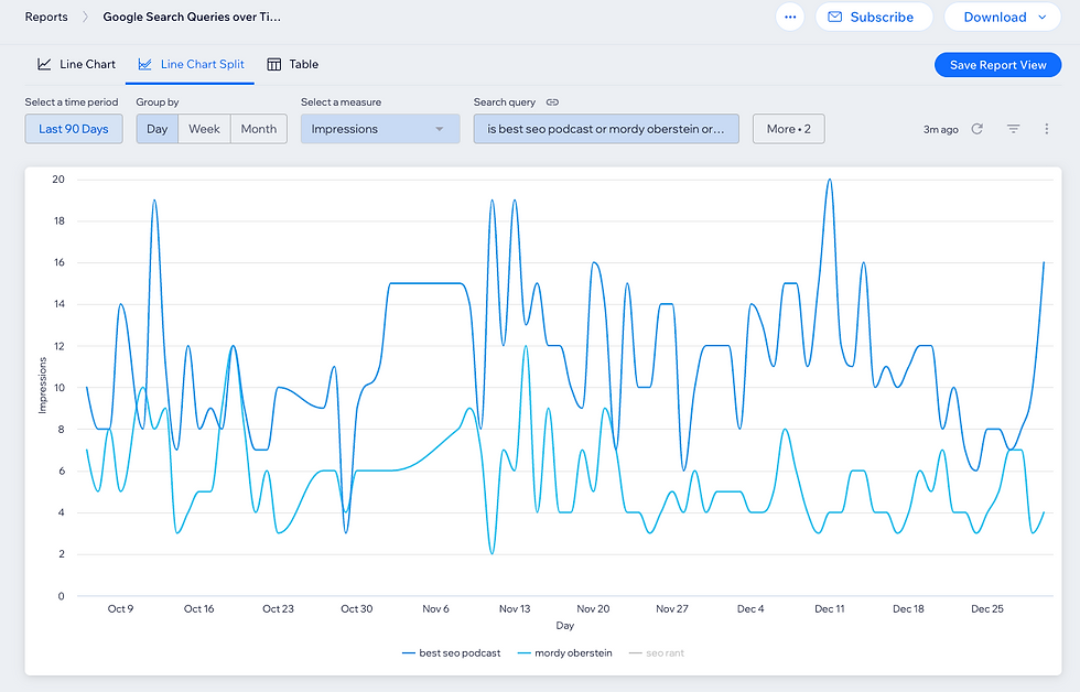
This data can help me identify search queries that my site performs well for (and, just as importantly, underperforms on) and can even help me track any relationships between various search terms. For example, if the site sells sporting goods, I could see if the various search queries related to basketball all perform in a similar way. This could help me understand how relevant the site is not just at the keyword level but topically as well.
Lastly, the table data view skips the trends-oriented graph so that I can work with the metrics in different ways, including comparing multiple metrics to each other all at once. This includes average position, which was not available in the trends reporting (average position has its own set of trends reports that we’ll discuss later on).

Here, too, you can filter the data according to device or region, and you can select to show data only for specific search queries.
In the example below, I’ve opted only to view data on a select few search terms and I’ve also set the table to show increases/decreases compared to the previous period:

You can also customize which columns you want (or don’t want) to see.

This way, if you wanted to be able to reference the specific search query, you could add a column to do so. This would allow you to sort the table according to search query as well.
Top Search Queries on Google
The Top Search Queries on Google report helps you immediately identify which queries are your site's top performers (according to impressions or clicks).
Moreover, you can apply a secondary metric (either average position or CTR) to help you better qualify the data.
In the screenshot below, I’ve set impressions as the primary metric (see the blue bars) and average position as the secondary metric (reflected by the individual data points).
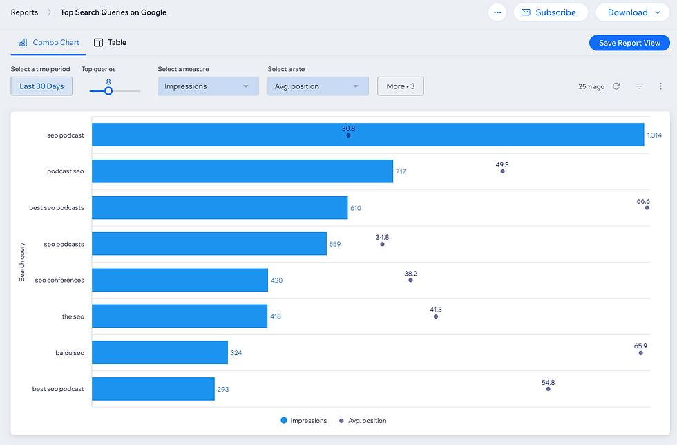
You can see there are about 750 more impressions for the search query seo podcast than there are for the term seo podcasts (plural) despite the average rank being within the same vicinity.
The obvious question is, why?
Are there just more searches for the term seo podcast than there are for seo podcasts? Does the small position difference mean something in terms of how the results page is structured (resulting in one term producing more impressions than the other)? The data here helps me identify inconsistencies so that I have a starting point to dive deeper.
For example, one of the things I might do is head to the line split view within the Average Position over Time report (coming soon) and compare the two search queries. Perhaps there was a spike in impressions for one of them (which would indicate that, for a brief period of time, the page ranked higher than usual) as, again, we are looking at average position. It’s entirely possible that the averages for both keywords are similar, but that one of them sees fluctuations that push the page higher up in the rankings from time to time.
Again, the data here is a great starting point to dive deeper so I can better understand my site’s performance.
Remember, you can also adjust the report to your needs. The settings within this report let you set how many queries you want to analyze and allow you to filter according to device and region, or to select a specific query.
The table view of the Top Search Queries on Google report offers you an easy way to review the entire scope of your query performance.
Here, I’ve ordered the table according to country, with comparison data added in as well:

Top Pages in Google Search Results
Oftentimes, what we care about are not necessarily the search queries, but how the pages on the site perform overall. At the end of the day, your goal might be to understand how a page performs across all of the search queries that drive impressions and clicks from Google.
For this, you can use the Top Pages In Google Search Results report.
Similar to the Top Queries On Google report, you are automatically served with your top-performing assets—in this case, pages across two metrics. For example (in the screenshot below), I have impressions as the main metric (represented by the blue bars) and the average position shown as the specific data point:

Check out the table view if you want a more comprehensive view of the data.
In the screenshot below, I’ve removed the date column so that the table shows the aggregate totals for the entire reporting period (as opposed to a per-day breakdown):

Average Position in Google over Time
Where the pages on a site rank on Google (i.e., their rank position) can significantly impact the number of impressions and clicks they receive.
The Average Position In Google Over Time report helps track how a site ranks over time, both for specific search queries and in aggregate.
While the line graph view can show trends for specific search queries, it defaults to showing the average position for all keywords that have resulted in an impression during the data period.

The line chart split graph lets you dive a little deeper by enabling you to compare the average position of multiple search queries against each other.
Below is the average position for the two search queries I called into question above, seo podcast and seo podcasts:

Despite them both having similar average positions at the end of the data period, you can clearly see that for most of the period seo podcast ranked higher. The most logical reason why I saw more impressions for seo podcast and not seo podcasts has little to do with how often people search each term on Google. Rather, the site ranked higher for one term and therefore received more impressions.
Of course, and at the risk of sounding repetitive, you can filter and segment this data accordingly.
Making SEO data more efficient and available for all
In sports, there’s a famous saying: the best ability is availability. That’s what we aimed to do when integrating Google Search Console into Wix Analytics. We wanted to make some of the most important SEO data available to you in a way that makes it more accessible than ever.
We manifested this in the way we display the data and in the way we made data comparisons and filtering easier than ever. At the end of the day, you now have a tool that makes the bedrock of SEO insights not only more available to you, but accessible for you as well.
For an equally accessible overview of your site’s impressions and clicks over time, along with specific page and query metrics at a glance, check out the Wix SEO Dashboard, the central location for all your SEO capabilities.

Mordy is the Head of SEO Branding at Wix. Concurrently he also serves as a communications advisor for Semrush. Dedicated to SEO education, Mordy is one of the organizers of SEOchat and a popular industry author and speaker. Twitter | Linkedin

