


Build and design your modern website

Drag and drop editor
With Wix's flexible editor, you can build a modern website exactly how you picture it. Arrange striking sections, layered visuals and custom layouts with a drag and drop website builder, no code required.
Design features
Give your modern website a polished edge with scroll effects, smooth transitions, hover states and dynamic animations that bring every section to life.
AI creation tools
Use a free ai website builder to craft sharp, on-brand copy, refine your layout descriptions and add sections that keep your modern website looking current and professional.
Built-in growth tools
Scale your modern website with eCommerce features, email marketing, SEO settings and powerful integrations that grow alongside your brand.
Trusted by over 290M users
.png)

Content ideas for your modern website
Explore website design ideas for your modern site to build something visually striking that feels fresh, professional and built for today.

Hero section
Set the tone with a full-bleed hero that balances white space, sharp typography and a single call to action. Modern hero sections strip away clutter and let the visuals carry the first impression.

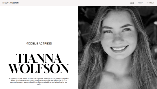
About page
Pair a minimal layout with a strong photo and a few short paragraphs to tell your story. Modern About pages avoid walls of text and use generous white space and clear typography to feel approachable and current.

Work showcase
Display your work in a structured grid with plenty of white space between each piece. Add subtle hover effects or project labels to give your modern site that polished, intentional feel.

Services or products
Use a card-based layout to present your services or products without visual noise. Pair each item with a short headline, a one-line description and a clear CTA for a modern, conversion-focused design.

Testimonials
Place client quotes in minimal, well-spaced blocks with a name and photo. Modern testimonial sections avoid heavy styling and let the words speak clearly against a simple background.

Contact section
End with a low-friction contact section using a short form and a clear heading. Modern contact sections keep fields to a minimum and use generous white space to make reaching out feel effortless.
Modern website design FAQ
What is modern website design?
Modern website design is about creating a site that looks clean, works well on any device and is easy for visitors to use. It focuses on clear layouts, fast loading, good typography and visuals that support your content rather than distract from it. A modern website feels current and intentional, whether you are a freelancer, a small business or a creative professional.
What makes a website look modern?
A modern website usually has a clean, uncluttered layout with plenty of white space. It uses a simple color palette, easy-to-read fonts and high-quality images or videos. Navigation is intuitive, pages load quickly and the site looks great on both desktop and mobile. If a site feels easy to use and visually consistent, it almost always comes across as modern.
Do I need to know how to code to build a modern website?
Not at all. A free website builder like Wix lets you design a professional, modern-looking site without writing a single line of code. You can customize templates using a drag and drop editor and use built-in AI tools to generate layouts, write content and set up your site in a fraction of the time.
How long does it take to build a modern website?
It depends on how complex your site needs to be. Using a website builder, you can have a simple, polished site live in a day or over a weekend. A more detailed site with multiple pages, a blog or an online store typically takes one to three weeks. If you are hiring a professional to build a fully custom site, expect the process to take four to eight weeks or more.
How much does a modern website cost?
The cost varies widely. Using a free website builder like Wix, you can get started for free and upgrade to a paid plan starting at a few dollars a month. If you hire a designer or agency, a basic small business website typically costs between $2,000 and $10,000. Larger, more complex sites can cost significantly more. The good news is that modern tools and website templates make it easier than ever to build a great-looking site on a modest budget.
What is responsive design and why does it matter?
Responsive design means your website automatically adjusts its layout to fit any screen size, so it looks great on a phone, tablet or desktop. This matters because more than half of all web browsing happens on mobile devices. A site that does not work well on a phone is frustrating to use and can hurt your rankings in search results. Most modern website builders handle responsive design for you automatically, so you do not have to think about it.
What colors work best for a modern website?
Most modern websites stick to a limited palette of two or three main colors. A neutral background such as white, off-white or a soft gray paired with one strong accent color tends to look clean and professional. Bold, high-contrast color combinations are trending, as is dark mode with light text. The most important thing is that your color choices reflect your brand and make your content easy to read.
How do I make my existing website look more modern?
Start by simplifying. Remove anything that feels cluttered or outdated, such as too many fonts, busy backgrounds or small unreadable text. Update your images with higher quality photos, refresh your color palette and make sure your site loads fast on mobile. Even small changes like improving your typography or adding more white space can make a big difference in how current your site feels.
What is the difference between a modern website and an outdated one?
Outdated websites tend to have cluttered layouts, too many fonts, slow load times and designs that do not work well on mobile. Modern websites are fast, clean and designed around the user's experience. They use consistent branding, clear calls to action and visuals that feel intentional. If a site looks like it was last updated a decade ago and is hard to navigate on a phone, it is likely outdated.
What are the most important features of a modern website?
The biggest ones are fast loading speed, mobile-friendly design, clear navigation and strong visuals. Beyond that, a modern website should have a clear purpose on every page, a call to action that tells visitors what to do next, and content that is easy to scan. Website security (an HTTPS connection), accessibility and good SEO are also part of what separates a truly modern site from the rest.