- Oct 20, 2022
- 5 min read
Updated: Aug 31, 2025

When you make a website design for your business, here’s something to think about: while symmetry might seem like a safe (and aesthetically pleasing) choice, it’s not always the best choice. In certain situations, an asymmetrical layout may be the out-of-box design element you prefer or even need.
While imbalance can feel uncomfortable, asymmetry doesn’t necessarily mean out of balance. If you want to learn more about balance—an important web design principle—and understand how you can apply it to your website in interesting ways, keep reading.
We’ll look at the differences between symmetrical and asymmetrical balance, and the effects it can have on your users.
What is symmetrical balance?
Balance is one of the most important principles of design, and it refers to an evenly weighted composition. By using an equal distribution of elements, designers create visual harmony. Rather than one or more elements overpowering the entire composition, each element contributes to the greater whole (for more information, see our guide on Gestalt theory).
Symmetrical balance refers to an object or composition that looks the same across or around its axis due to an even distribution of elements. As a result, the composition feels safe and stable.
Types of symmetrical balance
You can use these different types of symmetrical balance in web design:
Reflection symmetry
Most of us imagine this type when thinking of symmetry. A line goes across the center, effectively cutting the composition in half. We see a more or less identical image on both sides.
Take the word “wow,” for example. A line cut through the word’s center leaves us with a mirror image on both sides:

“Wow” also happens to maintain symmetry when cut vertically:

Rotational symmetry
This type of symmetrical balance occurs when identical elements rotate around a central axis. The elements don’t necessarily need to attach to the axis, nor do the elements need to be uniformly sized throughout the graphic.
As the axis turns, the image looks the same due to the layout and element’s symmetry. The petals around a flower exemplify how this type of symmetry works. In addition to having rotational (radial) symmetry, this flower also has reflection symmetry. However, that’s not always the case.

Translational symmetry
This kind of symmetry pertains specifically to the objects within a larger composition. The individual objects don’t need to be symmetrical in design. However, the exact object must repeat across space to be translationally symmetrical.
A honeycomb is the perfect example of translational symmetry. Even if it has jagged edges or missing pieces, the repeating cells within it are symmetrical in shape, size, and angle.
A design has translational symmetry when you can place the elements on top one another and they perfectly match up.

What is asymmetrical balance?
Asymmetry—as opposed to asymmetrical balance—refers to an object or composition with unevenly distributed elements. Asymmetry’s lopsided nature can create unease and tension for the viewer. That is, unless the design brings balance.
Here’s an example:

Although the empty space in this visual is beautiful, the viewer feels an element is missing. But by applying asymmetrical balance, we can turn this into a complete composition:

We don’t need to make an asymmetrical design symmetrical to bring stability. Asymmetrical balance is all about visual weight. By adding enough elements or depth to the composition’s other side, we reduce the dominant element’s power.
In the example above, text weighs down the image on the left. Not only does it add visual balance, but it changes how the viewer perceives the photograph.
You can balance an asymmetrical design in many ways. But is asymmetry the right choice when you create a website? We’ll explore this next.
Asymmetrical balance vs. symmetrical balance in web design
Balance can help your visual content make a lasting impression on visitors and customers alike. But which kind of balance will best suit your website?
Let’s look at the benefits and differences of each.
Using symmetrical balance
Most people find a symmetrically balanced design aesthetically pleasing. With nothing out of place or “fighting” for attention, the viewer can appreciate the composition as a whole.
But symmetrical interfaces are not always a conducive choice in web design. For example, symmetrical balance harmonizes all elements within the interface. Without any friction, this can sometimes make symmetrical designs monotonous and boring—and if you want visitors to focus on what you’ve written, or to take action on your offer, you’ll need to pique their interest.
What are the benefits of symmetrical balance?
When you build a website, you want to provide a great user experience. Symmetrically balanced designs can help you deliver your content to visitors in a straightforward manner.
Symmetrical design is also useful for discovery. Because symmetrical website layouts are ordered and predictable, they’re generally easy to understand and navigate. Visitors won’t have a hard time finding what they want.
When should you use symmetrical design?
Symmetrical balance is best used for more formal events and buttoned-up enterprises. It’s also good for companies centered around peace and wellness.

That said, even if your brand isn’t known for its formality or elegance, symmetrical balance can come in handy when designing certain parts of your website. Take the features section on your home page, for instance.

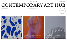
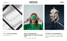
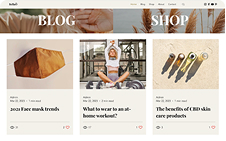
Unless you want to prioritize one feature over another, design each of the blocks symmetrically. This goes for the actual sizing of the blocks, the spaces between them as well as the content within them.
Also, it may benefit you to use symmetrical balance in any section of your site that you want visitors to read, rather than scan.
Using asymmetrical balance
Because an asymmetrical design feels uneven, it can create tension or disorganization. That said, asymmetry tends to be more dynamic and can make visitors feel more excited and energized.
To reap asymmetry’s positive effects, you need to maintain visual balance. A haphazard approach to asymmetry won’t benefit you or your visitors, so you must strategize your asymmetrical design choices.
Perhaps asymmetry’s biggest drawback is that it can cause visitors to miss parts of your website. Because asymmetrical objects and layouts steal so much of a person’s attention, less visually interesting elements can fade into the background.
What are the benefits of using asymmetrical design?
Asymmetrical balance makes asymmetry an effective approach to web design. When done right, it can feel more modern, energetic and alive than its symmetrical counterpart.
Because your users will find asymmetrically balanced objects and layouts more interesting, you have more control over which page elements they’ll focus on, allowing you to ensure they discover everything they need.
Designers also find asymmetrical balance freeing and more fun to play with since you don’t have to make everything uniform. Again, though, there’s a tradeoff. With more freedom of expression comes more challenges.
When should you use asymmetrical balance in your web design?
To decide if asymmetrical balance fits your web design, first look at your brand identity and personality. If you use words like “modern”, “creative” and “independent” to describe your brand, then you may benefit from asymmetrical balance.
Also, because of asymmetrical balance’s dynamic feeling, brands that deal with sports, movement and other activities should consider using it.

Just keep balance in mind: Even if you have an edgy and unique brand, your entire website doesn’t need to look that way.
Learn more:

Asymmetrical balance belongs in site areas with big, bold, yet brief statements like the hero image, the call-to-action banner and maybe even your online portfolio. If you can contain your asymmetrical element with tons of white space, that might be all the stability and balance it needs to look and feel good.
Learn more about how to make a website with our extensive guide.


