- Sep 26, 2025
- 16 min read
Updated: Dec 9, 2025

Contact us pages are a bit undervalued in website design. Some designers save up all their creative energy for the homepage, the shop or the portfolio. While these pages are certainly the priority, the humble contact page is also worthy of attention—if contact information isn’t easy to find, 44% of website visitors will leave.
A contact page is the place where you provide information such as your email address, phone number, mailing address and location, created using an online form builder. Using attractive and compelling design ideas, they draw in clients and encourage website visitors to engage with the brand. The following websites boast unique and engaging contact page examples.
As you create a website and potentially start a business of your own, feel free to draw inspiration from these examples when designing your contact us page.

Need inspiration for your website? With Wix, building a standout site is easier than ever. Choose from hundreds of customizable templates and use Wix’s easy drag-and-drop website builder tools to make your vision come to life. Turn your ideas into reality and see just how simple it is to create a unique, professional website.


TL;DR: contact us page examples
Finding the best "Contact us" pages isn’t just about aesthetics—it’s about usability, clarity and trust. We reviewed dozens of websites and highlighted the ones that make connecting with a company easy and straightforward.
What makes a great contact us page
Prioritize clear and accessible contact information
Include multiple ways to reach out (forms, email, phone, chat)
Make the page visually simple yet trustworthy
Ensure mobile responsiveness and fast load times
Feature | How we selected examples |
Visibility | Contact info is easy to find without scrolling |
Usability | Forms are simple, intuitive and error-free |
Engagement | Pages encourage interaction with clear CTAs |
Design | Clean layout, readable fonts and clear hierarchy |
Trust | Includes location, team info or social proof |
"The most important thing before building a website is good research. Know what you want to do and collect good inspirations that will contribute to your design." - Anna Suntsov, blog and social design team lead at Wix
15 contact us page examples
01. June Digan

The top section of June Digan’s contact page is a stunning visual that grabs attention instantly. The words "Let's work together on your next project" sit beautifully on a full-screen illustration, setting a playful creative vibe. This clever design pulls visitors into the artist's world, blending an inspiring message with eye-catching visuals. It feels personal, inviting and full of heart—an experience that stays with you.
The contact page on June Digan’s site keeps things simple and effective. The design is clean and easy to navigate with a clear call-to-action inviting users to collaborate. You’ll find two main ways to get in touch: a direct email address for commissions and inquiries and a quick no-fuss contact form design. The form is super user-friendly, asking only for the basics like name, email and message.
"Follow along on Instagram for the latest projects and updates" invites visitors to connect with the artist's work in a more personal way. By sharing updates on social media it creates a stronger connection and builds a growing community around the brand.
View more minimalist websites and contact pages for inspiration.
Like what you see? Build your own contact us page with this same template.

Template name: Start from scratch website template
02. Truly Craft Chocolate

The contact page for Truly Craft Chocolate is as delightful as their chocolate. A bold image of vintage telephones paired with a vibrant red flower sets the tone—playful, nostalgic and full of handcrafted charm. It perfectly captures their blend of tradition and creativity.
Moving clouds behind the subscription section bring a sense of lightness and motion, creating an inviting, dreamlike feel. The playful "For Post & Liebesbriefe Only" section encourages old-school mail to their Munich address, adding humor and personality. Easy-to-find contact options like email and social media links keep things accessible, while links to stockists and the shop make it simple for visitors to explore what they offer.
Like what you see? Build your own contact us page with this same template.

Template name: Flower shop website template
03. The Robin Collective

The Robin Collective's contact page is the perfect mix of professional and fun. It features a simple contact form for inquiries along with a friendly confirmation message. A physical address, phone number and email are all listed, giving people multiple ways to get in touch. Plus, the clearly stated operating hours are a thoughtful addition, helping set clear expectations for response times.
Vibrant design, playful imagery and creative vibe capture the brand's quirky personality. Social media links like Facebook, Twitter and Instagram are seamlessly included, making it easy for users to connect further. The "Subscribe for Updates" section invites visitors to join the community.
Like what you see? Build your own contact us page with this same template.

Template name: Design studio website template
04. Lumo

Lumo’s contact us page is clear and minimalistic, using text and white space rather than images. The background is a soothing dark green, helping it pop even without the use of visuals.
The contact page begins with the header “Let’s Talk,” followed by a short paragraph encouraging people to get in touch. It also includes their email address and a link to their Instagram and Facebook pages. To the right of this is a contact form where visitors can submit their own name, email address and message.
Like what you see? Build your own contact us page with this same template.

Template name: Photographer website template
05. Sophie Westfall

Sophie Westfall gives her graphic design website a dreamy feel by adding animated butterflies to her contact us page. She replaces the usual “Contact Us” heading with a friendly “Hello!” Before asking people to get in touch, she gives them a reason to contact her by explaining a bit about her background and experience.
To make things convenient for her site visitors, Sophie provides them with multiple options for reaching out. Her email address, LinkedIn profile and Instagram page are linked to directly from the contact page. Below these links is a form that lets people send her a message directly through the website.
Like what you see? Build your own contact us page with this same template.

Template name: Hair salon responsive template
06. Yukai Du

Yukai Du contact page nails the balance between global reach and user-friendly artist website design. By splitting contact details into regions—Worldwide, USA/Canada and Asia—it ensures questions go to the right team, keeping things efficient and hassle-free. This setup shows users they’re in good hands with their needs handled by the right people. Plus, adding direct emails and agency links for each region amps up the transparency, making it super easy for clients and collaborators to reach out.
What makes this page pop is how it mixes function with personality. Bold social icons and familiar logos add a creative, vibrant vibe that matches the brand’s artistic energy. From Instagram to Behance to Vimeo, it’s a gateway to the Yukaidu world inviting users to connect and collaborate in inspiring ways.
Like what you see? Build your own contact us page with this same template.

Template name: Artist website template
07. Bodyrock Bootcamp

Bodyrock Bootcamp is a fitness training program with a website that effectively reflects its brand. Its contact us page uses strong shapes and bold text and balances the seriousness of a black-and-white design with the subtle addition of energetic colors.
On the first fold of the page is a contact form that asks for all the standard details - name, email, phone number and message. Below that, they provide their own phone number and email address, coupled with an enticing offer for a free one-on-one session. This offer, which seems too good to pass up, encourages people to get in touch, try out their services and become dedicated clients.
Like what you see? Build your own contact us page with this same template.

Template name: Start from scratch website template
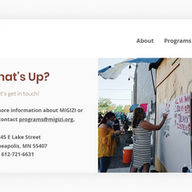
08. MIGIZI

MIGIZI is a youth education program that clearly displays its work and mission on every part of their site—including their contact us page. This page is essentially split into two parts, with their contact information on the left side and a large photo of their program on the right. The image not only makes the contact us page visually attractive, but it also emphasizes the program’s merits to interested partners and participants.
The contact page includes three unique elements: an interactive Google Maps image displaying their location, a donation button and an email signup button. This helps cater to each type of visitor - from people who want to donate to those who want to subscribe to their newsletter.
Like what you see? Build your own contact us page with this same template.

Template name: Women empowerment NGO website template
09. Mane Ethical Hairdressing

Mane Ethical Hairdressing’s website boasts a user-friendly, easy-to-navigate contact us page with a stunning layout. As a service business, she puts the most critical element at the top of the page: a “Book an Appointment Online” button that lets clients schedule an appointment directly through the site.
Below the booking button is a phone number, email address and physical address, as well as the business’s opening hours and a box for people to send a personal message. To the right of this information is a large photograph showing an unclaimed cup of coffee and a cookie - beckoning clients in for an afternoon drink.
Like what you see? Build your own contact us page with this same template.

10. Ice Mobility

From looking at Ice Mobility’s website, it’s clear that they gave due attention to their contact us page. The page has strong visual appeal, with a behind-the-scenes photo of their company directly beneath the header. They also preface their contact page with a pun - “Let’s break the Ice” - eliciting a chuckle and making the brand feel approachable and relatable.
It’s clear that Ice Mobility would “love to hear from you,” and they promise high-quality customer service and quick response times. This helps encourage people who otherwise may not be motivated to reach out, while giving visitors a sense of their strong brand values.
Learn more about how to make a website with our guide.
Like what you see? Build your own contact us page with this same template.

Template name: Marketing agency website template
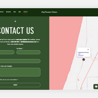
11. Lakeside Resort

Lakeside Resort creates one of the most inviting contact us page examples by making it incredibly simple for visitors to connect with the right person. Instead of a single generic contact form, they provide specific email addresses for different departments like accommodations, retreats and the spa. This thoughtful approach, set against a stunning full-bleed background image, immediately directs users where they need to go.
The beauty of this page is its brilliant simplicity and focus on the user. By segmenting contact information, they remove guesswork for the visitor and ensure inquiries are handled efficiently. This is a great lesson for any service-based business: think about why your customers are reaching out and create clear pathways for them to get the help they need.
Like what you see? Build your own contact us page with this same template.

Template name: Hotel website template
12. Young Na Kim

Young Na Kim’s page is one of the most powerful contact us page examples because of its bold minimalism. The design is incredibly clean featuring only a direct call to action “Let’s start a conversation” , a single email address and social links. This stripped-back approach removes all distractions and makes the single next step perfectly clear for any potential client.
The genius of this page is its confidence. It trusts that the user has already been impressed by the portfolio and is ready to connect without needing extra persuasion. This is a fantastic lesson for designers and freelancers if your work speaks for itself your contact page can be a simple open door.
Like what you see? Build your own contact us page with this same template.

Template name: Artist website template
13. Extraweg

Extraweg offers one of the most compelling contact us page examples by blending a personal statement with clear ways to connect. The page opens with a confident paragraph that explains the artist's work philosophy and openness to collaboration. This intro sets a professional yet approachable tone before guiding visitors to a simple contact form and a comprehensive list of social media links.
The real power of this page is how it doubles as a mission statement and a point of contact. It not only tells you how to get in touch but also who you are getting in touch with and what they stand for. This is a brilliant lesson for creatives and agencies looking to build contact us page examples that attract the right kind of partnerships.
Like what you see? Build your own contact us page with this same template.

Template name: 3D designer website template
14. Scrub Heaven

Scrub Heaven's page is a perfect example of how a simple and direct approach can be incredibly effective for contact us page examples. The page gets straight to the point with a clean design centered around a single contact form. By keeping it minimal it ensures visitors can send their inquiries about products or returns without any distractions.
What’s so smart about this page is the reassuring confirmation message that appears after submission. The friendly "We will contact you shortly" message manages expectations and lets the customer know their message has been received. This is a great lesson in how small details can create a positive and trustworthy user experience.
Like what you see? Build your own contact us page with this same template.

Template name: Accessories shop (refined) website template
15. Daydreamer Domes

Daydreamer Domes provides one of the smartest contact us page examples by anticipating different user needs right away. The page opens with clear instructions telling visitors exactly who to call or email for specific high-value inquiries like weddings or retreats. This directs important leads to a faster response channel while providing a general contact form for all other questions.
The genius of this page is its efficiency and thoughtful direction. It empowers users to choose the best contact method for their needs which shows respect for their time. This is a great lesson for businesses with different customer segments to learn how to create contact us page examples that serve everyone well.
Like what you see? Build your own contact us page with this same template.

Template name: Family restaurant responsive website template
Editor’s note: This template comes from Wix Studio, our advanced platform designed specifically for professionals and agencies. Wix Studio offers powerful tools, full design flexibility and enhanced functionality—perfect for creating a website that truly reflects your brand and expertise.
The websites featured here were built with Wix and show what’s possible with real, DIY designs. They represent functional, effective and thoughtfully crafted options that help people run their businesses.
How the best contact us pages get it right
The best contact pages are simple but intentional. They’re clear, approachable and built with the visitor in mind. By removing obstacles, staying focused and encouraging real conversations, these pages transform a small section of your site into a powerful connection point.
Let’s explore what makes these pages so effective and how you can use those strategies to level up your own.
Clear the way for easy contact
The best contact pages make it easy for people to get in touch. Every second of confusion or hesitation is a chance to lose a lead, so they keep things simple. Instead of overwhelming visitors with long forms, they stick to the basics—name, email and message. If extra fields are needed, they’re added thoughtfully, like dropdowns to route inquiries to the right team.
Mobile-friendliness is a must. Many visitors use their phones to reach out, so the best designs make forms easy to tap, legible and quick to load. Features like autofill and field hints can save time and reduce effort. The goal is to remove every obstacle standing between someone and the “Send” button.
Answer questions before they're asked
Before someone fills out your form, they usually have a few quick doubts. Will I get a reply? Am I reaching the right person? Is there a quicker way to get help? Great contact pages answer these questions upfront. Something as simple as “We reply within 24 hours” can build trust and make people more likely to reach out.
Some sites take it up a notch by offering multiple contact options—like different emails for press, sales or support—while also linking to FAQs or help centers. This makes it easier for users to get what they need and cuts down on misrouted or duplicate questions.

Best contact pages feel like part of the brand
The worst contact pages feel generic, like they were thrown together at the last minute. The best ones, on the other hand, feel like a natural extension of the rest of the site. They use the same fonts, colors, voice and visual elements you’d find on the homepage or about page.
Learn more about website homepage examples and About Us page examples.
Your brand’s personality shines in the little things—a friendly headline, a photo of the team or a personal note from the founder. Even small touches, like button text or background images, can strengthen your brand identity. If your site is playful, serious, minimalist or bold, your contact page should match that vibe seamlessly.
Take a cue from the best websites when planning your next design.
Lead visitors to take the leap
The best contact pages are built for action. They guide visitors to it with smart design and clear calls to action. Instead of a boring “Submit” button, they might say “Let’s chat.” This small change makes the experience feel more personal and less robotic.
You’ll often find useful extras like business hours, physical locations or links to social media. These give visitors more ways to connect with your brand. Some contact pages even go the extra mile with a map, a booking tool or a quick FAQ section to keep things interactive and helpful.
Learn more: FAQ page examples
Turn a form into a conversation
The best contact pages feel like an invitation. Use a tone that’s friendly and welcoming, not stiff or overly formal. A simple message like “We’d love to hear from you” creates a sense of openness and encourages communication.
Some sites add a personal touch by showing a photo of the person who will respond or by including a few words about what happens after the form is submitted. Even a thoughtful thank-you message after submission—automated or not—can go a long way. When a contact page feels personal, visitors are more likely to reach out and more likely to come back.
Learn more: What is Wix Forms?

What to include on your contact page (and why it matters)
A great contact page should feel welcoming—not like a dead end. Before someone fills out a form or hits "call," they’re asking themselves: Am I in the right place? Will someone respond? Can I trust this brand? The content and layout you include help answer those questions. With thoughtful writing, useful details and purposeful layout choices, you can turn a simple form into the start of a real conversation. If you're designing websites, this is one page that deserves extra attention. Here's what to include to make reaching out easy—and worth it.
Start with a warm welcome: Kick things off with a friendly line like “Let’s connect” or “We’d love to hear from you” to make visitors feel at ease.
Keep your contact form simple: Stick to the essentials—name, email and message. Add extra fields like dropdowns only if they truly help.
Offer alternative ways to reach you: Not everyone prefers forms. Include an email, phone number, social links or a chat button for flexibility.
Set clear expectations: Let people know when they’ll hear back or which method is best for urgent inquiries.
Include location details if needed: If you’re a local business or meet clients in person, add your address, hours or a map.
Show personality: Use language and visuals that reflect your brand. A bit of humor or friendliness can go a long way.
Build trust with social proof: Add a quick testimonial, client quote or logo to reassure visitors you’ve done great work before.
Organize contact options by purpose: If you manage different types of messages (like support or media inquiries), list separate emails or form options.
Add smart design touches: Use icons, sections or tabs to keep the page clean and easy to navigate.
Use action-driven buttons: Replace generic “Submit” with something more engaging like “Send message” or “Let’s talk.”
Thank visitors right away: After someone submits the form, show a confirmation with next steps or links to helpful resources.
Make it visually engaging: Add a team photo, custom illustration or stylish graphic to make the page feel personal and branded.
Easy contact page copy ideas by business type
Great contact page copy should feel like a conversation, not a formal exchange. The best pages use friendly and simple language that sets expectations, invites interaction and matches your brand’s personality. If you’re a creative freelancer or a growing business, thoughtful copy builds trust and makes reaching out feel natural.
Here are a few ideas to help you get started:
Service-based businesses
Let’s talk about your next project
Need a hand? We’re here to help
Have a question? We’re just a message away
Want a quote? Fill out the form—we’ll follow up ASAP
Looking for reliable help? Let’s connect
Creatives and freelancers
Want to work together? Let’s make something great
Say hello—your idea might be our next project
Looking for a creative partner? Start here
Tell me about your vision—I’d love to hear it
Let’s create something original together
Ecommerce and product brands
Need help with your order?
Questions, feedback or just saying hi?
Looking for something specific? Drop us a note
We’re happy to help—just fill out the form
Got product questions? Ask away
Health, wellness and lifestyle brands
Let’s connect—your wellness journey starts here
Have a question about our services or classes?
We’re here to support you—reach out anytime
Need more info? We’re happy to help
Curious about how we can help? Let’s talk
Education, coaching and personal brands
Interested in working together? Let’s chat
Ready to take the next step? Start the conversation
Have questions about my programs or courses?
Let’s talk about how I can help you grow
Reach out and let’s see if we’re a good fit
Contact us page FAQ
What is a typical contact us page?
A typical contact us page is a simple section on a website where users can reach out to the business. It usually includes a short form with fields like name, email and message. Many also offer direct contact options such as a phone number, email address or physical location. The layout is often minimal and focused on making communication quick and straightforward.
What is a creative way of saying "contact us"?
Instead of “Contact Us,” try something more inviting like “Let’s Talk,” “Start the Conversation,” “Say Hello” or “We’d Love to Hear From You.” These options feel warmer and more personal, making it easier for visitors to reach out. The best fit depends on your brand’s tone—casual, professional, playful or approachable.
How to do a contact us page?
Decide what kinds of inquiries you want to get and create a short, straightforward form that collects only the essentials. Add helpful details like alternate contact options, office hours and response times to manage expectations. Use a tone and design that match your brand and ensure the page is mobile-friendly and quick to load. Test the form regularly to make sure it works smoothly and messages come through without a hitch.
What should I write in the contact us page?
Got questions? We’re here to help! Reach out anytime and we’ll get back to you as quickly as possible—usually within 24 hours. Need advice, guidance or just a quick answer? Don’t hesitate to ask. We’re all about making things easy and sharing what we know. Let’s chat!
What is an example of contact information?
Here’s how to share contact info that works for your business:
Email: hello@yourbusiness.com
Phone: (123) 456-7890
Address: 123 Main Street, City, State ZIP
Want to make it even easier? Add links to your social media or a quick contact form. Share what makes sense for your style and how you’d like people to reach you.


