

online store
bookings
events
popup
Mobile Menu Tab Bar
By
Give customers one-tap access to key pages
5.0
Free to install

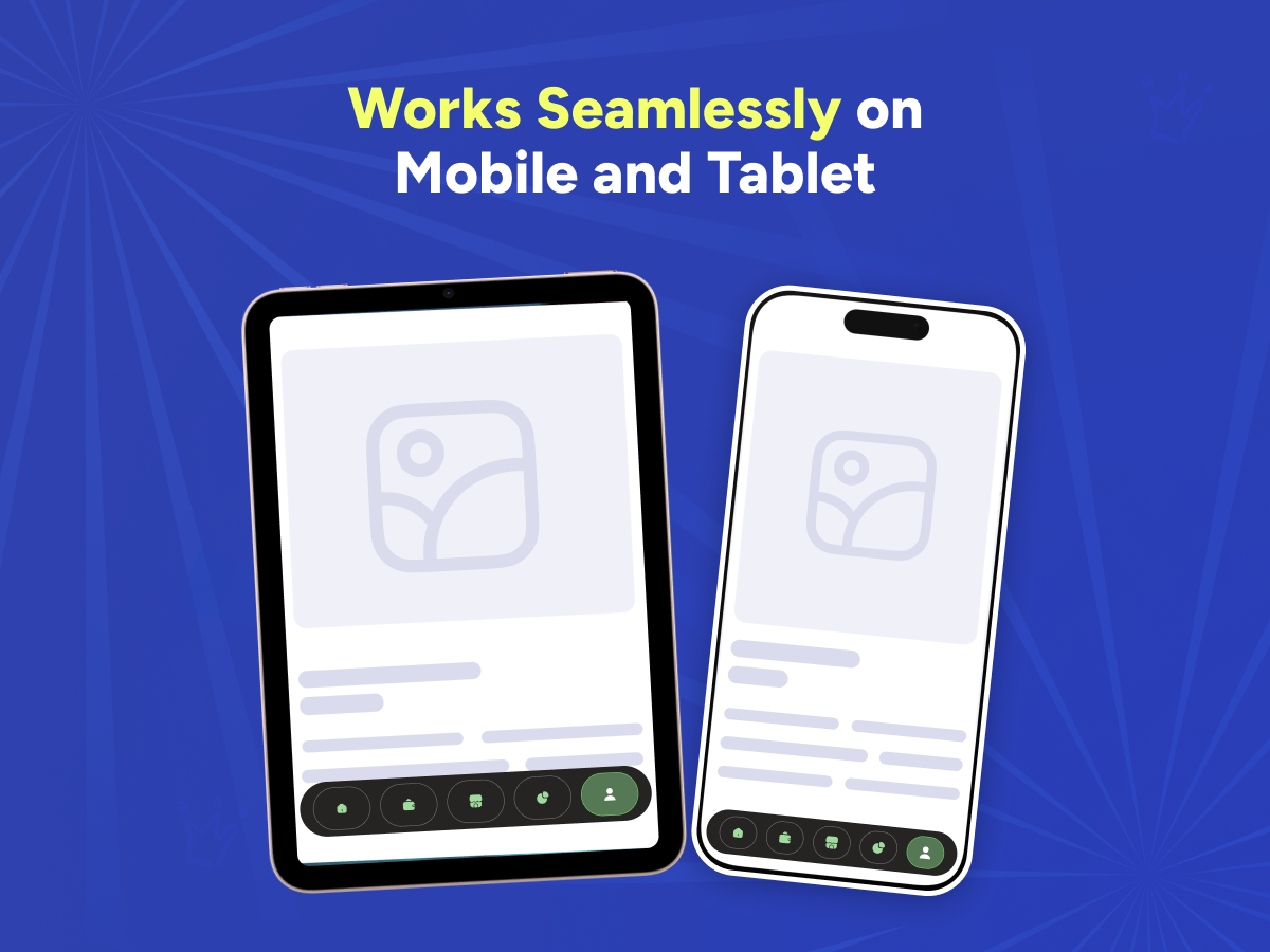
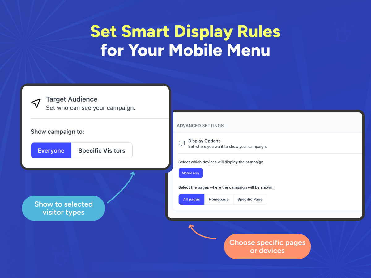
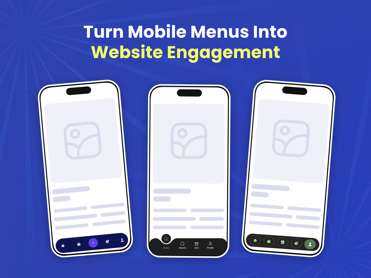
Mobile Menu Tab Bar overview
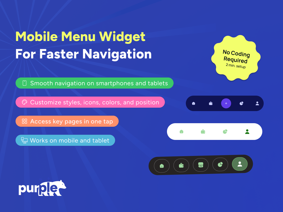
- Mobile-First Navigation: Deliver smooth, intuitive navigation optimized for smartphones and tablets
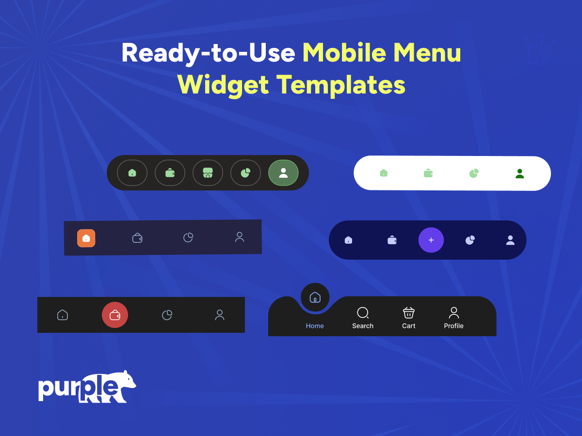
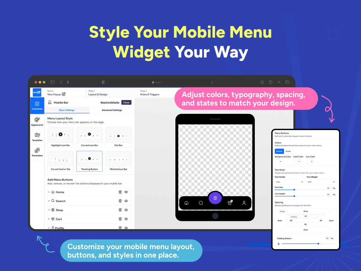
- Multiple Menu Layouts: Choose from styles like floating button, curved tab, minimal bar, flat bar, and highlighted icon layouts
- Full Customization: Adjust icons, colors, spacing, shapes, and active states to match your brand identity
- One-Tap Access: Let customers quickly reach key pages such as Home, Search, Shop, Cart, and Profile
Availability:
This app is available worldwide.App languages:
English,
French,
German,
Italian,
Japanese,
Polish,
Portuguese,
Spanish
5.0 Average Rating
5 reviews
5
5
4
0
3
0
2
0
1
0
Sort by:
DE
Demongfootman/ May 20, 2026
good
PU
team PurpleBear
thank you!(0)
Thank you for your feedback
AR
Arberrexha58/ Apr 28, 2026
Amazingmy webs are amazing, responsive and inovatiove
PU
team PurpleBear
Thank you for taking the time to leave a review — we truly appreciate it.(0)
Thank you for your feedback
GE
Gezegenonline/ Apr 16, 2026
Bayuldu Uşak
PU
team PurpleBear
Thank you!(0)
Thank you for your feedback
PA
Paulairvine8/ Apr 3, 2026
yes thank you brilliantgreat app thank you
PU
team PurpleBear
We really appreciate your positive feedback.(0)
Thank you for your feedback
CA
Canercinar34/ Mar 17, 2026
Güzelgüzel beğendim kolay ve anlaşılır bir uygulamaydı hızlı oldu :))
PU
team PurpleBear
Thanks so much for your review!(0)
Thank you for your feedback
Pricing & plans
Usage based pricing plan
Free to install
Flexible monthly pricing based on usage
3-day free trial
Low-cost pricing starting at $6/month
Styling customization to suit theme
Support & live chat
* The price does not include applicable taxes, which may apply according to your billing address. Additional charges may apply.