- Sep 29, 2025
- 11 min read
Updated: Jan 29

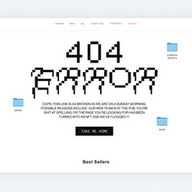
Landing on an error page doesn’t have to be the end of the journey. In fact, nearly 75% of visitors who encounter a 404 page are likely to leave a site, highlighting the importance of making these pages engaging. The best website designs use 404 page examples as a chance to be helpful or entertaining, offering a fresh take on website design that guides visitors back on track. A little creativity in your approach can turn a small mistake into a memorable brand moment.
Below, you’ll find creative 404 page examples that show how smart website design keeps things positive, even at a dead end. Let these ideas inspire you to add a thoughtful touch to your own site with your website builder.

Need inspiration for your website? With Wix, building a standout site is easier than ever. Choose from hundreds of customizable templates and use Wix’s easy drag-and-drop website builder tools to make your vision come to life. Turn your ideas into reality and see just how simple it is to create a unique, professional website.
TL;DR: 404 page examples
Great 404 pages do more than say “page not found”—they reassure visitors, keep them engaged and even strengthen brand personality. We reviewed a wide range of 404 page examples and selected the best ones based on usability, creativity and how well they guide users back on track.
Prioritize clear messaging (no confusing jargon)
Offer helpful navigation options (links, search, CTAs)
Use creative design or humor only if it fits the brand
Ensure mobile responsiveness and fast loading
Key point | Why it matters | What we looked for |
Clarity | Visitors should instantly know what happened | Simple direct 404 message |
Navigation | Keeps users from leaving | Links to homepage, search bar, popular pages |
Brand personality | Keeps the experience engaging | Tone, visuals or humor aligned with brand |
User experience | Reduces frustration and bounce rates | Fast load, mobile friendly design |
"Each combination of design elements has the potential to evoke specific emotions, convey subtle messages and leave a lasting impression on viewers. From the choice of font to the selection of colors and the incorporation of graphic elements, every detail plays a crucial role in shaping the overall identity of a brand." - Yaya Aaronsohn, head of Brand Maker at Wix
15 best 404 page examples
A well-designed 404 page can turn frustration into delight. We have gathered 15 best 404 page examples to help you create your own, from fun animations to smart navigation.
01. Wix: playful, clear, branded and helpful 404 page

The Wix 404 page turns a wrong turn into a smile-worthy moment—proof that great web design extends to even the smallest corners of your site. With its bold visuals and clever copy, it stays perfectly on-brand, tying back to your original domain name and website color scheme for a seamless experience.
What makes it stand out is how it blends personality with utility. It’s a reminder that even your error pages are a chance to reinforce your voice and design smarts—something every site, from portfolio to business, should take note of.
02. Pixar: cute 404 page

Pixar fans will no doubt resonate with this heartwarming 404 page. Featuring a character from the much-loved movie, Inside Out, it helps strengthen their brand reputation and build a bond with their site visitors. The use of colloquial language and a familiar character also make the page feel more human, helping us relate and connect.
Whether or not your brand is as widely recognized throughout the world as Pixar’s, you can experiment with text and imagery to create a friendly, human sensation. Play around with warm and informal language, using words like “awww” and “oops” to connect with your audience.
03. Dribbble: interactive 404 page

Distraction isn’t always a bad thing. Social network Dribbble’s error page proves just that. The fun, interactive design invites visitors to play, while momentarily taking their attention away from the fact that they didn’t reach their desired web page.
Not only is the game addictive but it also serves as a form of navigation; clicking on any of the images will take you to the profile of its creator, fluidly removing you from the 404 page. They’ve also made sure to include a search bar and a link to their homepage.
Learn more:
04. The-Artery: on-brand 404 page

There aren’t many people who would complain upon reaching this beautifully designed The-Artery’s 404 page. The trendy visuals are cohesive with the rest of this creative studio’s website, resulting in a seamless browsing experience, even when coming across a broken link.
The image itself moves in response to the cursor and is made up of intriguing elements. This makes it likely that site visitors will even end up purposefully lingering a little longer on this page. The text used is also comforting, inviting you to click anywhere on the screen in order to easily continue browsing.
05. Lazy Oaf: trendy 404 page

Here’s a 404 page that doesn’t quite stick to conventions. Claiming to be ‘Keeping it weird since 2001’, fashion label Lazy Oaf has stuck to its promise here as well—in the best way possible.
Instead of providing site visitors with the usual explanation of why they may have reached this error page, they’ve switched it up with comical excuses, sad emojis and a sign saying ‘s*** happens’. However, this very frank and brightly colored 404 page is anything but sad. They’ve also ensured intuitive navigation by keeping the menu bar visible, as well as including images from their online store just a short scroll away.
Learn more:
06. Spotify: personalized 404 page

Spotify’s error page helps strengthen their brand identity, with its trendy use of millennial pink and vinyl record imagery. They’ve kept their menu bars on show, both in the header and footer, making navigation simple.
Other than the possibility to navigate via the menus, Spotify has also adopted friendly, conversational language to suggest other useful pages. When creating your own, try implementing informal words like “maybe” and adding questions, to help your site visitors feel as though there is a human on the other side.
07. Lego: friendly 404 page

Lego has used a familiar character for their 404 page design, helping connect the audience to the brand and create a friendly atmosphere. Their conversational style of text is also reassuring, keeping the tone light and playful, with exclamation marks and everyday language.
If you’re also going for a humorous 404 page, make sure it's functional, like Lego has done here, offering alternative navigation options. They’ve emphasized the CTA button with a white background that makes it pop. By keeping the menu on show, both in the header and footer, site visitors can easily reach additional pages.
08. Figma: engaging 404 page

While this may appear to be a classic black-text-on-white-background design, it’s far from that. A closer look will reveal the possibility to play around with the text, creating a somewhat addictive interactive game and giving a glimpse into the nature of the product itself.
Figma has also incorporated many navigation options, including menus on both the top and bottom of the page. Potentially frustrated visitors can easily access the page they’re looking for by clicking on one of the many menu items.
09. MailChimp: heartwarming 404 page

Implementing an illustration style that sits in a perfect spot between childlike and emotive, MailChimp definitely knows how to cushion the somewhat disheartening situation of landing on a 404 page. They’ve included a large button that stands out, being the only colored element and situated right in the middle of the page.
However, what makes this 404 page truly special is the sensitivity with which each element has been created. The image of the donkey with its head in a hole, desperately searching for the page the visitor was looking for, is moving in itself. But when combined with the poetic language and the font pairing of a serif with a sans-serif font, the effect is touching and uplifting.
10. Marble: engaging 404 page

Marvel delivers one of the most clever 404 page examples by using its iconic characters to handle a common website error. The page rotates through different heroes and villains with witty, on-brand messages that turn a dead end into a fun surprise. This approach is a masterclass in using brand personality to make even a simple error page feel like part of the experience.
The lesson here is to think about how your brand’s voice can transform a technical issue into a positive interaction. By providing a site search and clear guidance, Marvel helps users find their way while reinforcing what makes its universe so beloved. It's a great reminder that every page on your site is an opportunity to connect with your audience.
11. Disney: whimsical 404 page

Disney’s 404 page is a wonderful example of turning a missing page into a magical moment. Featuring Mike Wazowski from Monsters, Inc., the page uses a character-driven message to explain the error in a fun, story-like way. This is a brilliant use of branding to make 404 page examples feel less like a mistake and more like an amusing detour.
What you can learn from this is how to infuse your brand's unique charm into every corner of your website. By offering a clear "Back to Home" button, Disney quickly gets visitors back on track while still providing a delightful experience. It’s a great way to keep your audience smiling, even when they get a little lost.
12. Amazon: playful 404 page

Amazon provides one of the most endearing 404 page examples by turning a simple error into a delightful surprise. Instead of a generic message, visitors are greeted by one of the "dogs of Amazon" , a rotating gallery of employees' pets. This simple, charming touch creates an immediate positive emotional connection and softens the frustration of landing on a broken link.
This page is a masterclass in using unexpected content to build brand affinity and guide users. It cleverly links back to the homepage and encourages searching, all while showing a human side to a massive company. It’s a powerful lesson in how even the smallest details can create a memorable experience.
13. Discord: quirky 404 page

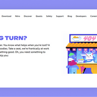
Discord serves up one of the most imaginative 404 page examples by turning a dead link into an interactive animation. The quirky illustration and friendly message about cooking up noodles make the experience feel playful and uniquely on-brand. It’s a fantastic way to greet lost users with personality instead of a cold error message.
This page shows how you can use storytelling and helpful links to guide users back to where they need to go. By offering links to its status page and support channels, Discord helps users find solutions while staying true to its fun-loving identity. It's a great lesson in making every interaction with your audience count.
14. Slack: minimalist 404 page

Slack offers one of the most serene 404 page examples with its calming, interactive background. The page features a beautiful landscape with playful farm animals that wander across the screen, turning a potential moment of frustration into a peaceful pause. This design is a great example of how animation can create a soothing experience and reflect a brand's friendly nature.
The page’s copy is straightforward and helpful, explaining the error and guiding users toward the Help Center or back to the previous page. The lesson here is that you don't need a lot of complexity to create an effective and memorable 404 page. A simple, beautiful design combined with clear direction is a powerful way to keep users engaged.
15. YouTube: playful 404 page

YouTube offers a great 404 page example that uses humor and simplicity to address a broken link. The page features a quirky illustration of a monkey, along with a straightforward message that the page isn't available. This lighthearted approach is effective because it quickly diffuses any user frustration and keeps the experience friendly.
The design cleverly guides users back to what they came for with a prominent search bar and a link to the homepage. This teaches a valuable lesson in user guidance: acknowledge the error, keep it simple, and make it easy for visitors to find what they need. It’s a clean and efficient way to handle a common website hiccup.
Learn more about how to make a website with our extensive guide.
What is a 404 page?
A 404 page is an online page that appears when you click on a link that is broken and is therefore no longer (or in fact, never was) available.
This can happen if someone mistypes the URL (or in other words, the web address that appears in the browser’s address bar). You can also reach a 404 page if a company has deleted or moved certain content from their website or has made changes to their permalink structure.
When you create an eCommerce website, you can either leave the default option as is, or you can customize your 404 error page. The latter gives you the opportunity to craft an enticing design that will boost your customer experience. On top of the design, you’ll have the option to write a friendly, on-brand message that will provide visitors with the help and direction they need to keep browsing.
How to create a 404 page that actually works

Creating a custom 404 page is essential for keeping visitors happy when they hit a broken link. The best 404 page examples show that these pages can be both helpful and fun. Follow these steps to create an awesome 404 page for your website.
01. Design a clear and engaging page
Start by clearly explaining that the page can't be found using simple, friendly language. Skip the tech speak like "404 error." Include links to your homepage, popular pages or main categories so visitors can keep exploring with ease. Adding a search bar also lets users find what they're looking for without any hassle.
02. Add personality
Make your 404 page memorable by adding humor, illustrations or animations that fit your brand. Use brand elements like your logo, colors or mascots to keep things consistent and create a great impression.
03. Optimize for SEO
Use a descriptive title tag like "404 page not found | [your brand]" and a meta description that briefly explains the page while guiding users to main content. Include internal links to important pages to improve navigation and help search engines understand your site. If you don't want the page indexed, add a noindex meta tag.
04. Implement and test
Follow your website platform's instructions for custom 404 pages and make sure all broken URLs redirect properly. Test the page across devices and browsers to confirm it works perfectly.
By following these steps and drawing inspiration from the best 404 page examples, you can reduce bounce rates, improve user experience and strengthen your brand.
404 pages FAQ
Why are 404 pages important?
404 pages are essential for maintaining a good user experience. Instead of leaving users frustrated, a thoughtful 404 page can redirect them to relevant content, reducing bounce rates and keeping them engaged with your site.
Do 404 pages affect SEO?
A few 404 pages won’t harm your SEO, but too many can signal structural issues to search engines. Regularly monitor and fix broken links using tools like Google Search Console to ensure your site remains crawlable and user-friendly.
What should a 404 page say?
Keep it simple and friendly. Something like "Oops, we can't find that page" or "This page went on vacation" works great. Add a suggestion for what to do next, like checking out your homepage or using your search feature.
How do I fix 404 pages?
Start by figuring out why the page disappeared. If you deleted it by accident, bring it back or redirect people to something similar. If it's because of broken links or typos, fix those and make sure your 404 page helps guide people where they want to go.
What should a 404 page look like?
Your 404 page should feel like part of your brand - same style, same vibe. Include your logo, a friendly error message, links to popular content and maybe a search bar or contact info. Some sites add fun graphics or witty copy to make hitting a dead end feel less like a bummer.


