

online store
bookings
events
popup

Collapsible Tab & Menu
By
Sleek collapsible FAQ & content sections
1.0
Free plan available

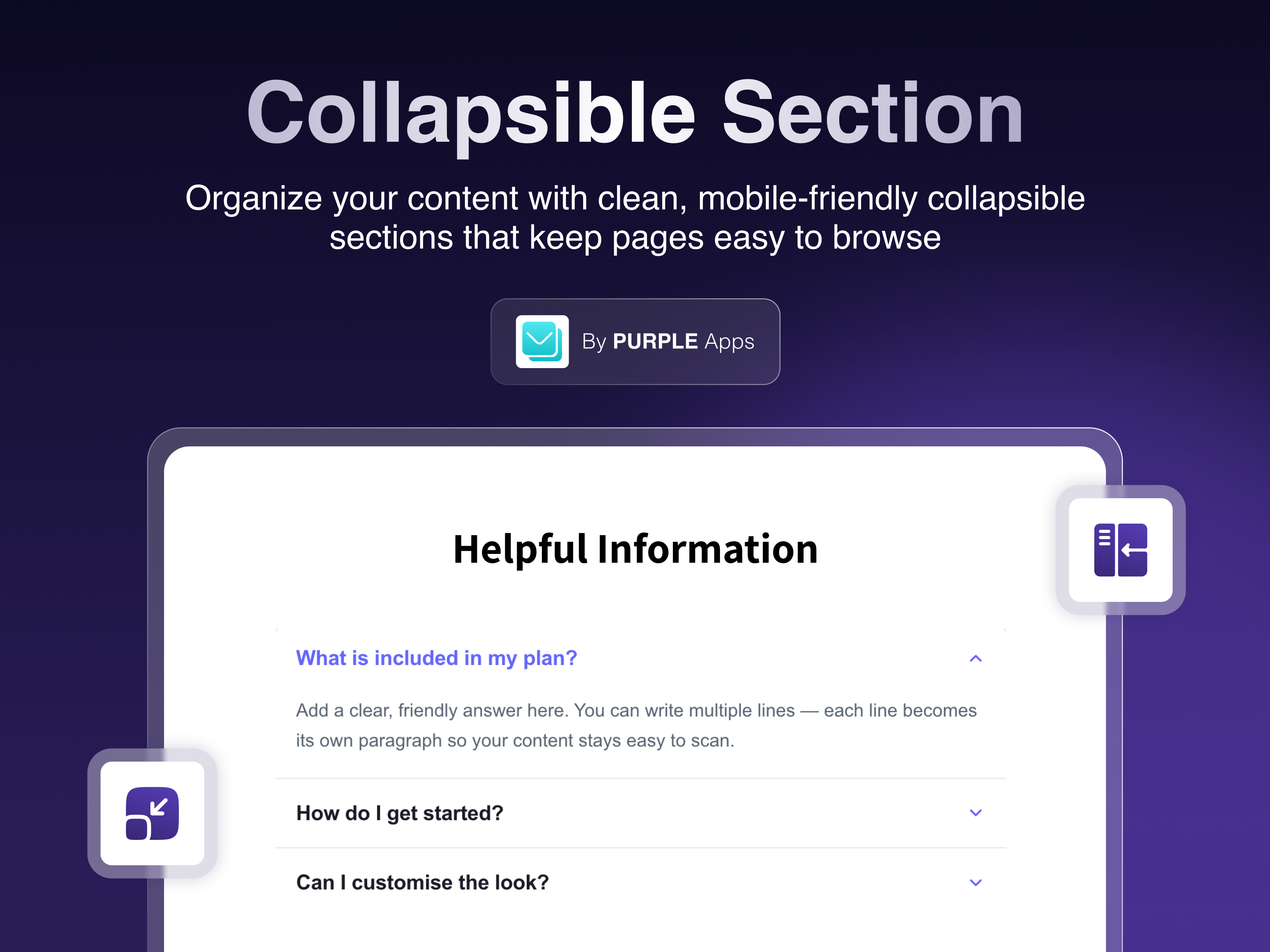
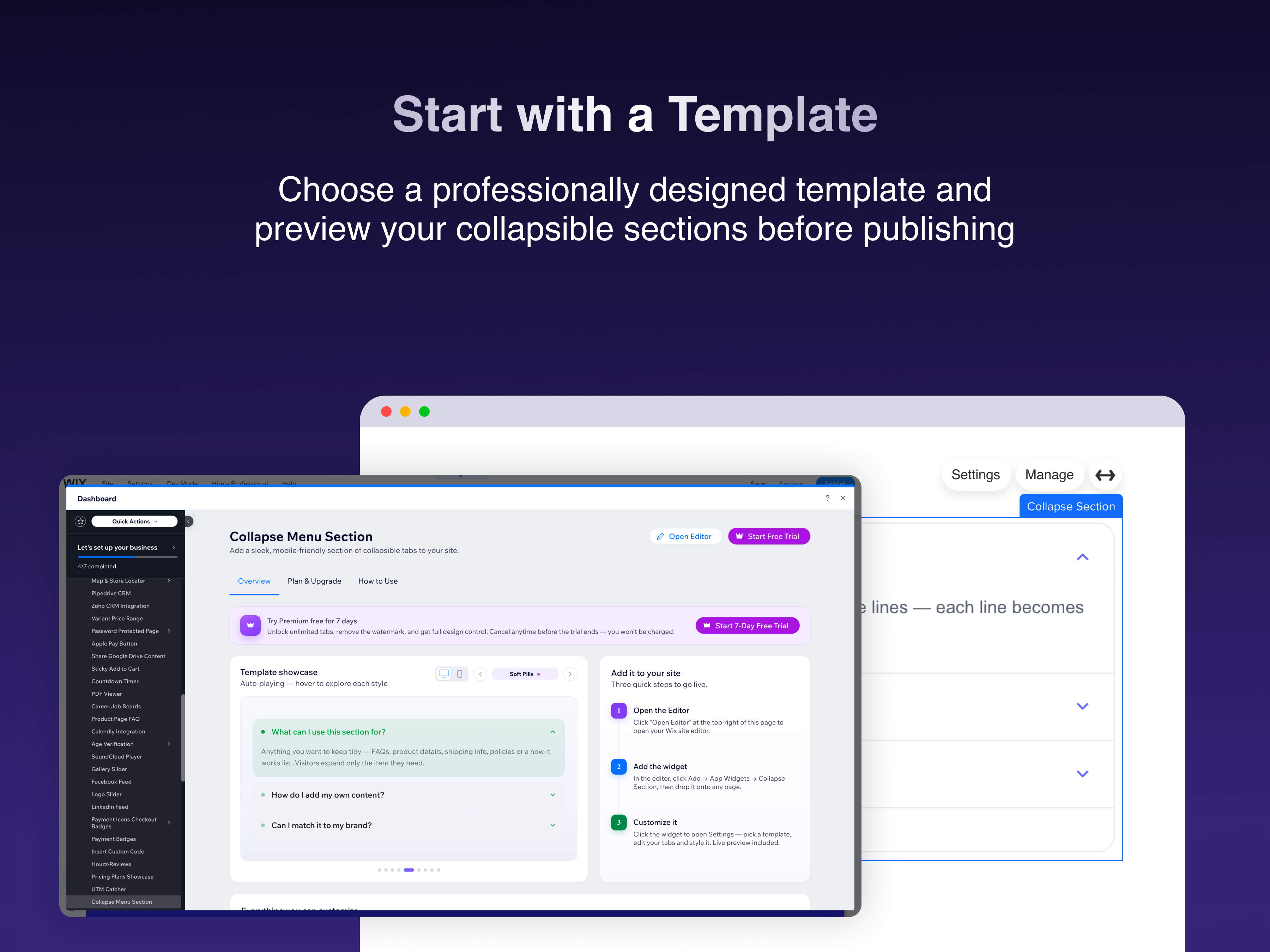
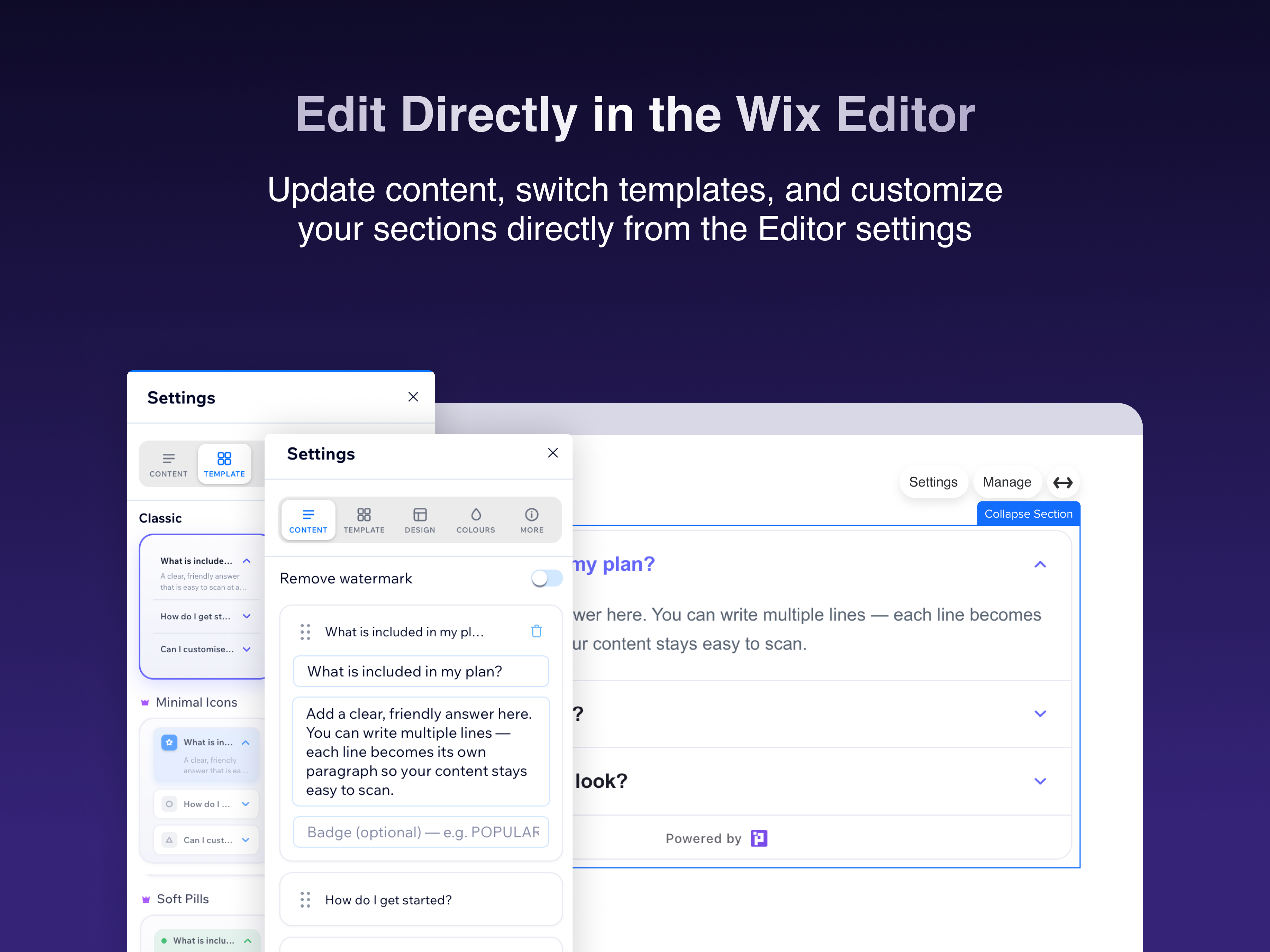
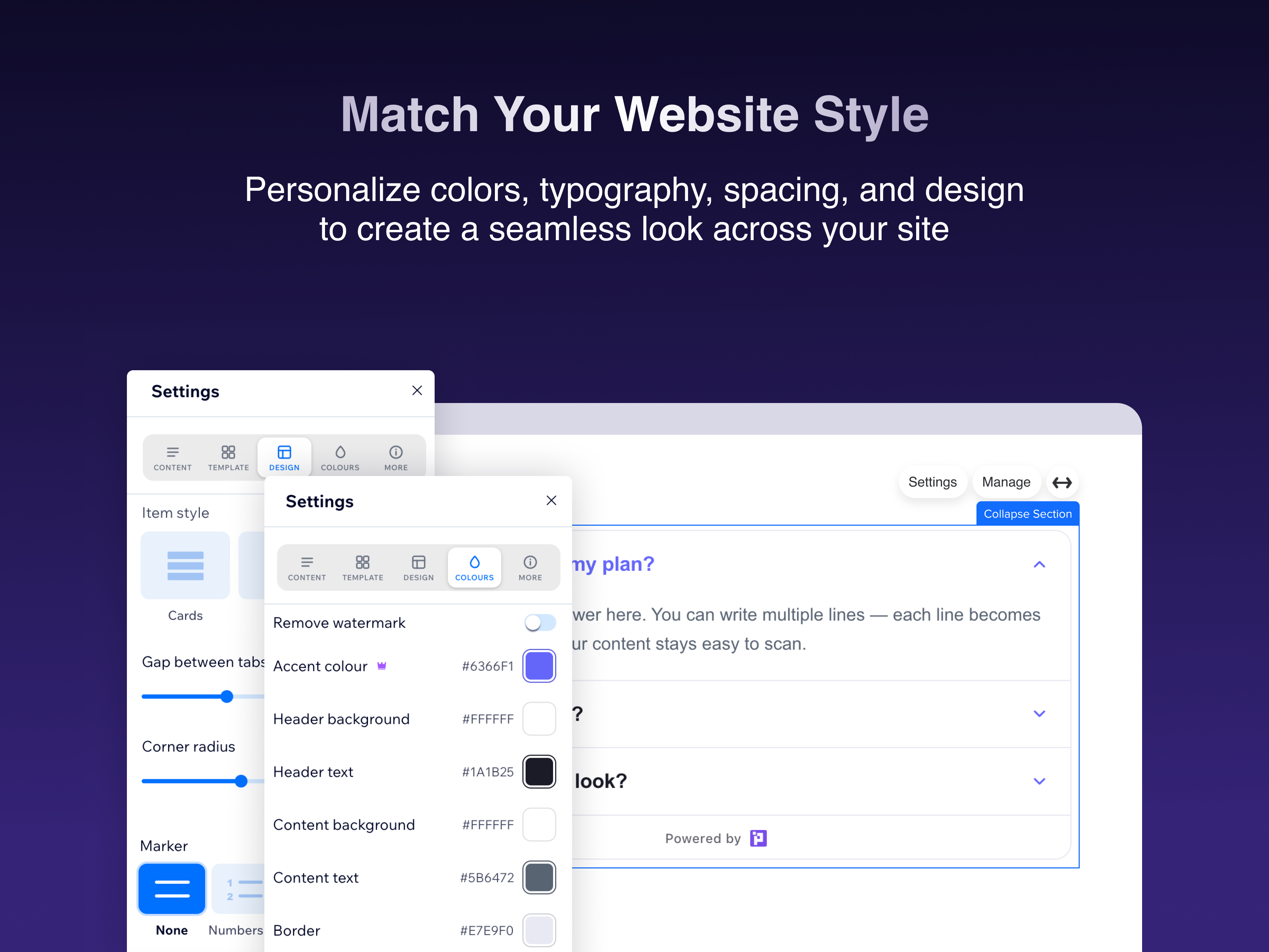
Collapsible Tab & Menu overview
- Ready-made templates — pick a polished style and go live in seconds
- Accordion, Timeline & Vertical Tabs layouts with full colour control
- Add numbers, icons or dots, plus custom text size & spacing
- Fully mobile-optimized with a live preview as you edit
Categories
Availability:
This app is available worldwide.App languages:
English
1.0 Average Rating
1 review
5
0
4
0
3
0
2
0
1
1
BR
Brennajbuckwalter/ Sep 14, 2026
Constant headache and no supportThis app simply does not work as advertised. Building FAQs is a huge headache - constantly try and update / add FAQs in the editor and they do not save to the page....
(0)
Thank you for your feedback
Pricing & plans
Basic plan
Free
Up to 3 collapsible tabs
2 templates
Mobile-optimized view
24/7 support
Premium plan
$
2
90
/month
Unlimited collapsible tabs
All templates unlocked
No watermark
Priority support
* Price is in USD.