- Sharon Hafuta
- Aug 7, 2025
- 10 min read
Updated: Dec 10, 2025

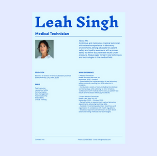
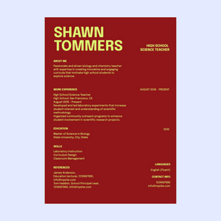
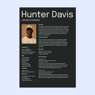
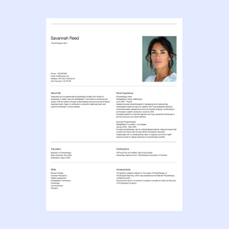
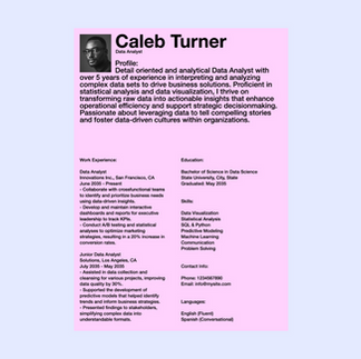
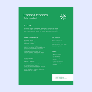
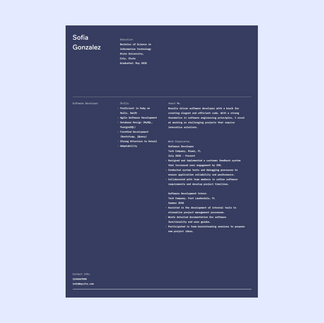
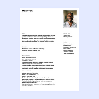
What story does your resume tell? From first impressions to the finer details, every design choice matters—even your font. Typography isn’t just decoration; it’s a powerful tool that can project professionalism, creativity and clarity. The right font invites your reader in; the wrong one can turn them away before they’ve even started. Knowing how to write a resume means paying attention to these details to make a strong and lasting impression.
This article dives into the world of resume fonts, breaking down how to choose, size and format your text with intention. With recruiters spending an average of 60 seconds scanning a resume, clarity and readability are more important than ever. Explore how the fonts you choose can make your resume both eye-catching and impactful.
Understanding what is typography and its impact can help you make better design choices and elevate your design project.
Stand out in the job market with our powerful resume builder. Select from professional templates and customize every detail to highlight your skills, experience and career aspirations. Create a polished, attention-grabbing resume that leaves a lasting impression.
TL;DR: 10 resume fonts to make your skills stand out
Choosing the right font for your resume is essential for creating a professional and impactful first impression. Fonts should balance readability, professionalism, and personal branding. Below is a quick guide to 10 recommended fonts and their best use cases:
Font | Best for |
Arial | Neutral and professional resumes in any industry. |
Barlow | Creative professionals or tech/design fields needing a modern touch. |
DM Sans | Sleek, minimalist resumes for startups, tech, or marketing roles. |
Epilogue | Creative industries or resumes with a contemporary vibe. |
Futura | Bold yet professional resumes for designers or creative professionals. |
Helvetica Neue | Polished, professional resumes for corporate or traditional industries. |
IBM Plex | Modern, professional resumes for tech or innovative industries. |
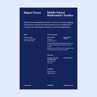
Libre Caslon | Refined resumes for academia, law, or traditional fields. |
Poppins | Stylish, modern resumes for creative professionals or marketers. |
Times New Roman | Formal resumes for law, academia, or government roles. |
Why font choice matters in your resume
Imagine your resume as a handshake. You’d want it to be confident and memorable, not limp or overwhelming. Fonts work in the same way—they convey tone, readability and intent, often before a recruiter has even read the first word. According to career experts, recruiters spend only about 6-7 seconds scanning a resume. That doesn’t leave time for hard-to-read fonts or overly playful typography to get in the way.
Your font choice should balance professionalism with your personal brand. It should help guide the reader’s eyes effortlessly through sections like work experience, education and skills. When considering resume design ideas, the right font can make a strong first impression.
According to Camila Porto, branding and social media specialist:
"By investing in your personal branding, you not only strengthen your position in the market but also establish a solid foundation for the future growth of your business."
10 resume fonts and when to use them
01. Arial
Arial might get a bad rap for being a default choice, but that shouldn’t overshadow its utility. This sans-serif font offers simplicity without sacrificing professionalism. Its even strokes and clean appearance make it a workhorse font for resumes in any industry.
Best for: Arial’s neutrality allows your content to take center stage, making it especially effective for job seekers who want their qualifications to shine without font-related distractions.

02. Barlow
Barlow is a modern sans-serif font with a clean and approachable design. Its slightly rounded edges and geometric structure give it a contemporary feel while maintaining readability. It’s a great choice for resumes that need a fresh, modern touch.
Best for: Creative professionals or those in tech and design fields who want a modern yet professional look.

03. DM Sans
DM Sans is a minimalist sans-serif font that exudes clarity and simplicity. Its balanced proportions and open letterforms make it highly legible, even at smaller sizes. This font is perfect for resumes that aim for a clean and modern aesthetic.
Best for: Job seekers in modern industries like startups, tech or marketing who want a sleek, no-frills design.

04. Epilogue
Epilogue is a versatile sans-serif font with a modern and clean design. Its slightly wider letterforms and subtle details make it stand out without being overwhelming. It’s a great choice for resumes that need a contemporary yet professional vibe.
Best for: Professionals in creative industries or those looking to add a touch of personality to their resume.

05. Futura
Futura is a geometric sans-serif font that combines modernity with a touch of creativity. Its clean lines and symmetrical design make it both professional and visually appealing. It’s a great option for resumes that need a bit of flair, without sacrificing readability.
Best for: Creative professionals, designers or anyone looking to make a bold yet professional statement.

06. Helvetica Neue
Helvetica Neue is a modernized version of the classic Helvetica font. Its clean, balanced design and timeless appeal make it a favorite for professional documents. It’s highly legible and works well for resumes in any industry.
Best for: Professionals in corporate, finance or traditional industries who want a polished and professional look.

07. IBM Plex
IBM Plex is a modern and versatile font designed for clarity and professionalism. Its clean lines and balanced proportions make it highly readable, while its contemporary design adds a touch of sophistication.
Best for: Tech professionals, engineers or anyone in innovative industries who wants a modern and professional resume.

08. Libre Caslon
Libre Caslon is a serif font that combines elegance with readability. Its classic design and subtle details make it a great choice for resumes that need a traditional yet stylish look.
Best for: Professionals in academia, law or other traditional fields who want a refined and polished resume.

09. Poppins
Poppins is a geometric sans-serif font with a modern and stylish design. Its clean lines and rounded edges give it a friendly yet professional appearance. It’s a great choice for resumes that need a contemporary and approachable feel.
Best for: Creative professionals, marketers or anyone looking to add a modern touch to their resume.

10. Times New Roman
Times New Roman is a classic serif font that has been a staple in professional documents for decades. Its traditional design and high readability make it a safe choice for resumes in formal industries.
Best for: Job seekers in traditional fields like law, academia or government who want a formal and professional look.

Ideal resume font sizing
Choosing the right font size ensures your resume is legible without appearing crowded. Remember to always view your resume at 100% zoom to ensure it's easy to read on screens and in print.
Here’s a quick guide:
Name: Your full name can be 18-22 points, ensuring it stands out boldly at a glance.
Headings: Headings can be slightly larger at 12-16 points to create hierarchy and structure.
Body text: Stick to 10-12 points for the main content of your resume. Smaller sizes may strain the reader’s eyes, while larger sizes can look unprofessional.
What makes a font a best font for resumes?
Not all professional fonts are created equal when it comes to impactful resumes. To identify the best options, you should consider the following factors:
Readability
Job applications may involve busy recruiters skim-reading dozens (or even hundreds) of resumes a day. A well-chosen font ensures they can read your resume quickly and without strain. Crisp letters free of excessive flourishes or ornamentation make resumes easier on the eye, helping your information stand out.
Professional aesthetic
Fonts for resumes should exude professionalism while reflecting your personality. Successful typography strikes that careful balance. For example, a font like Helvetica conveys neutrality and simplicity, while Georgia exudes authority with a creative twist.
Appropriate tone
Each industry has unwritten rules about creative flexibility. For corporate positions, you're better off with conventional serif or sans-serif fonts like Garamond or Arial. Meanwhile, positions in tech or design might benefit from subtler personality markers like Century Gothic.
Learn more: Serif vs sans serif
Resume font selection tips
Selecting the perfect font means finding harmony between style, legibility and brand alignment. Here’s how to make the best choice:
Match your industry
For corporate or traditional fields like law or finance, it's best to use serif fonts such as Times New Roman or Cambria. For creative or startup roles, such as marketing or design, modern fonts like Montserrat or Lato are a better choice. Choosing the right font can even be part of your marketing strategy, reflecting the tone and professionalism of your brand.
Stick with standard fonts
Fancy fonts might look great in theory, but can confuse Applicant Tracking Systems (ATS). Stick with well-known fonts that ensure your resume remains ATS-compatible.
Limit font variations
Keep your resume design simple by sticking to one or two font styles—one for headings and another for body text. For example, pair Helvetica (headings) with Georgia (body text) for a structured yet approachable look.
Explore more font pairings to create a polished, professional resume that stands out.
Optimize for both print and digital
A recruiter might review your resume on a printed page or digitally on a screen. To account for both print design and digital design, choose fonts known for readability across platforms, like Calibri or Tahoma.
Pay attention to white space
Your choice of typography interacts with other elements, such as margins and spacing. Balanced white space between lines and sections improves readability while signaling professionalism.
Be inspired: Graphic design resume examples
ATS friendly fonts
Applicant Tracking Systems (ATS) are software programs used by employers to manage and filter job applications. These systems use specific algorithms to identify keywords and qualifications in resumes, making it important to choose an ATS-friendly font. With 98% of Fortune 500 companies relying on ATS software, ensuring your resume is ATS-friendly is no longer optional—it's essential.
Stick to sans serif fonts
Sans serif fonts like Arial or Helvetica are the most commonly used and recommended for ATS compatibility. They have clean lines that make it easier for the system to scan and read your resume.
Avoid special formatting
Using special characters or symbols, such as arrows or bullets, can cause issues with ATS scanning. Stick to simple formatting, such as bolding or bullet points. Also, avoid using headers or footers, as the system may not read them.
Consider using keywords
Many ATS systems use keyword matching to filter resumes. To increase your chances of getting through the system, consider including relevant keywords from the job description in your resume. However, make sure to use them naturally and don't overstuff them.
Use standard headings
ATS systems are designed to recognize standard headings, such as "Work Experience" or "Education." Using unique or creative headings can confuse the system and may lead to essential information being overlooked.
Resume formatting tips
Your font is just one part of the puzzle; the formatting of your resume plays an equally important role. Here are some tips on how to write a resume and bring it all together:
Use clear headings: Organize sections like “Work Experience” or “Education” using bold headings in a slightly larger font size.
Leave space: Use consistent line spacing (1.15 or 1.5) to ensure your resume looks neat and readable.
Limit length: Stick to one or two pages max, unless applying for an academic or research-heavy role.
Maintain constraints: Avoid making text too narrow or overly wide. Aim for one-inch margins to keep content balanced.
Stick to standard formats: Hiring managers prefer resumes with clear sections, consistently aligned text and easy-to-understand highlights. Vertical layouts with left-to-right alignment are the most commonly accepted format.
Use visual hierarchy: Ensure your name, contact details and section headers are immediately noticeable by varying font size or styling. A subtle bold header, followed by lighter subheaders and text content, creates a clear reading experience.
Be consistent: Uniformity across your resume matters. From spacing to alignment to styling, maintaining consistency improves the aesthetic appeal and professionalism of your document.
Design your resume in minutes with AI resume builder.
Explore these fonts for more design inspiration:
Calligraphy fonts for elegant and artistic designs
Cool fonts to add personality to your creations
Cursive fonts for timeless designs
Cute fonts to bring charm to your designs
Free fonts: a curated selection
Fun fonts for playful and lively projects
Futuristic fonts for cutting-edge and modern designs
Graffiti fonts to infuse urban energy into your designs
Handwriting fonts to add a personal, authentic touch
Number fonts for creative numerical typography
Poster fonts to make your designs bold and eye-catching
Pretty fonts to enhance delicate designs
Professional fonts for polished and formal designs
Psychedelic fonts to inspire striking and retro visuals
Retro fonts for a nostalgic twist in your visuals
Scary fonts to give your designs a chilling edge
Script fonts for a touch of sophistication
Tattoo fonts to inspire edgy and unique designs
Resume font FAQ
Can I use multiple fonts in my resume?
Yes, but limit this to two fonts—one for headers and another for body text. This approach creates visual contrast without overwhelming the reader.
What’s the worst font to use on a resume?
Fonts like Comic Sans or overly decorative styles are rarely appropriate for resumes. These types tend to look unprofessional and can distract from your qualifications.
Should I include custom fonts?
Custom fonts can be risky unless the role you're applying for explicitly values creativity or design expertise. Safe, universally available fonts minimize formatting issues when someone opens your file.
Should I use color in my font?
Use colors sparingly, such as for headings or accents. Stick to subtle and professional shades like navy or gray.
What margins are best in a resume?
The ideal margin size for a resume is 1 inch on all sides. This ensures the content is evenly spaced and easy to read.
How long should a resume be?
The length of a resume is typically one to two pages, depending on the industry and position. If you have extensive experience or are applying for an academic or research-heavy role, it may be appropriate to have a longer resume. However, try to keep it concise and relevant by focusing on your most recent and relevant experiences.
How do I handle more than one page in a resume?
If your resume is longer than one page, make sure to include your name and page number in the header or footer of each subsequent page. Additionally, ensure that all sections are clearly labeled and organized for easy readability. If possible, try to condense information or use bullet points instead of lengthy paragraphs to keep the document concise.
What are ATS-friendly resume fonts?
ATS-friendly resume fonts are widely recognized and can be easily read by Applicant Tracking Systems. Avoid using fancy or complex fonts, as they may not be compatible with these systems, and could cause your resume to be filtered out. Stick to standard fonts like Times New Roman, Arial or Calibri for maximum compatibility.


