
Your grandma always warned you: “You never get a second chance to make a first impression”. Since that time, you’ve had many occasions to realize how true (and cruel) this saying is. It applies to a job interview, a Tinder date and – as surprising as it may sound – your very own photography website. If you don’t hook your visitors in the very first seconds, on the very first page, they’ll bounce back to Google’s results, and will eventually click on one of your competitors’ websites.
This first page has a name: your home page. It’s not only the online front door of your photography business. It’s also the place where random Internet people can turn into “I-want-to-know-more” visitors, and ultimately, into clients. But what exactly should a photography website home page look like? Very refined, and at the same time striking enough to convince and convert. Mixing minimalism and efficiency sounds like a daunting task. Actually it isn’t, as long as you know (and master) the flow. So here are the 10 steps to write the perfect home page for your photography website:
Home sweet home(page)
Just like your home, your home page needs to communicate your look and universe. Visitors should immediately recognize the items that compose your visual identity, from your logo to your fonts and color palette. Make sure that they align with all your other outlets, both online (social pages, etc.) and offline (business cards, brochures, etc.).
Making it your home also means that it should be neat and welcoming. You wouldn’t want your guests to find, at the entrance of your apartment, your cats fighting, in the middle of two months worth of plastic bottles to recycle – right? The same goes for your home page. Don’t overcrowd it with blog articles, your latest news or your Instagram feed. Although it’s tempting to put these items front and center, you have to know that they prevent your visitors from browsing your website further.
They nailed it: From the classy logo to the stunning background image, these radiant photographers provided some good “gryst” for their home page’s mill.

Say whaaaat (and who, and where)
A mistake made too often by photographers is to simply put a beautiful image on their home page, hoping that it will do all the talking. But when they only see a bride, how can you expect your visitors (and Google) to know that they have landed on a wedding photographer's portfolio - and not a wedding gown designer? One of the most important items on any home page is a strong, explicit headline that catches the eye of your newcomers. Don’t worry, it doesn’t have to be long - between 3 to 8 words maximum.
What should be present on your homepage? A good rule of thumb is to make sure that you’ve answered these three simple questions:
Who are you? Whether you go by your own name, your business name, or even a stage name, you have to write it with a large font on the top of your page. Remember that it has to be consistent with the name you use on all your other outlets, otherwise people might have a hard time finding you on Google.
What do you do? Your name should be immediately followed by the mention “[X] Photography” or “[X] Photographer”, where [X] is your speciality. Be crystal clear and avoid jargon that only shutterbugs would understand.
Where do you operate? Adding your location in the headline is not compulsory, but is still a very good practice. It will not only boost your local SEO, but also help potential clients to see in a blink if you operate within their area.
Pro tip: Some photographers like to add another line under their headline, like their own motto, a slogan, or even an inspiring photography quote. Only write such a statement if it brings real value to your home page, and if it’s really short. Otherwise, just discard it - and save time for your readers to browse your gallery and other pages instead.

How many images?
Answer: it’s your call. There are two schools of thoughts here, and you should decide which to follow based on your own artistic spirit. The first one, which is also the most widespread, advocates to put only one big photo in the background of your home page. Of course, this image has to be really stunning, and leave your visitors with a strong desire for more. But it’s definitely a safe choice, since it means less distraction for your visitors’ eyes, along with a faster loading website.
The second option is a bit less conventional, but very refreshing. It consists of displaying your entire gallery straight on your home page, using a grid layout. This way, your viewers can see the full spectrum of your talent, and are immediately blown away by the profusion of colors and shapes. This option is better accommodated with a single, long-scrolling page - which means that your gallery should be followed by your contact form, booking widget and other sections, that you would have otherwise put in separate pages. And of course, more photos means more bytes for your visitors’ devices to load, so make sure to optimize your images before you press that ‘Publish’ button.
Pro tip: Can’t decide which option to choose? Go for secret option number three: a slider-based layout. Still a single background, but with a few images that are replaced either automatically, or following a mouse click.

From the header to the footer
When you go to an important meeting, you usually groom yourself from head to toe. The same goes for your home page: it should be optimized all the way. So don’t forget to add a header with your logo and a clear menu. It’s a good practice to freeze your header, so that your visitors don’t have to scroll up like crazy, in order to travel from one page to another. Also make sure that your logo is duly linked to your home page - something that all Internet users expect to find on all websites.
Besides your header, consider adding a footer. It’s a way too-often neglected feature, and yet a crucial part of any website, since it gives you the ability to present information that is always visible, in a very discrete way. For example, 64% of Internet users want to see contact details straight on a vendor’s home page. So use it to display your address, email, phone number, and social media icons - along with a subscription button to your newsletter. Finally, make sure that your footer is the last thing that actually appears on your home page. This world has seen too many pages with useless, blank spaces at the bottom - a big turnoff for your visitors!
Serve your menu
Your home page is a hub to direct your visitors. Every section should be accessible in just one click from your home page. This is why you need to have a clear, full menu. It will provide a better user experience (UX) to your visitors, who won’t feel that they’re revolving in some sort of a maze. Ultimately, it will improve the time they spend on your website, which can only have a positive impact on your SEO.
As for the design, people are mostly used to horizontal menus, inserted in the header. You can also go for a vertical one (on the left or right side of your page) - a cool option, but a bit less instinctive. As for the sections, restrict yourself to eight items maximum, only the most important sections. The names of your sections should be short and straightforward. Don’t try to reinvent the wheel here, do stick to the conventional denominations that every Internet surfer is used to, like ‘About me’, ‘Gallery’, or ‘Contact’.
He nailed it: Logo, social icons, and clear sections: Wix photographer Kees Penders shows us that the way to a great menu is actually very black and white.

Let them act
Believe or not, although we cherish our freedom, the human brain doesn’t like to make decisions on its own. It’s a common psychological pattern that was documented by psychologist Barry Schwartz as the paradox of choice: the more choice you give someone, the higher the chances they’ll eventually choose… absolutely nothing. It doesn’t mean that you have to turn into a blood-thirsty dictator, and impose your will on your visitors. But a small dose of incitement never hurt anybody.
If you have one thing that you want your visitors to do, such as booking your services, discovering your gallery, or contacting you, make sure to add a strong call-to-action (CTA) straight on your home page. In most cases, it comes in the shape of a button with a short verb at the imperative form, giving some sense of urgency: ‘Book Now’, ‘Learn More’, or ‘Subscribe for Free’. Use design contrast and positioning to make sure that your CTA naturally stands out. It will help your visitors go where you need them to go.
Do your SEO
As we said, your home page shouldn’t carry tons of words. Does it mean that it won’t stand a chance to rank in Google’s results? Not necessarily. Search engines’ bots are trained to identify home pages, and they know that, for this specific section, the less words, the better. Moreover, there are a lot of invisible texts that you should be paying a great amount of attention to, on your home page. First is the description (or ‘alt text’, in SEO lingo) of your background image(s). Keep it simple and concise, with an objective depiction of what you ‘see’ on the picture.
Second is your meta-data, that is to say the title and description of your pages. Remember: the title is the blue, clickable line in Google’s results, and the description is the short, black chunk of text under it. Here is how to optimize them:
As for the page title, follow the general pattern, which is: Your Name | [X] Photography | Your Location where ‘X’ stands for your one or two main specialties.
As for the description, you have 150 to 160 characters to define your business and entice potential visitors to click. It’s the perfect location to add your main keywords.
Pro tip: Need more guidelines? Check our complete SEO guide for photographers now.
Optimize for mobile
One major criterion to differentiate a good photography website, is mobile optimization. Your online portfolio should be easy to navigate on all devices, big and small alike. Luckily, the Wix Editor gives you direct access to the mobile preview of your site, so that you can make all the small adjustments in just a few minutes. Something to bear in mind when we talk to smartphone users: attention span deficit might be one of the most common disorders in today’s world. Almost 50% of mobile users abandon a page if it doesn’t load within 10 seconds. So, again, make sure to discard all unnecessary elements from your home page before publishing it.
Set it in (e)motion
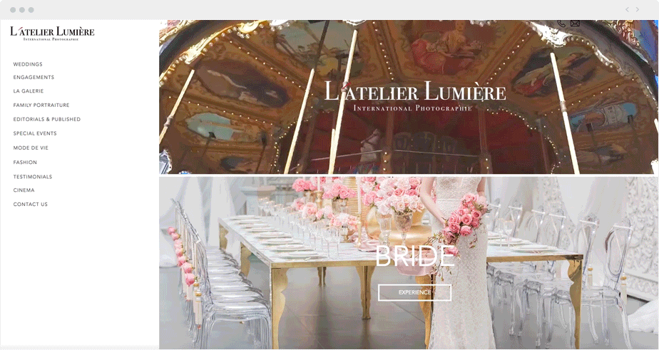
A well-designed home page is crucial to carrying emotions and building trust with your visitors. One of the 7 principles of design, that you can apply to your own photography website, happens to be movement. The Wix Editor enables you to very simply add (with a single drag-and-drop) a video of your choice, straight on the background, in a dedicated box, or in a strip of your home page. It’s an excellent way to grasp your viewers’ attention. You can also go for a cinemagraph, a very elegant item that is taking the Internet by storm (here is everything you need to know about cinemagraphs). And if you don’t have videos or cinemagraphs to show, you can simply go for a parallax effect, a web design pizzazz that creates the impression of 3D.
They nailed it: To make a long-lasting impression, the photographers from L’Atelier Lumière went for a parallax effect AND a video on their Wix website. Stunning!
One more step?
Some photographers decide to add one more step, before allowing their visitors to land on their home page. It can be a “lobby” page, designed to entice the visitor to the utmost, and make them want to desperately click and know more. Like all extra steps, it’s a double-edged sword that can repel a lot of visitors if not done correctly. Take inspiration from Wix photographer Lunatic Pictures, who came up with a super intriguing picture, a name chiseled in a funky font, and a direct CTA: “Enter”.
Another step you can take before the home page is adding a lightbox. It’s basically a small message that pops up when visitors arrive on your home page. By definition, they cannot miss it – so it’s a great strategic asset to promote a discount, an invitation to enter your mailing list, or to follow you on Facebook. Use lightboxes to direct the attention of your viewers, but never put more than one on your website, and preferably, only for a temporary period of time.