- Wix Team

- Mar 11, 2024
- 5 min read
Updated: Oct 31, 2025

You wouldn’t wear clothes that don’t suit your style, so why write in Times New Roman when your brand is more Helvetica? Whether you have a chic online store or a local restaurant, it’s important to pick the font that matches your brand. When you create a website, the typeface you choose sets the stage for your visitors and gives them a feel for your unique style.
The Wix Editor already provides a plethora of free customization options, including ninety six outstanding fonts, images and video backgrounds. You can also upload your own best website fonts to the Wix Editor easily. With the ability to add any font you want—in any language—the possibilities are endless.
Here’s how to add your personal fonts when you are learning how to make a Wix website, as well as some tips and best practices from our design pros.
How to upload your own fonts to the Wix Editor
See a font you want for your blog, business or portfolio? Follow these easy steps to upload and implement your favorite fonts onto your site.
If you have a few websites that will look great with your new typography, your fonts are now accessible from all sites in your account.
To upload your own fonts:
Using the Editor, add a text element to your site.
Select the text element and click
Click Edit Text.
Click the Fonts drop-down.
Click Upload Fonts to upload your own.
Click Done once the font has uploaded.

Tip: Uploading fonts larger than 4 MB can affect your site's performance and speed. We recommend using system fonts available from Wix, as they're optimized for your site.
To use your own uploaded fonts:
Click a text element in the Editor.
Click Edit Text.
Click the Fonts drop-down.
Select the font you uploaded under My Fonts.
With all the options of beautiful fonts at your fingertips, it can be hard to decide which font you want to use. The key is not to get overwhelmed and follow this guide when picking fonts that work best for you.
How to choose a font family that fits the tone of your site
It’s important to keep your audience in mind. Your business and brand have a personality that you should convey in your font types and colors choices. This will help you decide whether to choose serif, sans serif or script. For example, it’s a good idea to use serif for a lengthy text, while sans serifs are suggested for captions, headings and charts.
Be inspired: Typography trends

There are three main font families you should be familiar with: Serif, Sans Serif and Script.
Serif fonts are characterized by small decorative strokes at the ends of the letters, similar to Times New Roman or Baskerville. This gives them a classic and elegant appearance, making them well-suited for print media such as newspapers, books and magazines. However, they’re less readable on screens, so they’re not as commonly used for websites.
Sans serifs, on the other hand, are fonts that don’t have the same decorative trimmings at the edges. They’re classified as a modern and cleaner typeface, like Arial and Verdana, and are considered to be preferable for reading online. This is why sans serif fonts are the standard for digital and web design.
Script fonts are another more decorative typeface, often used for their ornate and flowing appearance. However, they can be difficult to read for long stretches of text or in call to action statements. As a result, they’re best used for short phrases or titles.
The golden rule: three’s a crowd
The judicious use of fonts is essential for creating a visually appealing and readable design. As a general rule, it’s best to limit yourself to two fonts in a design. This allows you to create a sense of hierarchy and focus, and helps ensure that your message is communicated effectively. If you’re feeling ambitious, you can use three fonts, but be sure to choose them carefully and use them sparingly.
How to make your fonts serve your UX
UX (user experience) is where design meets function. Essentially, it’s the concept that while websites should be beautiful, they should also be user-friendly and easy to navigate.
Pro tip: When choosing fonts for your brand, it’s important to consider both the needs of your brand and the readability of the text.
To ensure that your fonts are used effectively, you should:
Choose fonts that are appropriate for your brand's personality and values. For example, a classic serif font might be appropriate for a traditional brand, while a modern sans serif font might be more suitable for a contemporary brand.
Consider the readability of the text. Avoid using fonts that are too small or too ornate, as these can be difficult to read.
Use different fonts for different purposes. For example, you might use a larger font for headers and a smaller font for body text.
Experiment with the placement and composition of the fonts. This can help to create a sense of hierarchy and emphasis in your design.
Ultimately, the goal is to pick fonts that are both visually appealing and readable. By following these tips, you can create a design that is both stylish and effective.
To mix or not to mix?
If you’re feeling limited by only using two different fonts in your font pairings, play around with the contrast between bold and thin, italics or uppercase and lowercase. Spacing is also a great trick to use when wanting to accent certain words.
Experiment with mixing all the options of serif and sans serif, bold and thin. Put some thought into your combos and see what works best for you. Make sure your fonts flatter each other rather than detract from one another. If you’re a bit overwhelmed, here's how to choose the best fonts for websites.
The three website templates below are great examples of how to mix typefaces for the web. They represent different approaches to what typography is and how to use it. Which one do you like best?
Examples of fonts on Wix websites
This pilates studio website template is a great example of using a slab serif font to accent certain elements of your site, while sticking to simple sans serif for the paragraph texts:

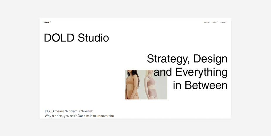
On the other hand, this branding portfolio website template uses only sans serif with different weights and styles to differentiate text elements and achieve a sense of hierarchy:
This interior design company website template, a single font is used across all content elements in order to strengthen the brand identity and avoid taking attention away from the project visuals.


Comments