- Mar 15
- 18 min read

Strong brands know how to effectively communicate the right message to their audience. How do they do this? Enter brand identity, the way a brand presents itself to the world.
Brand identity refers to both visual and non-visual aspects from how you create a logo and design a business card to how you communicate with customers. Without a unified, consistent vision of all brand elements, your work is not complete. In this article, we’ve compiled the best brand identity examples to get your creative juices flowing.
TL;DR: brand identity examples
Your brand identity is more than just a logo, it’s how your business looks, sounds and feels across every touchpoint. In this post, we highlight brand identity examples that stand out for their clarity, creativity and consistency. From color palettes and typography to voice and visual storytelling, each example offers practical takeaways you can apply to your own brand.
These examples show how a strong brand identity can help you build trust, stand out in your market and connect with the right audience.
Top features of a great brand identity
Brand identity feature | Why it matters |
Visual consistency | Builds recognition and reinforces your brand across all channels |
Clear brand voice | Helps you communicate in a way that feels authentic and aligned |
Distinctive logo | Makes your brand memorable and instantly identifiable |
Thoughtful typography | Sets the tone and supports readability across materials |
Strategic color use | Evokes emotion and strengthens brand association |
Cohesive imagery | Tells a visual story that supports your mission and message |
What is a brand identity?
Brand identity is the overarching writing style and visual language your business uses to communicate with the world. Through meticulous and thoughtful design choices paired with clearly outlined mission and vision statements, your identity serves as the core of all branding decisions. This includes (but is not limited to):
Logo
Tone of voice
Colors
Typography
Imagery
Brand name
Each of these tangible elements contributes to the greater sum and directly influences your brand perception. Ultimately your brand identity is established and represented mainly through your visual identity and all of the different elements that represent it.
Learn how to edit photos to make sure your brand's imagery always looks professional.
The purpose of your brand identity
Your brand identity makes your business recognizable to your customers and helps you stand out in the marketplace. This brand positioning can be the deciding factor between competitors for new customers as well as returning ones. A strong brand identity leads to brand trust, consistency, loyalty and ultimately determines your customers’ relationship with your business.
Still, your brand identity must be built with your customers in mind. Consider setting up buyer personas, these are visual representations of your ideal customers. This helps you better understand your target audience and how you can craft a brand identity that resonates with it.
Inspiring brand identity examples
01. Glossier
Back in 2010, CEO and founder Emily Weiss started Into The Gloss, a blog that eventually turned into a beauty powerhouse built on the belief that "beauty isn’t built in a boardroom—it happens when you’re a part of the process."
Glossier changed the rules of the beauty game when it created a brand based on transparency and honesty. According to Glossier, “We believe in thoughtful design, and enabling conversation (which is where it all starts). But most of all, we believe that beauty is about having fun, wherever you are in your journey.”
Glossier’s simplistic approach to both their products and branding makes them unique. They offer high-end products stripped of all the bells and whistles to reach a wider audience. Unlike many competitive brands, Glossier also steers clear of artificial ingredients and promotes a clean approach to beauty. They maintain ethical production processes, never test on animals and offer select vegan products, too.
Glossier uses minimal packaging and is committed to other sustainable business practices. With a soft pink and white color palette and minimalistic typeface, Glossier communicates an effortlessly cool visual language. Their website, packaging and social media all speak the same visual language, promoting the brand’s simplicity.
Not only has the brand marked the beauty scene, they’ve extended their product line into hoodies, mugs and even a collector’s cookie cutter—launching themselves even further into the heart of the beauty community they’ve worked so hard to build.

02. Hydro Flask
The Gen Z must-have water bottle brand Hydro Flask is another brand identity example done right. The Pacific Northwest-based company knows the value of natural beauty, and uses it at every touchpoint of their branding identity. As they put it, “Mother Nature is the best designer there is. There’s never anything extra—every choice is made for a reason. That's our inspiration behind every product we design. Keep it strikingly simple. From product innovation to color leadership—simplicity drives all.”
Hydroflask’s logo has gone through just a handful of iterations, which today appears as a jumping, smiling person whose body shape resembles the letter H. Their minimal black and white palette stands out against their brightly-colored metal bottles.
Part of what makes the Hydro Flask brand identity so appealing is the option to customize the bottles. From custom colors and straps, to engraving, customers can personalize their bottles to suit their style. However, regardless of the color, a Hydro flask owner can always spot another out in the wild. This is a testament to the cultivated brand loyalty and ever-growing community.

03. Jungalow
Another blog-turned-business model, Jungalow is a brand identity example worthy of praise. Curated and created by Justina Blakeney, Jungalow is both a lifestyle brand and a design inspiration source. The female-run business sells bold wallpapers, indoor and outdoor decor, rugs and art prints designed to "bring good vibes home.”
Jungalow’s brand identity reinforces their values at every level. From their social and sustainability efforts and inclusion of international artists, they commit to community building. As part of their ethical mission, they’ve partnered with Trees for the Future and donate two planted trees after every purchase.
The brand’s visual identity is unmistakably their own, featuring an earthy green and warm gold color palette and a logo that conveys a playful mood. Their dreamy website and Instagram feed further supports their creative and positive feeling.
Create a standout brand identity with the Wixel color palette generator today.
Best of all, their products holistically embody the brand. Customers can easily replicate the Jungalow’s visionary aesthetic in their own homes with the brand’s decor. From rattan and macramé pieces to natural fiber rugs and bright accent walls, the beauty is in the details. Customers feel proud purchasing Jungalow pieces as their commitments to sustainability and community show they practice what they preach.

04. United Sodas of America
Bold, colorful and deliciously playful, United Sodas of America’s visual identity is love at first sight. They splashed their modest cans with bright colors and refined typography, highlighting their flavors. These minimalist cans simply, yet powerfully, entice thirst-quenching customers.
Founder Marisa Zupan created the company to shake up the soda industry and its relationship with Americans. Zupan reimagined soda from a new perspective, eliminating ingredients like high-fructose corn syrup and replacing it with organic, plant-based ingredients. Beyond the ingredients and unique flavors, Zupan wanted to visually appeal to customers, too.
In a Fortune interview, Zupan explains her strategy behind including color.
“We wanted the can’s design to capture consumers’ attention and then let them get even more excited about the flavor. In an age when aesthetics are everything, and people are always looking for their next Instagrammable moment, we knew United Sodas had to stand out on the shelf. We put design first by using a matte finish, bright colors, and bold fonts that come in sleek packaging for a beverage that will taste as good as it looks.”
Look at their variety pack or their curated theme packs: Both feature a minimal white box that reveals the kaleidoscope of colors when opened. With flavors like Toasted Coconut, Strawberry Basil and Pear Elderflower, United Sodas totally changed the soda game. Each brand identity touchstone maintains the same visual language, effectively communicating their approachable vibe (and delicious flavor).

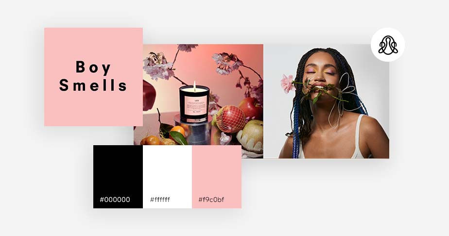
05. Boy Smells
What began as an experimental passion project of business and real-life partners, Matthew Herman and David Kien, evolved into a full-scale lifestyle brand selling candles, fragrances and undergarments that break traditional gender norms. Packaged in pale, pink boxes juxtaposed with bold, black text, the co-founders refer to Boy Smells’ brand identity as “genderful.” As they outline on their website,
“We wanted to have products that were embracing masculine and feminine simultaneously in a simple and straight-forward way that wasn’t overtly targeted to one gender. It’s a permission to harness your power from wherever you want it.”
The founders created enticing, unique scents like Cinderose—a combo of rose and smoke or Purple Kush—a pairing of cannabis flower and suede. Through their clever and intentional tone, imagery and package details, Boy Smells’ brand identity perfectly encapsulates their message. While self-care’s importance can often go overlooked, this lifestyle brand wants to create inclusive products that redefine identity, especially in a rigidly masculine/feminine industry. Their visual and non-visual branding details grant permission for anyone to enjoy their fragrances without any rules.
06. Coca-Cola
Reading “Coca-Cola,” probably evokes the pleasing sound of opening a refreshingly cold can (or trademarked bottle). The Coca-Cola brand, or as many of us refer to it, Coke, is one of the most recognizable brands on the planet, and many associate it with happiness. And this is no coincidence. Coca-Cola leads the industry branding and product sales because they appeal to their audience and leave a lasting impression.
For example, did you know that while Coca-Cola did not create the legend of Santa Claus, the brand’s advertising helped shape the beloved and jovial character we all know and love. Based on a 1931 painting that Coca-Cola commissioned, the brand “established Santa as a warm, happy character with human features such as rosy cheeks, a white beard, twinkling eyes and laughter lines.” That image endures today, and the positive feeling many associate with the holiday season is inherently linked to Coke.
Coca-Cola doesn’t base their brand identity solely on holiday cheer. Every aspect of Coca-Cola’s branding plays on emotion, connection and a sense of belonging. The brand’s many successful campaigns include “Share A Coke,” “Open Happiness” and “Taste the Feeling.” While each campaign has its own voice, each links back to the Coca-Cola’s Company purpose: To refresh the world and make a difference.
Even their iconic red and white logo has stood the test of time. It uses a classic serif-script font to evoke a hand-drawn quality, making the brand feel approachable. Through consistency, their unmistakable brand colors and logo design, Coca-Cola continues to develop brand loyalty from die-hard Coke fans.

07. Patagonia
Patagonia is a worthwhile contender on our list for best brand identity examples. Their mission is clear: “We're in business to save our home planet.” Like a thread weaving through every detail of their brand strategy and marketing efforts, the company successfully upholds their values of sustainability, leadership and inclusion and is the epitome of a purpose-driven brand.
The brand has a highly recognizable logo, depicting Monte Fitz Roy in the Southern Patagonian Ice Field. Their logo perfectly encapsulates the brand’s heart and origin. Fans easily recognize the brand’s logo without the name or even the colors. In addition, the public commends the company's high-quality products and commitment to slow fashion.
Perhaps the most noteworthy of Patagonia’s branding efforts is their commitment to giving back—like in 2021 when they donated every cent of their record-breaking $10 million in Black Friday sales.
“100 percent of our global retail and online Black Friday sales [go] directly to grassroots nonprofits working on the frontlines to protect our air, water and soil for future generations, we heard from many of our customers calling it a “fundraiser for the earth.”
Patagonia not only commits to their customers, but they focus on their employees too: The company closed all their stores, offices and warehouses in both the U.S. and Canada from December 25 through January 2 to give their employees a much-needed break. Patagonia as a brand identity example truly shows the value of transparency and the power of consistency.

08. Spotify
As 2021 recently came to a (much-needed) end, many of us were delighted to share our Spotify Wrapped with our nearest and dearest. The amazing marketing strategy rode the wave of connection, making Spotify’s listeners feel part of their community while also highlighting their unique preferences.
For a brand that puts music front and center, Spotify’s has a rather subdued visual identity. A modest color palette of green, black and white takes a backseat to the colorful album covers played on the streaming platform. The minimalist logo, which includes three horizontally curved lines in a circle, represents sound’s flow and movement. Look closely, and you’ll notice it’s crooked, bringing a humanistic feel to the brand.
Since global listeners use Spotify on both mobile and desktop devices, the brand successfully maintains consistency across platforms. Spotify's brand style guide allows external businesses to create branded playlists that show off their own identity, but visually they feel inclusive to Spotify's brand. In addition, these playlists become a branded asset unto themselves. For example, the fashion label The Row, has monthly playlists created by Mary-Kate and Ashley Olsen, the brand’s stylish founders. Originally, the playlists were launched to engage with their audience during quarantine, but they were so successful that the Olsen twins continue to release monthly music to engage with their audience.
You can explore other style guide examples to see brands that have done it right.

09. McDonald's
The American food chain associated with hamburgers, fries and the iconic golden arches, McDonald’s is a must in our list of brand identity examples. Arguably one of the most recognizable brands in the world, simplicity is the key to McDonald’s brand identity. Their no-muss-no-fuss red and yellow color palette is warm, friendly and accessible.
McDonald’s tailoring to their target audience makes their brand strategy particularly noteworthy. Each aspect of their brand identity—from their logo and packaging to their overall brand message and tone—considers their target customer. Think of Happy Meals or the playful characters like Ronald McDonald and the Hamburglar: Instantly you know McDonald's created these products for children. Their offering doesn’t stop there, their menu is accessible to a much wider audience, inclusive of diverse dietary restrictions and budgets.
Regardless of your age, or geographical location, step into any McDonald’s and you’ll experience the brand in the same way. Both their consistent visual identity and their dependable products make them a trustworthy brand. You can instantly recognize a McDonald's in almost every country. The brand successfully implemented cultural cuisine and localized marketing strategies to ensure that they are always aligned with their customers, no matter where they are.

10. Fatso
Sometimes peanut butter gets a bad rap, but Fatso isn’t your average peanut butter. Offering a wide range of creative flavors like Maple Almond Seed Butter or blended mixes of organic coconut oil, MCT oil, or chia and flax seeds, founder and CEO Jill Van Gyn created the Canadian brand to highlight the good fats and ingredients in nut butters.
The brand's quirky and approachable visual language uses a muted-yet-bold color palette of millennial pink, mint green and nutty brown paired with a friendly peanut character who appears on every container, and even on the company’s website favicon. The Fatso logo contrasts this with a dark and heavy typeface, not only drawing attention to the brand name, but also playfully evoking the brand’s spirit.
Learn more: Typesfaces vs fonts
What makes Fatso a particularly good brand identity example? The brand looks just as good on the inside as it does on the outside. The company supports a range of social justice efforts and has a commitment to inclusion. Even the product itself is non-GMO, vegan, kosher and gluten-free certified, making it accessible to a range of communities.
And you may not think of a nut butter business as a place for social change, but Van Gyn uses her brand’s influence and voice for many important causes. For example, the brand provides their product to underserved communities within Canada and the US, recently donating over $200k of product to food organizations.
According to Fatso’s website, “Fatso has donated to and supported a wide range of charities and organizations that focus on harm reduction, housing issues, food security, LGBTQ+ communities, Black Lives Matter (both Canada and US), and First Nations communities.”

11. Wix
For the last brand identity example, Wix is in the mix. The website builder has found its place as a go-to platform for business professionals, entrepreneurs and self-creators through consistent branding assets and a reliable product.
Wix’s visual identity has a minimalist black and white logo designed to be instantly recognizable in all sizes and contexts. It pairs well with a diverse color palette, showcasing the bright and dynamic creativity of Wix’s users. Wix even created its own custom typeface MadeFor to highlight the brand’s spirit.
“Wix Madefor is our custom typeface. A versatile and adaptable typography toolkit with a distinct personality, Madefor finds harmony between freedom and structure. Designed for your vision–made for you.”
With a strong foundation and a clear identity, Wix allows others to build their own brands from the ground up, at every level. In addition to creating websites, products like the Wix Logo Maker to The Branded App by Wix enable business owners to develop their own online presence and identities.

12. Airbnb
Whether it’s their lovable logo, user-friendly interface or honest brand messaging, Airbnb is a great example of a brand identity done right. Founded in 2008, Airbnb started out with a simple idea: to let people open their homes and couches to travelers. The idea, which has obviously evolved along with the brand, led Airbnb to totally change the game in the hospitality industry.
The company underwent a rebrand in 2017 when they realized that the true core of their business was much more than hospitality: it’s a total sense of belonging. They created their iconic Belo logo symbol and as they eloquently explain on their blog:
“Of course, an identity is about more than symbols. So we’ve redesigned the entire Airbnb experience to better reflect the people who make up this community. Our shared vision of belonging is the thread that weaves through every touchpoint on Airbnb. We have redesigned every single page of the user experience across the web and mobile to bring our new identity to life. Now we have a platform that reflects your feedback, and that can continue growing as we keep listening.”
The key takeaway from this example is the way Airbnb truly listens to their users. This was the catalyst for their evolution, which in turn made their brand more relatable, authentic and, of course—successful.

13. LEGO
Founded in 1932 on the premise of imagination, fun, creativity and learning, LEGO is an example of a brand that has stood the test of time. From their brand name (created with two Danish words “leg godt”, meaning “play well”) to their mission: “Inspire and develop the builders of tomorrow”—the LEGO brand totally embodies their values, down to each individual block.
It’s not just the familiarity and dependability of their product, or the personal connection so many of us have to this nostalgic-yet-modern toy, that keeps the momentum going. The company has developed a strong sense of brand trust and, in turn, brand loyalty. Each detail of their marketing efforts reinforces the core values at every level, which is palpable to any LEGO user, regardless of age.
LEGO’s brand identity is cross generational, appealing to both youngsters and adults, perpetuating their brand mission.

14. Bumble
Launched in 2014, Bumble is a female-focused dating app that has dominated the market since it came onto the scene. Built on values like respect and accountability, Bumble’s mission is to “create empowering connections in love, life, and work. We promote accountability, equality, and kindness in an effort to end misogyny and re-write archaic gender roles. On Bumble, women always make the first move.”
From their optimistic color scheme to their onboarding process and user experience, Bumble’s brand identity is strong in every touchstone. They continuously reinforce their brand values and empower women to be decisive and unapologetic in their dating endeavors.
To further manifest the importance of their brand, they also have Bumble brand ambassadors, a collective “hive” and community-based initiative that holistically embodies female change-seekers to spread the brand mission on a global scale.

How to create a brand identity
Creating a brand identity is like shaping your business’s personality. It’s what people see, feel and remember about your brand. From designing packaging to launching a website, these building blocks will help guide every visual and verbal decision.
Pillar of your brand identity | Core focus | Key actions | Examples |
1. Purpose and values | Your North Star which is why you exist beyond making a profit. | Write a mission (what you do), vision (future goal) and values (how you behave). | A fitness brand promoting inclusion and confidence rather than just selling leggings. |
2. Audience knowledge | Understanding your customer like a close friend. | Create personas: defining their hobbies, pain points and where they hang out online. | A Gen Z skincare brand using playful TikTok tutorials vs. an eco-brand using earthy tones. |
3. Visual identity | The first impression and your logo, colors and fonts. | Use color psychology (e.g., blue for trust) and consistent typography (e.g., serif for premium). | Every brand touchpoint from packaging to website feeling unmistakably you. |
4. Voice and messaging | How your brand talks and the personality it conveys. | Define a specific tone: Are you quirky, formal or the knowledgeable friend? | Using a casual, helpful voice to make tech feel less intimidating. |
5. Consistency | Applying the identity across every single brandtouchpoint.v | Check your banner, emails and even internal docs use the same visuals and tone. | A custom email footer or a branded giveaway that matches your posters and ads. |
Define your brand’s core purpose and values
Start by getting clear on why your brand exists. It’s not just about what you sell—it’s about what you stand for. Your mission and values act as your brand’s compass. What problem are you solving? What principles guide your choices? A fitness brand, for instance, might focus on more than just workout gear, promoting confidence, strength and inclusion for every body type. Your purpose and values should influence everything, from your products to your messaging.
To put this into action, write a short statement for each: your mission (what you do), vision (where you’re headed) and values (how you behave). Keep them concise but meaningful and test them to see if they connect with your audience and reflect your internal culture.
Know your audience like a friend
Creating a brand identity without understanding your audience is like picking a gift without knowing who it’s for. Build detailed personas: what do your ideal customers do for fun? What’s keeping them up at night? Where do they spend their time, both online and offline?
Once you know who you’re talking to, adjust your tone, visuals and product experience to match their needs—and surprise them with things they didn’t even know they wanted. For example, a skincare brand targeting Gen Z could use bold colors, playful copy and TikTok tutorials. A brand for eco-conscious parents might focus on earth tones, minimalist design and stories about sustainability.
Develop a distinct visual identity
Your visual identity is your brand’s first impression and a great way to make it stick. This includes your logo, color palette, typography, imagery style and even the smaller details like icon design. Every piece should reflect the personality and values you’ve already defined.
Choose visuals with purpose. Color psychology plays a big role in how people see your brand—blue suggests trust, red brings energy, green hints at growth or nature. Fonts matter too. A custom serif says “premium and timeless,” while a clean sans serif screams “modern and approachable.” Keep things consistent. From packaging and posters to your website, every element should work together and feel unmistakably you.
Craft your brand voice and messaging
A strong brand identity isn’t just how it looks—it’s also how it sounds. Define your brand voice and tone: playful, formal, quirky, confident or caring. Think about how your brand would talk to a customer if it were a person.
Your messaging should always be clear, consistent and focused on what your audience needs. Create phrases or taglines that reflect your value and personality. For example, Mailchimp’s voice is casual but knowledgeable just like a smart friend who gets it.
Want to practice? Write social media captions, email subject lines or product descriptions using your voice guidelines and test them with real users.
Apply your identity across every touchpoint
A brand identity works when it’s applied consistently. Your visuals, tone and message should appear across all parts of your business—from your website banner to customer service responses, business cards, packaging and even internal documents.
Small moments matter too: a label on a freebie, a custom email footer or a branded workshop giveaway. Hosting events or creating print campaigns? Use poster ideas that reflect who you are. Launching a new product or marketing effort? Ask yourself, “Does this feel like us?”
Learn more about website builders:
Brand identity FAQ
What's the essence of a brand identity?
A brand identity, whether yours or someone else's, is made up of all of the different characteristics, values, attributes and even background gradients that define a brand and distinguish it from others. It should convey a unique and memorable brand image, through a variety of visual and textual elements. In turn all of these should resonate with your target audience and create a lasting, positive impression.
How much does it cost to develop a brand identity?
The cost of developing a brand identity can vary tremendously, depending on how much you plan to rely on external experts to help you build it. Each step of the process, from research to creation, and implementation could cost from several hundreds of dollars, to several hundred thousand.
What's the ROI of brand identity?
The ROI of brand identity can be difficult to quantify, but it can have a significant impact on your bottom line. A strong brand identity can help you:
Increase brand awareness and recognition
Build customer loyalty
Attract and retain top talent
Increase sales and profitability
Charge premium prices
What's an example of a brand identifier?
A brand identifier is any element that helps people identify your brand. This could include your logo, tagline, color palette, typography, imagery or even your brand name.
What's the brand identity, behind a huge brand like Coca Cola?
Coca-Cola's brand identity is centered around the concepts of happiness and togetherness. They also often involve the feeling of refreshment and quenching thirst. This huge, global brand employs a consistent color palette, predominantly red and white to evoke the energy, excitement and positivity behind its brand. Coca-Cola's messaging focuses on the joy of sharing moments, via campaigns like it's iconic "Taste the Feeling."
What are some of the best ways to represent brand identity?
Consistent visual identity: Use a cohesive color palette, typography and logo across all platforms to create a recognizable visual identity. The best brand identity examples all do this.
Clear messaging: Develop a compelling tagline and brand story that reflect your values and mission.
Unique voice and tone: Maintain a consistent voice and tone in all communications, whether formal, friendly or humorous. There's no right or wrong voice, each brand voice is different.
Quality content: Produce high-quality, relevant content that aligns with your brand’s values.
Customer experience: Provide a seamless and positive customer experience that reflects your brand's promises.


