- Mar 29
- 13 min read

A luxurious resort in an enchanted location can be tempting but without a professional hotel website your hotel business can quickly lose ground to competitors. With more travelers planning trips online, your site needs to work hard to earn their trust and inspire bookings. A well-designed hotel website is no longer optional, it’s a must for attracting guests and filling rooms.
That's why we've put together these 15 hotel website examples to help you build or improve your own website.
TL;DR: hotel website examples
The article features 15 Wix-built hotel websites that show how strong visuals, clear layouts and smooth booking flows turn visitors into guests. From Eastwind Hotels’ Scandinavian charm to Joyà Zanzibar’s tropical elegance, each example uses full-screen imagery, consistent branding and engaging descriptions to bring the property’s atmosphere online.
It also shares best practices like professional photography, mobile optimization, multilingual options and guest reviews. A visible booking button, live chat and simple reservation process keep users moving toward booking, while SEO and well-crafted content help hotels get found and stand out.
Need inspiration for your website? With Wix's hotel website builder, building a standout hotel website is easier than ever. Choose from thousands of customizable templates and use Wix’s easy drag-and-drop website builder tools to make your vision come to life. Turn your ideas into reality and see just how simple it is to create a unique, professional website.


Hotel website checklist for owners
Website feature to include for a hotel website | How to make it happen |
|---|---|
High-quality visualsx | Hire a professional photographer and use full-screen images or videos that highlight your property |
Prominent booking button | Place a bright, contrasting button in a fixed position so guests can book from any page |
Streamlined booking process | Keep forms short with only essential details like dates, guest count and room type |
Mobile-optimized website design | Test your site on multiple devices and design mobile-first to capture on-the-go bookings |
Multilingual website options | Add a language switcher for major guest demographics to reach international travelers |
Guest reviews | Display ratings and testimonials on your homepage to build trust |
Live chat | Add a chat widget linked to WhatsApp, Messenger or similar for instant guest communication |
Website SEO best practices | Use location-based keywords so travelers find your site when searching for hotels in your area |
Storytelling content | Share your hotel’s history, values and unique features to create a personal connection |
15 hotel website design examples
01. Eastwind Hotels

Eastwind Hotels offers a peaceful, design-driven escape in the Catskill and Adirondack Mountains of Upstate New York. Blending Scandinavian mid-century style with the raw beauty of nature, each location—from the riverside serenity of Oliverea Valley to the cozy minimalism of Windham and the untamed charm near Lake Placid—delivers the perfect mix of comfort and adventure. Accommodations are thoughtfully designed, from geometric Lushna cabins and warm vintage suites to sleek modern guest rooms, all seamlessly connecting design with the surrounding landscape.
The Eastwind website captures this vibe perfectly. Bold full-width visuals instantly draw you in with foggy forests, inviting A-frame cabins and beautifully designed interiors. The clean, open layout reflects the spacious airy feel of Eastwind’s properties. It’s easy to explore each location, discover amenities like saunas, fire pits and nearby trails or simply get lost in the experience. The design encourages you to scroll and imagine yourself there.
One standout feature is how rooms are presented. On the Oliverea Valley page, each suite comes to life with moody high-quality photos and vivid descriptions—vaulted ceilings, private decks and vintage touches—giving you a real sense of mood and texture. Practical details are integrated seamlessly without disrupting the story.


02. Muun Landscape Hotel

The Muun Hotel website welcomes you with a full-screen video that instantly immerses you in its calm, earthy world—lush landscapes, elegant interiors and soft natural light. The design feels effortless yet intentional, with a minimalist layout reflecting the hotel’s focus on nature, luxury and quiet retreat. A soothing palette of olive green and warm browns ties everything together, creating a grounded, tranquil feel.
Navigation is smooth and intuitive. Booking a suite, exploring Celosía (the hotel’s restaurant) or learning about the region feels effortless. Constellation-inspired design touches add a hint of magic, while a floating chatbox keeps contact options—WhatsApp, Instagram, email, maps and more—always within reach.
The About page doesn’t just inform, it tells a story. Through rich visuals and warm copy, it shares the heart of the hotel and the spirit of its location. From the moment you visit the site, you’re invited into Muun’s world of calm and understated luxury.


03. Outbuildings

The Outbuildings Dorset website feels like stepping straight into the property. From the moment you land on the homepage, you’re wrapped in the rustic warmth and relaxed luxury that define the retreat. Sweeping views of the West Dorset countryside, glowing fire pits, outdoor copper tubs and cozy interiors invite you in. The visuals are rich but never overdone and the layout flows effortlessly, guiding you like a gentle walk through the property.
The “About Us” page tells the story of a family transforming a derelict dairy farm into a unique retreat full of character. It’s the soul of the place brought to life through honest photos and warm thoughtful language. Room descriptions feel like personal invitations. The "Our Rooms" section is clear and inviting with detailed descriptions, simple pricing and clean visuals. From browsing to booking, every detail feels intentional.


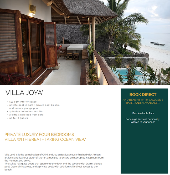
04. Joyà Zanzibar

This ethno-chic retreat located in Zanzibar delivers an immersive and visually captivating experience that instantly transports visitors to the resort’s idyllic setting. The Joyà Zanzibar site’s design is clean and modern, with enticing high-resolution imagery and video content that showcases the beauty of the resort and its surroundings. The user-friendly navigation makes it easy for potential guests to explore accommodations, amenities and activities with just a few clicks.
Thoughtful details, like an easy-to-use booking process, clear call-to-action buttons and engaging content, guide visitors effortlessly from browsing to booking. The hotel site also highlights the resort's unique offerings, like local experiences, curated honeymoon packages and wellness options, which cater to the needs of their clientele.


Be inspired: Luxury website examples
05. Varena Treehouse

Varena Treehouse is a one-of-a-kind retreat tucked away in the tranquil Varena District of Lithuania offering the perfect blend of nature and comfort. With a collection of beautifully crafted treehouses and cabins, each space combines rustic charm with modern amenities. From cozy spots like the East treehouse to spacious options for families or groups, every detail is designed to create an unforgettable stay. Surrounded by lush forest, guests can relax in hammocks, explore the outdoors or simply soak in the peaceful atmosphere.
The Varena Treehouse website captures the essence of the retreat immersing visitors in the beauty of nature from the moment they land on the homepage. A tree-filled background sets the tone while the clean minimalist design lets the stunning visuals of the property shine. The site is thoughtfully organized making it easy to explore accommodations, learn about the treehouses and book a stay in just a few clicks.
The "Treehouses" section offers detailed descriptions and gorgeous photos of each space giving visitors a real feel for their potential stay. Individual room pages highlight unique features and ambiance helping guests imagine their escape. Easy navigation and a simple booking process make planning hassle-free while the forest-inspired design creates a deep sense of connection to the retreat.


06. Playa Venao Hotel Resort

Tourism websites should show off the beautiful scenery of the areas they're featuring, and the Playa Venao Hotel Resort website does just that. This well-designed hotel website effectively conveys the unique appeal of this beachfront paradise in Panama.
Playa Venao lures visitors with tempting photos of palm trees, snacks by the pool and ambient nighttime lighting. If you want to create a hotel website, make sure to read up on photography tips for beginners, or alternatively, hire a professional to do the job for you. The design is clean and visually inviting, with a focus on user experience that makes exploring the site both enjoyable and intuitive.
This hotel website clearly promotes its strong TripAdvisor rating. This not only serves as a strong endorsement of the resort’s quality and guest satisfaction but also adds a layer of credibility that can significantly influence potential guests in their decision-making process.


07. Lazy Parrot Inn

The Lazy Parrot Inn boasts an effective hotel website design that combines user-friendly navigation with a visually appealing, cohesive design. The tropical theme, reinforced by the inviting images and a consistent color palette, perfectly captures the laid-back, inviting atmosphere of the hotel.
Additionally, the site is built with accessibility in mind, ensuring that all visitors can easily explore its offerings. Overall, the website's look and feel align seamlessly with the brand's identity as an eco-friendly, serene retreat.


08. Kuckuck

Kuckuck is redefining hospitality in Germany with cozy Tiny Houses and glamping tents perfect for anyone craving a peaceful escape into nature. Each stay is set in a secluded spot—think farms, vineyards or historic estates—offering guests a chance to immerse themselves in stunning surroundings with total privacy. With 15 locations across Germany, Kuckuck invites visitors to step away from the daily grind and reconnect with nature all while enjoying modern comforts.
The website greets you with a clean layout and stunning visuals that instantly draw you in. It’s simple to explore the accommodations, each with its own unique charm like panoramic windows in the cabins or the cozy appeal of glamping tents. Booking is effortless with clear calls-to-action and detailed descriptions that help you know exactly what to expect.
There’s more to discover too. A shop lets you grab gift vouchers making it easy to share Kuckuck's magic with friends and family.


09. Sea Breeze

The name says it all. The Sea Breeze Mykonos website is a standout example of an effective hotel website that effortlessly captures the essence of luxury and relaxation that the property embodies. The site’s design is sleek and modern, with airy visuals that showcase the breathtaking views of the Aegean Sea and the luxe look and feel of the suites themselves. From the moment visitors land on the homepage, they are greeted with visuals that instantly transport them to the serene and picturesque setting of Mykonos.
Sea Breeze proudly displays its excellent Booking.com rating directly on its homepage. This builds trust with potential guests and reinforces the property’s commitment to providing the best possible guest experience. By highlighting this rating, Sea Breeze Mykonos effectively communicates its reputation for quality and guest satisfaction, which can be a deciding factor for travelers when choosing where to stay.

10. Ballarat Premier Apartments

The Ballarat Premier Apartments hotel website exudes elegance, perfectly capturing the luxurious and historic essence of this unique property. This sense of sophistication is largely thanks to the accommodation itself, showcased in large, high-quality photos that fill the page. Like the property, the site design artfully combines traditional centerpieces with contemporary touches, using a cohesive color palette that echoes throughout the site solidifying a unified and polished look.
In addition, this hotel website is easy to navigate. Wherever you are on the site, the menu is never far away, with a fixed menu at the top of the page that ensures visitors can easily explore different sections. Additionally, a social bar on the side links directly to the brand’s main social media channels, making it simple for guests to connect with the property online.
The seamless integration of the booking system, paired with clear CTA buttons, guides users smoothly from browsing to booking.
11. Carlton Court

Situated in a peaceful location by the British seaside, this boutique bed and breakfast has a delicate and stylish website design. Their well-written copy includes a few carefully selected adjectives that stand out on the homepage and evoke a sense of coziness and luxury. In addition, clear imagery showcases the property's beautifully appointed rooms and lush gardens.
Taking the time to write good website content is a key step in the creation of any kind of website. In fact, Carlton Court has taken it a step further by creating a free blog, offering potential guests extra information on the area.
12. Sol de Scottsdale

Sol de Scottsdale is a prime hotel website example of how to effectively present vacation rental properties online. Each of Sol de Scottsdale’s individual properties is meticulously categorized into separate pages, complete with detailed descriptions and visuals, ensuring guests have all the information they need for planning their trip. This is particularly useful for families traveling with small children or large groups, or guests planning events like bachelorette parties to know very detailed specifics of each property.
The integration of maps and insider tips about nearby activities further enhances the user experience. One nice feature is that the site offers direct booking discounts, encouraging guests to book directly and avoid third-party fees like those on Airbnb or VRBO. This keeps users on the page and gets them to convert directly to the hotel website.
13. Moonflower Belize

At first click, Moonflower Belize’s hotel website instantly captures visitors through the use of video in the hero fold, that showcases the best of Belize—from crystal-clear waters to vibrant flora. This video is more than just a background; it’s an invitation to experience the beauty and tranquility of the location, creating a powerful first impression that draws users in.
Moonflower’s logo which is elegantly simple yet memorable, complements the overall aesthetic of the site. Its design reflects the natural beauty and relaxed vibe of Belize, using clean lines and a modern, minimalist style that aligns well with the website's theme. The logo is a visual anchor that reinforces the brand’s identity throughout the site and doubles as a home button to bring users back to the main page.
14. Hotel Leavenworth

Located in the heart of downtown Leavenworth, the Bavarian village located in Washington, Hotel Leavenworth is a unique gem, and like the property, their website beautifully captures the charm and warmth of its alpine-inspired setting. The web design is both elegant and functional, making it easy for visitors to navigate while offering a visually rich experience. From the moment you land on the homepage, you’re greeted with stunning imagery that showcases the hotel’s picturesque surroundings, instantly evoking the cozy, welcoming atmosphere of Leavenworth.
The "Book Now" button is prominently displayed in the top fold, making it easy for visitors to check availability and secure their stay without hassle. This straightforward approach to booking is a testament to the website’s user-friendly design, which prioritizes ease of use and convenience.
On top of this, the hotel website effectively highlights the hotel’s unique offerings, such as its proximity to local attractions and its charming, well-appointed rooms. Through their use of detailed visuals and descriptions, potential guests can get a real sense of what to expect during their stay. This use of visuals enhances the overall aesthetic of the site and serves as an important tool in helping guests make informed decisions.
15. Guesthaus Vail

Blending luxury with accessibility, Guesthaus Vail is one of the best hotel websites that succeeds in mirroring the upscale yet welcoming vibe of the property itself. Upon arrival, visitors are immediately immersed in the elegance of the location through a captivating video banner that showcases the breathtaking scenery of Vail.
What sets the Guest Haus Vail website apart is its attention to detail in showcasing the property’s luxurious amenities and accommodations. A particularly nice feature for those trip planning is to see a clear amenities menu with all that the hotel offers including breakfast, a free shuttle and free parking. High-resolution photography and detailed descriptions provide visitors with a clear picture of what they can expect during their stay, from the opulent interiors to the stunning mountain views.
Explore these architecture portfolio examples and interior design portfolio examples.
Best practices for spot-on hotel website design
High-quality media features
Images and videos are vital in setting the tone of your unique hotel. Lure in customers with fullscreen shots and other striking visuals. Use a professional photo gallery for sharp images, arranged in an eye-catching website layout. You can use this image resizer tool, to make photos look their best.

Learn more about parallax scrolling
Intuitive user experience for travellers
Make sure visitors can easily navigate your website by opting for a familiar and simple website structure. Use a well-labeled menu to help visitors reach the desired page easily. If site visitors have a hard time looking for the reservation page, you’re likely to lose potential customers. Really consider the different parts of your website to get this part right.
Prominent booking button
Your main goal is to get visitors to make a reservation, right? With this type of website, you want to make it as easy as possible for them by ensuring that your online scheduling button is highly visible .Play around with your website color schemes, picking a bright shade for your button that contrasts with its surroundings, making it stand out. You can also pin the element to the screen so that the button stays fixed even when visitors scroll down your site.
Live chat
Guests are much more likely to inquire about booking a room if they can easily contact you. Adding a live chat widget to your site can help visitors feel welcome. You’ll also be able to provide them with all the information they need and form real connections with them before they’ve even stepped foot in the door.

Simple online booking
Ensure an easy and seamless booking process by crafting a clear, to-the-point interface. Minimize the number of steps required, sticking to the crucial details like check-in and check-out dates and number of guests. Take note that visitors asked to fill in a never-ending online form are likely to give up midway.

Mobile optimized
Many of your site visitors are likely to be booking from their smartphones. To stay on top of your game, make sure your website is mobile-first, with clear navigation and booking options from any mobile device.
Using a hotel website template will set you off in the right direction for this, check out these best hotel website builders.
Multilingual option
In the hotel business, customers are likely to come from all over the world. That’s why building a multilingual website is recommended in this industry, as it can expand your chances of getting bookings from a global audience.
Online testimonies
Including real reviews by satisfied customers on your website will make you seem more reliable and set a positive impression. Another person's honest opinion can sometimes be more convincing than any business's best marketing efforts.
SEO best practices
Imagine prospective travelers planning their getaways, and when they start looking they're likely to type "best hotels in (insert your city)" into their Google search. By implementing specific keywords like this into your hotel website, you can improve your chances of ranking on search engines and driving traffic (and travelers) to your hotel website.
Best hotel website design examples FAQ
What features should a hotel website template include?
A good hotel website design template should make it easy to showcase your property and guide visitors to book. Look for clear booking buttons, high-quality image galleries, mobile-friendly layouts and space for guest reviews. The best hotel templates also include room details, rates and contact information in a clean, easy-to-navigate format.
Why is hotel website content important?
Hotel website content is important because it serves as a first impression for potential guests, showcasing what makes your property unique. Well-crafted content provides essential information like room details, amenities and local attractions, helping visitors make informed booking decisions. High-quality visuals and engaging descriptions create a compelling experience that builds trust and credibility. By incorporating clear calls-to-action and SEO-friendly content, your website can effectively attract, inform and convert guests.
How do hotels attract more customers?
Attract more guests to your hotel with a seamless online experience. Start with a mobile-friendly, well-designed website that makes booking easy and intuitive. Use social media and online ads to reach a wider audience, and offer promotions or special packages to drive direct bookings. Build trust by delivering excellent customer service and encouraging positive reviews. Partner with local businesses and highlight nearby attractions to enhance your guests' experience and increase your hotel's visibility.


