Tooltips: How to Craft Effective Guiding Text

Using a product for the first time can be a daunting experience. Click here? Go there? Navigate where? Sometimes a bit of extra support, like training wheels on a brand new bike, is necessary to prevent a nasty spill. Luckily for UX writers, we have a simple yet handy solution in our writer’s kit - tooltips. When used correctly, tooltips can be just what you need to give users that extra push in the right direction and help them succeed.
So, what is a tooltip?
A tooltip is a guiding message that appears when you hover over a graphic element online, such as an icon, image or link.
It’s usually indicated by a small question mark, exclamation point or “i” icon that seems to magically appear, like a glistening raft in a stormy sea, just at the right time. And that’s the beauty of tooltips—they’re there when you need them and completely unnoticeable when you don’t.
The important thing to remember about tooltips is that they’re secondary in nature, not primary guiding text.
Mission critical info should always appear on the screen, not tucked away behind a tooltip icon that can easily be overlooked. That being said, users do actively seek out tooltips when they’re stuck or lost, so they have an important role to play. As the UX writer, it’s up to you to provide the copy that guides confused users in the right direction and keeps them on track.
Types of tooltips
Before we get to the business of writing tooltips, let’s first take a look at a few different types.
Inline tooltips
The most common type of tooltip, these provide highly contextual info that's in line with the product, hence the name. They can be found virtually anywhere—next to links, icons, form labels, column headings, text fields, subheaders and more.

The label tooltip
The first tooltip ever created was the icon label by Microsoft in Windows 95. It displayed the names of the toolbar icons when users hovered over them. Today, label tooltips are still very much used to help guide users. They also improve accessibility for disabled users since screen readers will recite these labels aloud.

The discoverability tooltip
Tooltips can be a great way to bring a user’s attention to a new or overlooked feature.

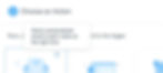
The tour tooltip
Like the discoverability tip, the tour tip introduces something new, but it’s displayed in a series of steps. This tip takes users on a virtual “tour” of a new product and highlights which features do what, and why they’re valuable. It’s great for onboarding and breaking up a lot of information into easily digestible chunks.
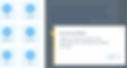
Triggered tips
Triggered tips are programmed to automatically appear according to a user’s profile or a condition. Here’s an example of a tip that appears after the first time a user adds a reservation to their calendar.

How to write great tooltips
Now that we’ve gone over several types of tooltips, let’s take a look at how to best craft these little gems. Here are some writing tips, with examples of do’s and don’ts.
1. Add Value
Tooltips should be helpful or interesting, and always relevant. This seems obvious, but you’ll be surprised how often you come across tooltips that aren’t. In other words, if you have nothing to say that adds value to the user, don’t use a tooltip. It’s not only unnecessary, but annoying.
When you start to write, sometimes it takes a few edits to make sure you’re adding value. Let’s look at the evolution of a tooltip aiming to help users pick their regional settings.
Tooltip take 1:

Just as you wouldn’t define a word with itself, avoid simply repeating a label in the tooltip. It doesn’t really add anything, does it?
Tooltip take 2:

Now the tooltip offers new and valuable information, by stating what regional settings actually are. But how can it be made even more relevant to the user?
Tooltip take 3:

Voilà! Now users can understand exactly what regional settings are and why they’re important to them. With your fine skills, you just prevented the inevitable chaos that would ensue if an American website displayed the European date format 31/2/2020.
2. Keep it short but link to more
In general, keep your tooltips to 1-2 sentences. If there’s more you need to say, you can add a ‘Learn more’ link leading to a Help article.

Remember:
Display the critical info on the page.
Add brief, extra guidance in the tip.
Link to in-depth explanation.
Using this approach, you can be sure to cover the needs of every type of user.
3. Cut the fluff
An effective tooltip gets right to the point and lets users continue on their way.
Not good:

Most of the info sounds like “fluff.” Drop it on the cutting room floor and keep what’s important. Otherwise, you risk losing readers’ attention before they get to the main message.
Better:

4. Include the benefit
If a feature has an important or interesting benefit, include it in your tooltip. Apply the "What > So What > Now What" approach. This is where you first explain what the feature is (the What), then the benefit (the So What), and optionally a call to action (the Now What).

Let’s break that tooltip down:
The 'What': Only use two to three fonts on your website.
The 'So What': Your site will look clean and professional—that’s great!
5. Use consistent formatting
Some tooltips have titles. Some don’t. With discoverability tooltips for example, you may have a title with the word “New,” and no title for your inline tips. Make sure to keep your format, punctuation, and alignment consistent to look professional. Users notice.
6. Punctuate sentences
You may be tempted to drop the period for a one-line tooltip. However, a 2-3 sentence tooltip with no punctuation would obviously look strange. So to stay consistent and play it safe, punctuate.
7. Give examples
Nothing beats a good example to illustrate a point. Take advantage of the extra space provided by a tooltip to inspire users with real examples:

This was an example of using examples. See? Case in point.
8. Write in active voice
Active voice is action-oriented language, starting with a verb. it is preferred for any UX text, and especially for tooltips since they need to be brief and empowering.

9. Create the trifecta
Tooltips don’t live in isolation. Always consider their surrounding environment. Forms for example, often contain labels, tooltips and placeholders. Strategize the content of these three elements to craft the copy trifecta and pack a powerful punch.

Let’s break it down:
The Label: Critical info.
The Placeholder: An example of what the user should enter in the field.
The Tooltip: Guiding info.
10. Incorporate your brand’s voice
A spark of your brand’s personality can show, even in tooltips. That being said, you don’t want to “try too hard” or you’ll risk confusing or annoying your audience. Refer to your company’s style guide and values to make sure you’re hitting just the right voice and tone.
At Wix, our voice is less about trying to be impressively cute or funny, and more about enabling users to succeed in using our product. We try to pack as much value and good advice as we can throughout the user journey. Here’s an example of our voice in action:

In another example, here’s a travel site with a different voice. This is a tip that appears when someone tries to book over the max time allowed:

It may not be everyone’s taste, but this tooltip is quite clearly tongue in cheek. Slightly risky, but if true to the brand, it works! Verdict: Helpful with a touch of abuse.
When to use tooltips
We’ve covered what tooltips are and how to write them. But really understanding when to add them is half the battle, and this comes from the skill of anticipating user pain points. If you’re not psychic, here are 5 ways to hone that skill:
1. Consider your users’ background
Plan a strategy for how often to use inline tooltips and for what purpose. If your users are extremely tech savvy or professionals in their field, you may not need to further explain every label or action. If your users are novice or varied, you may want to add more tooltips and explain more basic functions.
2. Put yourself in users’ shoes
It’s safe to say that as writers, we’re closest to the user mindset in that we see products as stories, as opposed to “graphical elements.”
So how do we put ourselves in users’ shoes? The answer—it’s a mind shift. When you look at design screens, imagine it’s the very first time you’re seeing the product. Forget everything you know about the technical parameters, dev capabilities or UI lib. Then go through the flow. Where do you linger or get stuck? Ask yourself, what terms could be clearer? And most importantly, how do you feel?
Anywhere that you pause, wonder, hesitate, feel anxiety or frustration—add a tip. Because you can be sure that a good percentage of your users will feel the same way.
3. Talk to support
Once a feature is in production, it’s crucial that you talk to your support team to discover where users actually get stuck. It’s a fast and efficient practice for getting inside information right from the source - your users.
4. Set up a usability session
Watch people use your product. Ask them to talk out loud so you can hear their thought processes. Listen for areas where they ask questions, or where they pause trying to figure something out. That’s where you add a tip.
5. Don’t explain navigation
A tooltip should focus on a feature’s functionality or benefit. If you find yourself trying to explain navigation or product, there’s likely a bigger issue going on. It may be time to talk to your team and head back to the drawing board.
In conclusion, the million dollar question: Are tooltips important?
The answer is a resounding yes. Anyone who tells you different is… well, not a UX writer.
Used correctly, tooltips are a powerful secret weapon. They make your product feel slick, professional and easy to use. This leads to user trust and yes, even delight—and that’s worth writing for.
Looking to start a blog? Wix has got your covered with thousands of design features, built-in SEO and marketing tools, that will allow you to scale your content, your brand and your business with their blog maker.

Anat Sivan, UX Writer & Team Lead at Wix
A New Jersey native, mother of 3 and certified word nerd.

