20 Gorgeous Website Examples for Website Design Inspiration
- Jan 15, 2020
- 5 min read

Once someone has decided to launch their own business, they will quickly discover that creating a website will be one of the most essential elements in order to optimally position their brand for success. However, not every entrepreneur has the extra time on their hands - not to mention the eye for complementary color schemes and sophisticated web design features - to invest in building their own website. As a web designer, then, your job is integral to the performance of so many businesses.
After spending a lot of time on the Wix Editor, you’ve probably discovered by now that you can create highly professional sites through a surprisingly simple process. Whether your clients require an online store, a design portfolio, a landing page, or any other kind of site, you can apply the amazing techniques that you’ve found and fallen in love with in the Editor to each of these platforms. Displaying remarkable attention to the details of a website - and putting in a ‘wow’ element or two - will allow you to exceed your clients’ expectations time and time again. In return, this stellar reputation will help you rake in those referrals and expand your clientele. In short, one of the big secrets to getting your name out there is this: Do a really good job. And for that, you need to keep your creativity soaring.
This is why our talented Wix designers selected twenty impressive websites showcase what it looks like when stunning web design meets a client’s needs. Browse through these examples to pick up some techniques you can integrate into your own work, and to get inspired by how other professionals are tackling client websites.
An intriguing logo - centered in the middle of the page and aesthetically coordinated with the featured image - lures in viewers to explore more of the site, and makes a statement about the brand itself.

In place of a written menu, captivating photos serve as clever gateways to this photographer’s image categories.

This site packs in fun and energy like no other. Yet with so much emphasis on the candy-coated colors, this site makes the wise decision to keep each menu narrowed down to a minimal three choices. ‘Work,’ ‘Hey,’ and ‘Shop.’ Simple and to the point. We can get behind that.

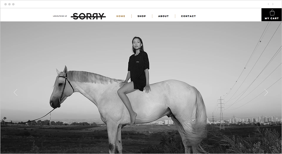
A black and white color scheme is the website version of putting on a tux. Classy, bold, and always in style. Against the background, a powerful (and clever) CTA and the font color hover effects on the ‘Menu’ header pack a powerful punch.
A bold, retro business name not only matches the denim in the homepage photo, but its size and font color contrast with the black background means it will get etched in the memories of visitors.

This site’s entry animation and video background create an intriguing invitation to engage further. Plus, the vertical menu options not only serve an aesthetic purpose of framing the page - they also put a new twist (literally) on a common feature. Anyways, Zvina is clearly doing something right - this site is a 2017 Wix Stunning Awards Winner.

This website conveys the studio’s signature playful touch right from the start - when they say ‘Floating Llama,’ they’re not joking around.

“Keep your love of nature, for that is the true way to understand art more and more.”
- Vincent Van Gogh
The hero shot of the Sardinian coast line is all a site visitor needs to be enticed by the site’s photographs. (Or, should we say, art?)

Did you know the color blue is known to evoke emotions of trust and dependability? This website shows they know that color isn’t just for looking pretty - utilizing color psychology basics has the ability to produce a specific reaction in the website’s target audience.

A study in minimalism, the site's welcome page elements are actually quite few in number: a logo, tagline, location, and sample shots that double as a background. Yet the personality-rich font and the way the two-tone accent of the logo plays into the bubblegum pink color scheme ensure this photography business still makes a big splash.

“Climb up on some hill at sunrise. Everybody needs perspective once in a while, and you’ll find it there.” - Robb Sagendorph
Take the audience on a journey to remember, just like this professional mountain guide does.

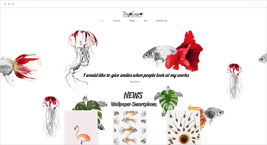
“I would like to give people smiles when they look at my work,” states the designer of this site. Every element of the design is a platform for bringing visitors into the artist’s brain and communicating his unique job title: “Fantasy Researcher.” Whether it’s a sashimi roll flamingo or an ice-cream cone fish, this site beckons its viewers to step into the creative zone - and to smile a bit.
The video backgrounds and the long scrolling look of this one-page website present a cohesive story about the professional expertise this motion designer brings to the table. And with links to the creative’s portfolios on design social media channels never far from reach, potential clients can easily get lost in the animated world in front of them.

Before even drinking their tea, visitors will already start feeling calm from the blissful design of this website. These calming colors and decluttered layout spell ‘z-e-n’ in web speak.

How can you resist the illustrated cat’s invitation to ‘Enter’ the site? By designing the page to look like the inside of the artist’s sketch pad, visitors can simultaneously feel privy to an exclusive area while also feeling the walls between them and ‘L’artiste’ break down.

This landing page uses its featured image to generate visitors’ curiosity, visually tempting them to follow the biker on his journey into the darkness (or, next page of the website) despite the ‘Do Not Enter’ warning sign. Challenge accepted.

This webpage hugs a grid tight - and for good reason. The symmetrical lines ensure visitors don’t get overwhelmed by any additional web elements that could potentially distract them from the bright colors of the artist’s work, or from her intricately designed name itself.

Simplicity is the name of the game, here. Yet ‘simple’ is not to be mistaken for ‘boring’ (especially here, when the designs originate from classic Russian criminal tattoos!) The horizontal strips take visitors through the story of the elegant ceramic pieces, and the consistent blue and white color scheme keeps the message focused, from the CTA to the sensational ‘About’ section.

A video background - that rotates based on which menu option your mouse is currently hovering over - makes the site’s dynamic design do double duty as a functional artist portfolio. Check and check.

The landing page image is so mesmerizing you won’t want to navigate away. And that’s exactly the magic here. (But if you do try and venture further, dynamic scrolling effects will only cast an even stronger spell over you. You’ve been warned.)

![[Free Webinar] Make Micro-Moments Matter: Optimize Your Client Sites for this Critical Behavior](https://static.wixstatic.com/media/255e2d_481effa64cf24be0b171397506ac236d~mv2.jpg/v1/fill/w_980,h_561,al_c,q_85,usm_0.66_1.00_0.01,enc_avif,quality_auto/255e2d_481effa64cf24be0b171397506ac236d~mv2.jpg)


Comments