- Mar 15
- 4 min read

You can add as much in-depth info about the client to your website as you’d like,but if the visitor isn’t compelled or guided in the right direction they’ll call it quits and hit the dreaded ‘x’ to close the tab. You can remedy this by creating a strong user interface that keeps the visitor engaged.
How to create strong user interface for your website
The following five tips are some of the best website design practices that you can use today to create a solid foundation for a strong user interface on your websites:
01. Keep it simple
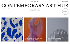
This first point is the most important, because if you have too many bells and whistles on your site or too many pages, you may confuse your visitors by creating a “sensory overload.” Especially in the modern age of the internet, simple websites are ever increasing in popularity. This is because simple website aren’t too overbearing with information and they help keep the visitor on track with the journey of the website. No doubt, some websites need a plethora of pages and a complex structure. However, most sites really don’t need much to become a powerful marketing tool. It’s important to be able to get straight to the point without confusing or distracting the visitor.
02. Guide the visitor
You want to be able to point the visitor in the right direction so they view the important content that will help guide their actions. The top two ways to do this are:
Creating a page hierarchy
Using strong call to actions (CTAs)
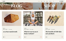
A page hierarchy is simply the way pages are set up and listed on the site, i.e. Main pages (the first pages you see on a menu) and subpages (the pages you typically see in the dropdown menus once you hover over the main pages). Page hierarchies are typically structured within the navigation menu. In our analogy, think of the navigation as the signs in a theme park pointing you in the right direction. The navigation menu is important because it’s one of the most used elements on a website and it’s where visitors look to view the main pages of a site. If you fail to add key pages to the navigation, you are failing to guide your visitors in the right direction.
A call-to-action is an element on a website prompting the user to perform an action; typically a button leading to a prominent page. Strong CTA’s are very useful in reiterating where to guide your visitors throughout the site and they also create an urgency to perform the action. A simple, yet effective, CTA is a button in a frozen header because it is one of the first things a visitor will see and it follows them around while they’re browsing your website.
03. Stay consistent
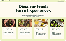
Style consistency is important to reinforce a strong brand image. A good place to start is the color scheme of the brand. You’ll usually see two or three colors being used by a company in their logo, website, ads, and prints. That’s because those core colors define the brand’s identity. Once you identify the core primary and secondary colors, start thinking about the different shades of each of those colors that can be used around the site.
A good idea is to create a stylesheet to layout the brand’s colors to reference when designing the website. Although you can use different shades of the core colors, the last thing you want to do is have the core colors being red and blue while using pink, orange, yellow, and purple scattered across the website. In addition to colors, the practice of being consistent also applies to graphics, font styles, logo files, and page layouts.
04. High-quality = High results
As you’re all very familiar with, a lot of clients want the world for a few hundred bucks. While some requests are irrational, you can’t fault a company for trying to save money. There might be ways to shave off a few dollars, but you don’t want to skimp on what goes into your website; after all, it’s usually the strongest digital asset of a company. In fact, 75% of consumers admit to making judgements on a company’s credibility based on the company’s website design. How can you gain the trust of the majority of your website visitors?
Use high-definition images that aren’t stretched or pixelated
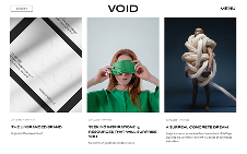
Keep elements appropriately spaced out from each other and don’t cram too much on a single page
Hire a professional videographer to shoot a killer video, rather than using a laggy webcam in a poorly lit room
Use visuals to explain the brand and to add to expand on the copy
Even if there are budget limitations, there are some amazing resources out there, such as Unsplash (free, high-quality, commercial-use stock images) and Graphic River (low-cost icons and graphics). Don’t publish a site just because “it’ll do,” take the time to build something that you’re proud of and launch the website when you’re thrilled to show it to the world.
05. Optimize for mobile
85% of adults think that a company’s website, when viewed on a mobile device, should be as good or better than its desktop website. This is due to the constant and consistent growth of mobile web page views. Luckily for you, Wix has a super easy to use editor for both the desktop version and the mobile version of a website where you can modify one version without affecting the other. The layout of the mobile version of a website is equally as important as the desktop version, so be sure to give it your full attention.


