

Studio Editor: Adding and Customizing Collapsible Text
4 min
In this article
- Adding collapsible text
- Adjusting the layout of the collapsible text
- Editing the collapsible text
- Designing the collapsible text box
Collapsible text is a great option if you have a lot of information that you want to display. Parts of the text are hidden, and visitors can view the full text by clicking an expand button, or a link to the full body of text.

Adding collapsible text
Depending on your needs, you can add different styles of collapsible text to the page. Some presets include a button that expands the text on the current page, others show a link that takes visitors to another page to read the full body of text.
To add collapsible text:
- Click Add Elements on the left side of the editor.
- Click Text.
- Click Collapsible Text.
- Drag your chosen text box onto the page.
 on the left side of the editor.
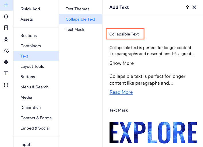
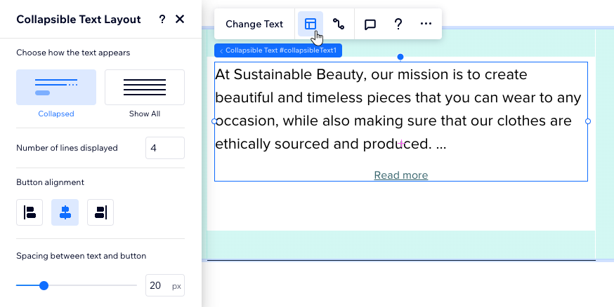
Adjusting the layout of the collapsible text
Choose how visitors can read the full body of text. Add a button that opens the full text on the current page, or a link that directs visitors to the full piece.
You can also set the alignment, spacing, and number of lines that appear before a visitor needs to click it.
To adjust the text's layout:
- Click the collapsible text box.
- Click the Layout icon .
- Customize the layout using the options:
- Choose how the text appears: Choose how the entire text is displayed:
- Collapsed: Visitors see a text preview, and they need to click a button or a link to read the full body of text.
- Show All: The entire text is displayed on the page, not collapsed.
- Number of lines displayed: Choose how many lines of text to show before visitors need to click a button to see the rest.
- Button alignment: Align the button visitors click to read more, to the left, right or center.
- Spacing between text and button: Increase or decrease the spacing between the text and the button.
- Choose how the text appears: Choose how the entire text is displayed:
 .
.
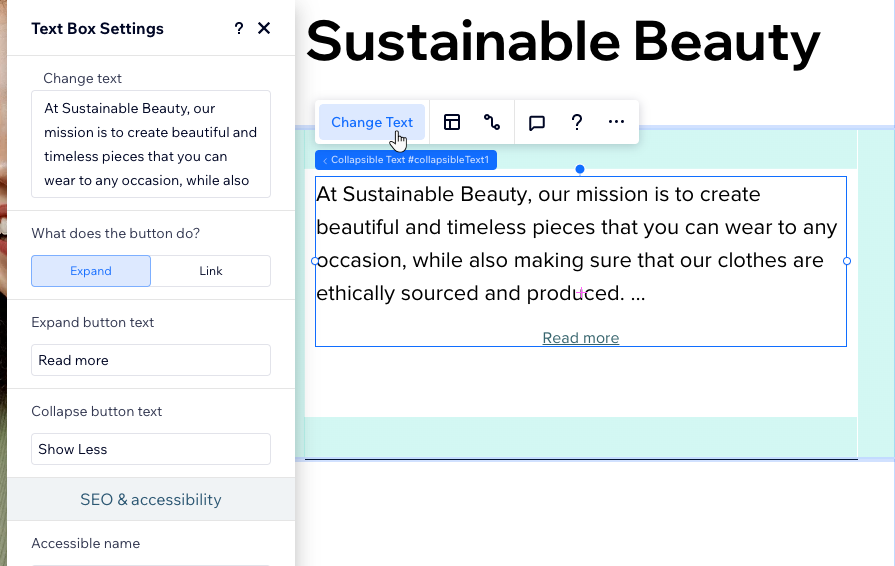
Editing the collapsible text
After adding a collapsible text box, click Change Text to enter the full body of text (up to 120,000 characters). You can also edit the text of the button or link that lets visitors read more.
To enter or edit the text:
- Click the collapsible text box.
- Click Change Text.
- Type or paste the full text under Change Text.
- Decide what the button does:
- Expand: Clicking the button expands the text box on the current page to show the entire text.
- Link: Clicking the button redirects visitors to another page with the full text. Make sure to choose the destination under Links to.
- Enter the text you want to appear on the button(s).
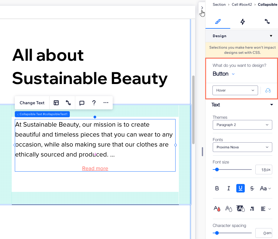
Designing the collapsible text box
Design the collapsible text box to match the page's aesthetic. You can adjust the look of the box itself (e.g. its background color), format the text and customize the button or link leading to the full text.
To design the collapsible text box:
- Click the collapsible text box.
- Click the Open Inspector arrow at the top right of the editor.
- Scroll down to Design.
- Choose an option under What do you want to design?:
- Text: Customize the box that contains the text (e.g. background color, borders, shadow), as well as the actual text (font, size and more).
- Button: Customize the link or button that visitors click to view the full text. You can adjust it on 3 different states – Regular, Hover and Disabled.
 at the top right of the editor.
Note:
Currently, the option to scale text is not available for collapsible text.