
“You only get one chance to make a first impression.” Such a common piece of advice to get before a job interview or a blind date. As a photographer, you might think that an outstanding photography website is the best way to create a good first impression. And, technically, you’re right. Your portfolio is the first place in which potential customers will see your work. But before they start browsing your masterpieces, they already have an image of your business in their mind. A logo is the very first thing people identify your work with. Despite representing the earliest conversation between business and client, the importance of a logo is regularly overlooked. This is especially true for emerging businesses and freelancers, who prefer to direct their efforts to other tasks. But if you stop to think about it for a second – how many businesses without a logo do you know? Especially nowadays, with infinite businesses begging for our attention both online and offline, logos have become an absolute necessity.
Now that we have established why logos are important, there are a few more questions you might be wondering about. What makes a good logo actually “good”? Can anyone create a nice logo? How do I make sure my logo looks fine anywhere? By the end of this article, all these questions will have been answered. Here are some tips on how to make a beautiful photography logo:
01. Dare to create
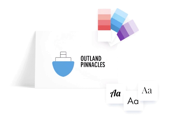
There are two paths that will lead you to create a logo on your own: one, you apply to design school and study for three to four years. Or two, you use the Wix Logo Maker and get a professional logo within minutes. Studying and learning new skills is always exciting, but an agenda full of photoshoots and meetings might be incompatible with going back to school for a few years. The Wix Logo Maker, the best online logo maker out there, will save you the time, money and hassle. Using an industry-specific one (in this case, a Photography Logo Maker) is even more helpful in making sure your logo reflects your brand.
All you need to do is answer a few basic questions about your business and style, based on which a wide selection of potential logos will be generated. Everything is fully customizable, so pick your favorite and get ready to put your knowledge into practice. Change the color palette, font, icon, and composition to perfectly match your portfolio’s character and needs. And ta-da! Your logo is now ready to be downloaded and used across all your photography marketing ideas.
02. Make it memorable
Ever heard that “imitation is the most sincere form of flattering”? Well, that absolutely does not apply to logos. A logo is the fingerprint of your business: a unique mark left in everything you do. People are exposed to thousands of brands every day, so being original will play a major role on whether or not you get noticed and, of course, remembered.
Keep in mind that your photography logo and portfolio should go hand-in-hand. Master the art of branding by creating a cohesive personality across your photos, logo, and website. No one will forget your business if there’s a strong connection between all its elements.
03. Choose your graphic
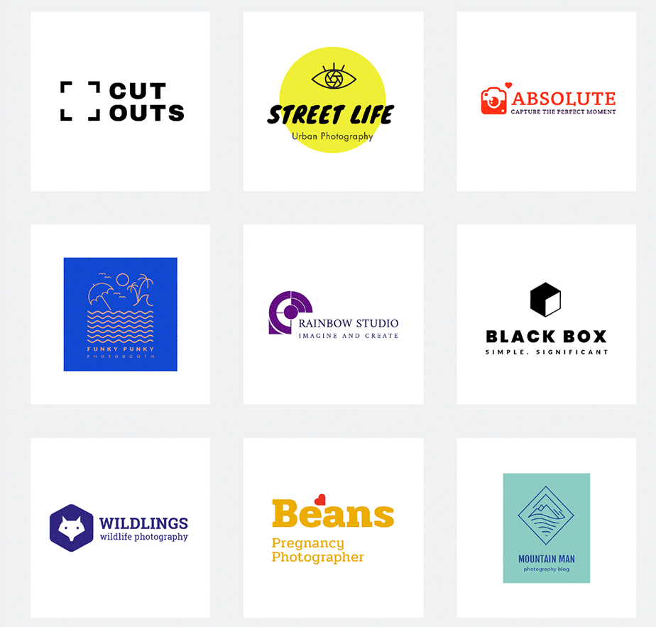
Selecting the image that will represent your business for a long time is not an easy task. Start by dedicating some time to research. Read about photography logo trends and see what other photographers within your genre and area use as their brands. If you need more logo design inspiration, check out these beautiful photography logos examples.
Think about who you are and what you want to be. Find what makes your photos special and translate it into graphic elements. This could be anything from an abstract concept to the animal that represents the region you work in.
As a photographer, you might be inclined to use classic shapes such as a camera or a diaphragm. This is, of course, a simple and straightforward way to represent your business. However, the popularity of these visuals in photography logos could get in the way of creating a unique brand. You’ll have to squeeze your brain to find a representation like nothing that has ever been done.
04. Remember the text
The end-goal of any brand is to be immediately recognized by their symbol, but this honor is limited to a few select globally renowned companies. For the remaining 99.9% of businesses that are not Nike and Apple, text is a fundamental part of their logo. Essentially, there are three things you should think about when it comes to your logo’s text:
The name of your business (obviously). Generally, it’s recommended to limit it to four words or 30 characters.
Your tagline. Also called advertising slogans, taglines are short catchphrases that provide a very brief description of your work, for example “wedding photography”.
The fonts. Try to limit it to one font per section. They should represent the essence of your style and be readable under all circumstances.
05. Keep it simple
Simple logos are also likely to survive obsolescence for a longer time than their complex counterparts. Yet despite all the evidence, it’s easy to go overboard when trying to come up with a unique logo. In fact, trying to include too much information is one of the main mistakes people make when creating a logo.
For better results, limit the number of words, colors, and visual effects you use. While rules are meant to be broken, only those with experience designing logos should venture outside these instructions.
06. Mind your colors
If there’s something that Inside Out taught us, it’s that emotions and colors are tightly related. Except that in the logo color world, none of them covey negative emotions. Colors play a major role in how we perceive brands, and so you should spend some time researching this topic before settling down on a color palette. As we mentioned before, the perfect photography logo should share a connection with your works. Thich applies to colors as well. For example, if your images have a soft color processing, you should refrain from using neon colors in your logo.
Something that may not be as obvious, is how important the lack of color is. When designing your photography logo, choosing the colors should be the last decision you make. Otherwise, you might find that your brand loses its identity once stripped down to one pigment. This might not seem like a big deal if you’re only planning to use it on your website and social media. But trust us, the day will come when you need to print it in black and white or use it as a silhouette watermark. Planning ahead will save you a lot of headache in the long run.
07. Adapt or die
Your logo should be optimized to work on every platform and print imaginable. The desktop version of your website, the mobile version, all of your social media accounts, email signature, watermark, business cards, invoices… Well, you get the idea. Each of these variables come with a few requirements and challenges, the most notable ones being the different sizes and number of elements permitted. We have already talked about the importance of creating a simple design that does not depend on color, but here are some other demands to take into account:
Social media platforms use rounded frames to display profile pictures.
Mobile displays are much smaller than we see on desktop.
Your logo should work in any size, which is why you should limit the use of small details.
The logo’s text and image should be able to work separately.
You might need to add a tagline.
Heavy images do not load well on emails.
To cover all your bases, it’s best to try out all these alterations during the design process. Once you’ve created your final logo, make sure to save as many versions of it as possible. This will help you save time whenever you need to use them.
The elements of a photography logo
A photography logo should be eye-catching, memorable and representative of the photographer's style and brand. Here are some key elements to consider when designing a photography logo:
Visual imagery: A photo logo should include an image or visual element that represents your brand. This could be a camera, a lens, an aperture or even a more abstract symbol that evokes the feeling of photography.
Typography: A well-designed photo logo should also include typography that complements the visual element. The font should be easy to read and reflect the photographer's style. For example, a wedding photographer might use a more elegant font, while a sports photographer might use a bolder, more dynamic font.
Color: Color plays an important role in logo design. It can be used to create a mood, evoke an emotion or simply make the logo more visually appealing. When choosing colors for your photography logo, consider the overall tone of your brand and the types of photography you specialize in.
Simplicity: A good logo should be simple and easy to remember. Avoid using too many complex elements or colors, as this can make the logo look cluttered and unprofessional.
Uniqueness: Your logo should be unique and stand out from the crowd. Avoid using clichés or generic symbols that could be mistaken for other brands.
Versatility: Your logo should be versatile enough to work in a variety of applications, such as your website, business cards and social media profiles.
Relevance: Your logo should be relevant to your photography business. It should reflect the type of photography you do and the style of your work.
Once you have considered these elements, you can start to brainstorm ideas for your logo. Sketch out some different concepts and experiment with different fonts and colors. Once you have a few ideas that you like, you can refine them to create a final logo that you love.