- Jun 30, 2024
- 10 min read
Updated: Dec 9, 2025

When your audience’s attention span seems to be shrinking by the day, learning how to make a website that encourages engagement is not a straightforward endeavor. It’s an art form that takes time to hone—but the time you invest in learning how to increase website engagement with website management is vital to the success of your website. Not only does increased engagement enhance your brand's credibility, but it also has a direct impact on your bottom line. The longer visitors stay, the more likely they are to make a purchase or become a loyal follower.
If those results sound appealing to you, keep reading this guide to learn about the different types of engagement, the web analytics metrics you’ll use to track it and our top strategies for increasing website engagement.
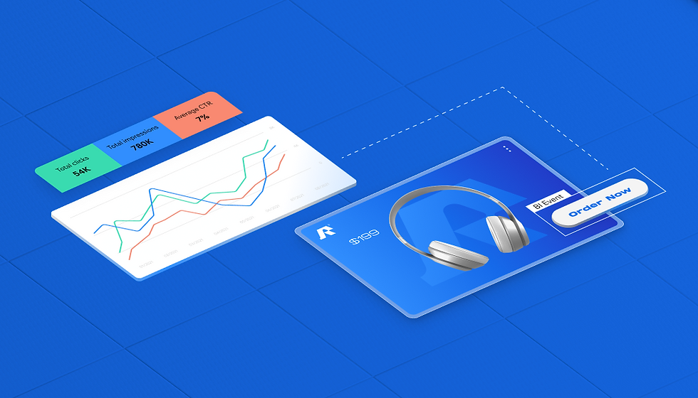
Use Wix’s website builder to get access to built-in analytics that’ll help you hone your engagement strategy.
What is website engagement?
Website engagement is a measurement of how often visitors interact with and take action on your website. It indicates that your website is interesting to visitors and contains the type of content they expect. A high engagement rate also improves bounce rate, which helps search engine optimization (SEO) by telling Google that your website is both relevant and useful to its readers. People may engage with your site in many different ways including:
Visiting a particular page, such as a product page or reading a blog post
Clicking a link or button
Signing up for your newsletter
Submitting a form or questionnaire
Interacting with your chat tool
Calling the number on your site
Adding a product to their cart
Completing a purchase or another type of transaction
Sharing a post or product
Leaving a review on your product or services
Writing a comment on a blog post
Watching a video
Downloading media
Keep these in mind as you monitor current engagement levels, set goals and develop a strategy for how to increase website engagement.
How to increase website engagement: 8 tried-and-true strategies
Ready to boost engagement on your website? Here are eight strategies you can implement today to cultivate long-term results:
While you’ll achieve the best return on investment (ROI) by using all these techniques in tandem, you’ll also see changes when you implement even just one to start, then add others as you go.
01. Increase site speed
In today’s fast-paced world, 53% of people will abandon your website if it takes longer than three seconds to load. Plus, having slow load times can impact your performance on search engines. If visitors can’t access the content they’re looking for instantly, they’ll leave. To increase website engagement and reduce your bounce rate (the percentage of visitors who leave your website after visiting only one page), look for opportunities to optimize your website speed. Factors like outdated software and large media files can significantly slow down your site.
Use Wix’s Site Speed dashboard and Google PageSpeed Insights to gauge your website’s speed and get suggestions for improving it. Wix’s Site Speed dashboard will suggest improvements based on actual user data (a.k.a., “field data”), as opposed to “lab data” that only estimates site performance.

Some quick tips for improving your site speed:
Be selective of what appears above the fold. Content that is above the fold of your site (i.e., the content that users see first when clicking onto your page) loads before the rest of your page. Don’t overcomplicate this space and make sure that it can load fast, plus keep people engaged while the rest of your page loads.
Resist the urge to add too many videos. Choose one or two strong videos and keep them below the first fold, where they won’t impact initial loading time.
Don’t go crazy with your fonts. Select a maximum of four different fonts to use on your site and stick to them. In addition to keeping your site looking sleek and more professional, fewer fonts will help improve performance.
Rethink your GIFs. GIFs are a great way to add a little flavor to your pitch deck but on a website, not so much. Don’t sacrifice speed for special effects.
Watch your image sizes and formats. Certain image formats tend to download faster than others without hurting quality. For example, we recommend using JPG rather than PNG, unless you require a transparent background. (However, if you use Wix, Wix will automatically convert images into modern image formats like WebP when possible.)
Make sure that your website builder gives you a leg up from the start. Learn more about Wix's performance standards and capabilities.
02. Suggest related items
No one can resist an on-the-nose recommendation, so suggesting related items is a low-lift way to encourage engagement. Ecommerce websites can add a related products section to the bottom of product pages to cross-sell or even upsell customers based on the products they’re most interested in. If you use Wix, you can suggest items that are frequently purchased together in the related products gallery to capitalize on social proof.
Pro tip: Start with easy-to-use free website themes to build a site that looks great and helps you earn online.

If your website has a blog, suggest related content in a sidebar or at the end of each blog post. You can configure your website to suggest blog posts that have similar tags, or use website analytics to see which pages visitors visit after that page and suggest those next.
03. Build a community
One of the best ways to keep visitors engaged with your website and coming back for more is by turning your website into a community. You can foster conversation directly on your site by creating a public forum or a members-only area. A member’s area is the perfect addition to a blog or course website. It’s a great way to encourage visitors to create an account within your website and designate a space for them to meet other like-minded individuals.
Let’s say you run a baking blog. A members-only space can be a place for readers to interact, show off the recipes they’ve tried out and ask questions. It’s also a good place for you to get feedback on content and crowdsource ideas for your next posts.

Install the Wix Groups app on your site or learn more about Wix’s community tools.
04. Request feedback
Engaging in a conversation with your website's visitors through feedback is crucial. This not only deepens their connection to your digital space but also helps you better understand the changes needed to keep them engaged. Think of it as having a direct chat with your audience where they can openly share their thoughts and experiences. In essence, seeking feedback isn't just a formality; it's a dynamic tool for ongoing improvement and more profound user engagement.
Use Wix’s form builder to make it easy for site visitors to offer their feedback.
05. Improve accessibility
In the United States alone, 42.5 million people (about 13% of the population) are disabled. Neglecting to cater to a diverse range of needs on your website might mean missing out on engaged readers and loyal customers. Ignoring accessibility standards can also put you in legal trouble, as local and state governments and businesses that are open to the public must meet ADA standards online.

When your website is accessible to all, you make sure every visitor can fully enjoy and interact with every aspect of your online presence. Boost accessibility by incorporating the following elements:
Contrast: Ensure that there is a significance in brightness or color between the text and its background to make the text easy to see.
Alt text: Alt text describes images and other visual media on your website. Alt text serves a dual purpose: it assists individuals using screen readers in understanding your website's content while also enhancing your website's SEO.
Keyboard navigation: Offer keyboard navigation options so people who need an alternative to a mouse can get around your website.
Captions: Set up video captions to make it possible for people who have difficulty hearing to enjoy your multimedia content.
All of Wix’s features comply with the highest global accessibility standards, making the process of optimizing for website accessibility a breeze.
06. Add interactive elements
Adding interactive components to your website is an effective way to encourage visitors to engage with your content more deeply.
A contact form is one of the simplest website interactivity tools. Embed a contact form on your website to give visitors an easy way to get in touch, and to collect their contact info. If you’re looking for a more sophisticated interactivity tool, opt for a quiz or questionnaire. This can be anything from a for-fun, Buzzfeed-esque personality quiz to a customer intake questionnaire.
Need inspiration? Check out the style quiz that personalized shopping service Stitchfix asks new customers to take. Customers share their preferences with stylists by choosing their favorite garments, patterns and more. Apps like Quizell can help you recreate a similar experience on your site and use quizzes to pair visitors with the right products or services.
07. Share your opinions in a blog
If you think blogs are just online journals for sharing study abroad updates with friends and family, think again. Blogs are versatile tools with all kinds of applications. Influencers often use blogs to share new content with followers, build their personal brands and sell merchandise. Businesses use blogs to educate visitors about their industry and show off their expertise in order to build trust.
When you add a blog to your website, you can boost engagement by giving visitors fresh content and various reasons to visit. If they like your blog posts, visitors may come back to read new posts, post comments to engage with you and fellow readers or even share them on their own socials.

Try Wix’s blog maker for free.
08. Enable comments
Another strategy for increasing website engagement is to enable comments on your blog posts and website pages. When visitors can comment on your website, they can engage with it on a deeper level. Visitors can start conversations with you, or engage in dialogue with other fans. They can ask questions, share their feedback and provide ideas for new content, products and services.
Add the Wix Comments app to your site to enable comments.
How to measure website engagement
Now, we’re going to discuss how these website engagement types translate into quantifiable metrics. Open your web analytics and follow along. If you’re a Wix merchant, you can track these key performance indicators (KPIs) in your Wix Analytics dashboard.
Traffic metrics
Website traffic metrics reveal which content and products people are most interested in. There are multiple ways to measure website traffic that allow you to understand engagement in different ways, including:
Visitors: The unique number of people who come to your website.
Sessions: The number of visits to your website.
Page views: The number of times someone visits or refreshes a page on your website.
Average pages per session: The average number of pages people visit during a session.
Average session duration: The average length of time visitors spend on your website.
Average time on page: The average length of time visitors spend on each page of your website.
Bounce rate: The percentage of visitors who leave your site after viewing only one page.
Look for patterns among your most-visited pages and try to replicate those successful elements throughout your website. You can increase website traffic through a number of strategies including SEO, advertising, email marketing, social media marketing, influencer marketing, brand partnerships and events.
Learn more: Website vs social media
Sales-related website engagement metrics
If you run an online store, the following sales-related metrics double as engagement metrics. Sales are the ultimate engagement metric and conversion on an eCommerce website, so these metrics track how well your conversion efforts are working:
Total sales: The total amount of money expected from sales, before deducting refunds, shipping and fees.
Leads: The number of website visitors who have taken action on your site, like signing up for a discount code, without making a purchase.
Customers: The number of people who have purchased products on your website.
Total orders: The number of orders customers have placed on your website.
Need to boost sales-related engagement? Analyze the pages from which customers leave your website and review your checkout flow to make sure there are no obstacles preventing visitors from turning into customers.
Blog-related website engagement metrics
It’s difficult to make people take action online. When blog visitors like a post or leave a comment, that’s the ultimate compliment and sign that your content is worth interacting with.
Whether your blog is the main focus of your website or just a small part of it, these engagement metrics can help you understand just how engaging your blog is:
Comments: The number of comments visitors leave on your blog.
Likes: The number of times visitors have liked your blog.
Post views: The number of times visitors have seen your blog posts.
Reactions: The sum of likes, comments and shares that visitors have reacted to your post.
Shares: The number of times visitors have shared your blog’s URL on another site.
If you hear virtual crickets after posting fresh blog content, add calls to action to your posts to encourage engagement. For example, if you’ve written a guide on how to fix a leaky faucet, you could tell readers to ask questions in the comments or share the post with someone who might need to read it.
Behavioral metrics
Behavioral metrics are quantitative data points that show how users behave on your website. They record how users scroll, where they click or tap, and what actions they complete (or don't complete) as a group.
Behavioral metrics are important because they can help you to understand how users are interacting with your website and identify areas where you can improve their experience. For example, if your bounce rate is high, you may need to improve your website's content or design to keep users engaged.
Wix's AI analytics–powered benchmarks report can be a valuable tool for tracking and improving your website's behavioral metrics. The report compares your website's performance to similar websites in your industry and region. This can help you to identify areas where your website is doing well and areas where it needs improvement.
Here are some specific ways you can use the Wix benchmarks report to improve your website's behavioral metrics:
Bounce rate: If your website's bounce rate is higher than average, the Wix benchmarks report can help you to identify the pages where users are leaving your site. Once you know which pages are causing the problem, you can make changes to improve the content or design of those pages.
Average time on page: If your website's average time on page is lower than average, the Wix benchmarks report can help you to identify the pages where users are not spending much time. Once you know which pages are causing the problem, you can make changes to improve the content or design of those pages to make them more engaging.
Scroll depth: Scroll depth is a metric that measures how far down a page users scroll. If your website's scroll depth is lower than average, it may mean that users are not finding the information they are looking for on your pages. You can use the Wix benchmarks report to identify the pages where users are not scrolling very far down. Once you know which pages are causing the problem, you can make changes to improve the content or organization of those pages to make them easier for users to find the information they need.