- Rebecca Tomasis
- May 26
- 5 min read

Finding great graph ideas is the first step toward making your data meaningful and memorable. This guide is packed with creative ways to visualize your numbers, helping you go beyond basic charts to create visuals that capture attention and tell a compelling story. You'll discover a variety of graph types and learn how to apply them to your own projects.
TL;DR: graph ideas
Here’s a quick summary of how to find and develop great graph ideas for your data.
Step | Action |
01. Start with your story | Determine the single most important message you want to convey with your data. |
02. Understand your data type | Identify if your data shows change over time, comparisons, parts of a whole, or relationships. |
03. Explore different graph types | Look beyond basic bar and line graphs to find more creative options like heatmaps or bubble charts. |
04. Sketch out your ideas | Quickly draw a few different versions of your graph on paper to see what works best. |
05. Focus on clarity and simplicity | Choose the idea that presents your information in the most straightforward and easy-to-understand way. |
06. Use a professional tool | Bring your best idea to life using a flexible platform that offers great design options. |
How to find great graph ideas in 6 steps
'
Coming up with the right graph idea is a surprisingly creative process that starts with understanding your data and your audience. A great graph doesn't just show numbers, it reveals insights. These steps will guide you toward finding the perfect visual approach for any dataset.
01. Start with the story you want to tell
Before you think about what your graph will look like, you need to decide what it will say. Every effective graph has a clear point of view. Ask yourself, what's the single most important takeaway I want my audience to get from this data? Are you trying to highlight impressive growth, expose an unexpected problem or compare the performance of different categories?
Once you have your core message, write it down in a single sentence. This sentence will become your guide. For example, your story might be, "Our new marketing campaign doubled website traffic in three months," or "Product A is significantly more popular with customers under 30." Having a clear narrative will help you choose a graph idea that supports and emphasizes that specific conclusion.
02. Understand the type of data you have
Your data itself will give you clues about the best way to visualize it. Most datasets fall into a few common categories and each one has graph types that are a natural fit. If your data shows changes over a specific period, you're looking at a time-series dataset. If you're comparing values between different groups, you're dealing with categorical data.
Understanding whether you are showing a comparison, a distribution, a composition or a relationship is fundamental. For example, if you want to show how different departments contribute to the company's total budget, you're illustrating a composition. Recognizing the nature of your data will narrow down your graph ideas and point you toward the most appropriate formats.
03. Explore different and creative graph types
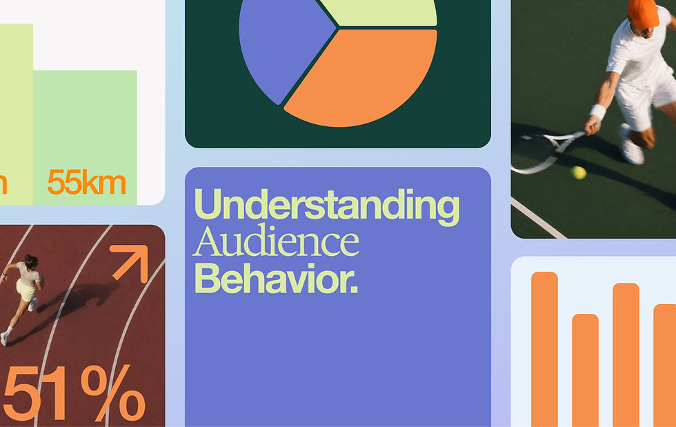
Don't limit yourself to the first graph type that comes to mind. While bar charts and line graphs are excellent tools, there's a whole world of creative visualization ideas that can make your data more engaging. For showing geographical data, a heatmap or a choropleth map is far more effective than a simple table. For displaying relationships between many different items, a network graph can reveal connections that would otherwise be hidden.
Consider using a bubble chart to represent three variables at once, with the X and Y axes for two variables and the size of the bubble for the third. A Sankey diagram is a fantastic idea for visualizing flow, like customer journeys or energy transfer. Exploring these less common options can lead you to a graph idea that is not only accurate but also unique and memorable.
04. Sketch out a few rough ideas
The fastest way to test your graph ideas is to grab a pen and paper. Before you open any software, try sketching a few different versions of your graph. This low-tech approach allows you to experiment quickly without getting bogged down in design details. Try plotting your time-series data as both a line graph and an area chart. Sketch your categorical comparison as both a vertical and a horizontal bar graph.
You don't need to be an artist. These are just rough drafts to help you see how the data looks in different formats. Does one layout make the main trend more obvious? Is another one cleaner and easier to read? Sketching helps you fail fast and find the strongest visual concept before you invest time in building the final version.
05. Prioritize clarity and simplicity
The best graph idea is often the simplest one. While creative and complex visualizations can be impressive, they can also be confusing if not executed perfectly. Your primary goal is to communicate information clearly. When you're choosing between a few different ideas, ask yourself: which one will my audience understand the fastest?
Avoid what’s often called "chartjunk"—any visual elements that don't add to the understanding of the data. This includes unnecessary 3D effects, distracting background images, or overly decorative fonts. A clean, minimalist design with plenty of white space allows the data to speak for itself. Always choose the graph idea that makes the data the hero.
06. Bring your vision to life with the right tool
Once you've settled on your best graph idea, you need a tool that can execute it beautifully. A professional website builder like Wixel gives you the flexibility to create custom charts and graphs that fit your brand perfectly. You can easily add graphs to your pages, connect your data, and customize the design to match your vision.
Using a powerful platform means you’re not limited by rigid templates. You can adjust colors, fonts, labels, and interactive elements to create a polished and professional-looking graph. This final step is where your idea becomes a reality, turning your data into a compelling visual asset that enhances your website or presentation.
Graph ideas FAQ
What are some creative ways to display data?
Beyond standard charts, you can use a word cloud to show the frequency of text data, a timeline infographic to display chronological events or a gauge chart to show progress toward a goal. A treemap is great for displaying hierarchical data, while a spider chart is useful for comparing multiple variables for a single item.
How can I make my graph more interesting?
To make your graph more interesting, focus on telling a story. Use color strategically to highlight the most important data point. Add annotations or callouts to explain specific peaks or dips. You can also incorporate icons or small illustrations to make the graph more visually engaging, as long as they don’t clutter the design.
What is the best graph for showing trends?
The best graph for showing trends over time is a line graph. It clearly connects data points over a continuous period, making it easy to see patterns, growth or decline. An area chart, which is a line graph with the area below the line filled in, is also an excellent choice for emphasizing the volume or magnitude of a trend.