- Aug 8, 2016
- 2 min read
There's much to be said about Eleanor Catton's novel “The Luminaries”- it rewarded Catton with the Man Booker Prize which, in 2013, made her the youngest winner in history - and the second New Zealander to taken in. But the luminous portrait of murky gold diggers in 18th century New Zealand tells an interesting story, just by looking at it. It is an exotic, and adventurous exploration into strange lands, but it's cover makes you want to curl up with it.
A Note on Quantity/Quality
Quantity – The beautiful cover can’t hide the mighty bulk of this book, a mere 828 pages. It might frighten some readers, but don’t let it’s sheer size dissuade you. It’s well worth it. Quality – At 28, author Eleanor Catton became the youngest person to win the prestigious Man Booker prize for this book. As a 28 year old myself, This piece of trivia never fails to make me feel a tiny bit worse about my accomplishments so far.
Friendly Feedback
Now we can start with the book itself. It was recommended to me by my father, as are many of the books I’ve read. He has great taste, so I often ask him for recommendations, even though he tends to get obsessed with books by Middle Eastern authors, Holocaust books and Ottoman History. Don’t worry, this one is none of the above.
The Backdrop
But let’s not jump ahead, Before we get to the cover we need to talk about the story. The book is set in a strange time, during the New Zealand gold rush of 1866, a part of history I had absolutely no knowledge of. It follows a series of unresolved crimes regarding a murder mystery and an enormous fortune. It reads like a Victorian, Jane Austinian sensation novel, and is extremely well-written with all its intricate twists and turns.
A Unique Layout
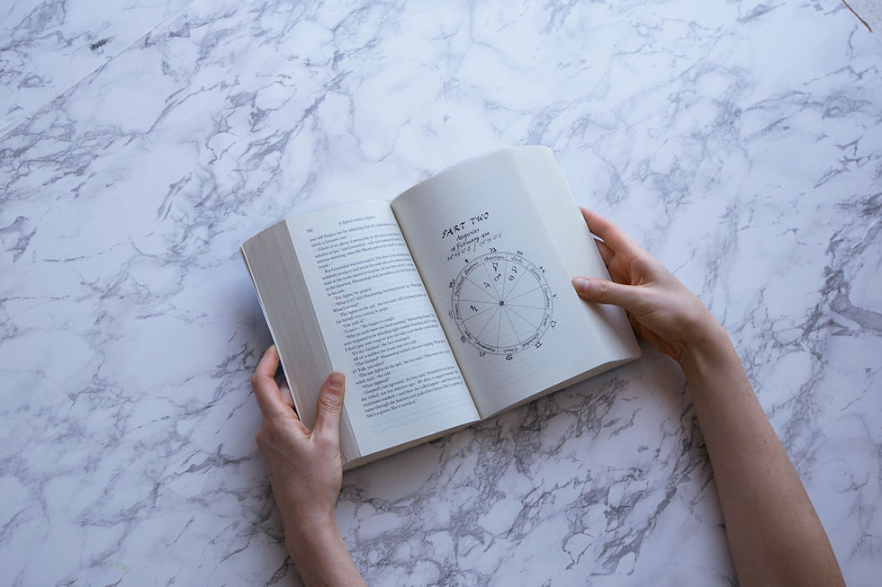
Even though it’s set in Victorian times, there is something very refreshing and inventive at the core of the book. The chapters are set in what initially appears to be a riddle, as they are laid out according to the waning of the moon. Meaning – the first part is 360 pages long, while each of the following 11 parts get progressively shorter, until the last part, just two pages long: a sliver of genius writing. Each chapter opens with a illustrated cover depicting an astrological map of each of the characters. This book is so elaborately thought out, that there are many more small visual details and clues throughout the book, but I’ll leave the thrill of discovery to you.
As a designer and a reader, I love books that combine my passion for both worlds. I’m used to enjoying the fusion between the two in illustrated books or graphic novels, which is why I especially enjoyed the sophisticated use of graphic elements in this book.
Cover Story
As to the cover, I believe book covers should seduce us with questions, while the answers lie between the pages. In this case, I can’t say that the cover adds extra layers of meaning or that it stands out due to outstanding design, but I do feel that it compliments the book and serves as a compelling gateway to what lies within.