- Apr 30, 2020
- 9 min read
In one of Franz Kafka's letters to his childhood friend and classmate, Oskar Pollack, he summarized his experience of reading a book written by Christian Friedrich Hebbel, saying that ״We ought to read only the kind of books that wound and stab us. If the book we are reading doesn't wake us up with a blow on the head, what are we reading it for? A book must be the ax for the frozen sea inside us." As a designer, Kafka's approach resonated with me. Experiencing a book stretches beyond the text to its cover, paper, type design, and spine material. A gripping opening is as exciting as a unique typographic composition; a match between shape and form is like another type of storytelling. With all elements combined, the design of a book adds a robust layer to the experience.
Similar to any design, the craft of designing a book can be divided into two main goals: function and emotion. Function means how legible the text is and how its design encourages you to read on; Emotion refers to how a book's design evokes a feeling or sentiment. And like many design fields, book design developed simultaneously with printing technologies. Thus, functional decisions about lettering, composition, and format ultimately designed decisions. As the printing industry grew, it became more aggressively fueled by economic logic, which maximized readership while lowering printing costs. This logic became more robust with the transition into digital publishing. This logic spotlights the book's exterior and its substantial marketing value rather than its interior. The latter could not be easily exhibited and promoted, so it became secondary to its marketable companion. Even today, covers are usually endowed with attractive design elements, color, font, and imagery, whose purpose is to entice and convince the consumer to pick up the book and purchase it.

Innovative formatting, as a result, has been far less apparent. It has thrived in niche genres such as children's books, cookbooks, and art and design books, —showing a flexible approach towards content and a higher level of freedom using typography, structure, dimensions, grid and use of visuals— but has not been widely implemented. As these books appeal to a diverse target audience, they place equal emphasis on the reading experience and the content itself. And while these exceptions serve as inspiration, innovative design formats can go beyond exception, and impact how books are designed as a whole. The opportunity for change has come about from digital reading experiences that took away physical limitations and enabled us to rethink how we experience content. Suddenly, past limitations that were affected by the financial aspects of ink use, like paper texture and cover requirements, were removed and made way for new, endless possibilities of movement, colors, images and typefaces. We’ve seen an essentially new approach towards text design that placed a spotlight on the experience of reading, and now we can take what we’ve learned and apply it again on non-digital experiences, and print in particular.
Designing a book according to its content creates a synchronized experience that gives words their rhythm and enhances the value of storytelling. Today, as we spend time looking at screens that enable a massive consumption of content, the process of reading and concentrating over time in any physical text becomes a difficult, not-obvious task. But employing some of the lessons that these screens brought to our lives - like the rules of UX - means that we can create more compelling, engaging and motivating experiences not just through apps but through physical experiences. Design can help motivate the reader, encourage them to continue reading, facilitating the experience while making it more engaging. Design announces not just how we would use an object but how we would enjoy the process, and so good design, like good content, will allow a book to be devoured, not letting you set it aside for even a moment. For books to ensure their place in culture, their design should take readers into consideration by becoming more accessible and producing an overall experience that requires less and gives more. It is impossible to ignore the fact that reading takes time and focus that many people are no longer willing to devote, and in a world where everything comes all too easy, the book must line up and do its best to stay relevant.

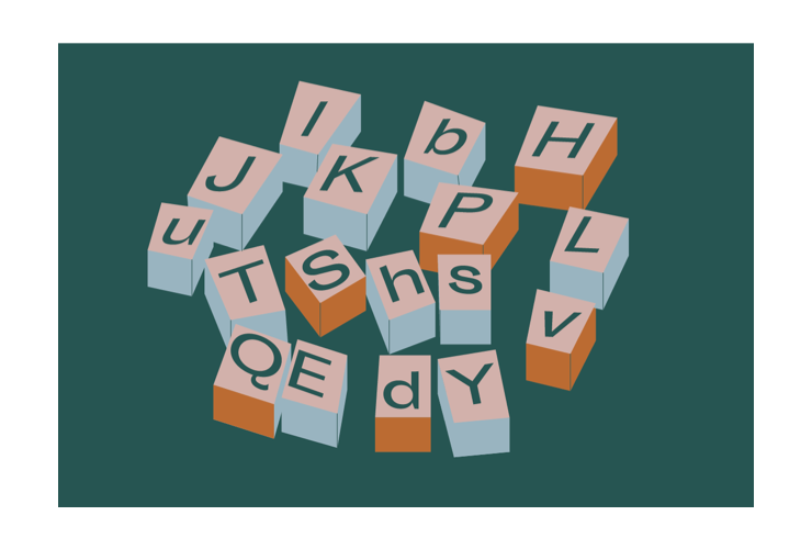


Brief history of print, illustrated by Noam Noy,
Though they are the exception, books that implement this approach to content design exist and are becoming more and more common. From philosophical books to graphic novels, to art books and even classic novels, book designers are adopting a working practice that includes the design as part of the storytellin, finding their own personal ways to create new and exciting book design formats. Here are a few notable examples.
The Age of Earthquakes (A Guide to the Extreme Present)
Written by Shumon Bazaar, Douglas Coupland, Hans Ulrich Obrist
Designed by Wayne Daly
Penguin Penguin Random House UK, 2015
Designed as a guide for dealing with the technological world we live in, Bazaar, Coupland, and Obrist examine the impact of the Internet's invention. "We see this as a kind of DIY manual," writes Obrist. Combining works by more than thirty artists and designers who discuss the Internet age, the authors suggest that similarities between individuals globally grew higher and that their affiliations have changed, relying much more on their relationship with technology than their age group ethnicity.
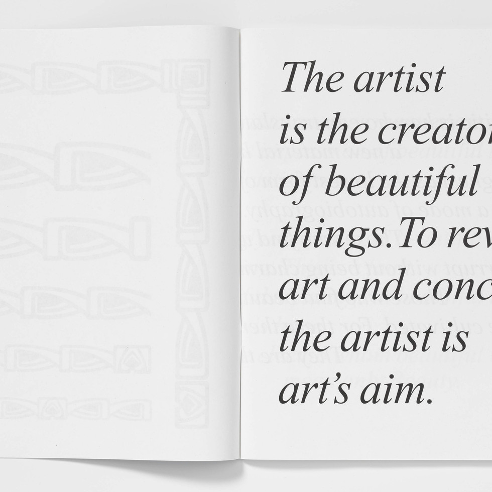
The work is a self-aware homage to Marshall McLuhan's The Medium is the Message (1967) and his writing partner and graphic designer, Quentin Fiore. While the former dealt with the era's technological revolution, television, the canonical work served as more than a textual inspiration for The Age of Earthquakes. McLuhan's work was considered the first "television book" since its format resembled a television screen. Its use of typography and iconic images evoked the visual language of advertising and billboards. Similarly, each page of The Age of Earthquakes stands on its own thanks to Wayne Daly's eclectic design, which uses the text so playfully, presenting it to the reader in an almost theatrical manner. The design turns the reader into a viewer, making pages fly, almost as though you are watching rather than reading. Beyond the clear inspiration from Fiore, Daly himself said of his works that he is guided by the belief that content and text are the ones that define and guide the design of the book.
Indeed, the design goes hand in hand with the content, making it clear that it is tailored to its dimensions. As a reader, the design draws me in almost unconsciously, convincing me to read just a little more until I find myself eagerly devouring the book entirely. The changing typography produces a rhythm of reading that accompanies the reader, emphasizing and reinforcing each sentence's role in the book. Remarkable passages are created. The reader can distinguish a text that is "whispered" from one that "screams", bringing to life how the writer conveys a position or states a fact or whether the text is humorous, cynical, or severe. Daly makes use of several measures, freeing the design completely from the format, using the page itself as if it were devoid of rules or a grid that, along with flexible typography, can adapt and change even in the middle of a spread or sentence. While breaking all the rules, Daly stays faithful to only one fundamental law - using black and white - thus paying his homage to McLuhan's book in the most exciting way.

Illustrated and Written by Myra Kalman
Penguin, 2009
Illustrated and Written by Myra Kalman
Penguin Press, 2010
From Pulitzer winning Maus by Art Spiegelman to the popular Japanese comic books, adult graphic novels are quite popular today, with a growing and evolving market. Compared to children's books, where the images take part in educating young readers as well as function as a tool for expanding the imagination, adult graphic novels are a common medium for dealing with complex issues or even trauma, and as such illustrations are given a deeper meaning through text and can reveal information written between the lines. They are another layer of information and allow for a different interpretation and an exciting reading experience.
In the case of Myra Kalmans work, it feels as though she writes as she thinks. Her books are a sequence of associations between thoughts and connections that are made within her head and transmitted to paper in a way that feels completely simultaneous. While some points go deeper into accompanying research, some rise and fall with the same ease that they emerged. When asked about her method of creation, Kalman said that she would go on a city trip every month and record her thoughts and observations. She later illustrated those she felt worthy and incorporated them into her books.
The books themselves are illustrated in gouache colors, combined with a few photographs and contain mainly handwritten typography that has already become iconic. The only thing that sets it apart from a children's book is the content itself. The books always follow a main narrative that is wrapped in simple, everyday events, making it exciting and heart-warming. They deal with sensitivity surrounding issues of death, loss, coping and joy. The casual and flowing language combined with the neverending sequences of associations produces books that give a sense of personal conversation and allow you to consume them quickly and with pleasure. The reader almost has to force himself to divide the pleasure into small portions, like savoring a chocolate bar, in order not to finish it all at once.
Design wise, the use of personal writing allows Kalman to play with the words and letters, to increase and decrease, to pull and float and thus obtain a great deal of freedom and broad expression. Typography becomes a material in her hands and she uses it well, creating drama and dictating the rhythm of reading. Each letter receives its own attention very differently from the mechanical operation of predefined typing. The illustrations take part in the construction of the story as well. Kalman's choices give a different and new perspective and hint about the character of the writer. They integrate with the typography which also becomes an image in itself, allowing the two to be consumed simultaneously and complement one another.
Written by Flaka Haliti, Bardhi Haliti
Published in conjunction with Flaka Haliti’s solo presentation conceived for the Kosovo Pavilion at the 56th Venice Biennale
Sternberg Press, 2015
Speculating on the Blue, entwined with work presented at the Kosovo Pavilion at the 56th Venice Biennale, serves as an invitation for the viewer to encounter an optical domain wherein physical boundaries are mediated by sensory experiences. The original artwork employs a saturated blue color, altered by architectural forms and the light that falls on structures, undermining the distinct concept of the ‘border’. The inspiration for the structure came from New York City's UN Building, which is separated from the city by a concrete wall barrier that looks like a military safe zone. In order to reduce the building’s militant appearance, present it as international and create the illusion that it is connected to the sky it was painted in blue.
The book's designer, Bardhi Haliti, chooses to present these politics through formal and spatial abstractness. This is a direct continuation of the installation that presents the structure and skyscrapers as representations of limitations and possibilities at the same time. Pages turn into fields of color and typography varying in size. The book offers interface points and similarities between present and future for history and institutions. Haliti seeks to create a constant sense of space that produces multiple temporal dimensions at the same time and thus is experienced through constant discovery. The viewer is in a temporary space that exists between restriction and extension, proximity and distance.
Haliti creates a spacious reading experience that echoes the exhibition wall through dozens of pages painted in ever-increasing blue hues. The typography alone creates a dynamic rhythm and keeps the reader alert and attentive. The book presents questions and answers between the designer and artist that come to life throughout the design. It gives the content a sense of realness where the reader feels like a fly on the wall, in contrast to reading a manuscript of the conversation in retrospect.


Written by Oscar Wilde
Designed by John Morgan
Art by Gareth Jones
Four Corner Books, 2007
A wonderful publishing house for content-oriented book design is Four Corners Books, which came out in 2007 with the Familiars project, in which it republishes classic books in new designs. This is a great project that makes for a perfect comparison between one reading experience to another by taking books that are known for their literary quality and presenting them farther away from their classic form in a dedicated design tailored specifically for them.
For example, we can see the Oscar Wilde classic, The Picture of Dorian Gray, redesigned by John Morgan and artist Gareth Jones. Morgan chose to reformat the book as a magazine, using the precise paper and iconic staple cover as a homage to the first publication of the text as a short story in the Lippincott's Monthly in 1890. Morgan uses common journalistic typography design, dividing the text into two columns, highlighting titles and excerpts and integrating vintage advertisements throughout the book. These elements refer to the content as well as the atmosphere he seeks to convey.