- Jun 5, 2018
- 4 min read
Updated: Apr 16, 2024
Designers – we’re not an easy crowd to please. It’s true that we often get over-enthusiastic about what others may perceive as mundane. But on the other hand, we can be pretty critical and picky about small details (well, how else will we get the best results?). Despite all of this, we decided to take on the challenge of crafting a collection of portfolio website templates, made especially for creative minds. To make sure we’d get it just right, a team of visual experts was behind each template. Spending a large part of their days cool hunting, they’ve gathered trends from a variety of fields and implemented them into the designs.
As a result, each layout is not only up-to-date but has the potential to tell a story in a unique and visually fascinating way. You can treat these designers’ templates as the base of your portfolio, editing and adapting them according to your own works, voice and style. Or you can simply use them as fresh inspiration. They may have been designed with specific creatives in mind, but you have the absolute freedom to take them in any direction you want, conveying your works online in their best light.
A breath of fresh air
Everyone needs a little space to breathe from time to time. Websites feel it too, you know. Sometimes, you’ve just got to listen to them and give your images the crisp air they deserve. This photography website template does just that. With an asymmetrical grid and maximum use of white space, each image is displayed in an optimal way. Whatever your field of design, this is a great way of giving each visual the platform it deserves. Why not add an element of surprise to your portfolio? You can subtly incorporate more of your works without causing clutter, by adding hover interactions – allow your mouse to drift over any of these stunning photographs and your eyes are in for a treat.
Welcome to the jungle
In a tiger-eat-tiger world, making sure your website stands out is key. This template created for graphic designers lures in its prey (in this case, site visitors) with a cute welcoming animation that you can’t stay indifferent to. The use of fullscreen visuals enables you to display your works in their best form, as well as engulf visitors with large images that together form the right atmosphere. Contrast stylish fonts with your own hand-drawn logo and illustrations for a unique touch – it will cause quite the uproar.
Musicians, take note
Stay on-trend with off-beat vibes. The random, yet strategically placed elements of this music website come together to form a rhythm that shouts out “personality” loud and clear. Powerful photographs are combined with playful illustrations, creating a memorable brand. The fun doesn’t stop there: check out how you can use subtle animations and autoplay on your videos, to truly get your site’s groove on.
Ordered chaos
You know when your desk looks like it’s been through a hurricane, and you pretend it’s on purpose? “Organized mess”, you say. Turns out that this whirlwind excuse can actually be a pretty good look for your website. You can take it to the extreme, like in this template, by creating eye-catching compositions and layering images on top of text. Put an emphasis on typography, both on the homepage and in the menu, to create a powerful message and bold color contrasts. The finishing touch: parallax. This will ensure your website is complete and that all elements work well together. Need we say more? Get whisking.
Split-screen chic
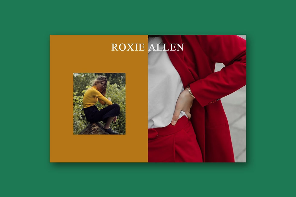
Did someone say ‘chic’? Well, hello fashionistas. This fashion designers’ website is the definition of elegance. Notice the sleek use of a split-screen, as well as slideshow images: an ideal way to showcase your best shots in the top fold, and ensure to set the tone for the whole site. See how this template utilizes a select few colors to create a clear and powerful brand. The subtle use of parallax scrolling completes the look and feel, and provides the most addictive scrolling experience we’ve seen in a while.
Grid with a twist
We all love a good grid. But how about spicing it up a bit? Whether you’re an illustrator, photographer or graphic designer, an off-beat layout is a great way to showcase works on an online portfolio. The structure on this template not only enables you to create captivating compositions and color combinations, but you can also boast your best pieces on the top fold, leaving your visitors hungry for more. Break up the geometrical format by weaving in a few animations here and there, and your site will truly come to life.
Move over, Taj Mahal
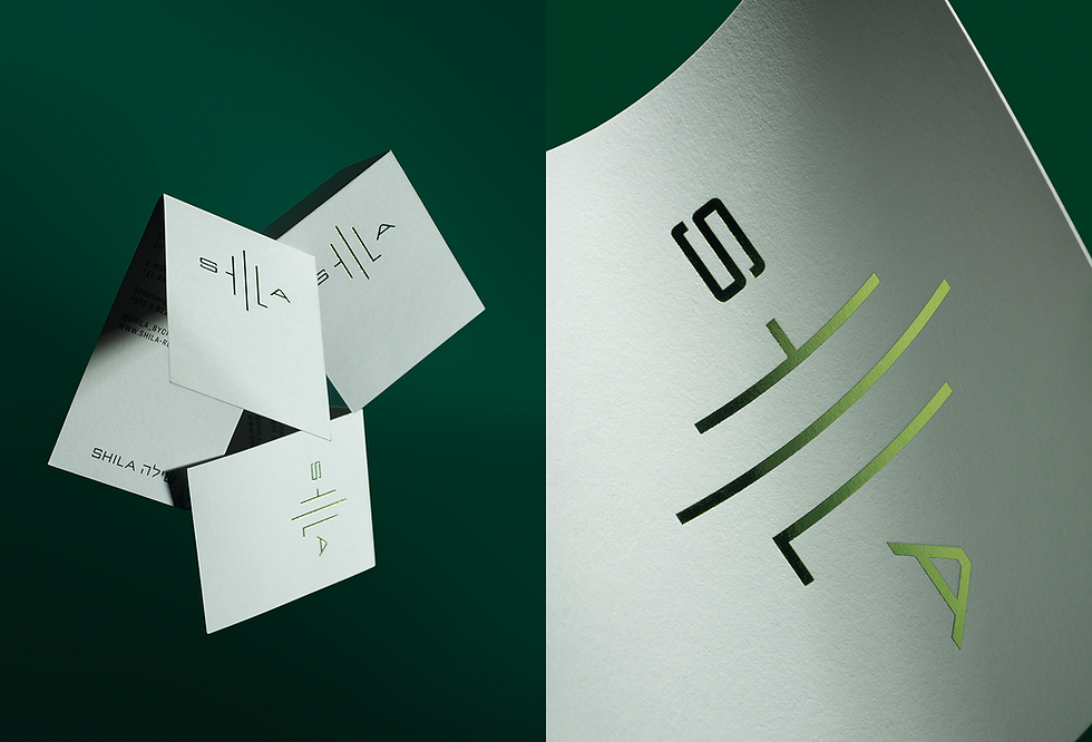
Playing it safe doesn’t have to be boring. True, this minimalistic template is so symmetrical that it could put the Taj Mahal to shame (well, not quite) – but when it looks this good, who cares? Use a split-screen to display works that compliment one another and reveal extra information about each image. If you’re an industrial designer, this is the ideal layout to display two separate images that show-off different angles or details of your product. Even if you go for a small menu bar that won’t shift the focus away from your works, pick a bright color that contrasts with the background. With lemons like these, now is the time to make lemonade.


