DESIGN
Throughout Rakia’s ambitious mission, we were honored to support their efforts.
We had the privilege of supporting Rakia’s efforts before, during and after their mission.
In order to do this, we had to pre-build the website for these three different scenarios, making the design process both challenging and extremely interesting.
Immediately after receiving this brief, we knew we wanted to steer clear of design clichés usually associated with space, but it was still very important to make it clear what the site was about.
For us, a key part of the design process was finding the right balance between the obvious and the unique. As part of the process, we defined a number of design elements that eventually became cornerstones for the final design.
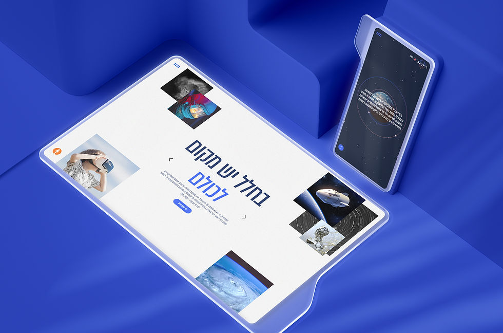
Inspired by the globe, we used circular outlines and solid circles. These shapes sometimes appeared in a group or in different layers, hiding or exposing various elements on the site.
We used mesh gradients to illustrate the rocket launch, the sun and the moon. This element isn’t just beautiful, but also represents the physical energy of the entire mission.
On the dashboard we created the counter, showing the remaining time leading up to launch. This was a key component of the site and the use of numbers and data led us to use motifs inspired by a spaceship dashboard.

The final sketches presented to our client were very different from one another. The first represented space in a much more abstract way, and the second was more literal, but still unlike the typical 'space' websites we had seen.
Although we were drawn towards the abstract design, our client was concerned that it might not speak the language of their audiences. After some discussion they went for a dark blue sketch with uniquely developed graphic elements.
After finalizing the design direction, we continued exploring the sitemap, breaking down the content elements we needed to use.
The amount of content we had to showcase was huge so we needed to use interactions to expose information in layers. We decided to use content sliders, filtering systems and downloadable files to display the content more interactively. To make the content more scannable, we went for big bold typography for the titles.
The launch of the site, followed by a large-scale PR effort, was a huge success. More than 210K users visited the site during the mission, taking part in the live streams and engaging through social media. The mission might be over but the memories will live on in the site’s archive.
BUILDING INFRASTRUCTURE
Before diving into building the site, it’s important to take a closer look at the pages design and outline their sections (i.e: header, footer, welcome, blog, etc.)
Tip: List all sections on your design files
Take your design file and use a short title to describe each section.
It will help you to better prepare for the building process. Don’t be afraid to have too many sections, It would only make your life easier moving forward.
Mapping Sections
01
We used regular text element with a hyperlink, container with grids and interactions to animate the button.
Mapping Sections
01
We used regular text element with a hyperlink, container with grids and interactions to animate the button.
Mapping Sections
01
We used regular text element with a hyperlink, container with grids and interactions to animate the button.
Mapping Sections
01
Immediately after receiving this brief, we knew we wanted to steer clear of design clichés usually associated with space, but it was still very important to make it clear what the site was about.
For us, a key part of the design process was finding the right balance between the obvious and the unique. As part of the process, we defined a number of design elements that eventually became cornerstones for the final design.


Inspired by the globe, we used circular outlines and solid circles. These shapes sometimes appeared in a group or in different layers, hiding or exposing various elements on the site.
We used mesh gradients to illustrate the rocket launch, the sun and the moon. This element isn’t just beautiful, but also represents the physical energy of the entire mission.
On the dashboard we created the counter, showing the remaining time leading up to launch. This was a key component of the site and the use of numbers and data led us to use motifs inspired by a spaceship dashboard.

The final sketches presented to our client were very different from one another. The first represented space in a much more abstract way, and the second was more literal, but still unlike the typical 'space' websites we had seen.
Although we were drawn towards the abstract design, our client was concerned that it might not speak the language of their audiences. After some discussion they went for a dark blue sketch with uniquely developed graphic elements.
After finalizing the design direction, we continued exploring the sitemap, breaking down the content elements we needed to use.
The amount of content we had to showcase was huge so we needed to use interactions to expose information in layers. We decided to use content sliders, filtering systems and downloadable files to display the content more interactively. To make the content more scannable, we went for big bold typography for the titles.
The launch of the site, followed by a large-scale PR effort, was a huge success. More than 210K users visited the site during the mission, taking part in the live streams and engaging through social media. The mission might be over but the memories will live on in the site’s archive.

For years, OFFF brand was known for its eccentric content, promoting authentic creative freedom for and inspiring ten of thousands of creators around the world. It was time to bring this vision online.

ELEMENTS
THE CHALLENGE
Creating a filtering system to sort between different types of content.
THE SOLUTION
Connect a layouter to a database using code (Wix Velo)
THE CHALLENGE
Showing the time left until the spaceship launch.
THE SOLUTION
Create a code-based (Wix Velo) custom designed timer element.

THE CHALLENGE
Adding typographic decorative elements.
THE SOLUTION
Create a scrolling text effect using code (Wix Velo).

THE CHALLENGE
Creating a custom-designed date format for posts to align with the typography system on the site.
THE SOLUTION
Connect a repeater to a database base using code (Wix Velo).


API'S
DESIGNER
Ilona Somer
PROJECT MANAGER
Gili Rozenefeld
PROJECT MANAGER
Michael Mishan
ART DIRECTOR
Liat Elkaim
TECH DESIGNER
Eden Apelboim
DESIGN
Throughout Rakia’s ambitious mission, we were honored to support their efforts.
We had the privilege of supporting Rakia’s efforts before, during and after their mission.
In order to do this, we had to pre-build the website for these three different scenarios, making the design process both challenging and extremely interesting.
Rakia
Rakia is an Israeli space exploration mission. The mission aimed at sending Eytan Stibbe, philanthropist, former Israeli pilot, and friend of Ilan Ramon, to the International Space Station.
WHAT WE DID
Content, Design, Velo, SEO
PRODUCTS USED
Created on Editor X

A major goal of the site was to build excitement for the historic mission, while educating and inspiring young Israelis about the importance of Israel's space industry. A challenging part of this project was to create a site that could successfully communicate to a wide range of audiences: children, teenagers, researchers and teachers in Hebrew, Arabic and English.
PROJECT OBJECTIVES
01. Celebrate the launch of the mission
02. Showcase educational and scientific content in an engaging way
03. Stream live events during the mission

