DESIGN
Designed to fit our brand values: Bold, Confident and Mature
This project was put together in parallel to building our own Wix Agency brand.
The values that guide our brand identity are reflected on the site with a confident and mature design style.
We chose to use big bold typography, a monochromatic color palette without extra decorations.
To add a playful side to the website, we used large falling shapes that appear on first load and disappear with a hover interaction.
Simple shapes were used to present our team members with a changing color hover interaction that we also used to show fun facts about our work during 2021.
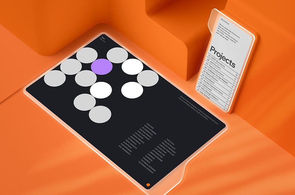
The website was designed to display our projects in the best way possible, so the images were curated carefully to focus on the essence of each project.
The layout we decided on was airy with the plan to layer projects on top of each other, allowing visitors to open and collapse projects as they browsed.
BUILDING INFRASTRUCTURE
Before diving into building the site, it’s important to take a closer look at the pages design and outline their sections (i.e: header, footer, welcome, blog, etc.)
Tip: List all sections on your design files
Take your design file and use a short title to describe each section.
It will help you to better prepare for the building process. Don’t be afraid to have too many sections, It would only make your life easier moving forward.
Mapping Sections
01
We used regular text element with a hyperlink, container with grids and interactions to animate the button.
Mapping Sections
01
We used regular text element with a hyperlink, container with grids and interactions to animate the button.
Mapping Sections
01
We used regular text element with a hyperlink, container with grids and interactions to animate the button.
Mapping Sections
01
To add a playful side to the website, we used large falling shapes that appear on first load and disappear with a hover interaction.
Simple shapes were used to present our team members with a changing color hover interaction that we also used to show fun facts about our work during 2021.

The website was designed to display our projects in the best way possible, so the images were curated carefully to focus on the essence of each project.
The layout we decided on was airy with the plan to layer projects on top of each other, allowing visitors to open and collapse projects as they browsed.

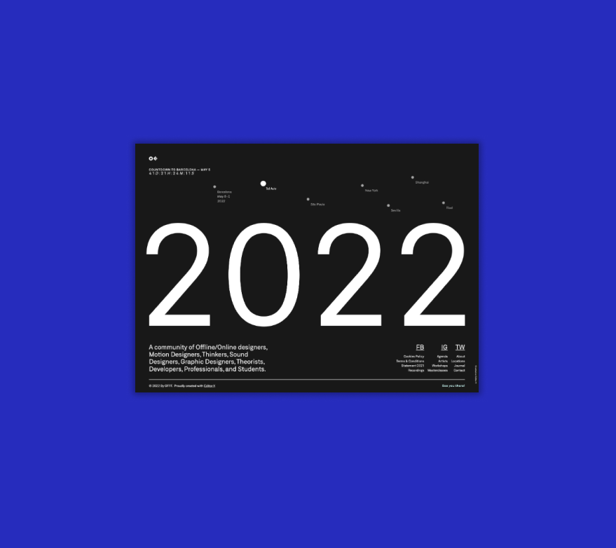
For years, OFFF brand was known for its eccentric content, promoting authentic creative freedom for and inspiring ten of thousands of creators around the world. It was time to bring this vision online.
For years, OFFF brand was known for its eccentric content, promoting authentic creative freedom for and inspiring ten of thousands of creators around the world. It was time to bring this vision online.

ELEMENTS
API'S
PROJECT MANAGER
Roee Kuperberg
PROJECT MANAGER
Michael Mishan
ART DIRECTOR
Liat Elkaim
DESIGN
Designed to fit our brand values: Bold, Confident and Mature
This project was put together in parallel to building our own Wix Agency brand.
The values that guide our brand identity are reflected on the site with a confident and mature design style.
We chose to use big bold typography, a monochromatic color palette without extra decorations.

Agency Year in Review
A website celebrating our projects and wrapping up 2021 at Wix Agency.
WHAT WE DID
Content, Design, Build, SEO, Velo
PRODUCTS USED
Created on Editor X

A collection of of our favorite projects at Wix Agency and a look behind the scenes at the people behind it all.
PROJECT OBJECTIVES
01. Showcase our projects
02. Share fun facts about our work
03. Introduce the Wix Agency team

