
As a marketer, you understand the effort that goes behind reaching potential consumers. You spend a significant amount of time determining which strategies to use and perfecting your brand image. But once you’ve gotten the attention of your audience, how can you actively convert them into users?
One of the most effective ways to boost leads and sales is by creating a landing page, a single web page that is used to promote an offering and generate conversions. You may have come across these types of pages before, but it’s a whole other ball game to design one yourself.
In this article, we’ll provide you with guidance and inspiration for designing landing pages—starting with this landing page builder that you can use to create one of your own. You’ll also find a list of landing page design examples and tips to guide you through the creation process. Armed with these tools, you’ll be able to choose the right type of landing page for your purpose, and then build an attractive, high-converting landing page within minutes.
Ready to design a landing page of your own? Get started with Wix today.
Landing page design examples
Take a look at these landing page examples for inspiration and to learn how to make your page stand out. If there’s an idea below that you love, clicking on the link will take you directly to a free landing page template that you can customize yourself. (Also, explore some of today's best AI landing page builders.)
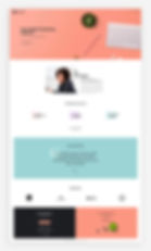
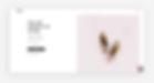
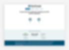
A landing page that doubles as a signup form is a highly effective design when it comes to capturing leads. The form requests the visitor’s full name as well as their email address, while customer testimonials further down the page persuade them to take action. If you’re looking to grow your client base online, this particular format is a valuable source of landing page inspiration.

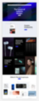
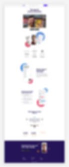
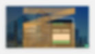
This landing page uses vivid colors for a playfully crisp, clean feel. Large-scale images of the product are showcased front and center, as well as the company’s slogan and a CTA that encourages visitors to buy the product. Towards the bottom of the page, a list of benefits serves to persuade people on the fence about purchasing.

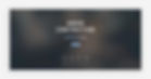
While people often associate landing pages with product promotion, they can also be used to promote a webinar or virtual event. This simple but powerful landing page design example begins with a straightforward header that explains exactly what the webinar is about. Because of the uncluttered design, the CTA - Reserve my spot - is prominent and clickable. More detailed information about the webinar, including the speaker bio and audience testimonials, is placed lower down on the page.
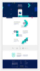
Another type of landing page centers around promoting your business’s mobile app. This particular design is both friendly and professional. It introduces the new app with a catchy headline, links directly to Google Play and the Apple App Store, and includes a screenshot that displays the app to potential users. Scrolling further down the landing page, visitors are given an introductory explanation of the app’s features and benefits.
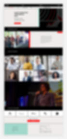
If you’re holding a conference, using a landing page is an effective way to promote it. This landing page design condenses all the important information about such an event on a single page. The top fold displays the location, date and a button to buy tickets, while a quick scroll downwards reveals details about the speakers, agenda and venue.
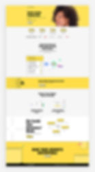
This attractive, modern landing page design works well for any company, but it’s especially on-brand for startups. While minimal text is an important feature of most landing pages, this format allows you to dive a little deeper into your product by providing places to include specific information. The How It Works section, for instance, is the perfect place to share product details that would attract investors and future clients.
If you’re in the process of launching an online store, use a landing page to attract customers leading up to the official opening of your shop. One strategy to get potential buyers excited about your brand is to display top items on the landing page itself, as you’ll see in the design below. This is far more effective than a text-based coming soon page, since it gives people a sneak peek of your store and entices them to sign up for updates.
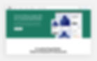
Website under construction pages are a specific type of landing page that explain to users that your site is still in the works. This is a fairly straightforward under construction landing page with a playful but minimalistic progress bar design.
There are two important elements that make this page stand out: the social media buttons and the Notify Me! CTA. These encourage the visitor to further engage with your brand, rather than simply navigating away from your page in search of another. And if a particular user is excited about your upcoming site, they’ll have the option to spread the word on social media and share it with friends.
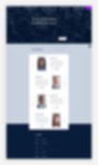
Marketing conferences aim to be fresh and innovative events, a vibe that’s captured perfectly in this design template. The right panel contains contrasting lines that move rhythmically, and the use of red highlight when your mouse hovers over each speaker adds to this contemporary feel. The top header contains a large, bold font with only a few vital menu options, helping visitors comprehend the content more easily.
How to design a landing page
Ready to start designing a landing page? These design tips will help you create a landing page that not only looks good, but will also generate leads and sales:
01. Keep text to a minimum
Designing a landing page requires a delicate balance when it comes to the amount of text you include. On the one hand, you want to provide details about your product that will convince visitors to buy. On the other hand, you don’t want to deter visitors by overwhelming them with information.
As a general rule, your landing page copy should be concise. Isolate the most essential information about your product and condense it down as much as possible. Show, don’t tell; let the images do most of the talking, supplemented by supporting text and compelling headlines. Since you will be using a minimal amount of text, the phrases you do choose need to be meaningful and engaging.
02. Opt for a simple UI
That brings us to our next point: visually, you’ll want the layout to be clean. When it comes to landing page design, simplicity equals clarity.
To make your landing page easy for visitors to skim and digest, avoid clutter. Leave plenty of white space, and break up large chunks of text. If you’re adding a signup form to your landing page, don’t add too many fields. Instead, keep it quick and to the point by including space for only the most important details: the visitor's name, email address, and perhaps their job title.
You can get a head start with your layout by trying one of the best landing page builders, which should include conversion-optimized templates. Once you have the basic framework, you can tailor the design to your needs.
03. Write a strong CTA
The ultimate goal of creating a landing page? Conversion. And if there’s one crucial element for conversion, it’s your call-to-action, or CTA.
Having a CTA is an important landing page best practice, as this is the button that tells visitors to take the next step. Depending on your goals, your CTA could ask visitors to fill out an online form (Sign Up), download an ebook (Download Now), or make a purchase (Buy Now). Whichever call to action you choose, it should direct your visitors toward fulfilling the main objective of your landing page.
CTAs, as a core landing page metric, should be simple - typically, they’re just 2 words - but they need to clearly communicate value. Visually, they should be bold and eye-catching. Create a CTA button in a contrasting color and place it in a highly visible location, such as directly below the main header of your landing page. You may also want to include your CTA more than once throughout your landing page, giving visitors multiple opportunities to take advantage of the offer.
04. Avoid long scrolls
Let’s face it: No one wants to spend a great deal of time on a landing page, however beautiful it may be. Everything your visitors need to learn about your product should be on the first fold of your landing page (that is, the part of the page that’s visible without scrolling down). An explanatory and enticing heading - and, most importantly, a powerful CTA - must be included near the top of the page. This ensures that visitors will be able to convert without needing to scroll.
Another note about scrolling: there are cases in which it’s desirable. If your offer is particularly complex and requires more detailed explanation, you can benefit from a long-form landing page design. Just keep in mind to include the most crucial elements for conversion at the top of the page. You may also consider using lightboxes to display additional information without adding too many page sections, or parallax scrolling to make the experience engaging and pleasant for users.
05. Stick to brand colors
The best landing pages include a pop of color. In fact, a recent study shows that using color on marketing materials boosts brand recognition and sales by up to 80%. Think about it: whether it’s a red wildflower in a field or a rainbow against a blue sky, color has a natural power to attract.
Before you go wild with the colors, though, remember that they’ll still need to match the look and feel of your brand. This ensures that your branding is consistent across all platforms and helps visitors instantly associate your landing pages with your business. Try using brand colors that contrast from the other elements of your site to create a landing page that stands out.
06. Choose engaging visuals
Your visuals, like your choice of color, must attract and engage your visitors. Even if your offering is highly technical, such as software, you’ll need to find a way to represent it visually. This is not only important for catching your visitors’ eyes, but also for breaking up the text and making your landing page more digestible.
Furthermore, any visual elements you select should be consistent with your brand. If you’re using photographs, make sure they’re staged in the same way as other photos on your site. Any illustrations or graphic art should likewise reflect your brand image. If you choose to add a video, the style and tone should be consistent with the overall feel of your brand.

07. Use F or Z patterns
Research has shown that people’s eyes tend to move around websites in an F or Z-shaped pattern. To maximize the effectiveness of your landing page design, try to take these patterns into account.
You can do this by placing your most essential landing page elements - the header, main image and CTA button - in an F or Z configuration. For instance, placing the image on the left, the header on the top right, and the CTA below the header follows an F pattern, prompting the reader’s eyes to settle on the CTA.
08. Keep visitors focused on the page
Since the only link you really want your visitors to click on is your CTA, a landing page is not the place to include links to other pages of your site. If a link doesn’t directly take people to a place they’ll convert, it doesn’t belong there.
With that in mind, avoid including your website’s navigation bar on the landing page itself - that will make it too easy for visitors to navigate away from the CTA. Similarly, don’t include backlinks within your landing page copy.

09. Enable social sharing
As we’ve seen in the landing page designs above, another effective strategy is to make it shareable on social media. This lets people who view your landing page spread the word to their followers. While this tactic doesn’t directly drive conversions, it can increase the number of clicks on the page. And the more visitors you bring in, the more likely you are to increase your number of conversions.
To encourage people to share, add a few different social buttons to the first fold of the landing page. The most popular options are Facebook, Instagram, Twitter, LinkedIn and Pinterest.
10. A/B test your design
Finally, while there are several best practices for optimizing your landing pages, consumer psychology can be surprising. If you’re conflicted about a particular landing page design, the best thing you can do is to run an experiment that tests out different versions of your pages.
Display slightly altered versions to different people - for instance, try playing around with the colors and the position of the CTA - and check to see which ones convert best. According to this conversion benchmark report, the average landing page conversion rate is 9.7%, so you’ll want to aim for that or higher. That way, your final decision will be based not only on aesthetics, but also on real, hard data.