
True, you don’t need any prior design experience to learn how to make a website with Wix. But wouldn’t it be fun to “walk the walk and talk the talk” like a professional web designer?
If you want to be able to talk to web designers, understand web design blogs or impress party guests with your knowledge, here are 15 web design terms that will gain you some street cred.
Check out more website design tips.
Recite and repeat:
1. Vectors: Vector graphics are visuals that are comprised of geometrical shapes, as opposed to tiny pixel dots. Their advantage to the pixel-based Bitmap graphics is that they can be scaled better for much larger sizes. Technically, vectors are made by stretching strokes from one point to the other. Though you may be imagining squares or triangles, vector graphics are also used to create a huge variety of images. They’re most commonly used for logos, icons and infographic designs.

2. Bitmap: Unlike vectors, bitmap visuals are made out of pixels – those tiny color dots that are now infamous for 80’s computer game design. Bitmap images always depend on the resolution. If you zoom in too much, you will be able to see the dots that comprise the full image. For instance – every photo that you take with your camera is a Bitmap image.

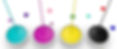
3. CMYK: Also known as “Cyan, Magenta, Yellow and Key (Black) Color Model”, CMYK is a common color scheme identified with print graphics. The four colors at the base of this model represent the ink colors injected by printers. Their various combinations create the color spectrum you see on printed materials.
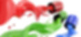
4. RGB: Also known as “Red, Green and Blue Color Model”. If CMYK is print, RGB is the color model of digital graphics. Unlike printers, computer screens “transmit” red, green and blue colors to create the digital palette. RGB is therefore the color model for web design.
5. Responsive: What can web design respond to, you ask? To the type of device that it’s viewed with, of course. With the rise of mobile and tablet web usage, responsive design – web design that makes sure your site looks great on all devices – is a key condition when designing a website. In case you’re wondering how to do this with Wix, check out our mobile optimization tool.

6. Flat Design: This is a design philosophy that promotes simplicity and functionality. Quite literally, flat means design that has no dimensional depth. Instead of designing elements that look like you can reach out and grab them, flat design goes back to the basics of graphics – bright colors, primitive shapes, icons, etc.
7. Skeuomorphism: Complicated word, but definitely an important one. Skeuomorphism is almost the opposite of flat design. Remember Apple’s old iOS design that was filled with apps and graphics that looked like they were taken from real life (the compass, the newsstand, the calendar…)? That’s what skeuomorphism is all about. After enjoying popularity for several years, skeuomorphism seems to be dying out recently.

8. Metro Design: Also known as “Microsoft Design Language”, this design method was developed by Microsoft and is today used on many of the company’s products. It was inspired by public transportation signs and it aspires to reach the same kind of visual clarity. The key aspect of it is thinking of the designed space as an action-oriented interface rather than a canvas of art.

9. Masonry Grid: This layout style became famous following Pinterest’s great success. It’s based on a column structure and the logic of fitting in parallel but not symmetrical pieces of content into the grid. The result is uneven spots that still maintain an organized and neat look. With the Wix editor you can easily add this beautiful layout to your own website, just go to Add -> Gallery -> Masonry.

10. “Above the Fold”: This is an important term for both designers and marketers who work with online platforms. It’s taken from old-school print newspapers lingo, where important news would be printed on the front page and “above the fold”, so readers notice them first. In web design, “above the fold” refers to the section of the screen that is seen without having to scroll downwards. Ideally, your most important pieces of content will be positioned in that space.

11. Infinite Scrolling: Though it sounds like an ancient torture technique, infinite scrolling is actually a popular trend on the web design scene right now. This term is pretty self-explanatory and refers to layouts with very long pages that require lengthy scrolling.

12. Single-Page Sites: Most internet users are familiar with websites that are divided into several pages and that use a navigation menu to move from one page to another. A single-page website literally has only one page. There are many reasons a website owner would prefer to have a single-page rather than a multi-page website. For the design process, the single-page layout requires planning and thought to achieve effective content hierarchy. Fortunately, Wix has many single-page templates that are already set up for that purpose.

13. White Space: Also referred to as “negative space”, white space is the space between elements. It is meant NOT to be used, so as to create margins and air out the layout. White space is not only considered very aesthetic in design, it also helps to generate a convenient and clear user experience.

14. Textures: Most commonly used as backgrounds, textures are repetitive themes that are often used to create a certain atmosphere on a website. For instance, think of a red-brick texture background for a pizzeria website. Textures can be very subtle or very boisterous, depending on your website’s purpose and style.

15. Mockup: Mockups are basically real size models of how your design is planned to look. For web designers, a mockup will be nearly identical to the actual website, only without the functionalities. Using Wix spares you the necessity of preparing a mockup before you start with creating your website, but you can still prepare one if you want by using a draft website in your account. Once you’re happy with the result, you can duplicate the draft site and add all the functionalities.